Users are seriously unimpressed with the new Tumblr logo
Has it crossed the line?

Sign up to Creative Bloq's daily newsletter, which brings you the latest news and inspiration from the worlds of art, design and technology.
You are now subscribed
Your newsletter sign-up was successful
Want to add more newsletters?
Ah, Tumblr. The social media app became a hub for everyone from angsty hipsters to alt musicians/artists when it rose to popularity back in 2013. Since then, the guidelines and rules of the app went through some changes, resulting in the fall of the social media giant – and its new logo apparently isn't helping its cause.
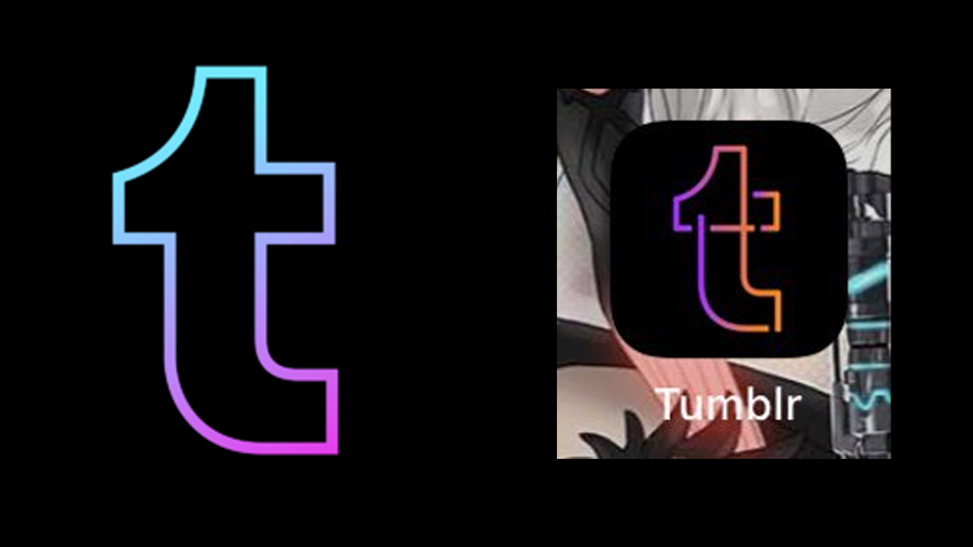
Many users woke up to the social media platform having changed its app icon. The design features the famous Tumblr lower-case T, however, the new logo is made up of overlapping lines in an orange and purple gradient (see below). Despite the refreshed look, many users dislike the new design. If you're looking to update your business' logo but are hoping to avoid a similar controversy, then make sure you check out our guide on how to design a logo.

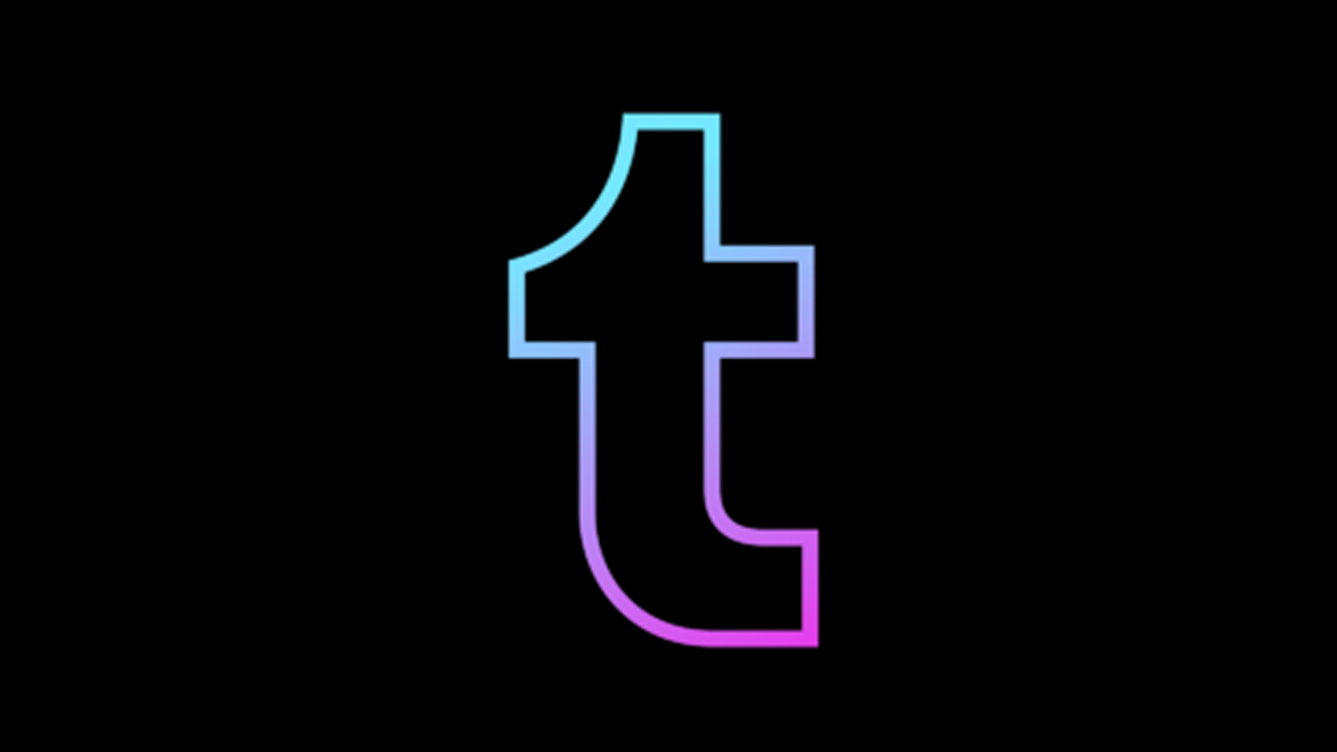
The previous logo featured a simplistic gradient outline of the letter T, taken from Tumblr's word mark. The new design's overlapping lines and gaps in the outline make it somewhat uncomfortable to look at, and the new colour palette is pretty similar to Instagram's app icon (which recently just got a whole lot brighter).
Article continues belowMany users took to Twitter to express their, well, dislike for the new design. One user posted, "I really REALLY want to erase the crossed lines," and another said, "Why is the Tumblr logo purple and orange? Oh my god, stop it". However, not everyone has criticised the design – one user tweeted, "Tumblr's new logo; I'm in love".
Can someone explain Tumblr’s new logo (here’s the other one for comparison) pic.twitter.com/2TT5z5QFePMay 18, 2022
just when you think tumblr can’t get any worse.. tumblr brings out this ugly ass logo pic.twitter.com/68pX3N7hxNMay 17, 2022
this new tumblr logo is actually kinda cute pic.twitter.com/2Vs2ljZ2HqMay 17, 2022
I can't say that I'm a fan of the app's new look, as all the overlapping lines and gaps in the design looks a little too mismatched for my liking. However, I like the idea that this could be the start of Tumblr often changing up its logo, a little like Google's Doodles (you can catch up on our favourites in our roundup of the best Google Doodles).
The social media platform is renowned for changing up its design every now and then, with its old homepage showcasing different artists' work every time you logged in, so we'll see a new app icon sooner than we think. However, if you're seriously not a fan of the design and fancy having a go at designing your very own Tumblr logo, then why not download Photoshop and have a go at creating one yourself?
Read More:
Sign up to Creative Bloq's daily newsletter, which brings you the latest news and inspiration from the worlds of art, design and technology.

Amelia previously worked as Creative Bloq’s Staff Writer. After completing a degree in Popular Music and a Master’s in Song Writing, Amelia began designing posters, logos, album covers and websites for musicians. She covered a range of topics on Creative Bloq, including posters, optical illusions, logos (she's a particular fan of logo Easter eggs), gaming and illustration. In her free time, she relishes in the likes of art (especially the Pre-Raphaelites), photography and literature. Amelia prides herself on her unorthodox creative methods, her Animal Crossing island and her extensive music library.
