We're big fans of the Sony Playstation and even bigger fans of clever logo design, so it's a delight to see the internet discover a secret behind the logo of one of the first PlayStation games. The Wipeout logo was a product of its time, and while it might not be the cleanest or even the most readable, people on Twitter are just discovering that it's extremely clever.
A tweet explaining the history and meaning behind the Wipeout logo has rapidly clocked up a thousand retweets and thousands more likes. Many of the people replying were big fans of the original PS1 video game back in the late nineties but never realised that there was more going in the Wipeout logo than what first appears (if you're looking for a contemporary game, see our pick of the best PS5 games – and don't miss our live blog on the best Nintendo Switch Prime Day deals)

For those who haven't had the joy of playing Psygnosis's original Wipeout, it was a futuristic racing game originally released as a European launch title for the Sony PlayStation, as well as for PCs, all the way back in 1995. Players competed in an anti-gravity racing league set in the year 2052, complete with music from the likes of Orbital and the Chemical Brothers (because that's what 2052 sounded like in 1995).
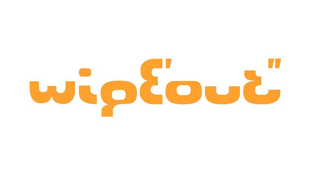
A vital part of that retro-futuristic package was the graphic design for the game, including the Wipeout logo. And self-described 'Design guy and font spotter' Cal Skuthorpe has just pointed out that what might look like a strange alien font with some precarious capitalisation actually contains symbolism that many fans have never noticed.
The original Wipeout logo is made entirely from a cut-up number 8 in the Eurostile typeface. The pieces are all aligned differently to spell out the name of the game (with a few modifications to clean things up). Even the dot on the top of the 'i' is formed from the negative space in the number 8 in Aldo Novarese's original type.
The design was intended as a reference to the segmented numbers in LCD stopwatches and timers, which seemed fitting for a racing game (at least at the time it was released). The logo even includes time indicators for minutes and seconds (' and "), although some people on Twitter say they never understood what the dashes meant.
Here's something I've always enjoyed about the original WipEout logo: it's made of the chopped up (and slightly modified) Eurostile letterform for the number 8.(The slight modifications are straightening out things like the tops of the u and the i.)#WipEout #typography pic.twitter.com/QAxSfnGafZOctober 10, 2022
It’s a simple idea, and it becomes very clear when Skuthorpe breaks it down above. Coupled with the rest of the game's graphic design, it was effective and cohesive. But a lot of people never made the connection.
One person replied on Twitter: "It took me 5 years to figure the logo actually meant Wipeout. It took me 20 additional years to figure out the 8... thanks to you." "It blew my mind the first time I learned the process behind this decision. I remember thinking 'wow now THAT is design process'," someone else commented.
This original Wipeout logo was the work of the famed Sheffield-based graphic design company The Designers Republic (TDR), a company that helped defined an era with their type design, particularly for record covers for the likes of Pop Will Eat Itself and Warp Records (In fact, some people think they've spotted the figure 8 idea coming up in other work by the agency).
Warp Records, 1994The Caliber EPBy pioneering DJ and producer Joey Beltram Nice font 😊https://t.co/YgZcgYsGbf pic.twitter.com/38C1Swq3ivOctober 10, 2022
We'd go as far as to say the Wipeout logo is a video game classic, and one that brings back nostalgia for the original game. The only thing that doesn't quite work is the idea that antigravity racers in 2052 would be using LCD stopwatches. That might be why the Wipeout logo has been modified over the years and no longer has this neat reference. But the design chimed perfectly with the Y2K feel of the moment, and it has this hidden meaning as a bonus.

We're suckers for a good logo secret, from the Bluetooth logo to the Twix logo. For more recent gaming logo discoveries, learn why the Mortal Kombat logo was almost killed – and don't miss the new Sonic logo.
Read more:

