How to paint traditionally in Photoshop
Here's how to paint an underwater figure using simple brush strokes in Photoshop.
Sign up to Creative Bloq's daily newsletter, which brings you the latest news and inspiration from the worlds of art, design and technology.
You are now subscribed
Your newsletter sign-up was successful
Want to add more newsletters?
Depending on the style I want for a project, different approaches to creating an image can be taken. It can be very stylised, a watercolour, an etching, a photo collage, a photorealistic piece, and so on.
Lately I've been working on digital images that look like traditional paintings. The techniques centre on building volumes while thinking about how light describes them in real life. I focus on the big shapes, trying not to get into details.
I've dived a couple of times and the underwater world is amazing. It's like an alien planet: breathing through tubes, floating, the diffuse light, the moving sun rays and the calm inhabitants.
Article continues belowThe image we'll be working on in this article looks loose and sketchy, yet has charm and a sort of openness. It conveys the feeling that I can always return to the image and work on it more, while the viewer can imagine more than what's on the canvas. You can watch my process in the video above, or read on to follow my step-by-step process.
01. Sketching
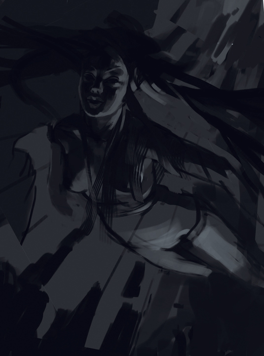
While sketching, I think about the basic elements that create a good composition: a point of interest, a unique perspective, the character's pose, accurate anatomy and lighting.
Starting on a grey canvas, I mark the big volumes in generous dark outlines, then add lighter areas with large brush strokes to describe the volumes and to set the overall mood. I work with these light and dark areas until I gain a good sense of volumes and perspective.
02. Setting the colour scheme
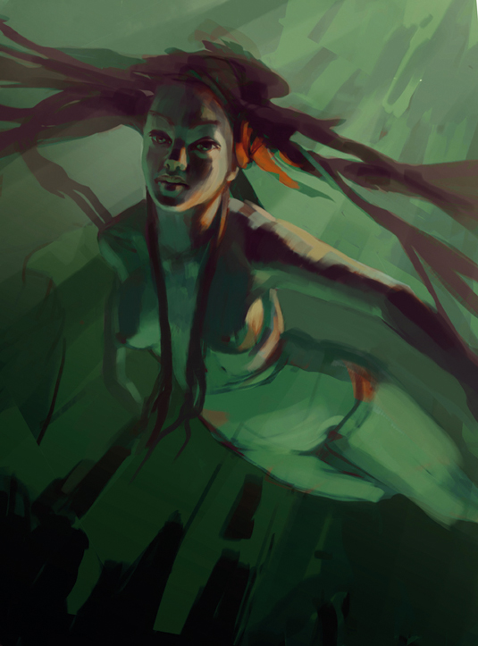
I'm looking for a colour combination that's harmonious, describes the underwater theme and is somehow original.
Sign up to Creative Bloq's daily newsletter, which brings you the latest news and inspiration from the worlds of art, design and technology.
I try different methods, such as applying an overall colour and passing this layer through several modes. I make use of the Image Adjustments options: Color Balance, Hue/Saturation, Levels and Selective Color.
Eventually I come up with a colour combination of violet in the dark areas, green in the areas that reflect the colour of the water, and yellow/orange for highlights.
03. Adding atmospherics
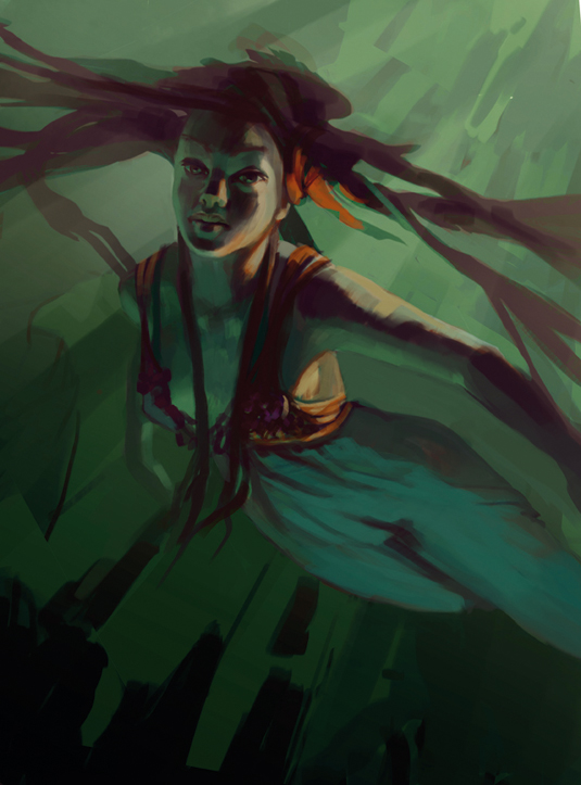
During my painting process I want to develop a good relationship between the background and the character, while gradually adding more details to each part of the image as I go along. It's now time to do the first pass on the painting's mood.
I'm adding a gradient on the right corner and painting the sun rays on its mask. However, I keep it subtle for this stage. With large brush strokes, focusing on how light affects the volumes, I find that I'm painting more on the face and the body.
04. Image adjustments
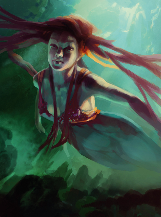
I think the painting is looking a little too dark, so I apply a new set of Levels and Selective Color layers. This provides me with solutions on how to develop the image.
All these adjustments transform the image as a whole, so it really helps when getting everything together. Now is a good time to start shaping up the rocks on the bottom of the sea as well as the surrounding cliffs.
05. Integrating photos
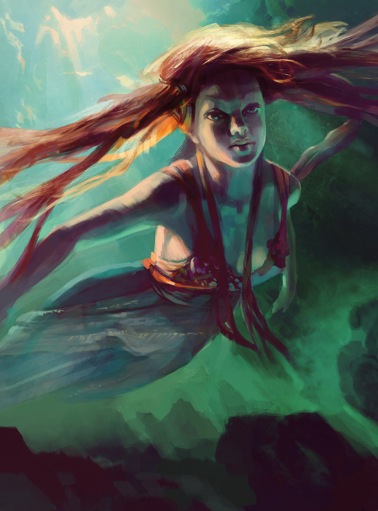
I want to add more colours and diversity to the hair, dress and environment by using photo references. I bring in some photos and pass the layers through different modes.
I also adjust their colours and contrast until they match the painting. I keep this to a minimum because I don't want to lose the painted look – I'm really after a base/inspiration to paint on top.
06. Fishy companion
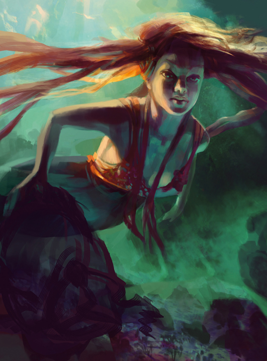
Now I have the basic idea in place and I can continue polishing the image, but it would be more interesting to create some sort of story around the girl.
Because it's a personal project and I like to try out things, I think it'll be fun to add an aquatic companion. I'm changing the girl's pose because I want her to look like she's guided by the fish into the depths of the ocean. I make the fish dark so that he's not the focal point of the scene. The texture on the dress isn't helping either, so I'll hide it for a while.
07. Adding subtle background elements
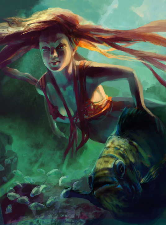
I paint more of the fish's face and fins until it's to the same level of detail as the girl. I'm quite happy with its look. Now I bring the small fishes I painted earlier back in.
I want to keep their shapes pretty loose and transparent, more like glimpses of light, so they won't attract attention. From a composition viewpoint it's good to introduce diversity in the sizes: a combination of big and small.
Next page: Connecting elements, using modules and more...
