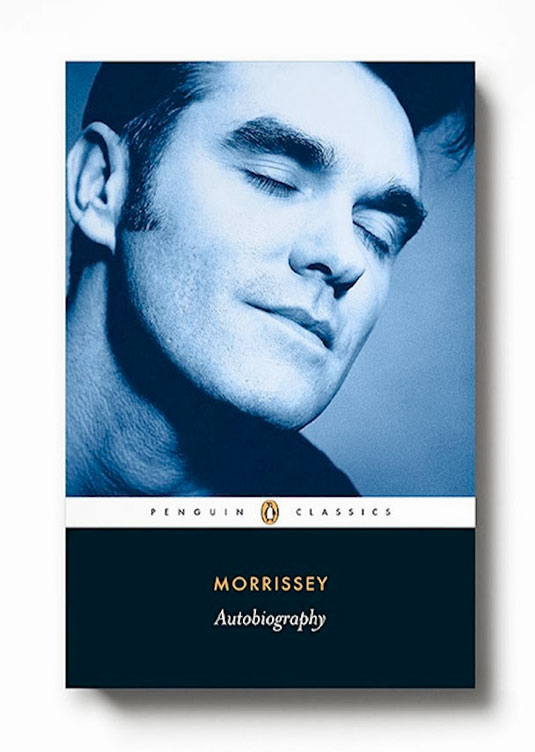
Morrissey autobiography published as Penguin Classic
The lead singer of The Smiths' Autobiography has been released as a Penguin Classic, causing heated debate among literature traditionalists. Jeremy Garner finds out why.
Sign up to Creative Bloq's daily newsletter, which brings you the latest news and inspiration from the worlds of art, design and technology.
You are now subscribed
Your newsletter sign-up was successful
Want to add more newsletters?

It's been fascinating to see how the decision to publish Morrissey's autobiography in the Penguin Classics imprint has polarized opinion. The debate is multi-layered and, with the portrait shot treated in the eye-catchingly traditionalist Penguin Classics design, it’s interesting to observe how design is at the centre of an artistic event that so ignites people's passions.
Much has been written about the decision to publish on the Classics imprint itself, with some citing narcissism, others lauding it as a smart, albeit tongue-in-cheek commercial gambit that will position the book well away from its trashy, conveyor-belt contemporaries weighing down the pop autobiography shelves this Christmas.

The unmistakable black base that anchors the cover shot and the treatment of the title showcases a certain serendipitous symmetry with the subject matter, perhaps, with the character portrait captured as simply as possible, but yet with an expression rich in irony, detachment and knowingness.
Article continues belowUsing a photograph from his 2008 Greatest Hits album as a basis, the treatment brings to mind the distinctive duotone printing which was a staple of Smiths 7in singles: the character study hinting at once towards a sense of idealistic naivety and world-weary eroticism. This ambiguity, set next to the Penguin Classics logo, and such a stripped-back choice of title, could keep readers talking for years to come.

This isn't meant to fit in nicely with other examples of the genre that it sits next to. To many The Smiths were the quintessential English rock group, and Morrissey the defining embodiment of English character at its most honest, poetic, funny, hateful and self-deprecating. That's why the decision to publish the book in the Classics imprint is such an interesting event.
The effectiveness in simply framing and capturing the character is probably the most powerful aspect of the design. It’s the sheer restraint, the discipline; the rigidness of the almost stoic design template that acts as both a juxtaposition and complement to the character portrait, and hints at a story fuelled by introspection, contrariness and confrontation. It's timeless. And isn't that what all the most engaging characters in Penguin books are?
Morrissey's autobiography has been published today.
Sign up to Creative Bloq's daily newsletter, which brings you the latest news and inspiration from the worlds of art, design and technology.
Words: Jeremy Garner
Jeremy Garner is executive creative director at Weapon7.
Like this? Read these!
- Discover what's next for Augmented Reality
- Download free textures: high resolution and ready to use now
- The best photo apps for iPhone, iPad and Android
What do you make of the debate? Let us know in the comments box below!

The Creative Bloq team is made up of a group of art and design enthusiasts, and has changed and evolved since Creative Bloq began back in 2012. The current website team consists of eight full-time members of staff: Editor Georgia Coggan, Deputy Editor Rosie Hilder, Ecommerce Editor Beren Neale, Senior News Editor Daniel Piper, Editor, Digital Art and 3D Ian Dean, Tech Reviews Editor Erlingur Einarsson, Ecommerce Writer Beth Nicholls and Staff Writer Natalie Fear, as well as a roster of freelancers from around the world. The ImagineFX magazine team also pitch in, ensuring that content from leading digital art publication ImagineFX is represented on Creative Bloq.
