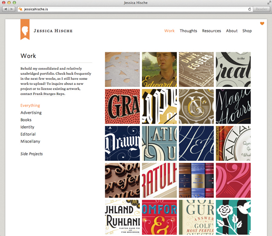
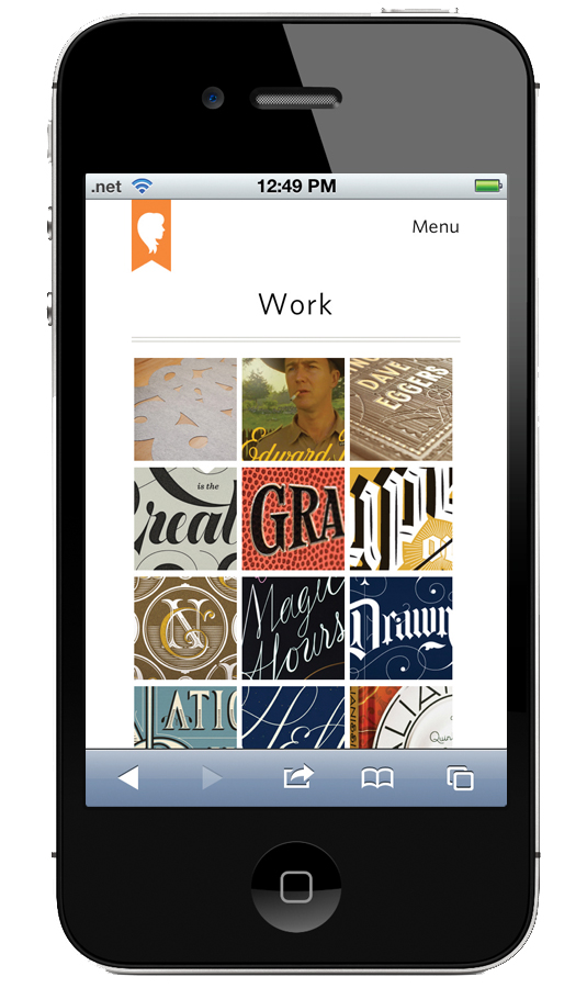
Jessica Hische's single-minded responsive site
In order to ensure her beautiful portfolio took centre stage, illustrator and typography expert Jessica Hische went mobile-first.
Words: Paul Lloyd
Jessica Hische is a renowned letterer and illustrator based in San Francisco - we featured her 'Drop cap' style covers for Penguin Classics recently - and she is now onto the second responsive iteration of her site.
"Much of the redesign had to do with a major IA overhaul, with my portfolio now one consolidated body of work," Hische explains. "I tried to approach the site mobile first, which helped a great deal in reorganising the structure and content."
Article continues below 
The site is beautifully typeset, providing much of its personality, and the design is subtle yet detailed, allowing her portfolio to take centre stage. To show it at its best requires large images, but despite the download hit, we think her work is worth the wait.

"My desire was to simplify," says Hische. "I learn more and more with every responsive site I design, and I think that streamlining my thinking is the biggest positive thing to come with each iteration."
Homepage requests/size: 82/2.24MB mobile, 85/2.52MB desktop
This showcase was originally published in .net magazine issue 233.
Sign up to Creative Bloq's daily newsletter, which brings you the latest news and inspiration from the worlds of art, design and technology.
Now read these!
- 20 pro tips for creating a mobile website
- 40 amazing examples of HTML5
- 30 web design secrets to boost your skills!
- 101 CSS and JavaScript tutorials to power up your skills

The Creative Bloq team is made up of a group of art and design enthusiasts, and has changed and evolved since Creative Bloq began back in 2012. The current website team consists of eight full-time members of staff: Editor Georgia Coggan, Deputy Editor Rosie Hilder, Ecommerce Editor Beren Neale, Senior News Editor Daniel Piper, Editor, Digital Art and 3D Ian Dean, Tech Reviews Editor Erlingur Einarsson, Ecommerce Writer Beth Nicholls and Staff Writer Natalie Fear, as well as a roster of freelancers from around the world. The ImagineFX magazine team also pitch in, ensuring that content from leading digital art publication ImagineFX is represented on Creative Bloq.
