21 fonts every graphic designer should own
Give your graphic design work a boost with these brilliant fonts.
Sign up to Creative Bloq's daily newsletter, which brings you the latest news and inspiration from the worlds of art, design and technology.
You are now subscribed
Your newsletter sign-up was successful
Want to add more newsletters?
17. Kondolar
- Price: £19.99
- Download here
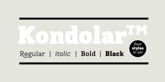
Unexpected flourishes on certain characters give Cadson Demak's appealing slab serif font something of a dual personality. This top font works hard as a legible text face, but used large enough, the sweeping descenders on the 'K', 'Q' and 'R' provide just the level of detail it needs to feel special enough to carry a headline.
18. Black Slabbath
- Price: From £24.99
- Download here
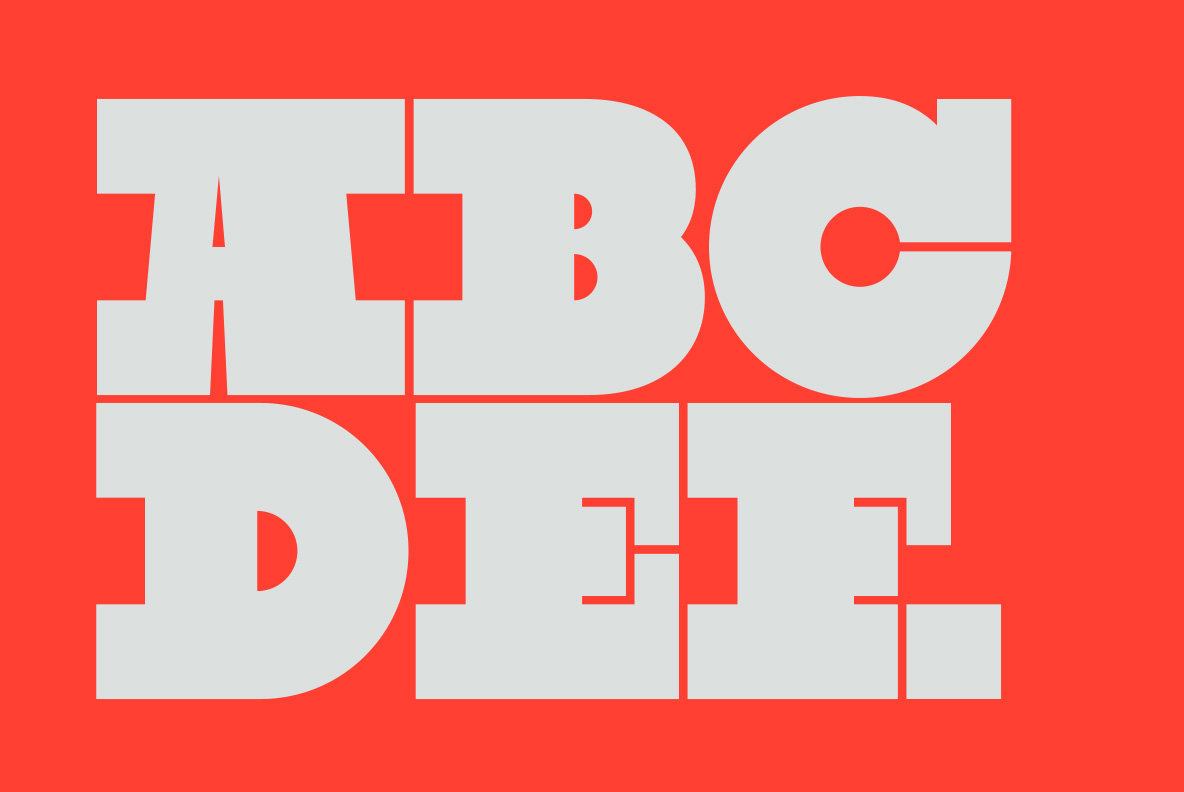
Besides Cumulus & Foam, this is Stefan Kjartansson's other major claim to fame – the headline-stealing, self-proclaimed "heaviest typeface in the world", with slivers of white space in between ultra-chunky geometric letterforms. Suffice to say, this one doesn't function at any size below monster – but then if you use it, you'll want it to roar.
19. Enclave
- Price: Prices start at around $600
- Download here
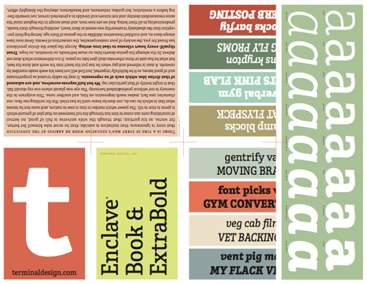
Designed by Terminal Design's James Montalbano with the goal of being unique but still highly legible, Enclave boasts thick, chunky slab serifs that are nonetheless softened and subtly rounded to take some of the harsh edge off, and warmth, and stop it looking too much like a typewriter font. It's another top font that works equally well large or as a text face.
Article continues below20. Sentinel
- Price: From $199 (desktop); From $99/year (cloud-based subscription)
- Download here
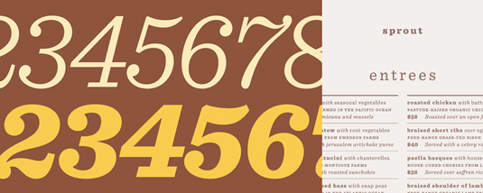
Based on Clarendon – one of the first and arguably most defining examples of a slab serif typeface, released in 1845 – Hoefler & Frere-Jones' "slab serif that works" overcomes many of the shortcomings of a traditional slab font by integrating a broad range of weights, and carefully-designed italics, to ensure true versatility without compromising on style. This top font was seen in President Obama's 2012 campaign messaging.
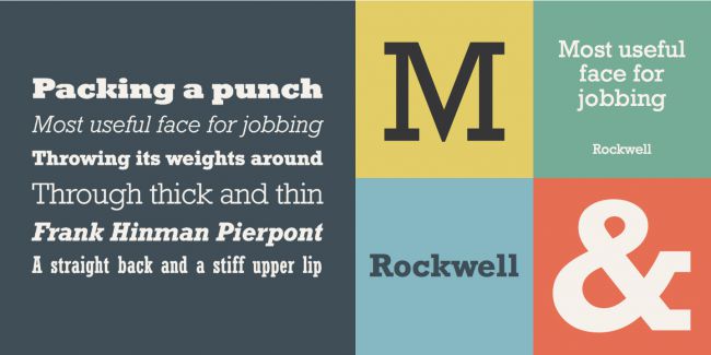
21. Rockwell
- Price: From £30
- Download here
One of the best-known examples of the slab serif genre, Rockwell demonstrates what strong, thick, edgy serifs, bold shapes and opposing curves can do to add clout and impact to a typeface. This top font is effective in capitals for a statement headline piece, but also features beautiful lower case forms for more versatile uses.
Read more:
Sign up to Creative Bloq's daily newsletter, which brings you the latest news and inspiration from the worlds of art, design and technology.

Nick has worked with world-class agencies including Wolff Olins, Taxi Studio and Vault49 on brand storytelling, tone of voice and verbal strategy for global brands such as Virgin, TikTok, and Bite Back 2030. Nick launched the Brand Impact Awards in 2013 while editor of Computer Arts, and remains chair of judges. He's written for Creative Bloq on design and branding matters since the site's launch.
