21 fonts every graphic designer should own
Give your graphic design work a boost with these brilliant fonts.
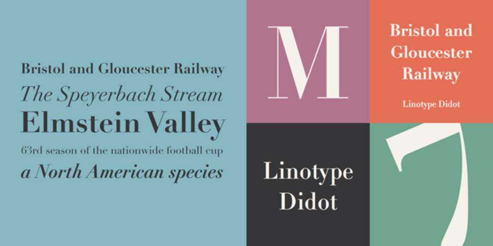
07. Linotype Didot
- Price: From £30
- Download here
This Bodoni alternative was also developed in the late 18th century, and the mutual influence between the two contemporaries is apparent. Both share characteristic sharp, seductive serifs and harsh angles. But with more space allowed for its counterweight, Didot feels like a slimmer version of Bodoni. This top serif font is great for adding a classic, timeless elegance to your work.
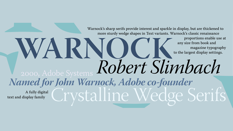
08. Warnock
- Price: From £219
- Download here
Named after co-founder of Adobe, John Warnock, this font was created for the invitations to Warnock's 60th birthday party at the request of his son, Chris. The Warnock font family includes four weights that are available for each of the four ranges. The optical ranges are caption, text, subhead and display and are available in two styles roman and italic. A classic that has been named as one of the most beautiful fonts for professional design, and continues to be up there with the best.
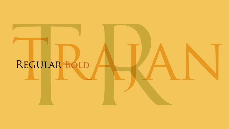
09. Trajan
- Price: £39.99
- Download here
The Trajan font was first released by Adobe in 1989 and is based on Roman typography. Because of this, its sweeping curves and understated elegance are only available in uppercase. The design was based on research carried out by a Roman Catholic Priest, Edward Caitch. He deduced that the serifs contained in Roman typography must have been painted rather than chiseled, the first examples of this technique. With a number of modern characters designed to fit the style, this font has everything you need to create a sense of importance.
10. Mrs Eaves
- Price: From £31.99
- Download here
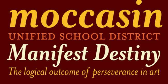
While its unconventional name may raise a few eyebrows, Emigre's versatile serif, designed by Zuzana Licko in 1996, is a subtle modern interpretation of the work of legendary 18th century type pioneer John Baskerville, and named after Sarah Eaves, the housekeeper who would become his wife. You may recognise it from its use in the WordPress logotype.
11. Bembo
- Price: From £30
- Download here
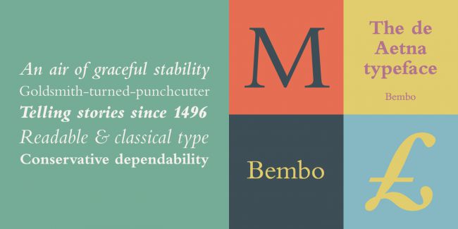
A 20th century revival of an old-style serif originally cut by Francesco Griffo in the late 15th century, Bembo was reborn under the Monotype label in 1929. Widely considered a great typeface for setting book copy, this top font is generally best used to express traditional, formal beauty, and is particularly notable for its stylish italic ampersand.
12. Modern No 20
- Price: From £25
- Download here
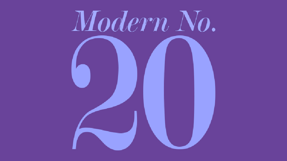
Designed by Stephenson Blake, this modern serif is excellent typographical shorthand for quality and refinement. Designed by Edward Benguiat for Bitstream, it's perfect for adding class to titles the world over. There's no better testimonial than the fact that it's been employed for world-renowned design agency Pentagram's logotype.
13. Rooney
- Price: From £20
- Download here
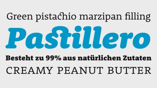
One of a growing number of modern fonts earmarked as particularly effective for use on screen – particularly for apps and websites – Jan Fromm's Rooney typeface has a friendly feel, without ever being too cheap and cheerful. The subtle rounded serifs and terminals of this top font add personality and impact when used large, as well as having a softening effect when set in smaller sizes. It's available in six weights.
Sign up to Creative Bloq's daily newsletter, which brings you the latest news and inspiration from the worlds of art, design and technology.
Next page: Sans serif fonts

Nick has worked with world-class agencies including Wolff Olins, Taxi Studio and Vault49 on brand storytelling, tone of voice and verbal strategy for global brands such as Virgin, TikTok, and Bite Back 2030. Nick launched the Brand Impact Awards in 2013 while editor of Computer Arts, and remains chair of judges. He's written for Creative Bloq on design and branding matters since the site's launch.

