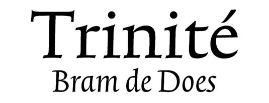
Greatest fonts countdown: 46 – Trinité
We're counting down the 100 greatest typefaces in existence. Here's number 46...
Sign up to Creative Bloq's daily newsletter, which brings you the latest news and inspiration from the worlds of art, design and technology.
You are now subscribed
Your newsletter sign-up was successful
Want to add more newsletters?
FontShop AG, the renowned type foundry, conducted a survey based on historical relevance, sales at FontShop.com, and aesthetic quality. With a few additions from the experts at Creative Bloq and Computer Arts magazine, the best fonts ever were selected for the new book, 100 Best Typefaces Ever.
Here we are counting down the 100 greatest fonts, but you can read interviews with some of the typefaces' creators, a brief history of type, the anatomy of a font, and much, much more in the book – find out how to get your copy in print or digital formats at the foot of this post.
But without further ado, here's the 46th best typeface…
46. Trinité

- Bram de Does, 1982
When Bram de Does was studying graphic design in Amsterdam in the 1950s, the curriculum was still very much influenced by Bauhaus and Jan Tschichold. Lectures on asymmetrical typography inspired him to rebellion, and he designed his pages symmetrically, just for the sake of doing things differently.
After graduating, he started work as art director at the respected typesetting company, Joh Enschedé en Zonen in Haarlem. He proved his talent for type design between 1980 and 1982 when he was entrusted by Enschedé with the task of producing an exclusive typeface for their Autologic phototypesetting equipment. Trinité emerged as an elegant and subtle body text font.
The digitised version of Trinité (by Peter Matthias Noordzij of the Enschede Font Foundry) has an impressive wealth of forms. Ascenders and descenders with three graded lengths, and a sleek italic font that works well with both Trinité Wide and Condensed, all bear witness to the ingenious typographical concept of the font family. It's for good reason that Trinité is one of the Netherland's favourite typefaces.
This is an extract from The 100 Best Typefaces Ever, the definitive guide to the greatest fonts ever created, in association with FontShop AG.
Sign up to Creative Bloq's daily newsletter, which brings you the latest news and inspiration from the worlds of art, design and technology.

The Creative Bloq team is made up of a group of art and design enthusiasts, and has changed and evolved since Creative Bloq began back in 2012. The current website team consists of eight full-time members of staff: Editor Georgia Coggan, Deputy Editor Rosie Hilder, Ecommerce Editor Beren Neale, Senior News Editor Daniel Piper, Editor, Digital Art and 3D Ian Dean, Tech Reviews Editor Erlingur Einarsson, Ecommerce Writer Beth Nicholls and Staff Writer Natalie Fear, as well as a roster of freelancers from around the world. The ImagineFX magazine team also pitch in, ensuring that content from leading digital art publication ImagineFX is represented on Creative Bloq.
