How to create reflective typography in InDesign
Discover how to quickly create reflective type with this handy how to.
Sign up to Creative Bloq's daily newsletter, which brings you the latest news and inspiration from the worlds of art, design and technology.
You are now subscribed
Your newsletter sign-up was successful
Want to add more newsletters?
Making objects and typography appear as though they're reflected in the surface they're sitting on isn't complicated. It is, however, a little more complex to make it look convincing within the environment that it's placed in.
Over the next few steps we'll run through how to use Adobe InDesign to quickly create an environment for your type to sit in that follows the basic rules of directional light. We'll then demonstrate how to place the type within the environment and create a reflection so that it appears convincing.
01. Create the basic scene
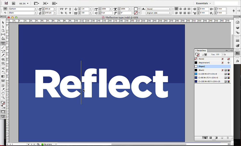
First we need to start by creating the environment that the type will sit within. Begin by drawing a large rectangle that fits to your document bounds by using the Rectangle tool. Now draw another one in a lighter shade that is half the height and sits flush to the bottom of the document creating the effect of a horizon line.
Article continues belowNext use the type tool to draw a large text box and type out the word that you want to work with. Take some time when choosing the typeface, bolder sans-serif faces will have more impact than serifs. In the above example, we've used Gotham in its Black weight and then kerned the letters back by holding alt and the left and right arrow keys.
02. Set the light source
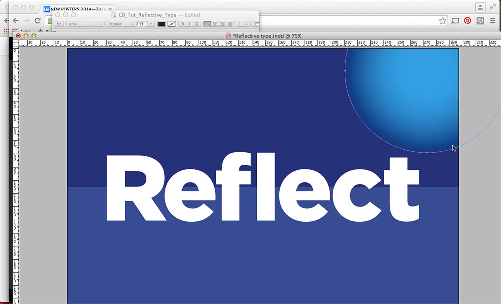
Draw a large circle in the top-right of the composition by using the ellipse tool while holding shift.
Fill this circle with a shade lighter than your background colour and then navigate to Object > Effects > Basic feather. Increase the feather width until you're happy with the results, in this case 30mm, then hit OK to apply the results.
03. Apply gradients to create depth
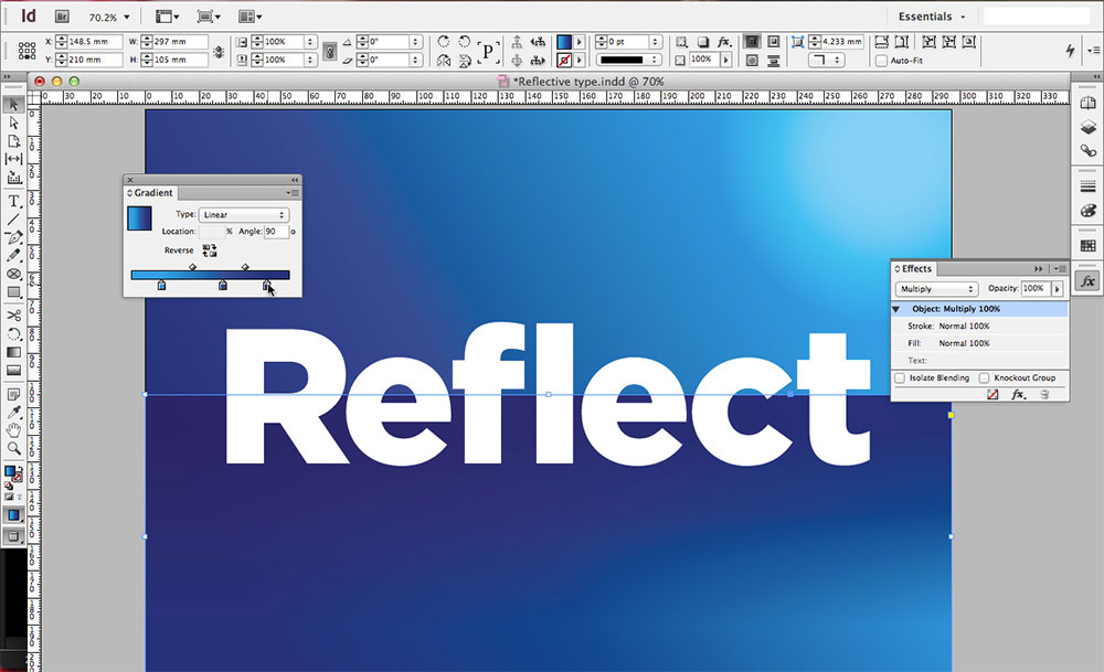
Next, select the background and apply a linear gradient to it by bringing up the gradient panel. By default this will be a black to white gradient. To make it a smooth gradient create three swatches that range from dark to light in your chosen colour covering the shadows, mid tones and highlights.
Sign up to Creative Bloq's daily newsletter, which brings you the latest news and inspiration from the worlds of art, design and technology.
Next, drag the swatches onto the gradient slider in the correct order so that the gradient gets lighter towards the light source. Set the angle to 30 degrees and then repeat the process for the horizon line but with a 90 degree angle and with its blending mode set to multiply.
You may want to lighten the light source at this point. We made it white and changed its opacity to 50 per cent.
04. Apply a highlight sheen to the type
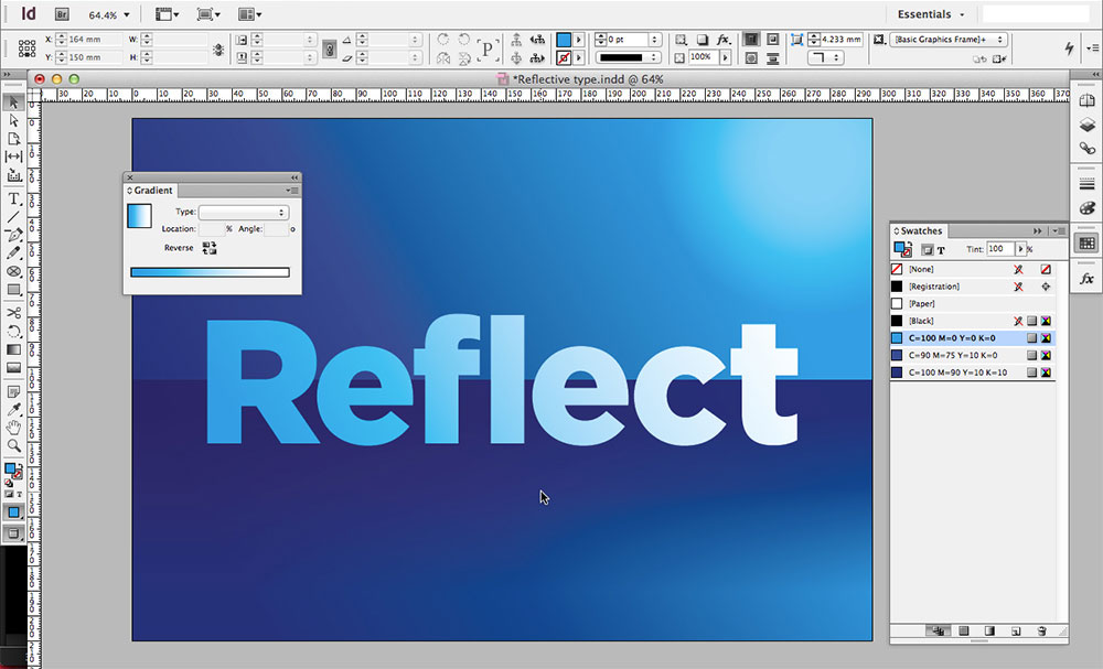
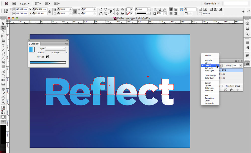
Next, apply a gradient to the typography using the lightest of your three swatches and white so that the white runs towards the light source, then apply a 30 degree angle to the gradient.
Now navigate to Type > Create Outlines so that the type is no longer live text and will now act as a vector object. Copy the type and paste it in place so that it sits exactly on top of the original type. Fill it with white and then draw a large rectangle that covers the bottom half of the type.
Now select both the top type and the rectangle and use the minus function from the pathfinder panel to delete the bottom half of the type.
Reduce the opacity slightly and use the gradient feather tool to make the sheen more subtle, then finally apply an overlay blending mode to the sheen.
05. Create the reflection
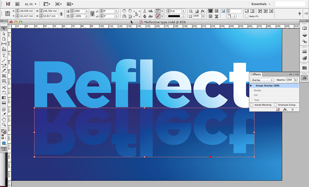
Now that we've set the scene, creating the actual reflection effect is relatively easy. Simply select both the bottom type and the highlight and hit cmd + G to group them. Copy and paste them in place and, ensuring that the bottom reference point is set in the top-left, hit the Flip Vertical function found in the top bar and then set the blending mode to overlay.
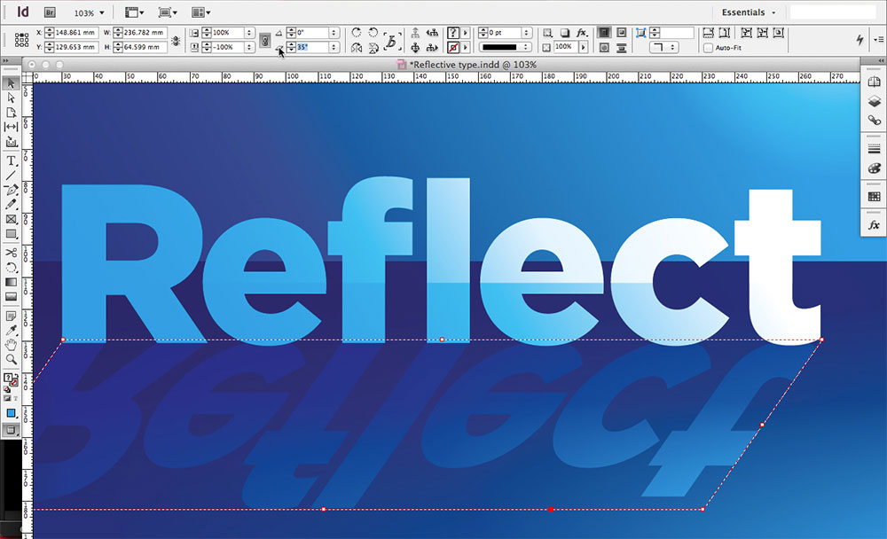
Now you can use the Shear X Angle tool, also found in the top bar, to skew the reflection away from the light source to give it a more realistic effect.
06. Add further details
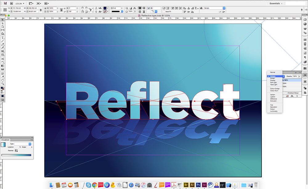
We've covered the essentials in the above five steps but it's up to you how much further you take it. You may wish to add more depth as we've done above by increasing the contrast of our darkest and lightest tints.
In the above example, we used the same method that we used to create the reflection to create a shadow behind the type. In this case, simply use your darkest swatch colour and set the blending mode to multiply. As a final tweak we added some yellow to the mid-tone swatch to make it a little warmer and more natural.
Luke is a creative director, visual designer and digital artist, who works at THG Studios in Manchester as creative director of beauty. He previously worked for Future Publishing, where he was art editor of leading magazines such as Guitarist, T3 and Computer Arts.
