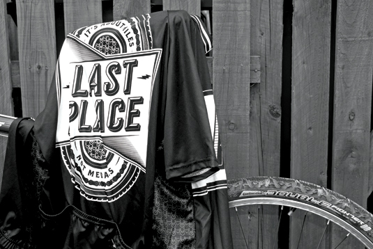
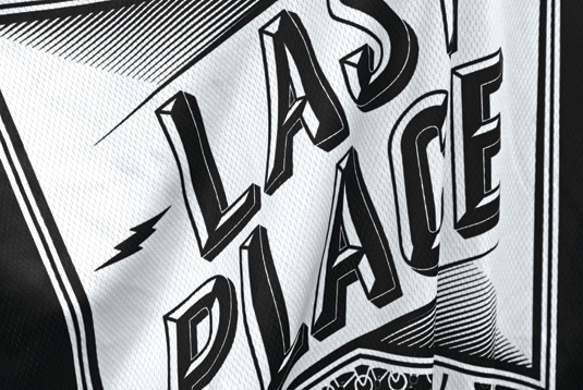
Last Place cycling jersey by Steven Bonner
Love typography? Love cycling? Love being last? Then check out this fantastic limited-edition cycling jersey.

- PROJECT: Last Place cycling jersey
- CLIENT: Milltag
- DESIGNER: Steven Bonner
- www.stevenbonner.com
What self-respecting cyclist would want to sport a yellow jersey when black looks so much cooler? Especially if it’s this limited-edition cycling jersey designed by Steven Bonner for Milltag that raises a chain grease-smudged middle finger to the idea that it’s all about winning.

Bonner, who is based near Stirling, Scotland, cycles purely for enjoyment and was inspired in his design by the era when Italy’s long-distance road race, the Giro d’Italia, would present the last-placed rider with a black jersey.
"The idea of wearing the black jersey struck me as ironic," he says, "If you’ve come last, you’ve ridden for longer and had more fun. Suddenly having a black jersey seemed like a good thing."
Article continues belowAs the design on the reverse (presumably aimed at deflecting the sneers of overtaking car drivers) states, it’s about miles, not medals.

Keeping to a monochrome palette so as to not dilute the central concept, Bonner used type and decorative elements to add interest. "I’d already designed a chiselled typeface for another project and had been itching to use it again, so I brought it back," he says.
Although he had worked on T-shirts before, this was his first commission for a full cut-and-sew cycling jersey; however, Milltag’s detailed technical specifications made the requirements clear whilst still allowing plenty of creative freedom.
"I did a custom pattern for the side panels, designed the collar and sleeve piping, and even got to put a hidden message inside one of the back pockets," he reveals.
Sign up to Creative Bloq's daily newsletter, which brings you the latest news and inspiration from the worlds of art, design and technology.
- For more typeface goodness, see our list of typography articles

The Creative Bloq team is made up of a group of art and design enthusiasts, and has changed and evolved since Creative Bloq began back in 2012. The current website team consists of eight full-time members of staff: Editor Georgia Coggan, Deputy Editor Rosie Hilder, Ecommerce Editor Beren Neale, Senior News Editor Daniel Piper, Editor, Digital Art and 3D Ian Dean, Tech Reviews Editor Erlingur Einarsson, Ecommerce Writer Beth Nicholls and Staff Writer Natalie Fear, as well as a roster of freelancers from around the world. The ImagineFX magazine team also pitch in, ensuring that content from leading digital art publication ImagineFX is represented on Creative Bloq.
