The stupidest fonts of all time
Everyone has their favourite typefaces. But what about those that offend the eyes?
Sign up to Creative Bloq's daily newsletter, which brings you the latest news and inspiration from the worlds of art, design and technology.
You are now subscribed
Your newsletter sign-up was successful
Want to add more newsletters?
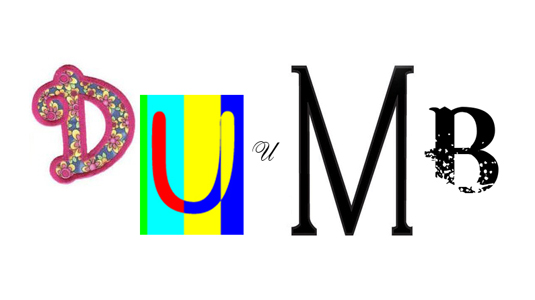
Fonts can be beautifully functional, quietly powerful, and subtly sophisticated. They can also be stonkingly stupid, managing to repulse every creative atom in a creative's body, simply by their essence of 'dumb'.
But what makes a stupid font truly stupid? Pretension? Overuse? Whackiness?!
Well, we've trawled the World Wide Web to find the most idiotic fonts of them all. This may sound like a purely subjective exercise. It's not. These really are the dumbest of the dumb.
09. Shelley Script
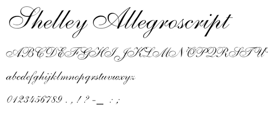
Unsurprisingly for a font named after a hypersensitive romantic whinefest, Shelley (pronounced 'Shell-aye') is more than a little affected.
No doubt, the makers of this limp-wristed scrawl would have it used exclusively for deeply personal observations on the fiery throb of unrequited love... We think it's better suited to bum jokes. And even then it looks dumb.
08. Ransom Note fonts (there are LOADS!)
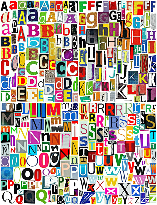
For sure, the uniformness of Brush Script makes it thunderously 'duh!'. But that doesn't mean that the opposite makes for a clever thing.
Each Ransom Note font – and there are several – is unique. That is, each letter is as uniquely imbecilic as the next. Combined, you can create sentences that will actually lower the IQ of anyone that reads them.
Sign up to Creative Bloq's daily newsletter, which brings you the latest news and inspiration from the worlds of art, design and technology.
No-one knows the origin of Ransom Note fonts.
07. Arial
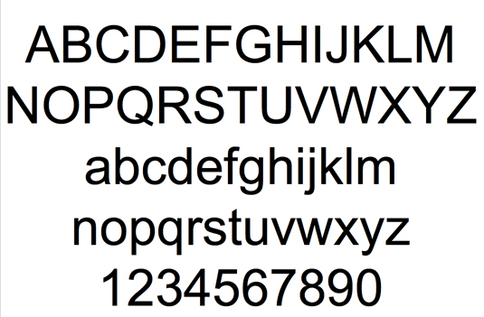
To be honest, we don't have anything against Arial. It's unassuming, not-that-elegant, not-that-showy vibe is entirely ignorable.
But speak to any font fan, and before you've exchanged names they'll be regaling you with how this Helvetica/Monotype Grotesque bastard child has been so overused that it has become a symbol for all that is dim-witted.
06. Papyrus
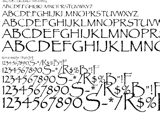
Best known as the favourite font of James Cameron's ancient blue alien people in Avatar, Papyrus is actually a free font that comes on all personal computers.
It may impress a child as a classy text-type from another land, but kids are notoriously bad-brained, and so is this font. Unless you use it to spell out 'David Icke'. It looks pretty cool then.
05. Hobo
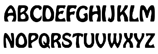
The name is daft, the font dafter. It looks like there's a mighty wind coming from starboard side, and all the chunky, funky letters are trying not to fall over.
There's not a straight line in sight, and everyone knows the old saying: 'no straight lines, you’re stupid!'
04. Giddyup
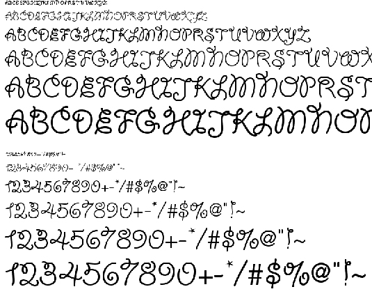
There's a story behind this font known to all in the typeface industry: some time in the 1970s, a publishing mogul was caught in a legal dispute over his use of an unlicensed font in his magazines.
Pinned in between a lawsuit and a deadline, he used the pages of his daughter's diary, and Giddyup was born.
This story is a complete lie, but at least it's a little less absurd than the font.
03. Bleeding Cowboys
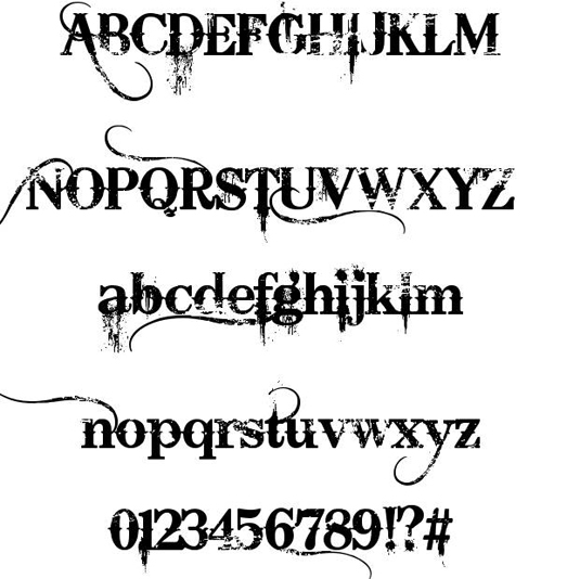
You know that kid in school who used to wear black all the time, and always frowned, and spread rumours that he'd killed a man with a knife, and he'd often look into the distance and slowly exhale, so you'd think he was profound and tortured? This is that, but in font.
The kid is now a well-adjusted father of three, and manager of a paper stockist. Bleeding Cowboys font remains pretentious.
02. Comic Sans
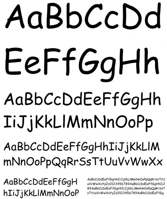
There's been a swell of professional, actually-employed designers that have stuck their necks out and said, 'No! Comic Sans is not the stupidest font. It has it's place, and serves a purpose.'
But they're wrong. It's a stinker. It's synonymous with people that aren’t creative trying to be creative, and that is in fact the definition of stupid.
Its history is equally dull. The font was introduced in 1995 by the US government to coincide with the release of Jennifer Love Hewitt's debut album Lets Go Bang in an attempt to make everyone smile. It merely created generations of quivering dum-dums.
01. Curlz
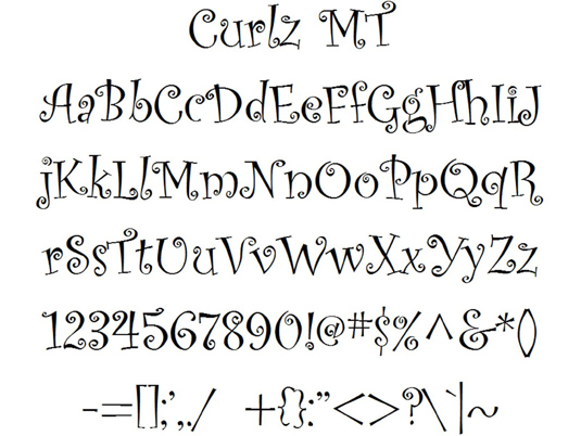
Sure, Curlz is sub-mental, but it's important in one respect – it's more annoying than Comic Sans. At least Comic Sans is Comic Sans, and not Comic Sanz... This font thinks its French!
And like a stopped clock, Curlz is totally, utterly pointless. Unless you're making a whimsical poster for a baking party… you're not making a baking party poster, are you?!

Beren cut his teeth as Staff Writer on the digital art magazine ImagineFX 13 years ago, and has since worked on and edited several creative titles. As Ecom Editor on Creative Bloq, when he's not reviewing the latest audiophile headphones or evaluating the best designed ergonomic office chairs, he’s testing laptops, TVs and monitors, all so he can find the best deals on the best tech for Creative Bloq’s creative professional audience.
