The 10 best new web design tools in April
Design interfaces and create moodboards on your phone, clean up your code and take control of your type.
Sign up to Creative Bloq's daily newsletter, which brings you the latest news and inspiration from the worlds of art, design and technology.
You are now subscribed
Your newsletter sign-up was successful
Want to add more newsletters?
Sketch 3.3 was unleashed on Tuesday, bringing with it a host of handy new functionalities as detailed here. If you plan to work on Apple Watch interfaces there are a couple of great UI asset sets for Sketch: try here and here.
This month's special shout out for a useful thing that isn't exactly a tool goes to Really Good Emails. Click on a category of email, such as 'Abandoned cart' or 'Thank you' and you're presented with an example of an email that did a really good job of dealing with that thing. It's a great place to get some inspiration for your own newsletters and other communications.
Read on for the 10 best tools we found in April.
01. Colorable
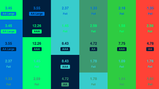
Etsy product designer Brent Jackson has created this tool for testing the contrast values for colour combinations. You can use it on your palette and get values for each combination, and it lets you know if your text complies with WCAG accessibility guidelines. Usage instructions are here and there's a demo here.
02. Type.js
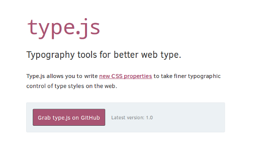
Type.js provides satisfaction for those who want a high level of manual control over their web type. It enables you to write new CSS properties that give you fine control over type styles, allowing you to adjust kerning between pairs of letters, set rag rules, determine how widows are dealt with and more. Type.js was created by Monotype product manager Nathan Ford.
03. Yosemite UI Kit

This comprehensive UI kit for Sketch 3 is available on a pay-what-you-want model and provides all the UI elements drawn to a high standard of accuracy. They're drawn as vectors and are therefore suitable for retina. The designer, Keir Ansell, promises to keep the set up to date as things develop.
04. Accessibility Wins
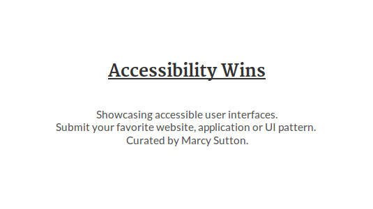
Rather than focus on instances where sites have failed on the accessibility front, Marcy Sutton has created this fantastic resource that showcases examples of great, accessible interfaces.
Sign up to Creative Bloq's daily newsletter, which brings you the latest news and inspiration from the worlds of art, design and technology.
If you're looking for inspiration and clever tricks this is a good place to go, as each accessibility win is explored in detail and Sutton points you towards useful tools for implementing the techniques. If you've seen any great accessibility work you're invited to submit it to the site so that others may learn from it.
05. Napkin
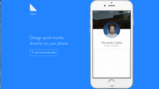
Do you want to design app interfaces on your phone? It's not for everyone, but Napkin is useful in that it provides a way to capture and test those ideas that come to you at inconvenient times and locations.
You can insert pictures from your camera roll, and creating a mockup is as simple as dragging, arranging and resizing layers. It's well designed and easy-to-use; we've even got a tutorial from the creator to get you started.
Next page: five more of April's top web design tools

The Creative Bloq team is made up of a group of art and design enthusiasts, and has changed and evolved since Creative Bloq began back in 2012. The current website team consists of eight full-time members of staff: Editor Georgia Coggan, Deputy Editor Rosie Hilder, Ecommerce Editor Beren Neale, Senior News Editor Daniel Piper, Editor, Digital Art and 3D Ian Dean, Tech Reviews Editor Erlingur Einarsson, Ecommerce Writer Beth Nicholls and Staff Writer Natalie Fear, as well as a roster of freelancers from around the world. The ImagineFX magazine team also pitch in, ensuring that content from leading digital art publication ImagineFX is represented on Creative Bloq.
