3 great uses of typographic hierarchy
Gene Crawford explains how varying the size and treatment of the type on your web page can help readers absorb information
Sign up to Creative Bloq's daily newsletter, which brings you the latest news and inspiration from the worlds of art, design and technology.
You are now subscribed
Your newsletter sign-up was successful
Want to add more newsletters?
There is an age-old technique in graphic design used to communicate to the viewer or reader the organisation of content and place emphasis on important elements. It's called hierarchy – and specifically visual or typographic hierarchy.
It's employed by graphic designers as a core design tool, and it is essential in making a clearly scannable and readable page, especially when that page features a large amount of content. Hierarchy helps people know where sections start and end, and also enables them to easily skip around the page.
We use some simple signals and cues to help create hierarchy. For example, we denote paragraphs with a line break. Or we use bold or italics to communicate emphasis. Or we might even change the typeface to show difference, like with a section header.
A general rule of thumb is to use no more than two signals or cues at one time. This will help you keep your design solution elegant and not tacky. Like using bold, italic and underline all at the same time – too many signals.
A great way to create a design system is to start with the body copy size, then scale your signals and cues from there. We start with the body copy because it's read the most and forms the base for the design. Next, scale up the type size to approximately 200 per cent for the primary header, then 150 per cent for the secondary header, and so on.
Here are three superb examples of these techniques:
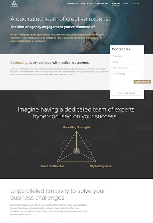
01. The Ascend Agency

The Ascend Agency’s website has a very varied typographic hierarchy on its content pages. This helps make it very easy for users to scan the page and absorb information.
Sign up to Creative Bloq's daily newsletter, which brings you the latest news and inspiration from the worlds of art, design and technology.
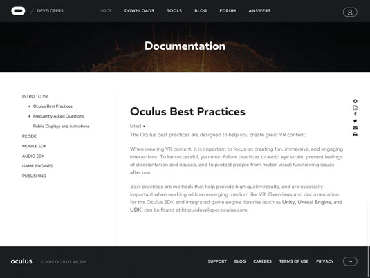
02. Oculus

The content pages for Oculus’ website uses basic signals to display hierarchy very successfully.
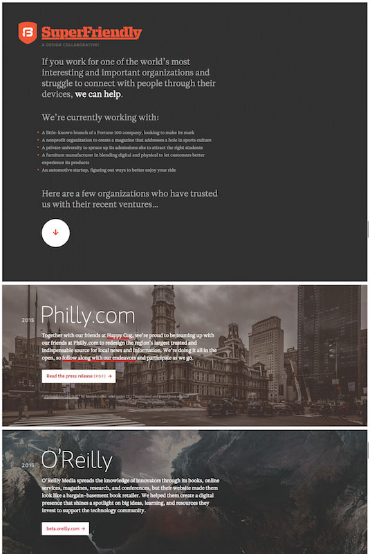
03. SuperFriendly

The website for design agency SuperFriendly employs a solid typographic hierarchy across all its homepage content. This not only draws users in but also makes it easy for them to scan the page very quickly.
Words: Gene Crawford
Gene’s mission is to work tirelessly to provide inspiration and insight for developers via his website Unmatched Style. This article was originally published in issue 272 of net magazine.
Liked this? Read these!
- The typographic secrets behind visual hierarchy
- The best collage maker tools – and most are free!
- How to build an app: try these great tutorials

The Creative Bloq team is made up of a group of art and design enthusiasts, and has changed and evolved since Creative Bloq began back in 2012. The current website team consists of eight full-time members of staff: Editor Georgia Coggan, Deputy Editor Rosie Hilder, Ecommerce Editor Beren Neale, Senior News Editor Daniel Piper, Editor, Digital Art and 3D Ian Dean, Tech Reviews Editor Erlingur Einarsson, Ecommerce Writer Beth Nicholls and Staff Writer Natalie Fear, as well as a roster of freelancers from around the world. The ImagineFX magazine team also pitch in, ensuring that content from leading digital art publication ImagineFX is represented on Creative Bloq.
