20 tips for faster and cleaner mockups
Steven Snell offers practical tips based on his own experience as a web designer and blogger.
Sign up to Creative Bloq's daily newsletter, which brings you the latest news and inspiration from the worlds of art, design and technology.
You are now subscribed
Your newsletter sign-up was successful
Want to add more newsletters?
It takes years of practice to nail down a reliable mockup design process. Even professional designers often change up their strategies to attempt new concepts and creative ideas.
As explained in The Guide to Mockups, design is a never-ending process of ingenuity and improvisation. The more strategies you learn, the more opportunities you have for new avenues of expression.
The following tips were distilled through my own experience as a web designer and blogger. I hope they'll help you improve the mockup design process through practical techniques and workflow concepts.
01. Rulers and guides for grids
It may be a shocking realization to learn that some designers still don't abide by grids for layout design. I'm not stating that every designer should always follow grid structures to a tee. What I'm advocating is the use of a planned grid for every interface mockup.
All designs can be improved through the use of an organized grid system to help with alignments, white space, and content hierarchy. Pixel-perfect measurements are great but even if you break the grid, that's still OK – so long as you have a grid to break!

Also keep in mind that while a horizontal grid is the most common, a vertical grid called the baseline also holds a great deal of importance in regards to typography.
02. Try starting with a pencil
Every good designer will find value in learning to sketch. Paper and pencil have been the most common tools for visually creative people, and this still holds true today in our modern world.
Sign up to Creative Bloq's daily newsletter, which brings you the latest news and inspiration from the worlds of art, design and technology.
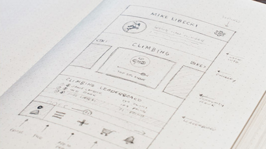
Just because your designs are digital isn't an excuse to avoid traditional mediums. It can be much easier to execute ideas and put down 5-10 different compositions on paper without relying on the somewhat discombobulating mouse and keyboard interface.
03. Digital prototyping and wireframing
At some point you'll need to move into digital design, and wireframing is a great place to start. Even if you sketch out a few wireframes on paper, it's still a good idea to transfer them digitally.
This process can be done in software like Photoshop, but the interface is fairly bloated for such a basic task. Wireframing & prototyping tools are easier to use and much faster.
For example, I'd recommend a wireframing & prototyping tool like UXPin which offers a slew of diverse tools, making your job easier by many orders of magnitude. The customizable libraries and smart elements are especially useful since they let you create your own UI recurring UI patterns and drop them in as much as needed.
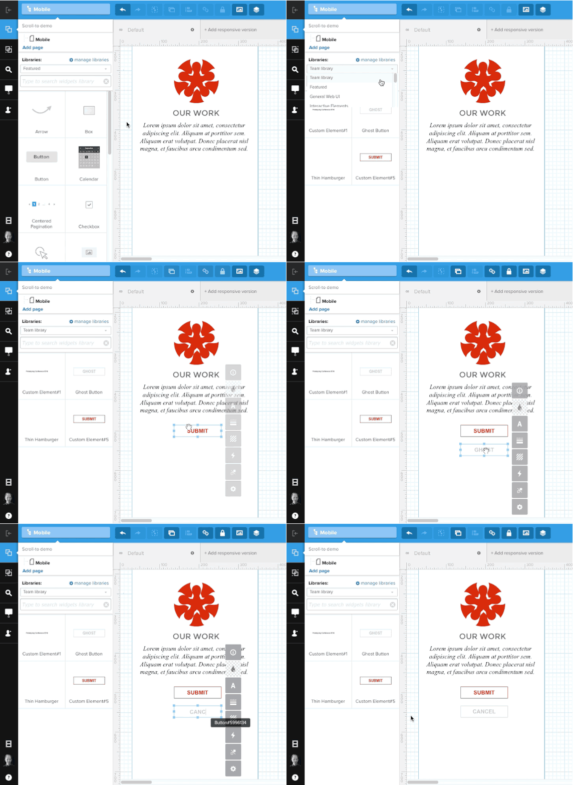
A workflow that I find helpful is starting with a wireframe in UXPin, then creating a higher fidelity static mockup in Photoshop (Sketch works just as well, if not better).
Once that's done, I'll drop the file back into UXPin and add interactions to all the layers to create a hi-fi prototype.
04. Start with UI freebies and icons
Every high-fidelity mockup requires time spent styling elements. These styles can be applied to buttons, backgrounds, icons, and many other graphical items on the page.
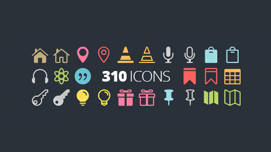
To save yourself time, kick-start your project with an interface kit freebie (like a free social media icon kit) to reduce time creating common or tedious elements. Designers often release free UI kits that include all the traditional elements you'd ever need. Plus, they come layered so it's easy to change colors or settings to match your exact vision for the project.
Full UI kits for Photoshop & Sketch are also easy to find. If you're a mobile app designer, you can find just as many resources like (like this useful iOS 8 UI kit) that are completely free and offer a pre-built foundation for each new project.
05. Use color tools
The task of styling a color scheme is always challenging unless you're a top-tier color maestro. But even still, color selection tools can help to save time and stress on new projects with looming deadlines.
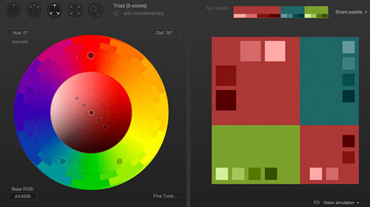
A free GitHub project named Cohesive Colors helps you match up color schemes based on set colors and distinct variable patterns. Similarly you might rely on a color wheel selector like Paletton.
Even if you put together a great color scheme of your own accord, it never hurts to check for potential alternative colors with these free color tools. For 28 useful free color tools, check out this excellent list of tools for choosing a color scheme.
06. Web-safe typography
Unless specified by the client or creative director, stay in the range of free web-safe fonts.
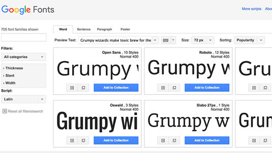
Free typefaces ultimately save the project money with no need to pay for licensing or subscription renewals like Typekit. If a project specifically calls for special fonts, then of course you should go out of you way to include them.
But speaking in a manner of "faster" mockups, I find it's a whole lot quicker to just stick with default fonts or free 3rd party options like Google Fonts. Check out this listing of 653 free typography resources.
07. Stick with vector objects
Traditional designers familiar with Photoshop know all about the differences between pixel and vector elements. Photoshop shapes and custom paths are default vector elements that scale without quality loss. Sketch offers vector support by default which is why so many UI designers tend to prefer Bohemian Coding's alternative to Photoshop.
The reason to use vector elements is malleability. Each vector element can be manipulated to scale quickly, both for last-minute changes and hi-DPI retina screens @2x, @3x, or larger.
Mobile app designers might enjoy this discussion with suggestions from designers about working for retina screens. Additionally you can find lots of free vector elements around the web to pretty up your designs.
08. Duplicate layers & layer styles
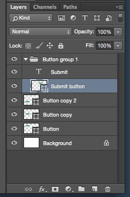
This mockups tip may seem like something of a no-brainer. Yet it's something that does require practice to fit naturally into your workflow.
If you need multiple buttons of similar styles on the same page, it'll save you a lot of time and effort if you duplicate existing ones and rename the layers.
If you have buttons with text and other layers, simply group them together and duplicate the group instead.
09. Organize layers & group names
On the topic of layer organization, it's very important to keep your working mockup file clean and tidy. Many designers tend to get ahead of themselves building faster than their organizational concerns. But it's much more confusing to rename hundreds of layer copies identified only by numbers.
The objective is to make your PSD easy to browse from a glance. Layers should be grouped together based on common areas in the UI so that edits can me made as expeditiously as possible. The below screenshot is an excellent example of layer hierarchy.
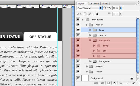
Remember that developers will need to build your mockups eventually, so the better your visual hygiene, the smoother the handoff.
To learn more, Josh Sears wrote a great step-by-step article for Webdesigner Depot on layer organization in Photoshop.
10. Practice makes perfect
While practice is the cornerstone to an improved skillset, you really need to focus and try to go outside your comfort zone to find improvement. Thankfully the Internet offers many free resources from quality Photoshop tutorials to YouTube videos and even free design e-books.
I'd recommend that you organize a list of skills you wish to learn and search Google for how to do so. Throughout this process you'll encounter many challenges, but if you power through them, you'll come out the other side much stronger and more well-equipped as a UI designer.
Next page: 10 more tips for faster and cleaner mockups...

The Creative Bloq team is made up of a group of art and design enthusiasts, and has changed and evolved since Creative Bloq began back in 2012. The current website team consists of eight full-time members of staff: Editor Georgia Coggan, Deputy Editor Rosie Hilder, Ecommerce Editor Beren Neale, Senior News Editor Daniel Piper, Editor, Digital Art and 3D Ian Dean, Tech Reviews Editor Erlingur Einarsson, Ecommerce Writer Beth Nicholls and Staff Writer Natalie Fear, as well as a roster of freelancers from around the world. The ImagineFX magazine team also pitch in, ensuring that content from leading digital art publication ImagineFX is represented on Creative Bloq.
