Fi creates the airline website of the future
Global agency Fi imagine what booking a flight would be like if the airlines cared about user experience.
Sign up to Creative Bloq's daily newsletter, which brings you the latest news and inspiration from the worlds of art, design and technology.
You are now subscribed
Your newsletter sign-up was successful
Want to add more newsletters?
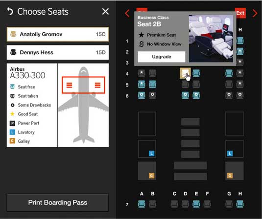
Ever had a bad experience trying to book a flight online? Of course you have. According to JD Power, 87% of travelers used the web to book travel tickets in 2012, yet most sites are still stuck in the 90s. So international design agency Fi decided to do something about it.
The agency reviewed all major airline websites, and graded them against design and usability criteria including information architecture, interaction design and visual design. Disheartened by the results, they decided to present an alternative view of how a travel website might look and function.
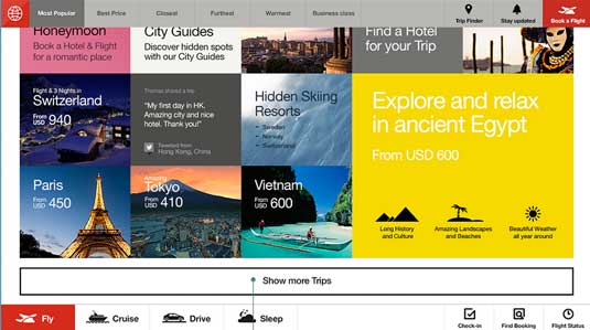
The designs they came up with were centred around the user-centred propositions including:
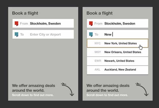
Article continues below- Syatic text and form fields replaced with relevant, attractive imagery and simple, intuitive toolsets.
- Icon-driven navigation to say more in less space.
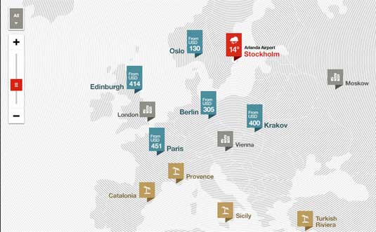
- The best possible deals in real-time, based on the user’s location and preferences.
- Smart filtering options so the interface is infinitely flexible, and tailored to each specific user.
- A site that plays travel agent by offering intelligent options based on a small amount of information you provide
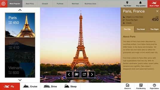
To expand on these and other principles, Fi has created a micro site that shows exactly how they would be put into practice, with mocked-up page examples and an array of thoughtful detail.
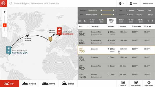
This is exactly that kind of disruption the online travel industry needs - and we hope there's a big player who's forward-looking enough to commission Fi to develop these intriguing designs.
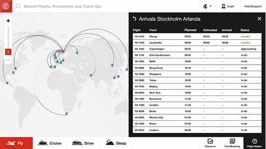
You can check out the designs, and the thinking behind them, in full here.
Liked this? Read these!
- How to build an app
- The best free web fonts for designers
- Discover what's next for Augmented Reality
What would you like to see on an airline website of the future? Share your views in the comments below!
Sign up to Creative Bloq's daily newsletter, which brings you the latest news and inspiration from the worlds of art, design and technology.

The Creative Bloq team is made up of a group of art and design enthusiasts, and has changed and evolved since Creative Bloq began back in 2012. The current website team consists of eight full-time members of staff: Editor Georgia Coggan, Deputy Editor Rosie Hilder, Ecommerce Editor Beren Neale, Senior News Editor Daniel Piper, Editor, Digital Art and 3D Ian Dean, Tech Reviews Editor Erlingur Einarsson, Ecommerce Writer Beth Nicholls and Staff Writer Natalie Fear, as well as a roster of freelancers from around the world. The ImagineFX magazine team also pitch in, ensuring that content from leading digital art publication ImagineFX is represented on Creative Bloq.
