This site shows exactly how responsive web design should be done
Godfather of RWD Ethan Marcotte has created a brilliant example every web designer should see.
Sign up to Creative Bloq's daily newsletter, which brings you the latest news and inspiration from the worlds of art, design and technology.
You are now subscribed
Your newsletter sign-up was successful
Want to add more newsletters?

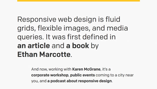
Ethan Marcotte is the designer who coined the term 'responsive web design' four years ago in an A List Apart article that was shortly followed by a descriptive book on responsive theory and practice. (If you're not sure what it is then check out Get Started with Responsive Web Design).
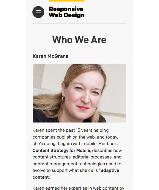
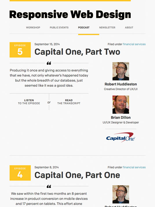
More recently he's teamed up with with Karen McGrane (author of Content Strategy for Mobile, published by A Book Apart), launched a site that links together workshops, public events and a podcast, simply but beautifully.

Perfectly aligned with Marcotte's book branding, Responsivewebdesign.com the site sets speed as its first concern, says Marcotte. "Performance was a priority for us. I set up a simple performance budget, and it was actually freeing to view the site's design through that lens. There's still plenty of work we can do, but it's satisfying to see how quickly our site loads over a spotty 3G connection."
"We're using Grunt to manage common tasks and a number of Filament Group-produced utilities to keep progressive enhancement and performance front-and-centre," adds Marcotte. He also mentions such tools as grunticon, grunt-criticalcss, CSS and JavaScript loaders, as well as fixed-fixed.js.

The result is a beautiful and faultless example of responsive web design in action – and a great resource on the subject to boot.
Words: Karolina Szczur
Karolina Szczur is a designer, developer, photographer and writer at &yet. She's also an open source aficionado and runs CSSConf in Oakland, California.
Sign up to Creative Bloq's daily newsletter, which brings you the latest news and inspiration from the worlds of art, design and technology.
Like this? Read these!
- How to build an app: try these great tutorials
- Free graphic design software available to you right now!
- Brilliant Wordpress tutorial selection

The Creative Bloq team is made up of a group of art and design enthusiasts, and has changed and evolved since Creative Bloq began back in 2012. The current website team consists of eight full-time members of staff: Editor Georgia Coggan, Deputy Editor Rosie Hilder, Ecommerce Editor Beren Neale, Senior News Editor Daniel Piper, Editor, Digital Art and 3D Ian Dean, Tech Reviews Editor Erlingur Einarsson, Ecommerce Writer Beth Nicholls and Staff Writer Natalie Fear, as well as a roster of freelancers from around the world. The ImagineFX magazine team also pitch in, ensuring that content from leading digital art publication ImagineFX is represented on Creative Bloq.
