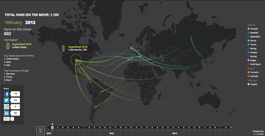
Mesmerizing site visualises how people travel for their passions
See how huge numbers of fans traverse the planet to see their favourite sports and music stars.
Sign up to Creative Bloq's daily newsletter, which brings you the latest news and inspiration from the worlds of art, design and technology.
You are now subscribed
Your newsletter sign-up was successful
Want to add more newsletters?

Global events like The Olympics, a Rolling Stones gig, and the Superbowl draw in fans from around the planet. Fans on the Move is a mesmerizing new visualisation that depicts the complexity and scale of an event's ability to pull in people.
Not only is the site beautiful to behold, it skillfully conveys the huge population movement numbers that might otherwise be hard to comprehend.
The site, designed by Spain's ElkanoData for TicketBits, draws in travel data from over 16,000 events that occurred over the last three years.
It's a great example of the way data vizualisation is being pushed to new limits on the web, thanks in part to a huge array of new tools. Check out our list of the best data vizualisation tools to learn more.


Words: Martin Cooper
Like this? Read this!
- TV service Freeview unveils new logo
- 20 fonts every graphic designer should own
- Will this stunning Mac concept revolutionise your desktop?
Sign up to Creative Bloq's daily newsletter, which brings you the latest news and inspiration from the worlds of art, design and technology.

The Creative Bloq team is made up of a group of art and design enthusiasts, and has changed and evolved since Creative Bloq began back in 2012. The current website team consists of eight full-time members of staff: Editor Georgia Coggan, Deputy Editor Rosie Hilder, Ecommerce Editor Beren Neale, Senior News Editor Daniel Piper, Editor, Digital Art and 3D Ian Dean, Tech Reviews Editor Erlingur Einarsson, Ecommerce Writer Beth Nicholls and Staff Writer Natalie Fear, as well as a roster of freelancers from around the world. The ImagineFX magazine team also pitch in, ensuring that content from leading digital art publication ImagineFX is represented on Creative Bloq.
