What we want to see in the next Adobe Muse
Are we ever satisfied? Lance Evans look at how could Adobe improve this already great program.
I have to say that sitting down to write this I instantly started to feel like a whiner. After all, it was only a few years ago that creating a web page or web site meant lots of fun-fun coding (yes, snarky sarcasm intended). Then Muse came along and created a whole new category of application, a design based web creation tool. Granted, it was not the first to sort-kinda be in this niche. But Muse really was the first to do it right.
A couple of years ago, Muse was a rather simple program, showing great promise, but needing a lot of development. As with most of their tools, Adobe is proving to be a really good parent to Muse. It has been giving it thoughtful and consistent development. So we have seen Muse begin to mature into a more capable tool in rather a short amount of time.
Given all this good, it is the height of ingratitude to complain. But hey, that's what we do, right? In truth, you will find many of the items below to be small, easily correctable and/or easy enough to live with. Mixed in are a few things that really need attention, and one item that we have all been wanting. Let's start with that last item first.
01. Is Adobe being responsive?

Let's start off with the biggie: We have all be asking, begging, and dying for what we now feel is the latest web-gift-from-above… responsive web design. This is the ability to create a website that scales to appropriately fit any size display a viewer is calling the site up on.
Even though responsive web sites are still relatively new, its omission from past versions of Muse has elicited a good deal of scorn from many users. My personal guess is that the users with the greatest scorn factor are the ones who have never tried to develop a responsive site. It ain't an easy thing to do. And while we currently may not like having to create the three separate desktop, tablet and mobile formats in Muse, that can often still be a faster workflow than developing complex responsive products.
Things are changing. On 30 November in an open letter, Adobe announced that it will be releasing a new version of Muse in early 2016 that will contain responsive design tools. All together… jump for joy!
But Adobe was clear that since this is a new functionality, for some amount of time we will lose our beloved 'scroll effects' tools (only for responsive design sites, they will still work if you opt for current development workflows). This limitation, at least at the start, is totally understandable as integrating such effects with variably scaled web page sizes will not be easy.
Sign up to Creative Bloq's daily newsletter, which brings you the latest news and inspiration from the worlds of art, design and technology.
After all, when you change the page widths of a responsive site, you get elements that shift around. That means two items that were sitting next to each other, may now be stacked. This will alter the vertical position of page items, and thus throw your scrolling positions off. This in turn would throw your scroll based effects off. Still, good to know that the option for responsive design is coming, right?
02. Browser lock and Google Chrome
Muse has a recurring problem that seems to exist one day, and disappear without warning. Only to reappear months later (also without warning). It is sometimes referred to as 'browser lock', but those aware of it on the forums have some other names for it that I can't use here.
Essentially what happens is that a browser will open a website's incorrect template. For example, opening the tablet version of a site while on a desktop machine. What's worse, the browser will essentially 'lock' itself to that version, and not easily allow the viewer to open the correct version.
Thankfully there are some limitations to this issue. First off, it seems to only be an issue with Google Chrome, I don't believe other browsers are effected. And the problem seems to come and go with various releases of Chrome. While the Muse team has tried to fix this issue, and claimed to do so a number of times, it keeps rearing its ugly head with new pushed releases of Chrome.
Until there is a real and solid fix, the only thing left to do is place some link on the tablet and mobile sites, offering to take the viewer to the desktop version (I don't think the error is reported to deliver an incorrect desktop version, so no worries there). Such a link overrides Chrome's 'lock' function, and usually resets it to bring up the correct format on subsequent visits.
I'll note that multi-format sites (desktop, tablet, mobile) developed by other systems do not seem to be reporting this issue. So while I am happy to blame Chrome, it is still on the Muse team to remedy.
03. Whose scale is it anyway?

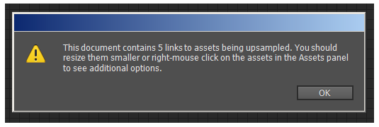
When you open an existing, work-in-progress Muse file, it will pop open a dialog to warn that there are images in the file that have been placed/scaled larger than their optimal size. Further, those files are also marked with a small red warning icon in the Assets list.
Seriously, you would think you were about to spread VD. There should be a way to turn these hysterical warnings off. The truth is, I sometimes intentionally place art and scale it up beyond its optimal 100 per cent size. I hope you don't think less of me for this.
Why would I do this? A few reasons, but mostly to save download time/space. For example, I don't mind if some background images are scaled up and softer than normal. You can often scale a soft looking background image up 200 per cent or more before jaggies become an issue. This means for example, that you can deliver a 75KB image instead of maybe as much as a 300KB one.
I don't believe Muse will ever up-sample your images (I'm fairly sure it will only downsample). But if it does any processing you don't like, you can always manually swap the file with a 'Save for Web' one from Photoshop, before uploading to the server.
04. Which item is this?

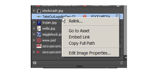
When I click on an object on the canvas, Muse will highlight the item in the Assets Palette, and automatically scroll to make it visible. This is a good thing. But what if I'm either not in the Assets Palette, or don't want it scrolling? Plus, what if I want more information than is offered by a right-click on the item in the Assets Palette?
A simple right-click on the art that is placed on the canvas should tell me what the name of the item is, and offer a number of other options that would streamline our workflow.
Next page: four more items on our Muse wishlist

The Creative Bloq team is made up of a group of art and design enthusiasts, and has changed and evolved since Creative Bloq began back in 2012. The current website team consists of eight full-time members of staff: Editor Georgia Coggan, Deputy Editor Rosie Hilder, Ecommerce Editor Beren Neale, Senior News Editor Daniel Piper, Editor, Digital Art and 3D Ian Dean, Tech Reviews Editor Erlingur Einarsson, Ecommerce Writer Beth Nicholls and Staff Writer Natalie Fear, as well as a roster of freelancers from around the world. The ImagineFX magazine team also pitch in, ensuring that content from leading digital art publication ImagineFX is represented on Creative Bloq.

