5 tips for planning your website user's journey
Developer Francesco Martella says it's time to focus on customer-centric design - here's how.
Sign up to Creative Bloq's daily newsletter, which brings you the latest news and inspiration from the worlds of art, design and technology.
You are now subscribed
Your newsletter sign-up was successful
Want to add more newsletters?
Websites are becoming more and more fundamental components of any well-tailored digital strategy aimed at contributing to the success of a business. There is no space for ugly, hard-to-use and sterile interfaces. It is time for web designers to step up and reinvent the way the web experience is offered to their audiences.
The goal is not only about building well-crafted and engaging interfaces, which are able to offer great performance across multiple devices, but to introduce the concept of strategic web design as a primary channel to boost conversion rate online.
A business' website is effectively the first channel used by users to evaluate the reliability and quality of a service or product while transitioning into the stages of a purchase cycle. While in the process of designing there are multiple factors that, if not planned carefully, can highly reduce the performance of a digital strategy that uses a website as a primary conversion funnel.
Article continues belowCaptivating easy interfaces and sharp key messages are still the core of any good web design able to deliver information quickly and effectively, but it's now time to focus on customer-centric design.
Push a user to click a banner or a post published on social networks in order to be redirected to a landing page sometimes is not enough. It is really important to plan the journey that the web designer wants to offer to his/her audience. What are the soft paths that a designer wants the user to follow?
One of the first stages is to develop a wireframe of touch points to drive a user through digital avenues leading towards a sales funnel. Users do not want to waste time thinking about what they have to do in order to find what they are looking for, but designers should enlighten the way.
01. Avoid too many links

The first rule is to avoid displaying too many links that might be distracting. The average user is attracted by multiple things all at once and sometimes it causes frustration, indecision and often the decision to leave a web page. Call to actions should be divided into the following: primary, as a highway towards the sales funnel, secondary, aimed at re-engaging a user that fell off track and ultimately the last type offering a single option that prompts information relevant to the journey.
Sign up to Creative Bloq's daily newsletter, which brings you the latest news and inspiration from the worlds of art, design and technology.
02. Menus send mixed messages
Statically positioned or sticky menus always offer the user an overview of what they might be interest in, but they can also mean that the person on the other side of the screen is so focused on using the menu as a main directory that they forget what caught their attention in the first place. An always-visible menu can trigger a loop where users start jumping from page to page, never following the soft paths strategically placed and ultimately leave the website.
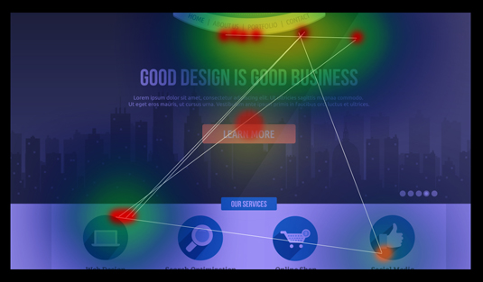
03. Study heat maps

Heat maps are incredibly useful to identify and correct usability bottlenecks throughout the website understanding how far, on average, users scroll a page down, as well as what the most clicked links are and followed soft paths in order to better integrate signals pointing towards the right direction.
04. Use images
An image should be used not just as a creative component but as an effective way to set a mood and recall that emotion through a properly labelled call to action button.
A perfect way of consistently engaging with a user and visually represent a touch point could be, for instance, to publish a post using a thumbnail picture with a prevalent colour. Colours are most likely related to emotions and therefore able to trigger an irrational reaction. Keep displaying consistent call to actions using the same colour, which could be very helpful in driving positive responses from the user.
05. Keep it clean

The best UI/UX offered online are able to assist the user during each step of their experience. This creates a sense of security and reliability that builds a stronger bond between the two parts.
Displaying tons of links, articles, products and options will only confuse the audience and waste the efforts made through online marketing activities. Keep it relevant!
Words: Francesco Martella
Francesco Martella is digital strategist and web developer at OnePoint. He has been developing websites and digital strategies for agencies all around Europe, USA and Australia.

The Creative Bloq team is made up of a group of art and design enthusiasts, and has changed and evolved since Creative Bloq began back in 2012. The current website team consists of eight full-time members of staff: Editor Georgia Coggan, Deputy Editor Rosie Hilder, Ecommerce Editor Beren Neale, Senior News Editor Daniel Piper, Editor, Digital Art and 3D Ian Dean, Tech Reviews Editor Erlingur Einarsson, Ecommerce Writer Beth Nicholls and Staff Writer Natalie Fear, as well as a roster of freelancers from around the world. The ImagineFX magazine team also pitch in, ensuring that content from leading digital art publication ImagineFX is represented on Creative Bloq.
