Website for PR agency sets a shining example
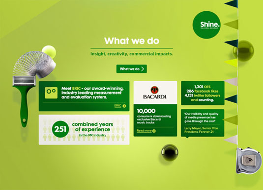
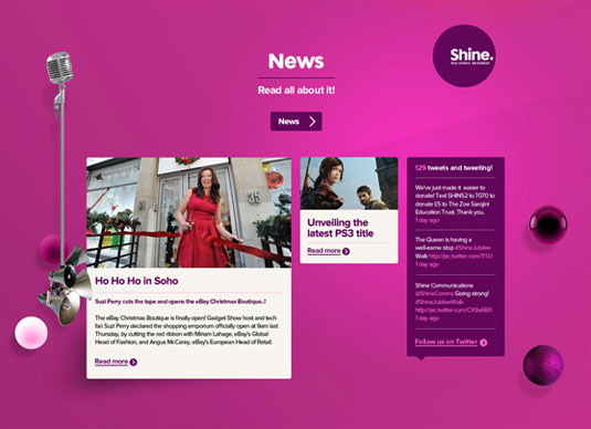
This site re-brand for PR agency Shine is a stunning example of Studio Output's stellar web design work.
Sign up to Creative Bloq's daily newsletter, which brings you the latest news and inspiration from the worlds of art, design and technology.
You are now subscribed
Your newsletter sign-up was successful
Want to add more newsletters?
We love it when we come across a stunning bit of web design and this offering from Studio Output is just that. Created for PR agency and long-term friend Shine Communications, it's a glorious mix of eye-popping colour choices and easy-to-use navigation.

The agency asked Studio Output to re-imagine their website to embody a new brand philosophy of 'restless brilliance' and we think they've done just that.
Art-directed photography
The visual and tonal direction is made up of specifically art-directed team photographs (produced with photographer Nick Andrews), infographics and a newly-developed written language. The site is structured so that projects, services and the character behind the people at Shine come across in a clear way.
Article continues below 
The site was built on Studio Output's bespoke content management system, enabling Shine to have the ability to have full control of the content on the site, plus it works well across smartphones, tablets and desktops.
Studio Output is a London based studio that focuses on "creating bright ideas for inspiring brands". They've certainly done that here, and we look forward to seeing what they come up with next.
Like this? Read these!
- 10 underrated web design tools
- The 20 best tools for choosing a colour scheme
- Web design training: the top 20 online resources
Sign up to Creative Bloq's daily newsletter, which brings you the latest news and inspiration from the worlds of art, design and technology.

The Creative Bloq team is made up of a group of art and design enthusiasts, and has changed and evolved since Creative Bloq began back in 2012. The current website team consists of eight full-time members of staff: Editor Georgia Coggan, Deputy Editor Rosie Hilder, Ecommerce Editor Beren Neale, Senior News Editor Daniel Piper, Editor, Digital Art and 3D Ian Dean, Tech Reviews Editor Erlingur Einarsson, Ecommerce Writer Beth Nicholls and Staff Writer Natalie Fear, as well as a roster of freelancers from around the world. The ImagineFX magazine team also pitch in, ensuring that content from leading digital art publication ImagineFX is represented on Creative Bloq.
