Twitter map showcases power of Node.js
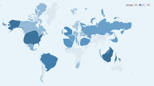
Tweetmap is one of the finest Twitter visualisations that we've seen to date. We chat to its creators about how it was put together.
Sign up to Creative Bloq's daily newsletter, which brings you the latest news and inspiration from the worlds of art, design and technology.
You are now subscribed
Your newsletter sign-up was successful
Want to add more newsletters?

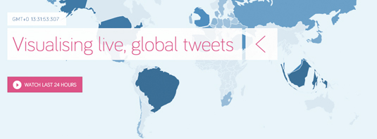
Ever wondered how many tweeters reside in a certain country? Or how often a residents tweet? Well look no further. Tweetmap by Pete Smart and Rob Hawkes represents countries in the world proportionally based on numbers of tweets.
“Tweetmap brings together lots of clever technologies, including TopoJSON, D3.js, Node.js, PhantomJS, and an algorithm to construct contiguous cartograms in real-time," Hawkes explains. "We chose Node.js to power the server side of things as it’s quick, flexible and we already had experience using it to scrape tweets.

"For rendering and animating the map (in TopoJSON format) on the client we use D3, which is a fantastic library for data visualisation. Specifically, we extensively used the geo module, which allows you to do some complex geographic calculations and conversions”.
Article continues belowTo prevent performance problems in the browser, Smart and Hawkes use D3.js on the server to render countries and generate contiguous cartograms. “However, we actually run it on the server using PhantomJS (a ‘headless’ WebKit rendering engine) and transmit the maps back to the client,” says Hawkes.
"This prevents the performance hit experienced when generating the cartograms on the client. “The browser locked up for four seconds,” explains Hawkes.
Like this? Read these!
- The best free web fonts for designers
- Useful and inspiring flyer templates
- The best 3D movies of 2013
What do you make of Tweetmap? Let us know in the comments box below!
Sign up to Creative Bloq's daily newsletter, which brings you the latest news and inspiration from the worlds of art, design and technology.

The Creative Bloq team is made up of a group of art and design enthusiasts, and has changed and evolved since Creative Bloq began back in 2012. The current website team consists of eight full-time members of staff: Editor Georgia Coggan, Deputy Editor Rosie Hilder, Ecommerce Editor Beren Neale, Senior News Editor Daniel Piper, Editor, Digital Art and 3D Ian Dean, Tech Reviews Editor Erlingur Einarsson, Ecommerce Writer Beth Nicholls and Staff Writer Natalie Fear, as well as a roster of freelancers from around the world. The ImagineFX magazine team also pitch in, ensuring that content from leading digital art publication ImagineFX is represented on Creative Bloq.
