Why visual consistency can make or break your web design
The effect your website has with the user on a subconscious level.
Visual flow
A clean, visually consistent site gives users feelings of comfort and control, whether consciously or not. Some designers attribute these benefits to properly designed visual flow.

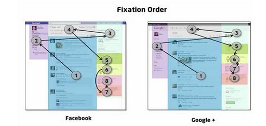
In terms of interaction design, visual flow is the path your users’ eyes take as they interact with your site or app. Experienced designers know how to manipulate their users’ visual flow through eye-pattern strategies, contrasting colors, varying sizes, and other methods (outlined in our free ebooks, Web UI Design for the Human Eye I & II).
The goal of visual flow is creating a harmony and rhythm to all the on-screen UI elements. Laura McGuigan, VP of Design at TrackMaven, explains that repeating elements create a pleasant visual pattern – a rhythm – that you can break up with smart variations to capture user interest. This reflects what we said in the our book Consistency in UI Design about knowing when to be inconsistent. But if you’ve read it, you’ll know: the potency of inconsistency relies on a pre-established, overarching consistency.

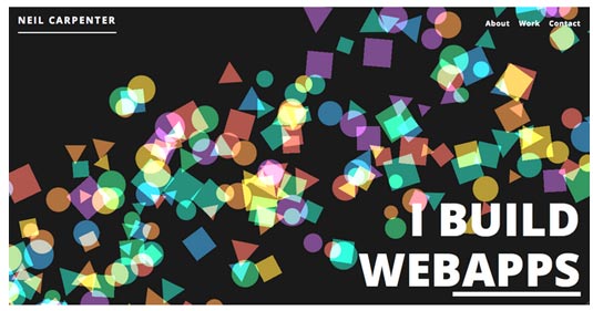
Take, for example, web designer Neil Carpenter’s site. You can’t tell from the screenshot above, but the colored shapes are in motion from the top-right corner to the bottom-left – literally creating a visual flow for the page. This colorful animation is a deviation from the norm (making it externally inconsistent), which actually sets Carpenter apart.
Take note, though, that he remains externally consistent where necessary. He keeps a top, horizontal navigation bar with the standard “About,” “Work,” and “Contact” pages you’d expect from a portfolio site. His “brand,” in this case his name, is in the upper-left.
Internally, the white text stands out against the black background and color of the animation. This breaking of internal consistency allows the importance message of the text, including links, to be clearly visible even amidst a visually competitive landscape. Other pages retain this black background/white text color scheme, and even play on the basic shape theme with the site’s loading icons.
First impressions
Considering that Google determined it only takes about 50 milliseconds for users to judge your website, visual interactions are usually the strongest (and most lasting) interactions. This is further evidence of how important the sense of sight is on your users’ decision-making.
Sign up to Creative Bloq's daily newsletter, which brings you the latest news and inspiration from the worlds of art, design and technology.

Many elements – most of which are visual – will affect how users initially judge your site. There are lots of design techniques for putting your best foot forward in how users perceive your site, but visual consistency is more about not embarrassing yourself than looking good. It is a thankless feature, and users only notice it when it’s not there.
Inconsistency will negatively affect your users’ impression of you, so take care in maintaining your visual consistency. Sporadic changes in typography, icons, element placements, and established patterns give the impression of disorganization and laziness, whereas consistency looks and feels more reliable and professional.
Which do you want to represent you?
Conclusion
As we explained, the sense of sight largely governs how humans interact with their world, even more-so on a subconscious level. Any interaction design that hopes to be successful must prioritize visual interaction.
Visual consistency is a great ally in communicating with your user. Thinking a little more about consistency during the design phase means they can think about it less when interacting with your site – freeing up their focus for what’s important.

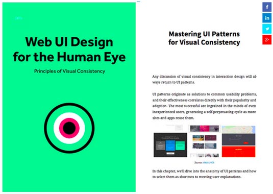
To learn more about balancing originality with familiarity in web design, download the free e-book Web Design for the Human Eye: Principles of Visual Consistency. Additional examples are analyzed from companies like Squarespace, Redhat, Jukely, Wunderlist, and many others.
Words: Jerry Cao
Jerry Cao is a content strategist at UXPin — the wireframing and prototyping app.
Like this? Read these!

The Creative Bloq team is made up of a group of art and design enthusiasts, and has changed and evolved since Creative Bloq began back in 2012. The current website team consists of eight full-time members of staff: Editor Georgia Coggan, Deputy Editor Rosie Hilder, Ecommerce Editor Beren Neale, Senior News Editor Daniel Piper, Editor, Digital Art and 3D Ian Dean, Tech Reviews Editor Erlingur Einarsson, Ecommerce Writer Beth Nicholls and Staff Writer Natalie Fear, as well as a roster of freelancers from around the world. The ImagineFX magazine team also pitch in, ensuring that content from leading digital art publication ImagineFX is represented on Creative Bloq.
