Why you should switch from Photoshop to Sketch
Designer Brian Hoff explains why he made the switch to Sketch.
Sign up to Creative Bloq's daily newsletter, which brings you the latest news and inspiration from the worlds of art, design and technology.
You are now subscribed
Your newsletter sign-up was successful
Want to add more newsletters?
Over the past year or two, Bohemian Coding's Sketch app has gained momentum across the glorious internets as a 'better' alternative to Photoshop. Most of this ample praise has come from the web and interface design community. If you're anything like me, then you're always on the lookout for new tools and better alternatives to an existing workflow. However, at first I was tentative about handing over my 20-year Photoshop baton.
For the most part, Photoshop does the trick and does it well enough. 'Why switch?' I thought. Photoshop shortcuts are my second language. Performing a specific effect or task no longer required much brain power since I had likely already done something similar many times over. This old dog was thinking that Sketch was for the new-school cool kids.
As the chatter surrounding Sketch increased, my curiosity finally got the best of me. I needed to see for myself why Sketch had caught fire amongst my peers. As I was about to begin a new project, I decided the moment was right. If I was going to do it, I wanted to give it my all for a week.
Article continues belowI closed down Photoshop, downloaded a 30-day trial of Sketch and took a dive into the deep end with no flotation device, hoping to keep my head above water long enough to figure out what the hype was all about. If you're thinking of exploring Sketch, I'd recommend this approach.
Within two to three days, I was convinced. Once again, I felt enthusiastic about opening up a piece of software, and I reaped the benefits instantly. I quickly felt comfortable learning the new interface. The overlap with Photoshop was just enough. I was in love. 'Yes!' I thought.
In this article, I'll be covering a few of Sketch's core features, and comparing them to their Photoshop equivalent. If you're on the fence, looking for a better (and much cheaper) alternative to Photoshop, or as curious about its increasing popularity, then read on.
Hello, friend
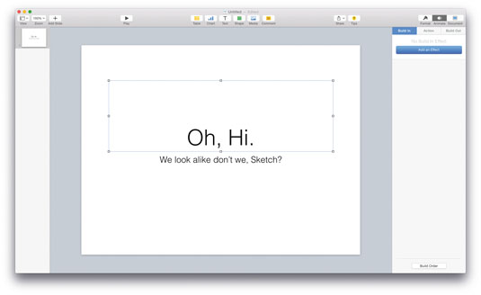
Sketch is exclusive to Mac OS X, and by the looks of Bohemian Coding's FAQ section, it's not even considering supporting Windows and Linux. This is good for us long-time Mac users. If you're at all familiar with OS X's productivity apps (Pages, Keynote, Numbers) or have used any older, discontinued software by Apple (I'm looking at you iWeb), you'll instantly feel like you've run into an old friend that's grown a more mature beard.
Sign up to Creative Bloq's daily newsletter, which brings you the latest news and inspiration from the worlds of art, design and technology.
Much like I did in Keynote when I started using it, the first thing I did in Sketch was to customise the top toolbar. You do this by simply right-clicking on it and tossing as many items as possible onto it.
Keyboard shortcuts
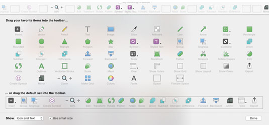
The advice I received from numerous friends and Twitter folk was to learn the shortcuts as quickly as possible. However, the visual guidance of the tools along the toolbar helped me to better understand Sketch's capabilities and how it handles various tasks. Many of the tools will be semi-familiar from Photoshop, but they are now located in different places. In Sketch's case, a more unified area.
To help my transition from Photoshop, I brought over some frequently used keyboard shortcuts by creating custom keyboard shortcuts in OS X. If you're not familiar with this process, get ready to fall in love. It's quite easy to do right from your Mac's System Preferences. Also, here's a handy list of Sketch Shortcuts to get yourself familiar with: sketchshortcuts.com.
A focus on focus
Don't get me wrong: Photoshop gets the website and UI mockup job done and does it well. It also does a ton of other stuff well, too. It sets out to be the tool for everyone. And you know what? That's OK. One issue, though, is that it lacks focus as an app for web and user interface design.
Sketch's focus is specifically those that design websites, interfaces and icons. Compared to Photoshop, Sketch's menus look stripped down. A nice breath of fresh air. No more fighting through the clutter that doesn't necessarily translate to the web. Sketch's tools and values lie in what translates easily to CSS and browsers in general.
For example: making and customising the layout settings (i.e. creating a grid). In Sketch, predefined fields enable you to customise your grid's total width, gutters, columns and rows. As someone who always works with responsive grids, I'm constantly in these settings before starting a new project.
Artboard presets
Another feature that showcases Sketch's emphasis on the web and UI is its preset templates and artboard presets. And for this I'm thankful.
Let's say you're starting a new iOS app project. You could either create a new project like you're used to in Photoshop, or select the 'iOS UI Design' template Sketch provides under File > New From Template. The advantage here is that Sketch first presents you with an iOS UI kit for quickly mocking up iPhone apps and dragging, say, the native iOS keyboard into your mockup.
Recently, I was mocking up a map view for a booking app I was working on. I didn't have to open up a separate file or hunt around for an iOS map mockup. Just toggled over to my Elements page and copy and pasted.
Sized to perfection
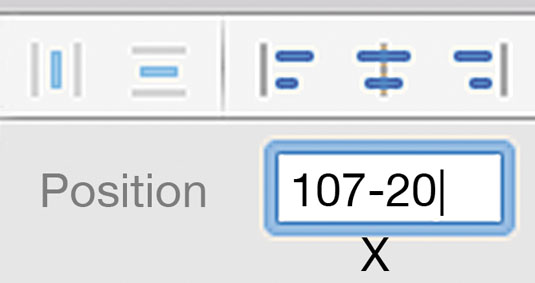
Just like Photoshop, Sketch's Inspector enables you to define exact sizes and positions on an artboard. Sketch, however, has an itty-bitty secret to its Size and Position Inspector. It understands maths! Not only addition, subtraction, multiplication and division, but also percentages.
Want to shift a button to the left 20 pixels? Just add '-20' to the field. Want an image to fill half the entire artboard? Just type '50%' into the width field. Brilliant!
One project, one file
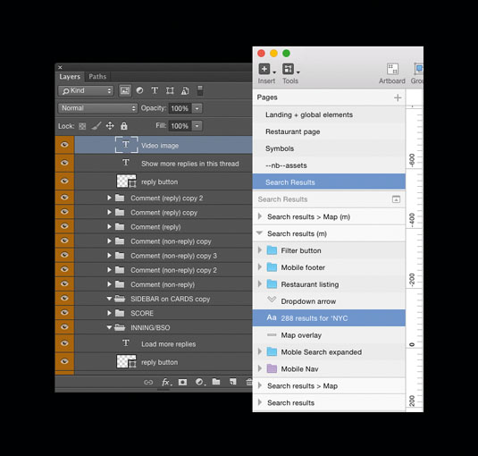
With Photoshop, my project and file structure looked something like this:
BigTimeClient folder
– BigTimeClient_landing-page.psd
– BigTimeClient_about-page.psd
– BigTimeClient_contact-page.psd
Sketch handles things a bit differently. A single Sketch file houses all the pages and artboards within one document. At first I was concerned it would crush my Mac's performance, however I've since designed iOS apps with roughly 30 screens and did not experience any significant performance issues.
The main benefit of this approach is that you can access and view all your screens side by side, so it's much easier to make changes and compare things. If you're mocking up various responsive breakpoints you'll absolutely love it.
Recently, Photoshop introduced its version of multiple artboards. However, in Sketch it's possible to organise all the artboards into pages within one document, making this feature much more powerful. Otherwise, the multiple artboards in both applications function very similarly.
The layer palette in Sketch brought a level of comfort when I first opened the app, since it mimics Photoshop in various ways. Much like Photoshop, this is where you view, rename, search for groups (folders) and elements across your project.
One file fits all
In Photoshop, I'd typically create three (or more) file assets. One for @1x and another for @2x and yet another for @3x. Saving those out separately was tedious. Unless you were working with vector objects and elements 100 per cent of the time, this became painful. Sketch has not even one rasterised tool or element in its app. Well, unless you drag one in, of course.
When creating an iOS app design project in Photoshop, I'd design at a much larger size on my screen and test over a mirroring app, Skala Preview, on my iPhone.
With Sketch, my workflow when working with Retina devices and assets has changed and improved dramatically. I now design at the standard device size. Since everything is a vector by default in Sketch, I don't have to worry about making my artboard abnormally large on my desktop so I can preview the work over mirroring (now via Sketch Mirror). Working from desktop to mobile feels more natural now.
What's more, saving out various sizes of elements is as simple as clicking an export button, adding as many sizes and file formats as you'd like, and ... well, that's it. You can even drag and drop layers and groups to your desktop to save things out – although the Export button gives you more control. This is by far one of my favourite Sketch features, and one of the biggest time-savers as well.
From smart to symbolic
Photoshop's Smart Objects and Linked Smart Objects are extremely handy and powerful. I used to use them often, especially when designing apps and interfaces that utilised a lot of repetitive elements.
If you're unfamiliar, here's a quick use case. You're designing a mobile breakpoints navigation and you're already 15 screens deep into the workflow when you realise something needs to change. If you weren't working with Linked Smart Objects you'd have to manually open every file and make your change in each one. With Linked Smart Objects, you can alter one element and all its counterparts will change automatically. Huge time-saver!
Creative Cloud Libraries
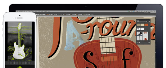
Another of my favourite features in Photoshop, which is also fairly new to the programme, is Creative Cloud Libraries. Simply drag commonly used assets to their own Libraries panel, for easy access when you want to drag and drop them onto other areas of the project. If you want to read about CC Libraries in more depth, go here.
Symbols
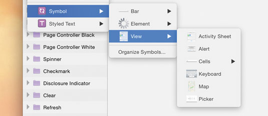
What do Linked Smart Objects and Libraries in Photoshop have to do with Sketch, you ask? Well, Sketch has this little, big thing called Symbols. I think of it as the love child of Linked Smart Objects and Libraries, with a dash of hot sauce for an extra kick.
With Symbols, you can reuse assets or groups across pages and artboards. Make a change to the Symbol and, hot diggity dog, it changes everywhere! It even remembers spatial alignments if, for example, you're adjusting assets and/or text in a list. Even the words of the text change.
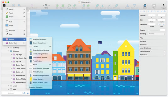
And here's that extra dash of hot sauce I spoke of: 'Exclude Text Value from Symbol'. Take for example, a button style that repeats, but with different text. Want to change the button style across the board, but keep the text? No problem. No extra 'Change all instances' option. Magic!
In addition to a group of elements that update automatically, you'll also find joy in defining styles for layers and text. Define, for example, H1 tags in GT Walsheim – size 48 and with a shadow, and all instances will update across the board. Again, like magic!
Shaping things up
When designing user interfaces, apps and websites in Photoshop, I typically used shapes to create a variety of elements. You'll find similar ground with Sketch. Shapes is where I spend most of my time, creating buttons from rectangles, filling or masking large rectangles with image fills, drawing separator lines, and so on.
Photoshop provides you with a variety of ways to create vector and non-vector shapes and paths. However, Sketch is built around scalability. Everything is vector-based, and shapes can easily be adjusted on the fly.
For example, you could go back and add a corner radius to a rectangular button simply by selecting the 'Radius' option. You could also fill any shape with a photo and resize either one in a non-destructive way. This is great when testing how responsive images will scale and resize.
When masking an image within a shape, a personal tip is to not use the 'Use as mask' option. Instead, 'Fill with image' gives you much more flexibility most of the time.
There's also common ground between shape combinations in Photoshop and Sketch. While I don't personally create custom icons in Sketch (or any software for that matter), I do find myself needing unique shapes here and there. However, I'd imagine icon designers use this feature quite often.
Beyond Sketch
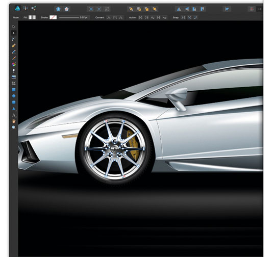
Here I've just touched on some of the features, differences and familiarities when moving over from Photoshop. Sketch feels like a great leap in the direction of a better, more fine-tuned workflow for designing UIs and sites. This doesn't eliminate the need for a 'photo shop' application, like Photoshop or Affinity Designer, though. Sketch's power lies in its focus as an app for web and user interface design. No more, no less.
The learning curve from Photoshop to Sketch was quick enough. It took me three and a half days to get about 90 per cent comfortable within the app, and it was three weeks before I felt like I had a 99 per cent grasp on things. You can read more about my experience on my site, where I live-blogged my journey.
Sketch's user base is growing fast. Its community of plugins is impressive and effectively extends Sketch's capabilities. If you're looking for a new tool, and at an extremely reasonable price, Sketch is a great option. In my opinion, at the moment, it's the best choice for UI work. I'm excited for its future.
Words: Brian Hoff
Brian Hoff is the founder and creative director of Brian Hoff Design, a Philadelphia-based boutique digital agency with a focus on web and mobile platforms and products. This article was originally published in issue 273 of net magazine.
Liked this? Read these!
- How to start a blog
- 15 top Sketch plugins
- Free Photoshop brushes every creative must have

The Creative Bloq team is made up of a group of art and design enthusiasts, and has changed and evolved since Creative Bloq began back in 2012. The current website team consists of eight full-time members of staff: Editor Georgia Coggan, Deputy Editor Rosie Hilder, Ecommerce Editor Beren Neale, Senior News Editor Daniel Piper, Editor, Digital Art and 3D Ian Dean, Tech Reviews Editor Erlingur Einarsson, Ecommerce Writer Beth Nicholls and Staff Writer Natalie Fear, as well as a roster of freelancers from around the world. The ImagineFX magazine team also pitch in, ensuring that content from leading digital art publication ImagineFX is represented on Creative Bloq.
