50 fantastic tools for responsive web design
To get started with building a responsive site, having a strong toolkit can make a world of difference. Here Denise Jacobs and Peter Gasston round up 50 great tools to aid the process of making your sites responsive.
Sign up to Creative Bloq's daily newsletter, which brings you the latest news and inspiration from the worlds of art, design and technology.
You are now subscribed
Your newsletter sign-up was successful
Want to add more newsletters?
As introduced/coined by Ethan Marcotte in both his article "Responsive Web Design" as well as his best-selling book, one needs three elements to make a site responsive:
- A flexible/fluid grid
- Responsive images
- Media queries
There are plenty of other great articles that cover motives, concepts, and techniques regarding responsive web design, so we'll keep the focus of this article on some top tools that will help you become responsibly responsive.
Tools for starting out
Before you start with building your site, it's best to sketch out how the elements on the page will adapt to fit the different browser sizes of the various devices that they will be viewed upon, and to avoid the disconnect that often comes from thinking primarily about the desktop design and the rest of the responsive iterations as an afterthought (see especially Stephanie (Sullivan) Rewis' comment).
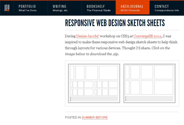
Article continues below01. Responsive Web Design Sketch Sheets
This set of responsive sketch sheets, by Jeremy P Alford, is a great starting point to begin mapping out how the page sections will shift in different resolutions.
02. Responsive Design Sketchbook
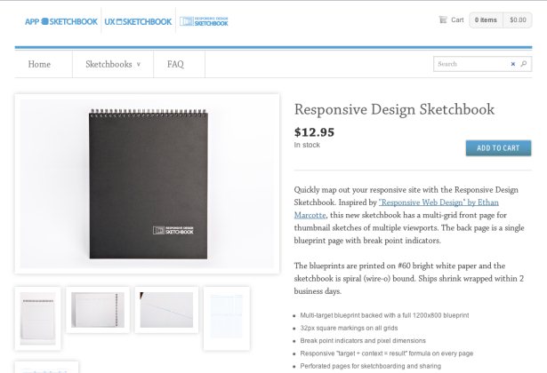
If you prefer to keep all of your sketches in one place, then you may want to consider this wire-bound book of 50 responsive sketch sheets by the App Sketchbook company.
03. Responsive Wireframes
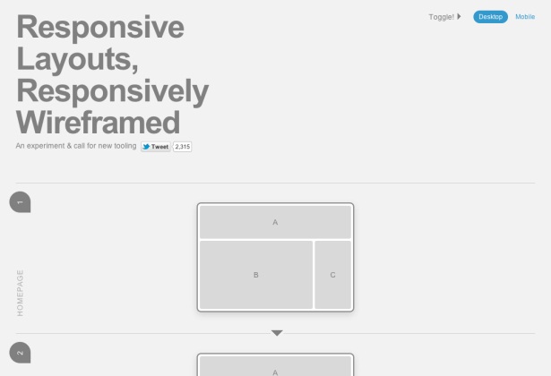
One of the difficulties of building responsive websites is using wireframes to show how the responsive design will work. James Mellers of Adobe has put together this experimental tool to show how responsive wireframing of complex layouts can work.
04. Multi-Device Layout Patterns
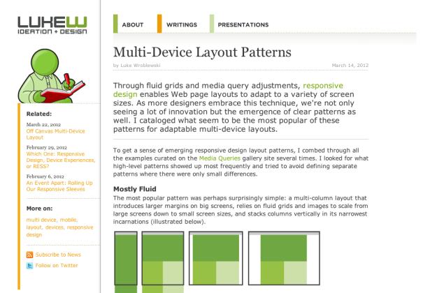
When planning a responsive design it’s useful to see how other people have approached it before you, so Luke Wroblewski’s Multi-Device Layout Patterns, which lists popular patterns with links to examples, is a great place to start.
Sign up to Creative Bloq's daily newsletter, which brings you the latest news and inspiration from the worlds of art, design and technology.
05. Style Tiles
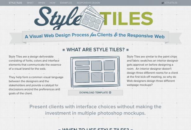
Samanatha Warren’s Style Tiles propose a new technique for design in the responsive age; rather than fixed width design mockups, these are like swatches or moodboards that show the general design approach without going into granular detail.
Tools for a flexible/fluid grid
As stated earlier, the first component needed for responsive design is a flexible/fluid grid. The following are already pre-built: you just need to download them and you'll quickly be on the road to a more responsive site.
06. Golden Grid System
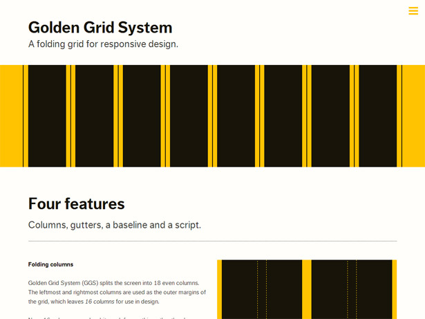
Joni Korpi, who also developed Less Framework, has recently released this new version of a reliable grid system for responsive design. Deemed "folding" as it easily adapts from 16, to eight, to four columns, the Golden Grid System also features a small browser overlay that exposes the grid on your pages for testing.
07. Foldy960
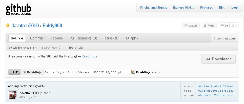
The talented gents at Paravel, Inc. have released the modified 960.gs grid that they use as the basis for their responsive projects.
08. SimpleGrid
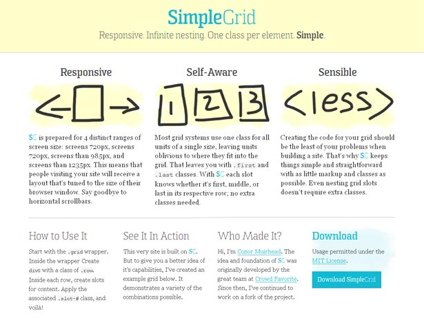
SimpleGrid, by Conor Muirhead, was built with responsiveness baked in, so it's easy to get up and running with your responsive website project.
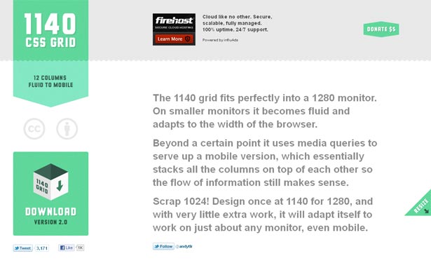
09. The 1140px CSS Grid
Another great responsive grid system is the 1140px CSS Grid by Melbourne designer Andy Taylor, which goes from a wide desktop resolution down to mobile.
10. Columnal CSS grid system
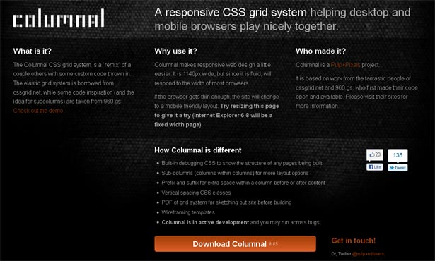
The Columnal grid system, created by Pulp+Pixels aka creative director Nick Gorsline, is based on the 1140px grid system, but with some extra goodies such as a design kit with sketchsheets and wireframing templates, as well as CSS debugging styles.
11. Semantic grid system
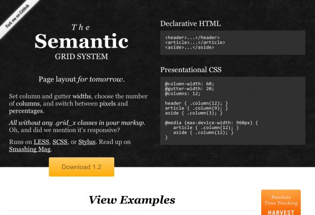
Pre-processed CSS extensions like Sass and LESS are becoming more and more popular, and Tyler Tate’s Semantic grid system uses them to maximum effect in this grid system which claims to use no unnecessary classes or elements. Read more at coding.smashingmagazine.com/2011/08/23/the-semantic-grid-system-page-layout-for-tomorrow/.
12. SUSY
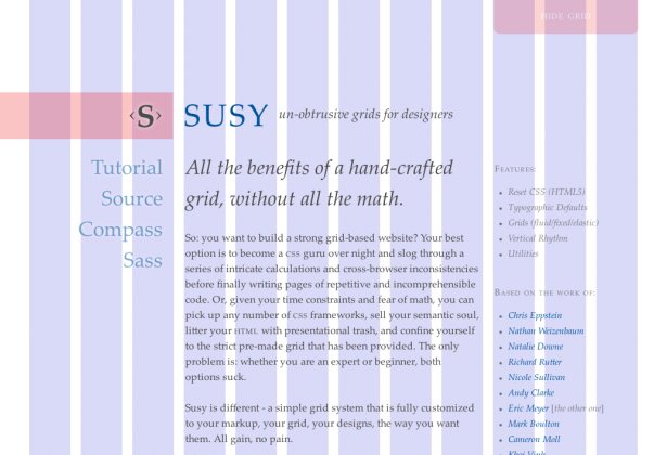
Like the Semantic grid system Oddbird’s SUSY created a grid system that uses no extra markup or special classes, but SUSY is aimed only at users of Sass (and its extension, Compass).
13. Gridpak
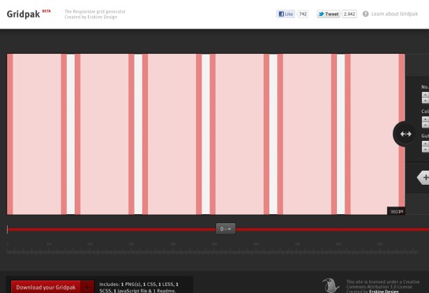
Gridpak, by Erskine Design, is one of the newest responsive grid generators around. It allows you to set your columns and gutters at a number of breakpoints, then outputs CSS, JavaScript and PNG files so your whole team is working from the same starting point.
14. Gridset
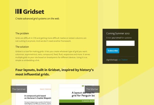
There’s still a slight air of mystery over Gridset as, at the time I write this, it hasn’t actually been released yet. But the tool by Mark Boulton Design promises bespoke, non-prescriptive, grid systems and a way to save and manage your grids online.
15. A better Photoshop grid for RWD
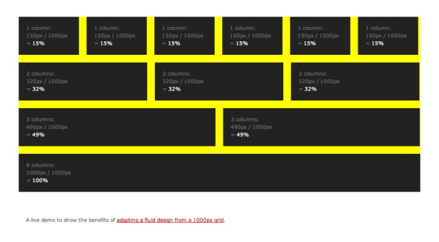
Elliot Jay Stocks proposes abandoning the old 960px de facto grid standard and working from a 1000px base instead, making all percentage calculations easier to work with. If you agree, he’s made a PSD for you to start working with.
16. Fluid Grids
If your design is highly specialised and you need to create your own custom grid, you can do so with .net Awards brilliant newcomer nominee Harry Roberts' fluid grid calculator.

17. Responsive Calculator
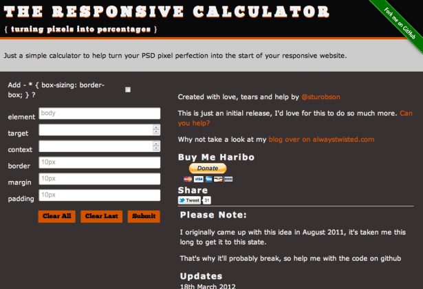
Another pixels to percentages calculator, but this one by Stu Robson goes a step further than others by generating all of the CSS rules for you, meaning you can just copy and paste them into your stylesheets.
Tools for responsive images (and text)
Another crucial component of responsive web design is fluid images. While the technique for achieving fluid images is straightforward, optimising performance and page load for different devices seems to be one of the biggest challenges in responsive web design. Here are some resources for approaching the issue.
18. Responsive Images
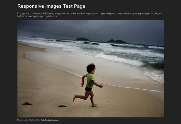
The Filament Group devised a way to send an appropriately-sized image based on screen resolution. This experiment with mobile-first images that scale responsively and responsibly calls for having two images of different sizes to reference.
19. Adaptive Images
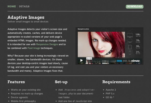
Matt Wilcox took inspiration from the Responsive Images tool to create Adaptive Images, which uses PHP and a little JavaScript to serve appropriate images to the user’s device without requiring any extra markup.
20. Sencha.io Src (formerly Tinysrc)
Sencha provides a cloud service that sends optimised versions of hosted images for the size of device requesting them. To find out how to use it, see docs.sencha.com/io/src/.

21. FitText
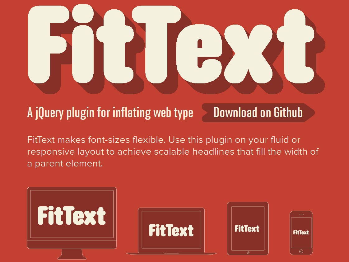
Yet another gem from Paravel, Inc is FitText.js, a jQuery plug-in to make headline web type responsive to the design and the device. For details see trentwalton.com/2011/05/10/fit-to-scale/.
22. slabText
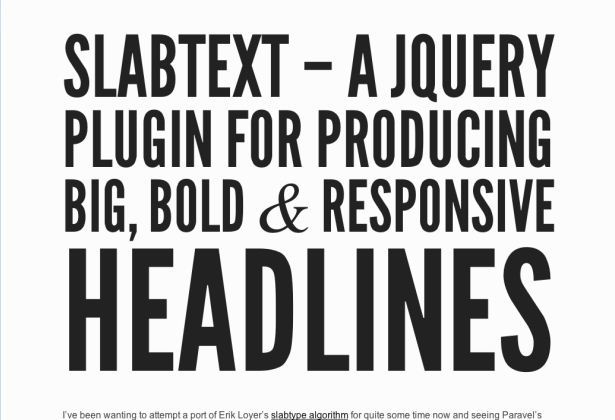
Inspired by FitText and the SlabType algorithm, Brian McAllister’s slabText is a jQuery plug-in that makes bold blocks of text that resize responsively while keeping to a defined width.
Tools for media queries
Now that you have an idea of how your layout is going to change for different devices, a fluid grid and fluid images, you need media queries to shift the page's elements into a state of responsiveness.
23. Respond.js
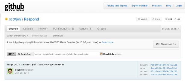
The one issue with responsive design is that browsers that can't read media queries get left behind. This may not be an issue with your target audience, but it is still a good practice to accommodate users on older browsers. Respond.js, by Scott Jehl, only supports properties min-width and max-width.
For more see filamentgroup.com/lab/respondjs_fast_css3_media_queries_for_internet_explorer_6_8_and_more/.
24. CSS3-Mediaqueries.js
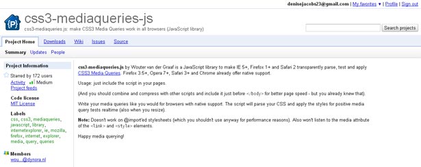
CSS3-Mediaqueries.js, by Wouter van der Graaf, enables older versions of IE and other browsers to effectively test and apply all kinds of media queries.
25. Adapt.js
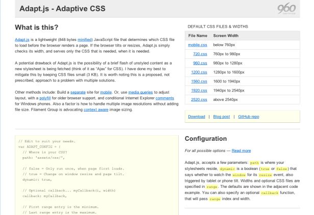
Nathan Smith, author of the original 960.gs grid system, has written Adapt.js, a script which detects browser dimensions and serves only the required stylesheets – like media queries but without media queries, meaning it works in older browsers too.
26. Categorizr
This is device detection approached from the opposite angle – Brett Jankord’s Categorizr script presumes that devices are mobile unless otherwise detected as desktop or tablet, enabling you to serve resources to browsers in a sympathetic way.

Responsive design (and mobile) boilerplates
In the spirit of an efficient responsive workflow, boilerplates facilitate the process of moving designs to the browser sooner than later. Most of these boilerplates combine the best of the tools mentioned above into one neat package: a flexible grid enhanced with scripts, while implementing the mobile first, content-out philosophies.
27. 320 and Up
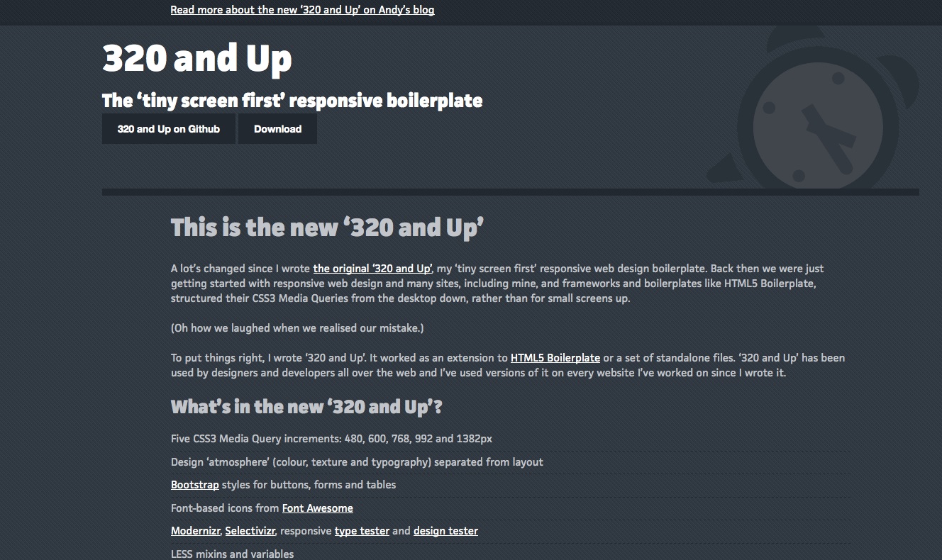
Andy Clarke’s 320 and Up is a mobile-first boilerplate which integrates with many other modern web design tools, such as LESS and Bootstrap (see #30). It’s a light and agile way to get a site up and running quickly. Also check out our interview with Andy, in which he tells us more about the new version.
28. Gridless
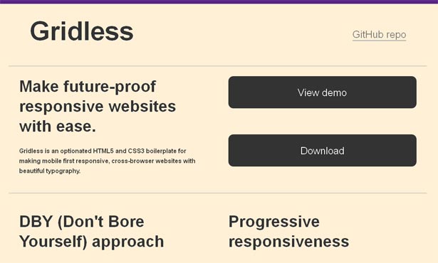
Gridless is an HTML5 and CSS3 boilerplate that can serve as the basis for your responsive designs, with focus on typography and baked-in cross-browser compatibility.
29. Skeleton
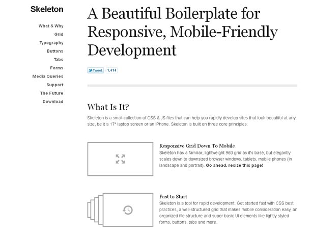
Unlike the previous two boilerplates, whose starting point is with the smallest resolution, the Skeleton development kit, created by Dave Gamache, is based on the 960.gs grid system and scales down to mobile. Skeleton also boasts a great style framework for developers to build styles on top of.
30. Bootstrap
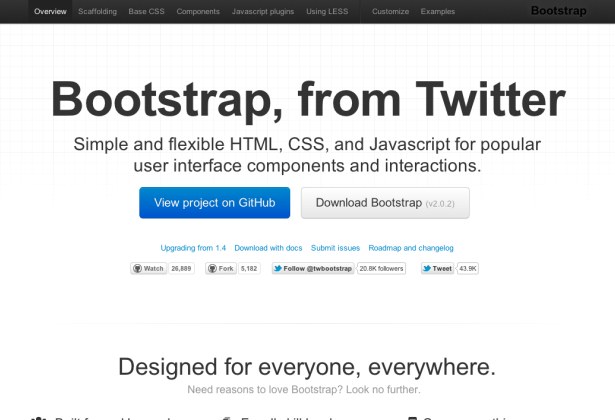
Built by Twitter and now open-sourced, Bootstrap is a framework and series of components for quickly getting a site online, and as of version two all of its core parts work responsively.
Plugins, shims and polyfills
Although modern browsers and software tend to be geared up for responsive, sometimes we have to use extra tools to provide a consistent experience.
31. Responsive Plugin
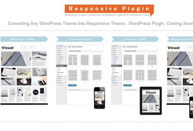
Marios Lublinski has written a WordPress plug-in that promises to turn any current WP theme into a responsive one. How this works I don’t yet know as it hasn’t been released as the time of this writing, but if it lives up to its promise it should be very useful.
32. Overthrow
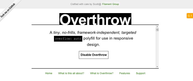
Content overflow handling works well on desktop browsers, but older mobile browsers handle it inconsistently. The Overthrow polyfill from the industrious Filament Group adds consistent graceful degradation across devices, making sure that all mobile users get the best possible experience.
33. MediaTable
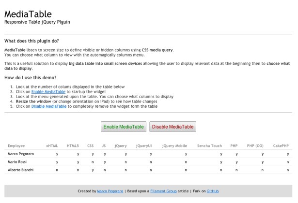
Marco Pegoraro’s jQuery plugin, MediaTable, works with Respond.js to help you get around the problem of how to display large data tables on small screen devices, making responsive columns and adding a show/hide toggle where suitable.
"Testing, testing: 1-2-3 ..."
Another aspect of the responsive workflow is to know your target devices and resolutions and then test in them.
34. resizeMyBrowser
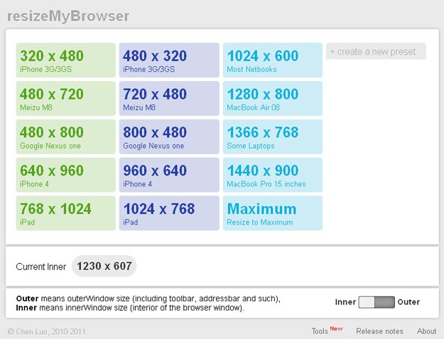
resizeMyBrowser, by frontend developer Chen Luo, has several preset dimensions for your browser window to test responsively designed pages or create a new preset if you can't find the one that fits your needs.
35. responsivepx
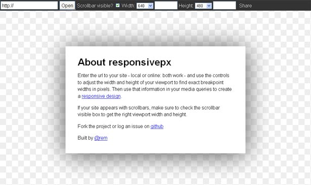
Much like resizeMyBrowser, responsivepx, built by Remy Sharp, loads your pages in a window where you can test the width and the height to determine how well your media queries are firing and where the breakpoints are in the design.
36. Responsive Design Testing
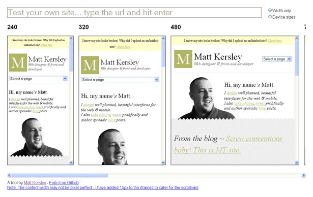
An incredibly useful tool by designer and developer Matt Kersley: simply enter the URL of your responsive site in Responsive Design Testing to see how it renders at various browser sizes.
37. The Responsinator
Enter a URL and The Responsinator will show you how it displays in many common device sizes – with ruthless robotic efficiency. Tama Pugsley and Andy Hovey are responsible for this one.

38. Responsive.is
Another in-page device emulator, Responsive.is lets you type in a URL then quickly resizes it between a range of different presets. It’s made by the team behind the forthcoming Typecast app.

39. Screenqueri.es
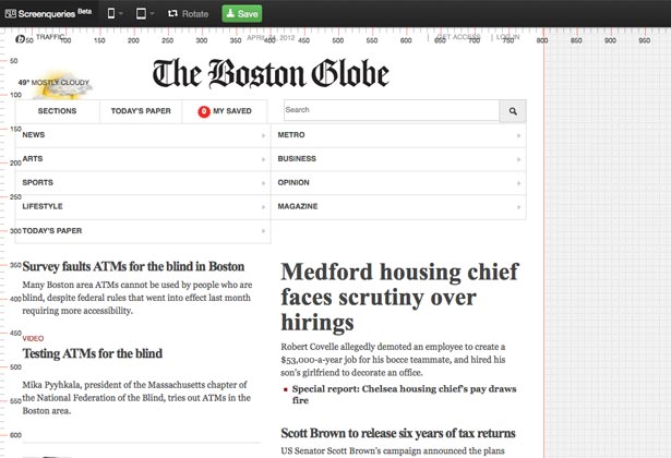
One more browser dimensions tool, but Screenqueri.es from Mandar Shirke differentiates itself by having an extensive set of mobile and tablet presets, as well as a grid and rulers that make fine measurement so much easier.
40. Aptus
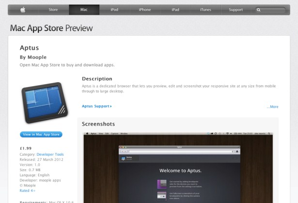
Another app for testing sites at multiple defined sizes, but Aptus is Mac-native. It’s availablility through the Mac App Store, and being native brings extra features such as easy screenshots and offline support.
41. Responsive Design Bookmarklet
Victor Coulon has made a very simple but effective bookmarklet; when you activate it on any web page it adds a toolbar which lets you switch between four common screen dimensions so you can see how your site renders at different sizes.

42. Responsive Design Test Bookmarklet
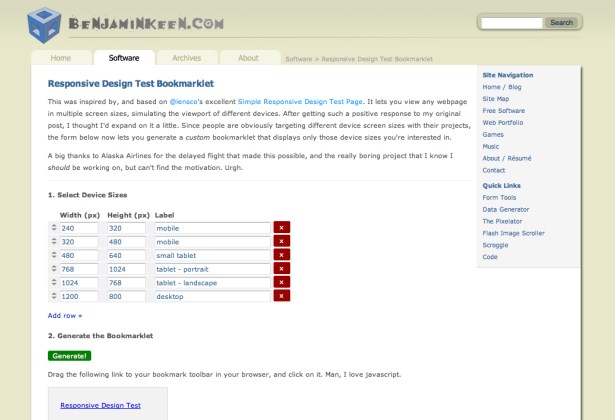
This bookmarklet by Benjamin Keen allows for more customisation by letting you define your own device sizes, and as many or few as you like. When activated it shows the site at all the selected sizes, side by side for easy comparison.
43. Screenfly
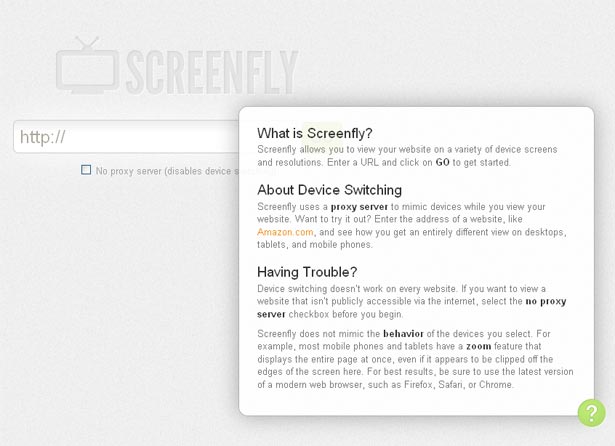
Screenfly, by QuirkTools, allows you to test a site on different resolutions on desktop, tablet, mobile and television. The desktop testing is currently limited to Safari, while the tablet and mobile have more options for devices and browsers. Television is limited to Opera.
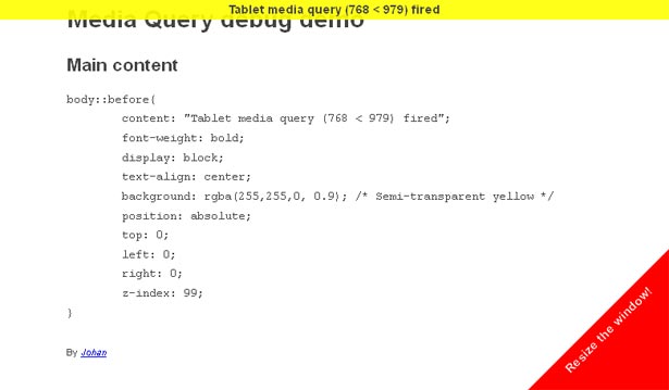
44. Media Query Indicator
Johan Brook offers a pure CSS way to test when a media query has been triggered by the browser. Media Query Indicator is another good tool for testing and playing with design breaking points.
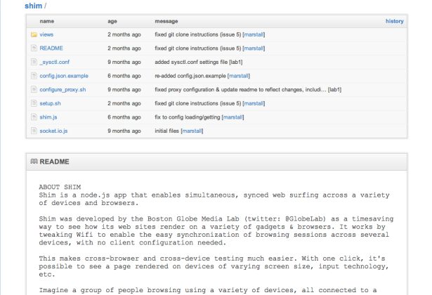
45. Shim
One of the tools used in the redesign of the Boston Globe, the poster boy of the RWD movement, Shim is a Node.js app which runs a web page across multiple devices on the same Wifi network, making cross-device testing that much easier.
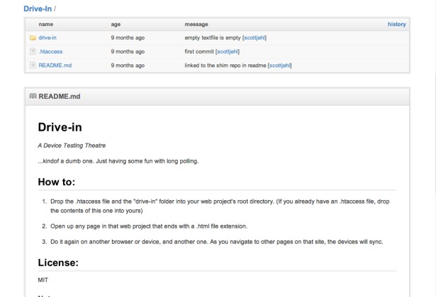
46. Drive-In
If you don’t have a Node.js server in place to run Shim, Scott Jehl has made a simpler version called Drive-In which works in fundamentally the same way, but using PHP, Apache, and an .htaccess file.
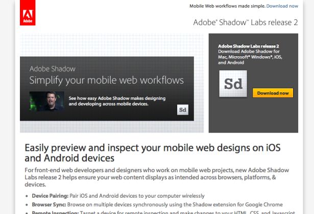
47. Adobe Shadow
Adobe continue their push into web technologies with this remote debugging tool. Install Shadow and the Chrome extension on Mac or Windows, plus the Shadow client on Android or iPhone, and you can share web pages between many different devices.
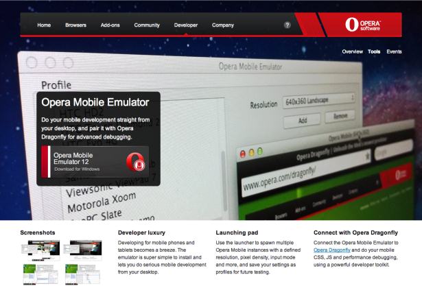
48. Opera Mobile Emulator + Remote Debug
An easier way to debug mobile pages is to install Opera and the Opera Mobile Emulator and connect the two with their Remote Debug option. Simple and fast to setup, and has the added benefit of testing on more than WebKit.
Further inspiration
Want to get an idea on how others are making their designs responsive?
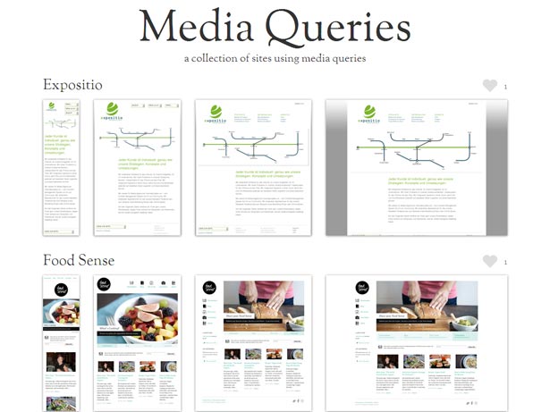
49. MediaQueri.es
If you haven't seen it already, the site Mediaqueri.es has an ever-growing number of sites that have crossed over to the responsive side.
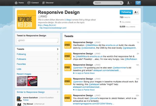
50. @RWD
Ethan Marcotte runs a Twitter account which brings the latest news, tools and showcases from the world of RWD.
Denise Jacobs adores being a speaker, author, web design trainer and creativity evangelist, while Peter Gasston is the author of The Book of CSS3 and a veteran web developer who blogs at Broken Links.
Liked this? Read these!
- Pro tips for building a mobile website
- Top CSS and JavaScript techniques
- How to build an app
- The best free web fonts for designers
- Discover what's next for Augmented Reality
- Download free textures: high resolution and ready to use now

The Creative Bloq team is made up of a group of art and design enthusiasts, and has changed and evolved since Creative Bloq began back in 2012. The current website team consists of eight full-time members of staff: Editor Georgia Coggan, Deputy Editor Rosie Hilder, Ecommerce Editor Beren Neale, Senior News Editor Daniel Piper, Editor, Digital Art and 3D Ian Dean, Tech Reviews Editor Erlingur Einarsson, Ecommerce Writer Beth Nicholls and Staff Writer Natalie Fear, as well as a roster of freelancers from around the world. The ImagineFX magazine team also pitch in, ensuring that content from leading digital art publication ImagineFX is represented on Creative Bloq.
