30 famous graphic designers that everyone should know
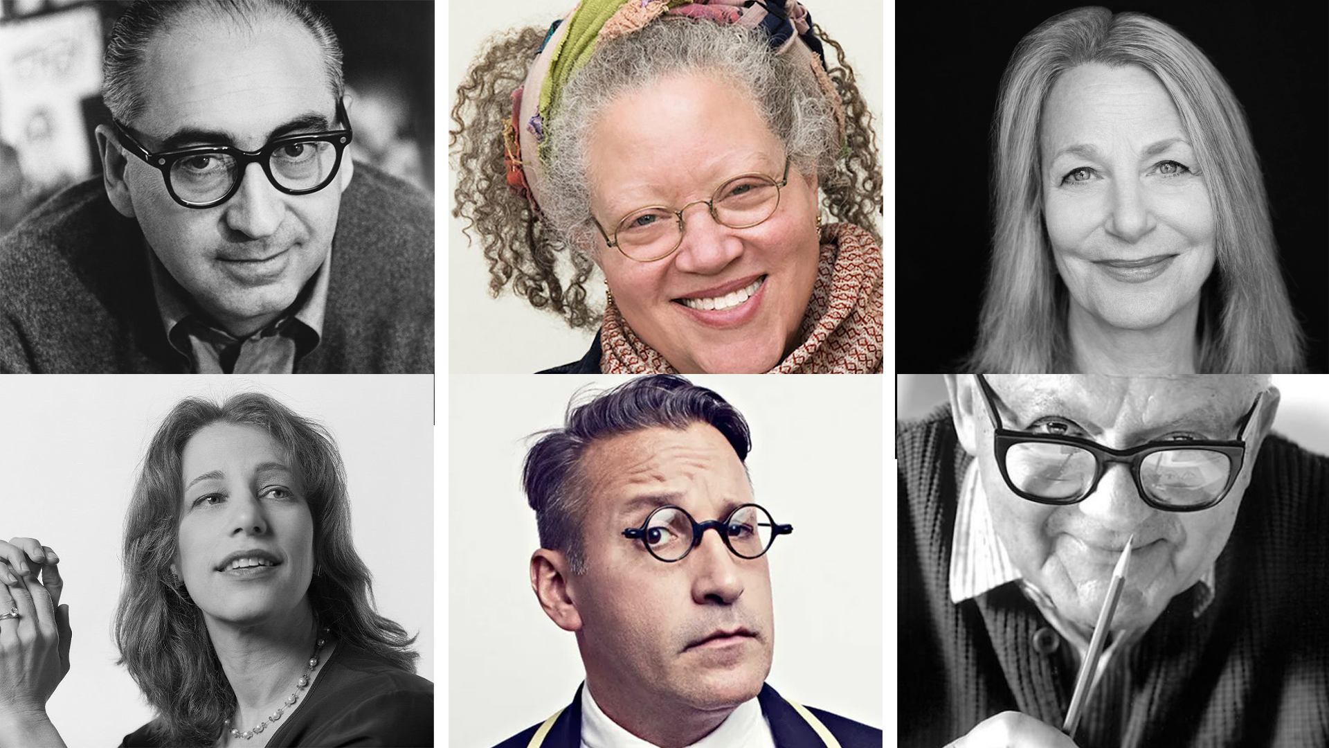
From UI to public transport, famous graphic designers influence our lives in ways we might not expect, inspiring new generations of creatives to push boundaries and break rules. From design's founding fathers to today's groundbreaking pioneers, the industry has evolved considerably since the early days, proving that graphic design innovation isn't slowing down anytime soon.
Having the best graphic design software and the best computer for graphic design can only get you so far – it's the ideas that make you a graphic design icon. To spotlight some of the most legendary designers, we've compiled a list of the most influential creatives to inspire your design career.
30 famous graphic designers that everyone should know
01. Georg Olden
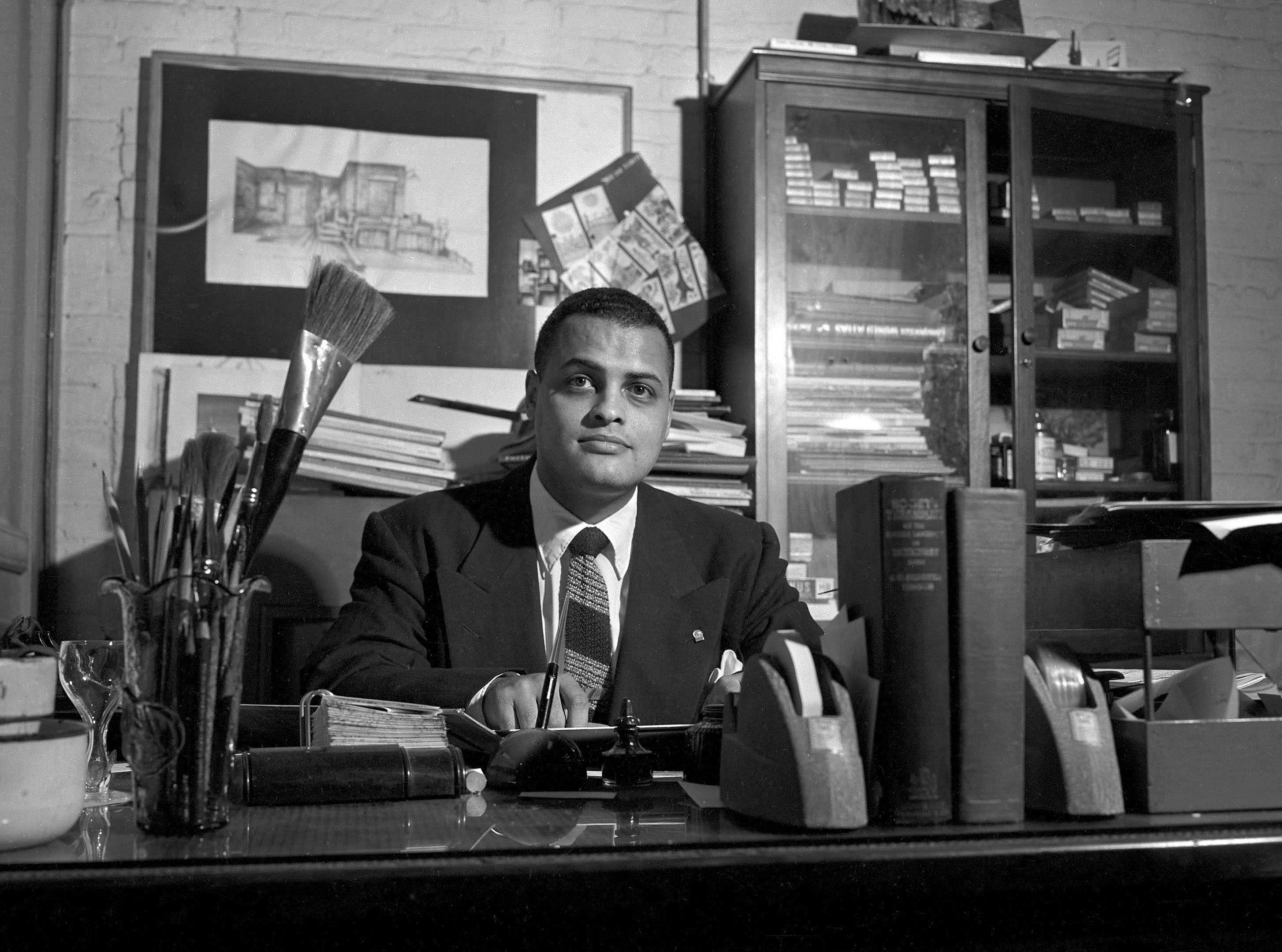
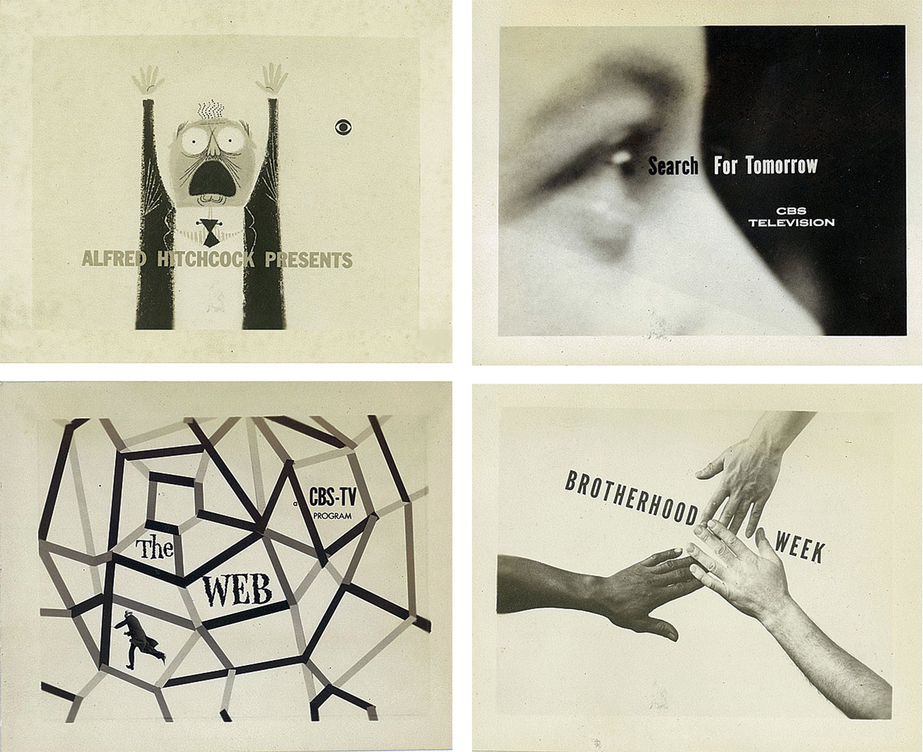
Georg Olden was a pioneer in the world of TV graphics, paving the way for African-American designers. The grandson of a slave, Olden's impressive career was propelled by his role at CBS, where he built iconic identities for titles like I Love Lucy and Lassie. Olden was also instrumental in creating the first vote-tallying scoreboard for the 1952 presidential election, showcasing both his practical and stylised design talents.
In 1963, he became the first African American to create a postage stamp – the design depicted chains breaking to celebrate the centennial anniversary of the Emancipation Proclamation. In 1962, Olden redesigned the Clio statuette, alongside winning seven Clio awards across his lifetime.
02. Paula Scher

A partner at Pentagram, Paula Scheris one of the most famous female graphic designers alive today. She's designed branding for giants ranging from Microsoft to Coca-Cola and is particularly known for her work in typography.
Scher completed a Bachelor of Fine Arts in 1970 and began her career as a layout artist for Random House's children's book division before going to on design iconic album covers for CBS and then Atlantic Records. Inspired by Russian constructivism, she started working on her own in type in the early 1980s and co-founded Koppel & Scher in 1984 before joining Pentagram in 1991.
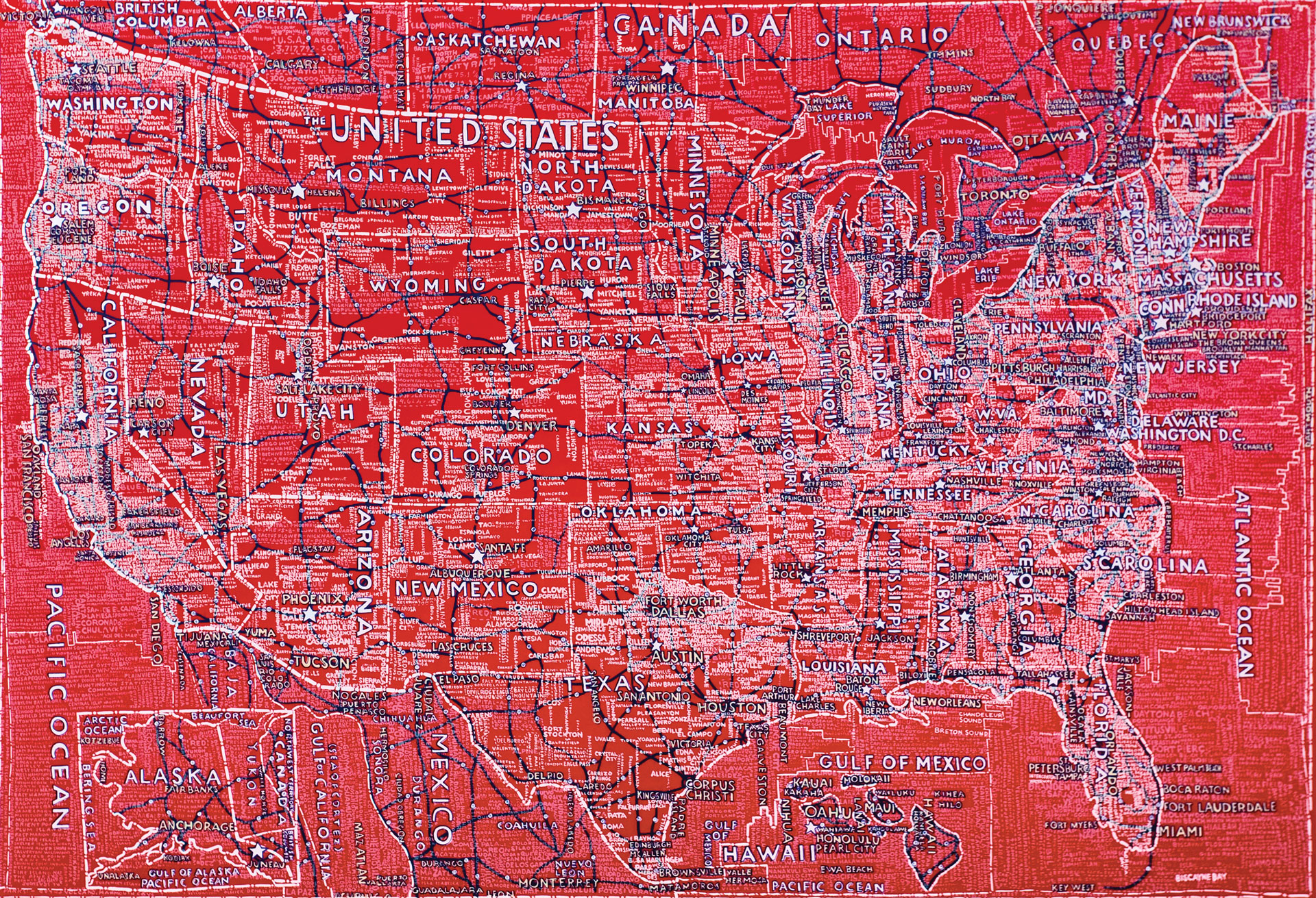
Paula's work for the likes of MOMA, New York City Ballet, Microsoft and NYC Transit sits among the finest examples of graphic design for branding and identity. Her typographic maps are also sublime, and she continues to experiment and push boundaries, including with recent (and controversial) use of AI for the US government's performance tracking website.
Daily design news, reviews, how-tos and more, as picked by the editors.
We've had the pleasure of interviewing Paula several times over the years, learning about her influences from album artwork and how she designed some of the world's most famous logos.
When we asked what advice she would give new designers, she said: "I think that the first thing is to understand that everything is designed and that sometimes the design is just bad, but everything is designed – every chair you sit on, every door you open, every light switch you turn on, every car on the street, everything that you look at all the time is designed and the world is full of it. What design is is a series of choices based on a few aesthetic principles and some understanding of the world and the subject matter that you're trying to express."
03. Chip Kidd
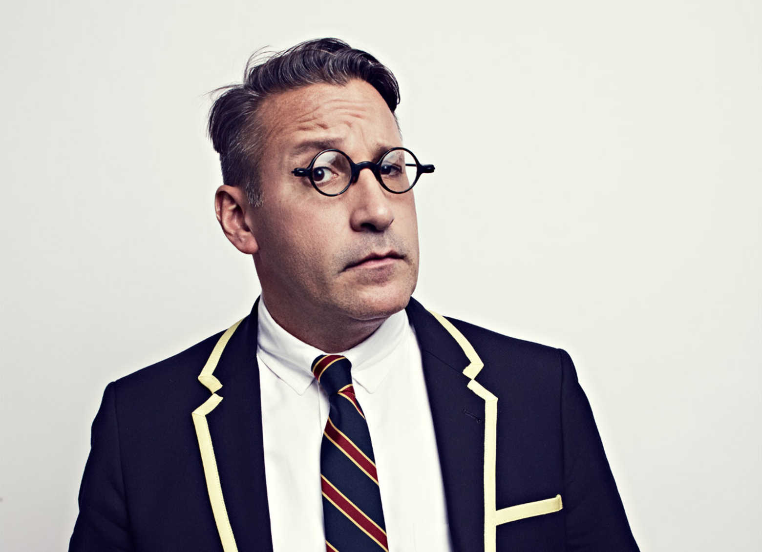
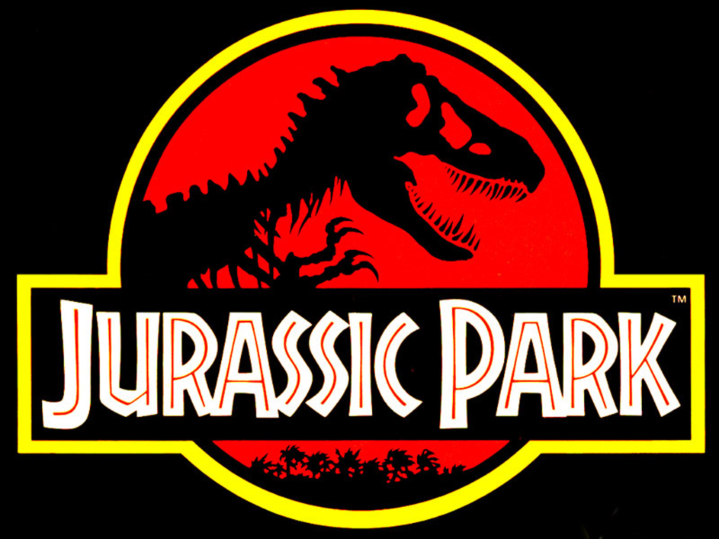
Based in New York City, Chip Kidd is best known for his stunning book jackets – most notably for seminal publishing house Alfred A. Knopf. Chip has designed covers for writers such James Elroy, Michael Crichton and Neil Gaiman and was responsible for the the iconic Jurassic Park logo, which he originally designed for the cover of Crichton's novel.
In his 2005 monograph, Chip explained the thinking behind his design: "When trying to recreate one of these creatures, all anyone has to go on is bones, right? So that was the starting point. Not only was the drawing integrated into the movie poster, it became the logo in the film for the park itself. I think it's safe to say that the Jurassic Park T-Rex became one of the most recognisable logos of the 1990s.”
You can listen to Chip's hugely entertaining TED talk here. Oh, and if you want to see what you could learn from Chip's portfolio, check out our roundup of famous designers' online portfolios.
04. Rob Janoff

Why do you need to know about Rob Janoff? Simple: he designed the Apple logo. Rob masterminded possibly the most famous mark in the world today while at ad agency Regis McKenna back in 1977. And although it’s been tweaked, the basic form has remained the same ever since – a testament to its simplicity and longevity (and it was created in only two weeks).
Back in 2013, Rob told us that the idea of an apple with a bite taken out of it was “really a no-brainer”. He continued: “If you have a computer named after a piece of fruit, maybe the image should look like the fruit? So I sat for a couple of weeks and drew silhouettes of apples.
“Bite is also a computer term. Wow, that was a happy accident. At that point I thought ‘this is going to have a wink and a nod with it, and give it personality’.”

And the long-gone coloured stripes? “The big deal about the Apple II was that it was the only computer that reproduced colour images on the monitor, and it was the only computer that you could plug into your home colour TV.
"Also, a lot of it had to do with the aesthetic origins of both Steve [Jobs] and I, which was a kind of hippy aesthetic and The Beatles and Yellow Submarine.”
05. Susan Kare

Another figure from the Apple Hall of Fame, Susan Kare is the designer responsible for the original icons and interface elements on macOS. While Jony Ive is now responsible for all the icons you see on your Mac and iOS devices, we would never have got to this point without Susan's graphic design flair.
A creative director at Apple in the 1980s, Susan paved the way for what we see on our desktops every single day: the trash can, the happy/sad Mac, the Command key icon.

In our interview with Susan back in 2013, she reflected on her time at Apple: “I really enjoyed working with Steve Jobs, both at Apple and then later at NeXT [the company founded in 1985 by Steve Jobs after he'd been forced out of Apple]. He cared so much about every detail, was interested in design and graphics, and challenged you to do your best work."
She's still innovating now, with her portfolio boasting icons for Facebook, Microsoft, Wired and more. Susan also worked on the Geneva typeface, as we revealed in our post 5 fonts created by famous designers and why they work.
06. Aries Moross
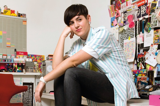
Aries Moross (previously known as Kate Moross) is creative director of Studio Moross. They are an art director and designer from London who came onto the scene in 2008 with their trademark typography and energetic, fluid drawing style.
Aries has since become one of the UK’s most sought-after and successful designers, creating a myriad of album covers, magazine covers, branding and video. Aries even created live visuals for One Direction and for the Spice Girl's 2019 tour.
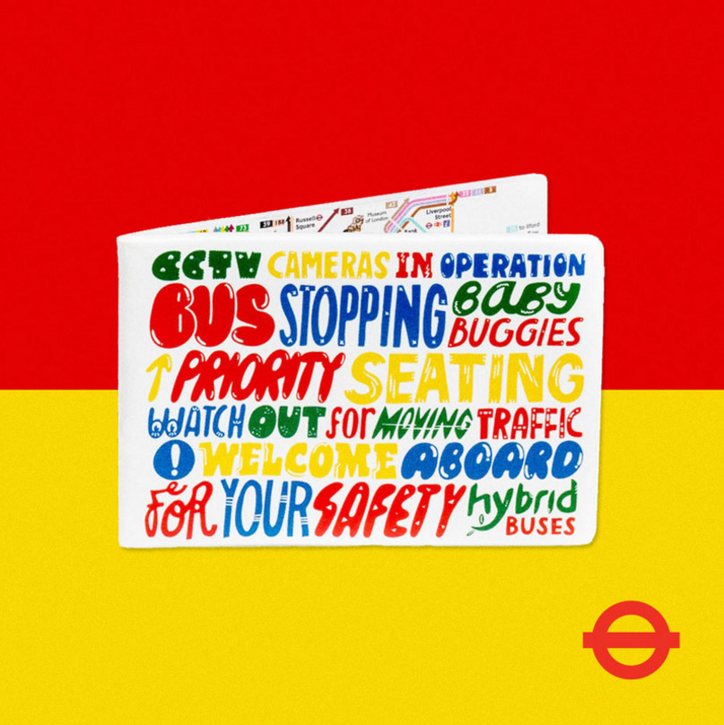
"I don’t think about things in terms of influence. I’m not at school any more," Aries told Creative Bloq in an interview in 2011. "I don’t look at a painting by van Gogh and go off and do a van Gogh drawing in my sketchbook. I don’t read magazines, I don’t go to art galleries, I don’t engage with the culture in a traditional way that perhaps a lot of people do.
"I think I get most of my ideas from everyday life – going to the shop or interacting with the bus driver or seeing something by accident. I’m not one for organised culture or anything like that, so I do try to let things happen naturally. I definitely think your influences are to do with your character, your life, your mood and general culture like TV and film that you can’t really escape."
07. Saul Bass
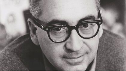
It sounds like hyperbole, but Saul was probably the most famous graphic designer of the 20th century. His work covered poster design, film titles, logos and more – with perhaps his most iconic works being his opening sequences for Hitchcock. In fact, his opening credit work spanned five decades – right up to his death in 1996. Some of his last work was for Martin Scorcese on Goodfellas and Casino.
In a 2011 article for the Telegraph, Scorsese reflected on Saul's genius: "When we were growing up and seeing movies, we came to recognise Saul’s designs, and I remember the excitement they generated within us. They made the picture instantly special. And they didn’t stand apart from the movie, they drew you into it, instantly. Because, putting it very simply, Saul was a great film-maker. He would look at the film in question, and he would understand the rhythm, the structure, the mood – he would penetrate the heart of the movie and find its secret.”
Saul was also prolific as a logo designer, creating the marks for AT&T, Kleenex, United Airlines, Minolta and many, many more.
08. Jessica Walsh
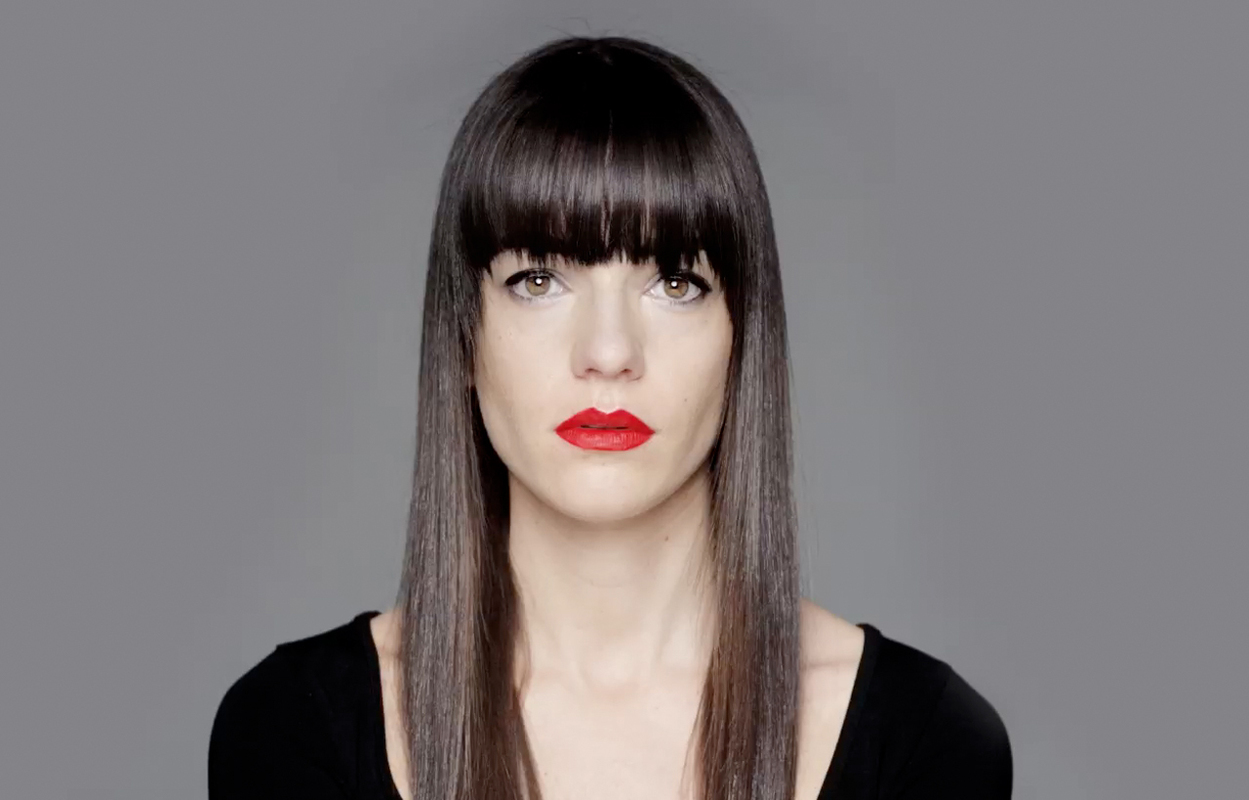
And that brings us to... Jessica Walsh, currently one of the most famous female graphic designers. In 2010, she was working at Print magazine where she reached out to Stefan Sagmeister for advice. He spent five minutes flipping through her book and offered her a position at Sagmeister Inc on the spot. "I quit my job the next morning," she grinned when she related the story in our interview with her and Sagmeister.
Sagmeister confirms the attraction: "I immediately loved her sunny character and no-nonsense approach to work." Jessica brought a fresh output to the already iconic design company, and in 2012 she was made a partner. In July 2019, Jessica left that partnership to form her own studio, &Walsh, which she heads up to this day.
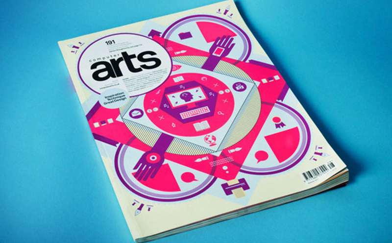
Another partnership, this time with photographer Timothy Goodman, also hit headlines. The duo's 40 days of dating project documented their quest for love through illustration and design from some of the world’s leading designers. They replicated that success with a new project, 12 Kinds Of Kindness, in 2016.
In the same year, Jessica set up the nonprofit organisation Ladies, Wine and Design , which encourages women to collaborate and empower each other within the design industry. Her most recent project was the launch of Type of Feeling in 2024. The unique font foundry focuses on the emotional power of typography, with typefaces that have names like Sonder and Joy.
09. Michael Bierut

There aren’t many design agencies that are more respected than Pentagram. Designer and educator Michael Bierut has been a partner for 27 years now and has won hundreds of design awards (he’s also got permanent work in MoMA).
Before Pentagram, Michael worked for 10 years at Vignelli Associates. since then his work has included identity and branding for Benetton, the New York Jets, Walt Disney, design work on Billboard magazine and Hilary Clinton's 2016 campaign logo. This is of course, just a small slice of his portfolio. He also served as a senior critic in graphic design at the Yale School of Art. Check out his Monograph – How To – published in 2015 and his collection of essays, Now You See It, published in 2017.
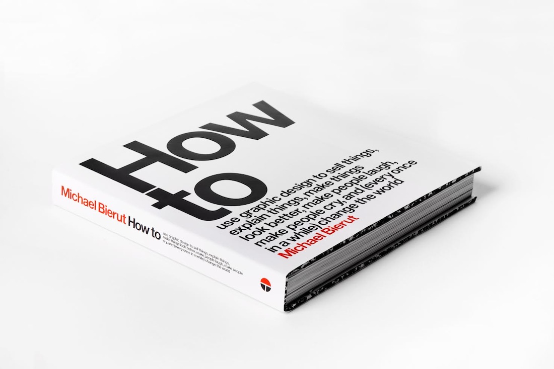
In 2013, we caught up with his to find out what he looks for in new talent: “The best are people who are bright and articulate, and have great work in their portfolio. I could sit with them all day,” he says. "The second best have great work but can’t talk about it intelligently. That takes work, but still it’s worth the effort.
"I like people who, in talking about their work, scratch below the surface. Don’t talk about typefaces and Photoshop effects; talk about the subject matter, and how that interested and inspired you."
10. Carolyn Davidson
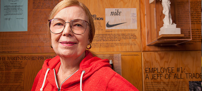
Some famous graphic designers have created icons that become known the world over, and few sports logos are as well-known internationally as Nike’s iconic swoosh. It’s often the simplest ideas that are the best, and the Nike mark (which we rate as one of the best logos of all time, proves it.
Graphic designer Carolyn Davidson designed the logo as a student at Portland State University in 1971 – and was paid $35 for it by Nike founder Philip Knight (Philip met Carolyn in an accounting class he was teaching).
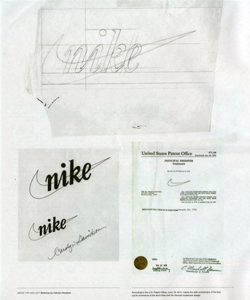
The tick-like logo was seen as a symbol of positivity, but it was intended to represent the outline of the wing of the Greek goddess of victory, who the brand was named after. In 2011, Carolyn told OreganLive.com that “it was a challenge to come up with a logo that conveyed motion” and that Philip Knight was very impressed with the stripes of rival company Adidas – it was increasingly hard to come up with something original.
As Nike grew in the 1980s, Philip Knight gave Carolyn an undisclosed amount of Nike stock, making up for that tiny fee she received for the logo design.
11. Jonathan Barnbrook

Jonathan Barnbrook came to many people's attention as David Bowie’s go-to designer, but Johnathan's work is far deeper than Heathen, The Next Day and Blackstar. Before Bowie, he was perhaps best known for his influential type design – Exocet becoming the most pirated font on the web shortly after release in 1991 (it was also used in the FPS video game Diablo).
Johnathan's VirusFonts foundry continued to thrive throughout the next couple of decades, with Bastard and Tourette being good examples of his still contemporary, but controversial, typefaces.

In an interview with us in 2012, Johnathan said: “Tourette is based on an early 19th-century slab serif form. Having Tourette’s means that people move outside an agreed code of language... That’s what I was trying to say in Tourette. There are swear words that are banned, but it’s necessary that they appear in language as well, because we can’t calibrate it otherwise. And I do like swearing.”
12. Gail Anderson
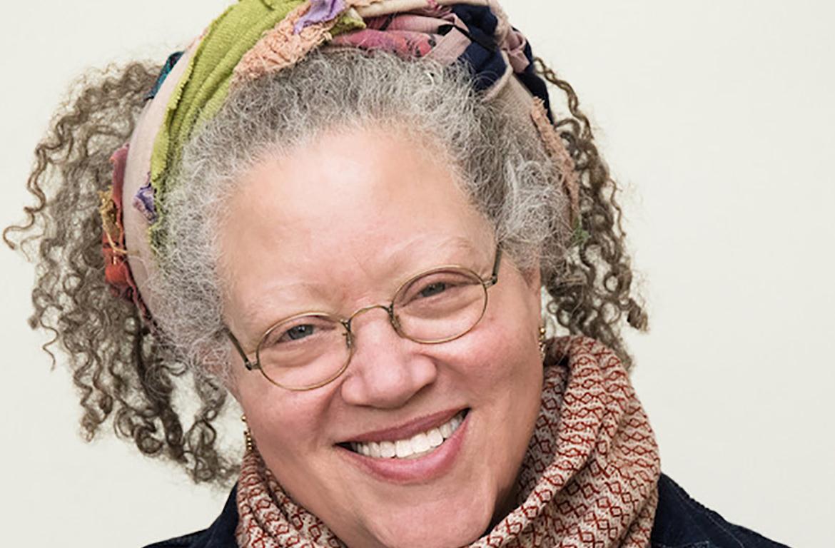
Gail Anderson is an American graphic designer, writer, and educator best known for her hand lettering, typography and poster design. Her work often carries a political power, spanning multiple genres from theatre posters to book jackets. From 1987 to early 2002, Anderson worked at Rolling Stone as a designer before advancing to become deputy art director, and eventually, the magazine's senior art director.
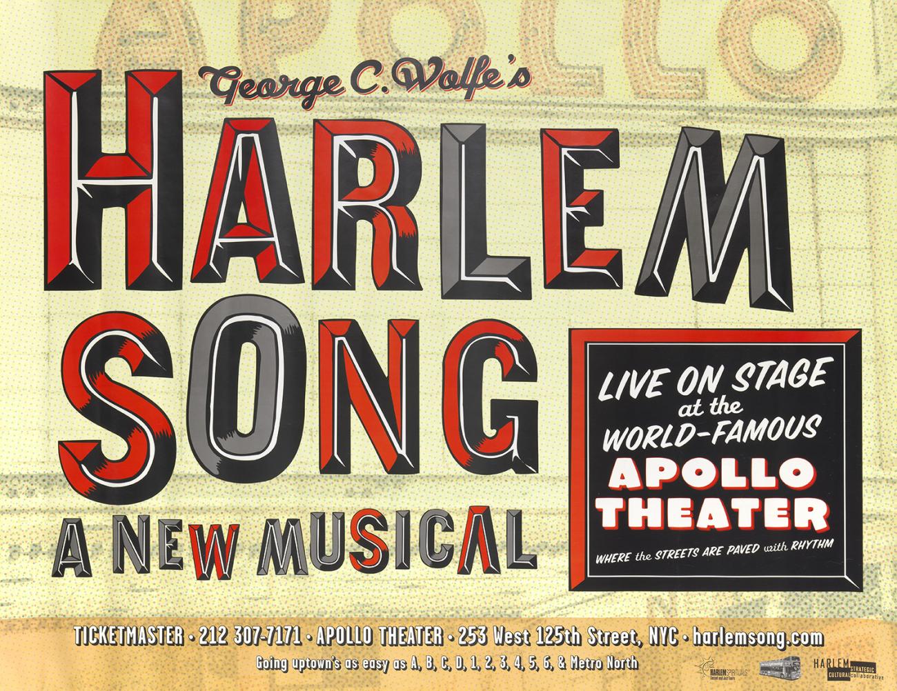
Anderson’s work has received major design awards from the Society of Publication Designers, the Type Directors Club, the American Institute of Graphic Arts, the Art Directors Club, Graphis, Communication Arts, and Print.
From 2002 to 2010, Anderson served as Creative Director of Design at SpotCo, creating artwork for Broadway and institutional theatre. Today, she is an educator at the School of Visual Arts in New York City and director of design and digital media at SVA's Visual Arts Press.
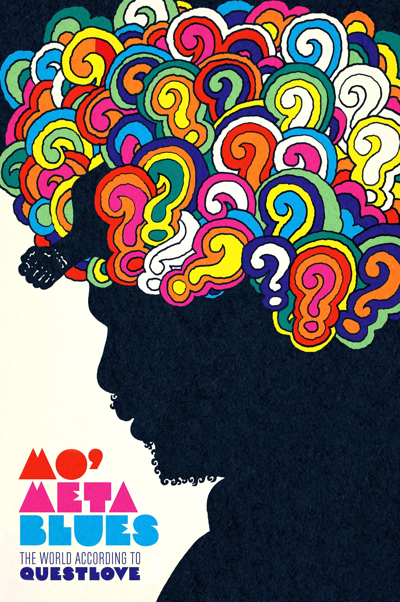
13. George Lois
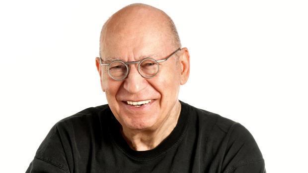
When it comes to magazine design, George Lois was perhaps the original maverick. From 1962 to 1972 he enjoyed an incredible 10 years at US Esquire magazine, designing some of the most iconic, and perhaps controversial, covers in history – including April 1968’s Muhammed Ali cover. He aimed to present big ideas in a simple but surprising and memorable way.
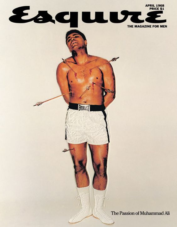
As well as a successful magazine designer, George was also a big figure in the world of advertising, working for a raft of huge clients including MTV, VH1, ESPN and Tommy Hilfiger.
14. Morag Myerscough

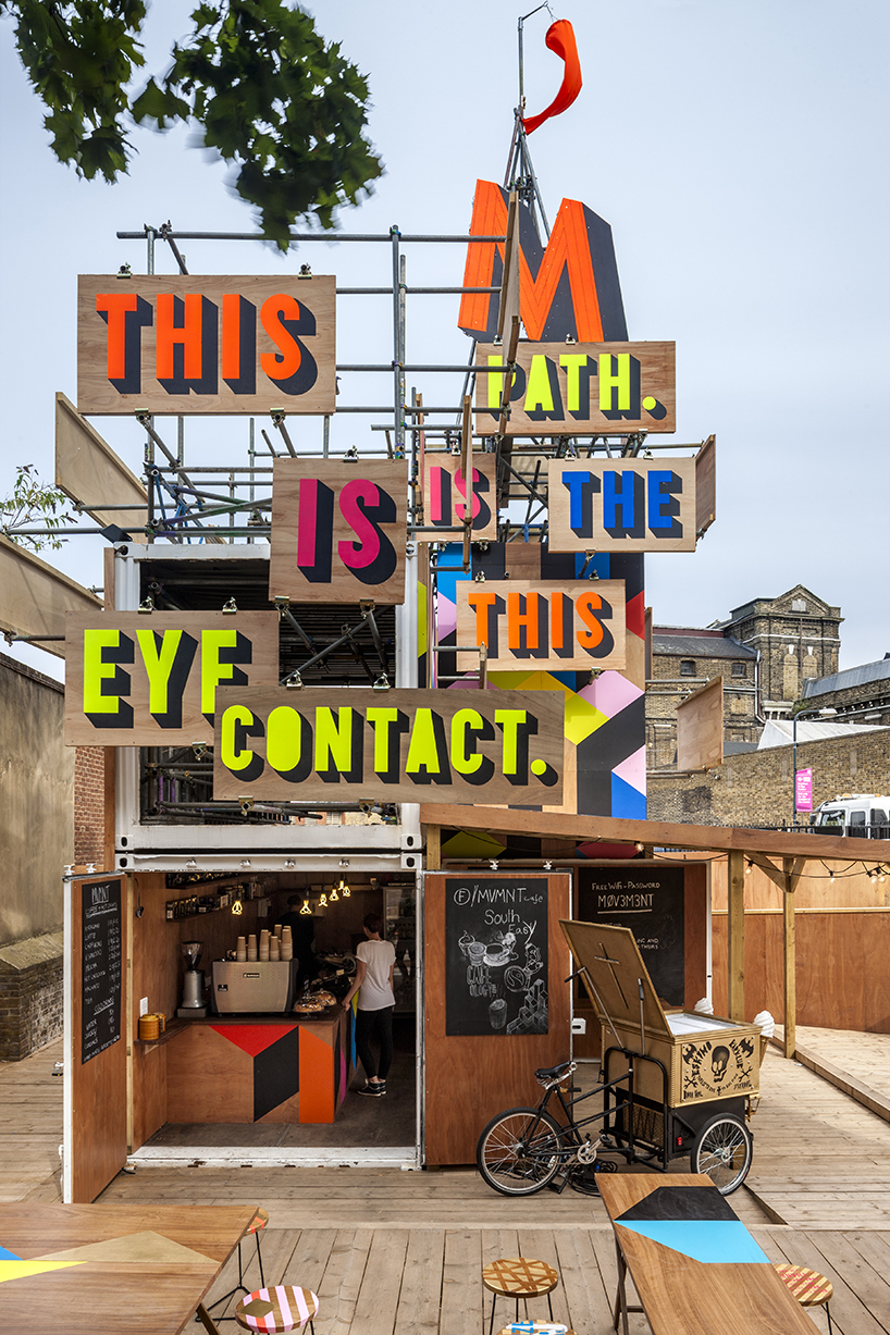
Morag Myerscough may be best known today for her installations and immersive spatial public artworks, but she is also a graphic designer, and has designed wayfinding graphics that bring spaces to life with her trademark bright colours.
Her clients – through her studio, Studio Myerscough – have included London's Barbican, Royal London Hospital and the Stockholm Kulturfestival.
15. Marian Bantjes

Marian Bantjes is a Canadian designer, artist and letterer who describes her work as graphic art. Her unique approach to typography, weaving it between often ornamental graphics, has built her a reputation as one of contemporary design’s most creative letterers, aiming to challenge the way type is seen.
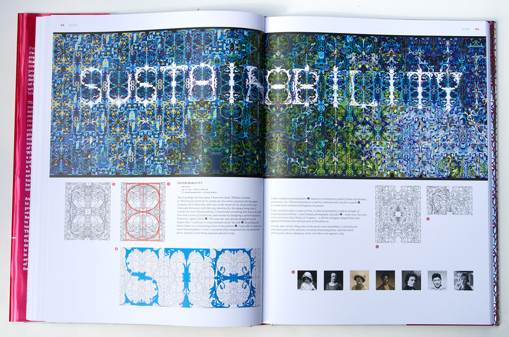
With a particular fascination for graffiti, Marian has played with levels of legibility and how a text can be recognisable and readable to those who know how to read it, but not everybody else. In 2010, she released the beautiful monograph I wonder an in 2013, she released Pretty Pictures.
16. Lindon Leader

Leader by name, leader by nature. Lindon Leader is responsible for one of the cleverest logos out there for its use of negative space: he worked on the FedEx logo when he was senior design director at Landor Associates in 1994.
Lindon told us in an interview in 2013, that Landor did around 200 designs for the logo before settling on a shortlist of 10 to show FedEx's brand manager.

“I cannot tell you how many times I fight with a client who says ‘I’m paying an enormous amount of money to pay for an ad in a magazine and you’re telling me you want 60 per cent of it to be empty space?’” he told us.
“On the one hand I can understand where they’re coming from, but basically the average client does not have a sophisticated enough appreciation of white space to understand that it can be a strategic marketing tool.”
As well as FedEx, Lindon worked on many high-profile branding projects while at Landor – he cites his favourites as Hawaiian Airlines, Cigna Insurance and Banco Baresco.
17. Max Miedinger
Max Miedinger was the man behind the now-omnipresent typeface Neue Haas Grotesk, which was renamed as Helvetica in 1957. As neutral as it is legible, the typeface has become one of the most-used in the world, and it's widely used in logo design, from the American Airlines logo to BMW to, well, hundreds of big brands.
Max learnt his trade in the 1930s, and after the Second World War he worked at Haas Type Foundry in Switzerland. The story behind Helvetica is that the foundry needed a typeface to rival Akzidenz-Grotesk by H Berthold. It took Max months to draft the new typeface before presenting it to the company’s director Eduard Hoffmann.
Neue Haas Grotesk was soon changed to Helvitia (to denote the typeface’s Swiss origins) before another tweak made it Helvetica. It remains a top choice for designers wanting a clean, legible typeface that’s an expression of modernist perfection (also see our list of alternatives to Helvetica).
18. Paul Rand
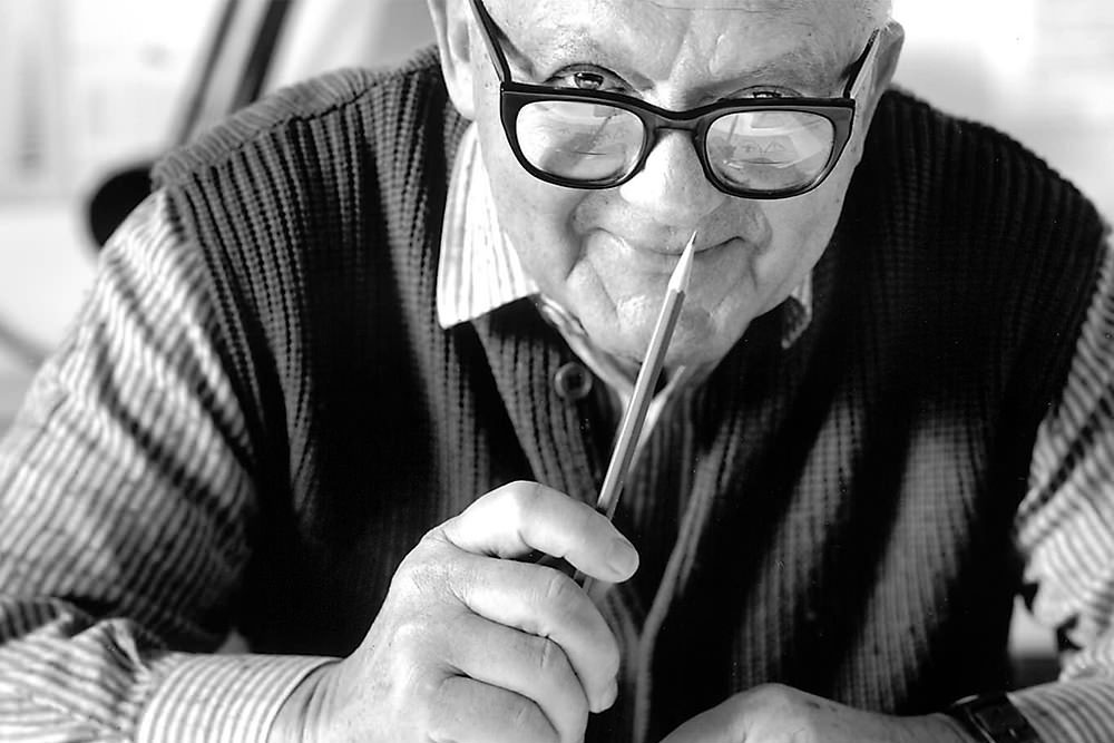
Born in 1914, Paul Rand was an American art director and graphic designer. He was best known for his logo work, including that for one of America’s biggest companies, IBM. Paul's first IBM logo was revealed in 1956 as part of the company’s new focus on the importance of design. Using a big, slab serif face, its statement was bold and confident.
In 1972, Rand refined the logo, breaking it into eight horizontal stripes (reminiscent of the scan lines on the cathode ray tube monitors of the day) and introducing the distinctive IBM blue.

Interesting fact: Paul was actually born Paul Rosenbaum but when he established himself as a designer he shortened his name to Paul Rand – four letters for name and surname. And his name became a symbol in its own right as he became one of the most famous graphic designers of his age.
Paul also designed the logo for Steve Jobs’ post-Apple venture, NeXT. Jobs said: “I asked him if he would come up with a few options, and he said, ‘No, I will solve your problem for you and you will pay me. You don’t have to use the solution. If you want options go talk to other people.'” Paul passed away in 1996.
19. Sindiso Nyoni
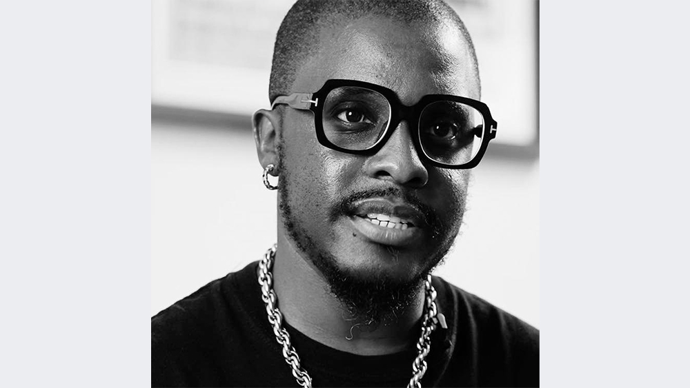
Born in Zimbabwe, Sindiso Nyoni is a self-developed graphic designer who forged his career under the name R!OT while working in advertising in South Africa. While he's known as a graphic designer, he's also an illustrator, activist, street-artist. His posters have been displayed at various international exhibitions and his projects have won Cannes Lion awards. But as well as working for major brands, he tackles contemporary social issues in subversive street-influenced visual art.
20. April Grieman
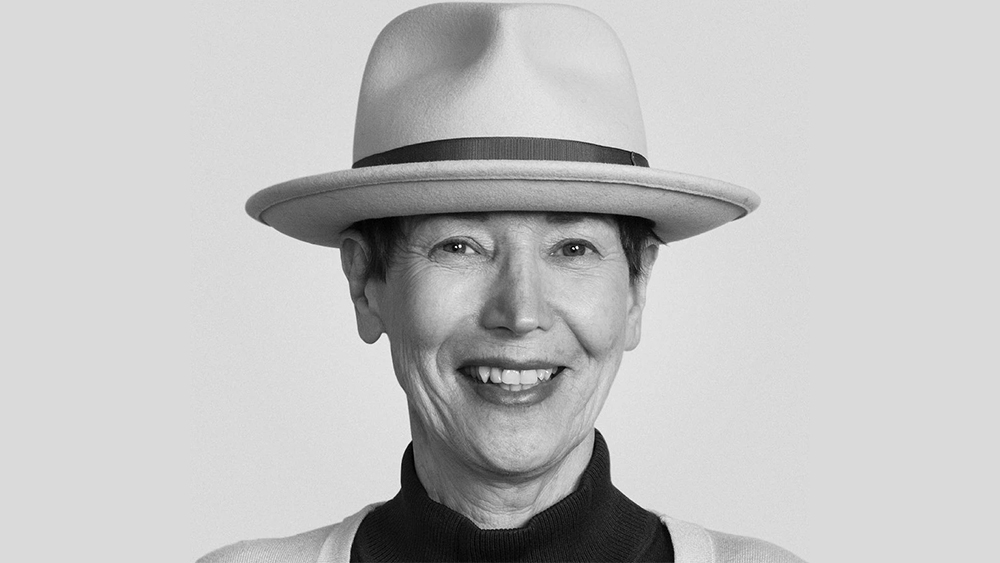
April Greiman was one of the most famous female graphic designers of the 20th century and is well-known for pioneering the use of computers as a design tool as well as for the technique of typelayering.
One of the first to use tools like the Quantel Paintbox and early computers for graphic design, she made an impact with her 'Does It Make Sense?' project for Design Quarterly in 1986, which pushed the boundaries with its exploration of layered digital imagery and typography made entirely with MacDraw.
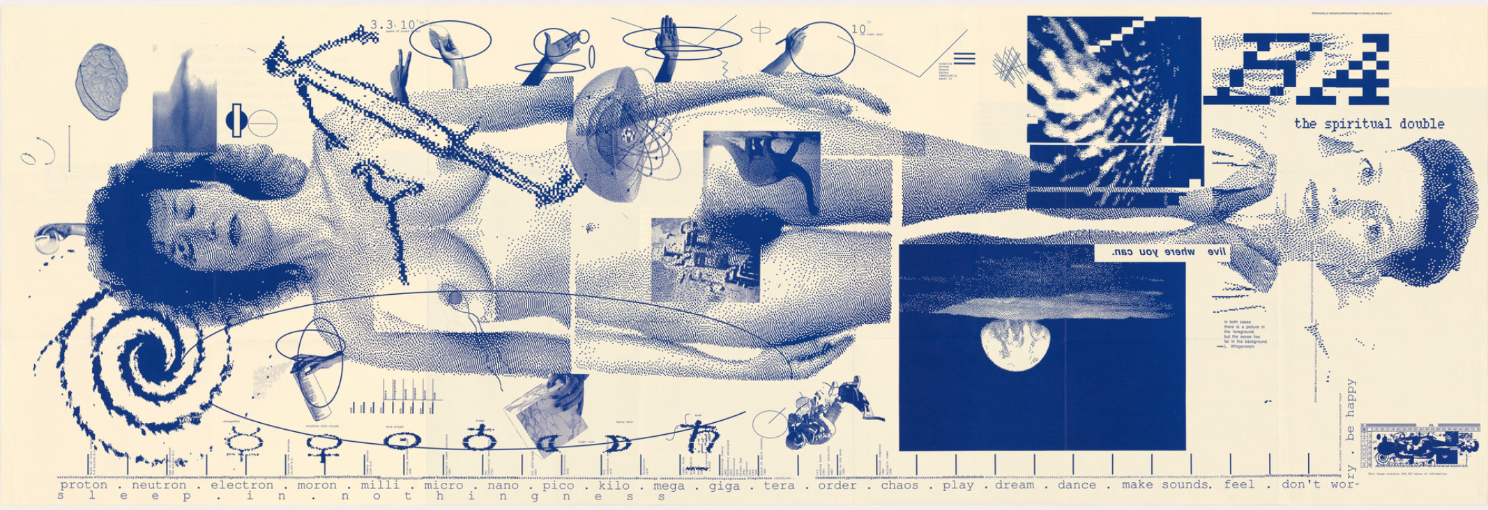
April studied typography in Basel, learning the style of classic Swiss modernism before opening a design studio in Los Angeles and became an important figure in the California New Wave.
She would later she preferred to consider herself a transmedia artist rather than a graphic designer, finding the latter term too limiting – after being appointed director of the design department at the California Institute of the Arts, she succeeded in changing the department's name to Visual Communications in 1984. In 2005, Greiman founded the Los Angeles-based design consultancy Made In Space.
21. Alan Fletcher
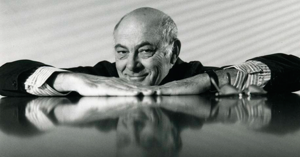
One of the founding partners of Pentagram, Alan Fletcher was one of the most famous graphic designers of his generation (and any generation). His work spans decades, but he was most recognised for his Pentagram years, when he was at his most prolific.
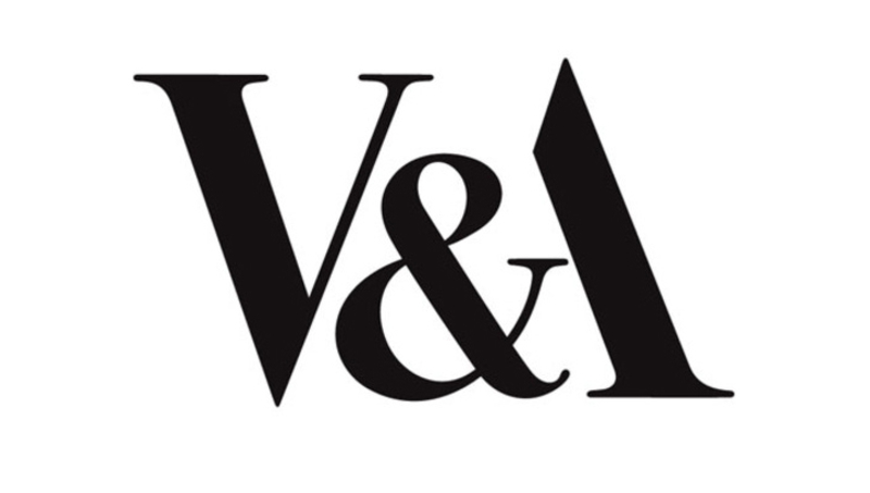
Alan's logo for London's V&A museum is a testament to the timeless appeal of his work. Designed in 1989, it's still going strong more than 30 years later. The relatively fragile Bodoni-style serifs work brilliantly with negative space to create a high-contrast, confident logotype.
Alan passed away in 2006. The Alan Fletcher archive offers a journey through his career.
22. Rodrigo Corral
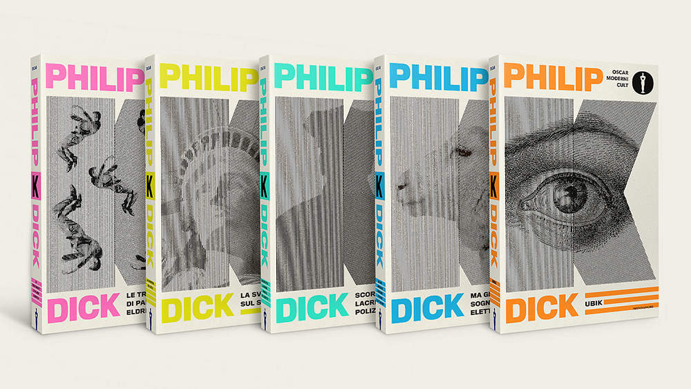
Chances are that even if you don't know the name, you'll have seen some of Rodrigo Corral’s book covers. He's designed the covers for huge bestsellers, including John Green’s The Fault in our Stars, JAY Z’s Decoded and series of titles by Chuck Palahniuk and Philip K Dick as well as for The Met, Criterion Collection, Amazon Prime and The New York Times.
Based in New York, he's a prolific designer, working as creative director at Farrar, Straus & Giruoux as well as running his own studio. He lectures at his alma mater the School of Visual Arts and other colleges.
23. Milton Glaser
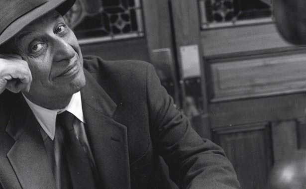
Milton Glaser was another of the most famous graphic designers of all time. His most celebrated work is undoubtedly the logo he designed for New York to promote tourism in the city in 1977. Much used, adapted and adored, the I ❤ NY logo is set in American Typewriter, a rounded slab serif.
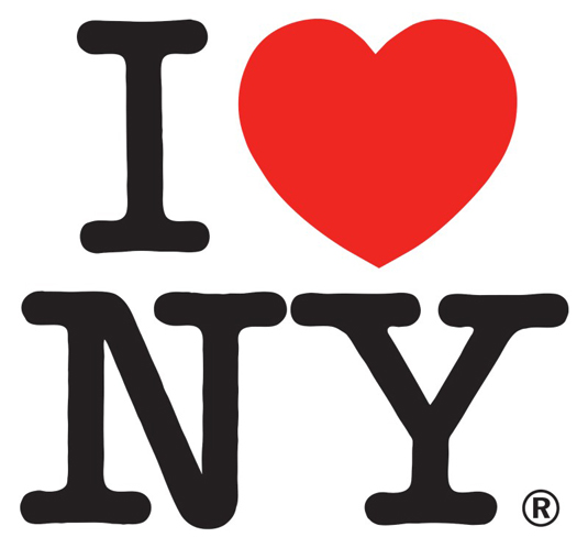
But Milton, who died in 2020, was much more than one logo. His work for Bob Dylan, DC Comics and The Brooklyn Brewery are just some of the logo masterpieces that cement him as one of the most prominent designers in history.
"The most important thing in design, it seems to me, is the consequence of your action, and whether you're interested, fundamentally, in persuading people to do things that are in their interests," he told us in an interview in 2009).
24. Hermann Zapf
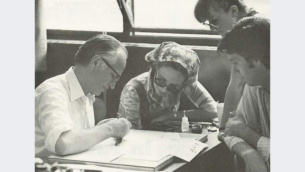
Hermann Zapf was a German typeface designer who was married to calligrapher and typeface designer Gudrun Zapf von Hesse. Prolific and versatile, he created around 200 typefaces in numerous alphabets and changed typography in many ways. He pioneered the move from printing press designs to computerised typography and was the man responsible for Zapf Dingbats, Palatino and Optima.
25. Ikko Tanaka
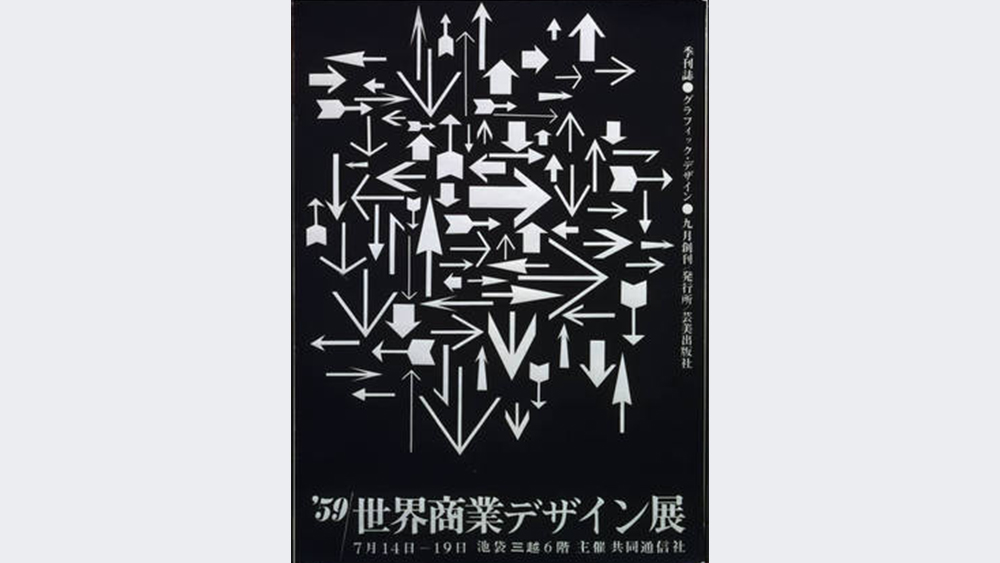
The Japanese graphic designer Ikko Tanaka had a style all of his own that blended Japanese tradition with Modernist principles. The designer, who died in 2022, worked with a vast array of brands, including Mazda, Issey Miyakea and Hanae Mori and created posters for many expos and for Japanese cultural institutions and events. He designed signage and medals for the Tokyo summer Olympics of 1964 and the Sapporo winter Olympics of 1972. He also served as the first creative director for Japan's Muji retail brand, helping it develop it signature minimalist style.
26. Archie Boston
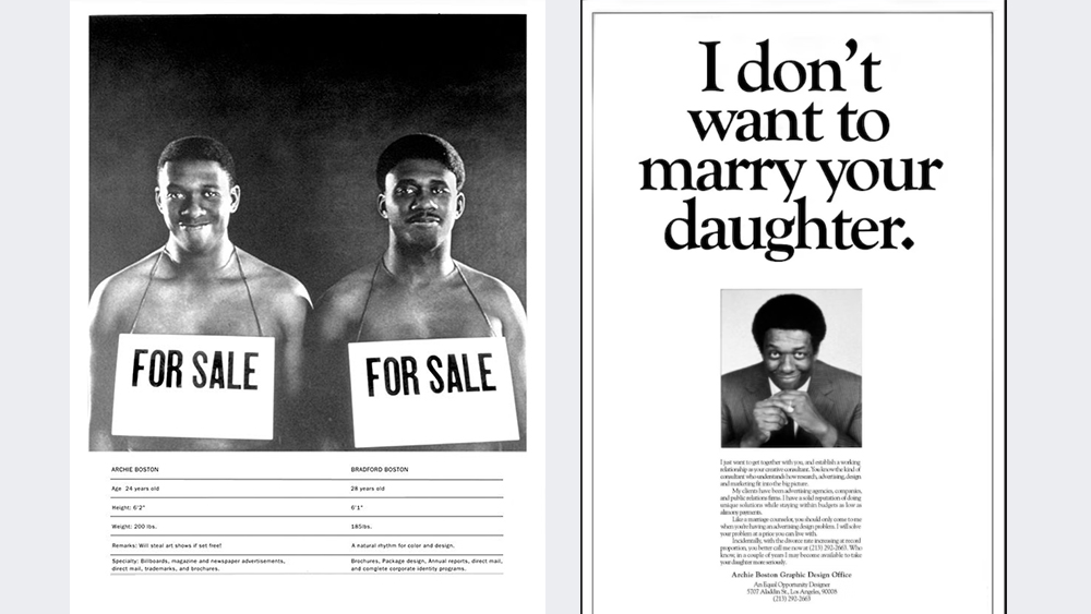
After training at the Chouinard Art Institute (today CalArts), Archie Boston became a bold graphic designer in LA, confronting racism with courageous, fearless work that went on to influence the sector. Some of his boldest pieces were his promotional posters for Boston & Boston, which he ran with his brother, Bradford.
These included a promotional poster with the headline: “I don’t want to marry your daughter,” focusing on establishing business relationships as a poster showing a black man in Ku Klux Klan garb. He's also remembered for his packaging design for Pentel Pens. He was president of the Art Directors Club of Los Angeles for two terms and was the first African American to win the AIGA Fellows Award.
27. Vaughan Oliver
The British graphic designer Vaughan Oliver has been an inspiration for many contemporary designers, most famously through his work for the indie record label 4AD in the 1980s and 1990s.
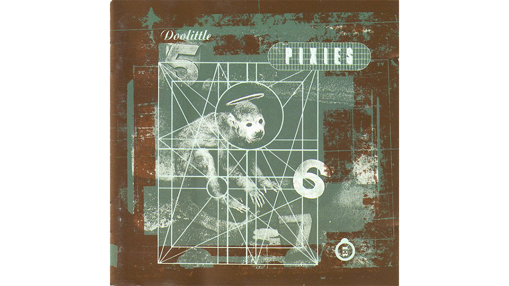
Inspired by Roger Dean, who painted album covers for the likes of Yes, Vaughan studied graphic design at Newcastle upon Tyne Polytechnic. With his studios 23 Envelope and then v23, Oliver created distinctive jackets for bands as diverse as Pixies and The Breeders, Throwing Muses Cocteau Twins and Lush, giving 4AD a unique surreal aesthetic that crossed genres. Many designers credit Oliver's work with having inspired them to explore and experiment.
While most of Vaughan's work was with 4AD, he did sometimes work for other artists, and non-music clients. He even designed a record cover for Sunderland Football Club, the team he supported. He died in 2019.
28. Michael C Place

Michael C Place also studied graphic design in Newcastle – at Newcastle College. College but left in 1990 without graduating to, like Oliver, design record sleeves. After gaining experience at various studios in London, he made his name The Designers Republic, the makers of the video game Wipeout.
He later launched his own acclaimed agency Studio.Build with his wife Nicky. He's since worked with brands as big as Nike and Google and has judged the D&AD global awards. In an interview with Place that we published back in 2010 he told us about his youth, his time at Designer's Republic and the founding principles of Studio.Build.
29. Zuzana Licko and Rudy VanderLans
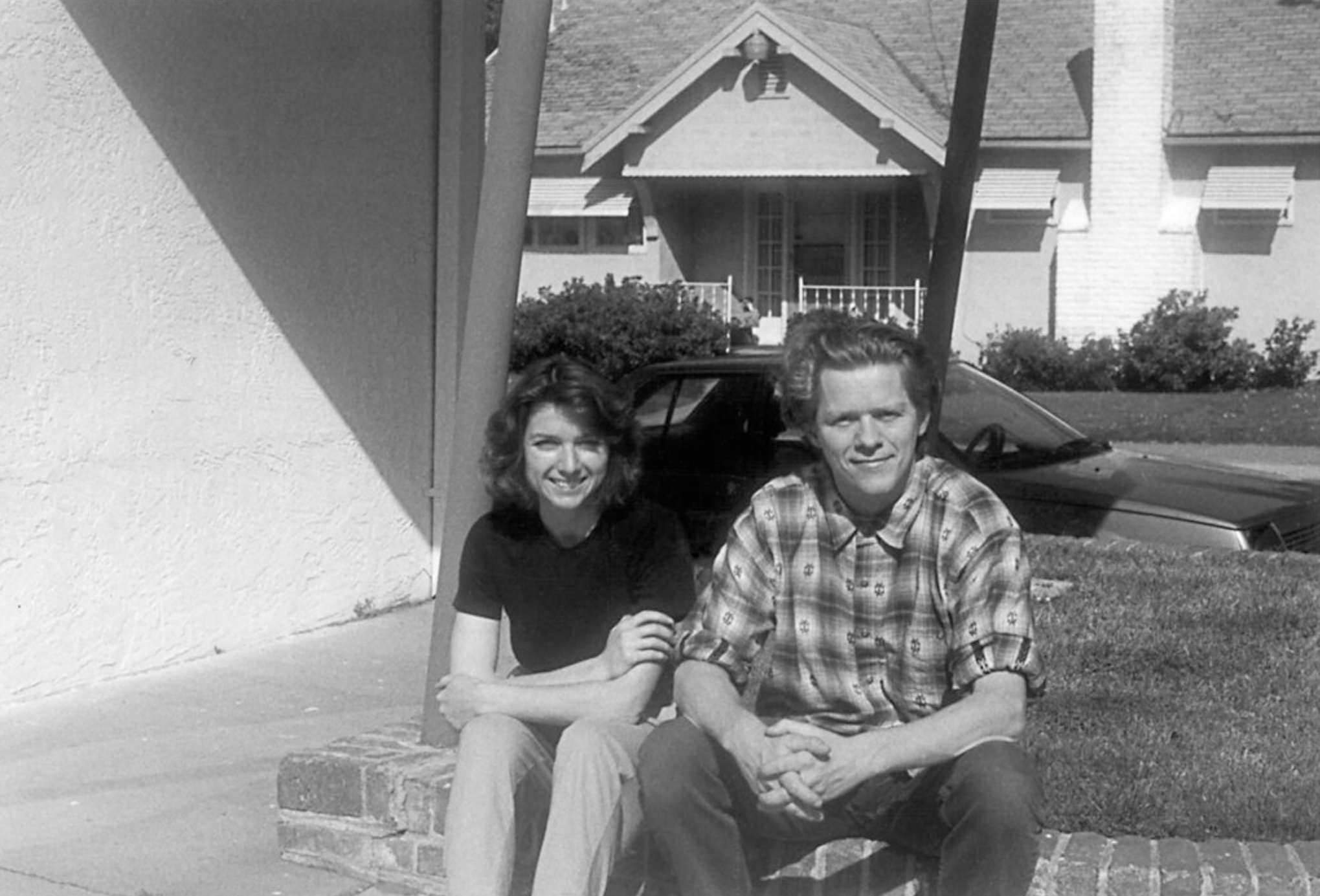
Number 29 on our list of famous graphic designers is actually two people, but the husband and wife team of Rudy VanderLans and Zuzana Licko are best known as Emigre Fonts. They founded the digital fonts foundry in Berkeley, California, in the early 1980s and their type work gained exposure through the Emigre magazine, which VanderLans founded with two other Dutch emigres.
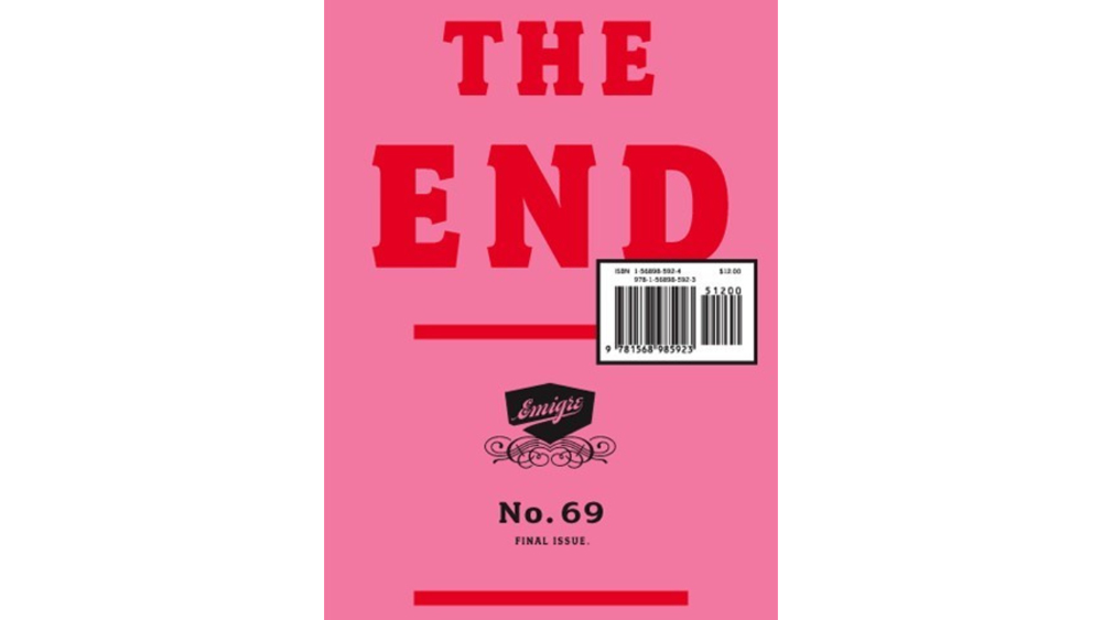
The foundry was an early adopter of the Macintosh computer and used the new technology to create some of the first digital layouts and typeface designs. Part of its influence was in its rejection of previous rules. Instead of following the aesthetics of letterpress printing, Zuzana designed fonts according to the limitations and idiosyncrasies of bitmap graphics and dot matrix printing.
Emigre's rejection of Modernist design rules earned it significant criticism, with Massimo Vignelli (see number 5 above) calling it a “typographic garbage factory.” Intense debate ensued, although Vignelli did later collaborate with the foundry. Emigre magazine ran right up until 2005, expanding its content in the 1990s to cover a wider discourse on graphic design in general.
30. Jane Davis Doggett
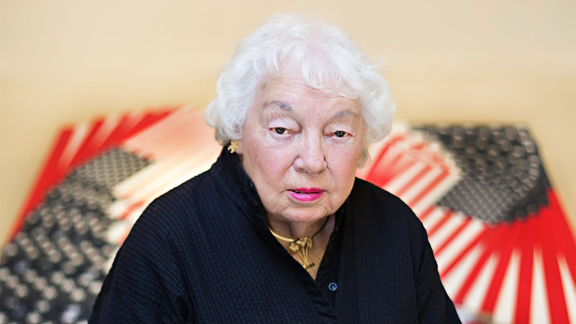
Jane Davis Doggett was a famous female designer who pioneered the use of graphic design for wayfinding through her airport signage systems. She showed how a combination of colour, typography and symbols could be used guide the flow of people through complex buildings.
Jane studied an MFA in graphics under colourist Josef Albers at Yale University School of Art and Architecture in 1956 with an MFA in graphics. She then worked in Europe for a time as a photographer for Architectural Record.
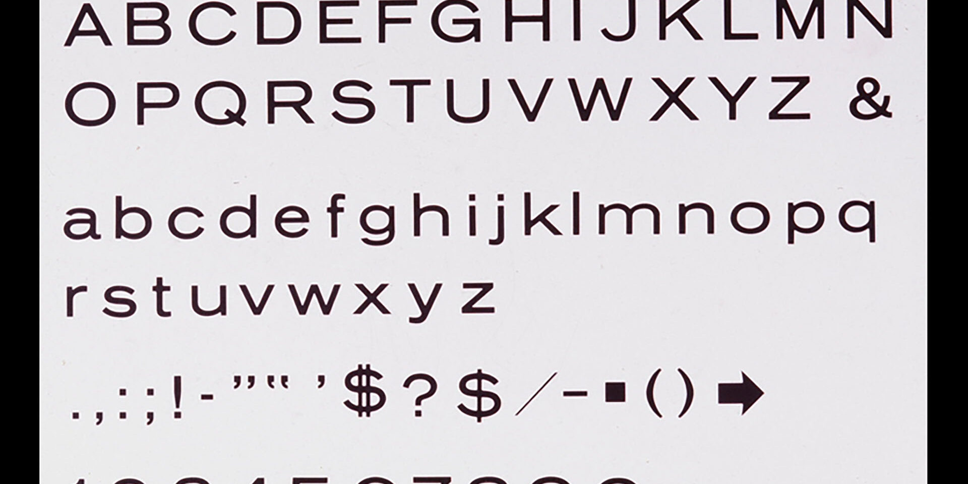
Back in the US, her first design job involved created a standardised font for Memphis airport in 1959. 'Alphabet A' was designed to be legible from far distances, and it was so successful that it would be used at other airports, including Miami, Newark and Tampa International. She would design complete graphic systems for airports, including logos. Other landmark projects included Madison Square Garden and the Philadelphia subway system.
For more inspiration, see the 12 skills to help designers get ahead in 2025 and take a look at how AI is impacting graphic design.

Rob is editorial, graphic design and publishing lead at Transport for London. He previously worked at Future Publishing over the course of several years, where he launched digital art magazine, ImagineFX; and edited graphic design magazine Computer Arts, as well as the Computer Arts Projects series, and was also editor of technology magazine, T3.
- Joe FoleyFreelance journalist and editor
You must confirm your public display name before commenting
Please logout and then login again, you will then be prompted to enter your display name.
