Save My Day
Morris Pinewood's new work for Metro International
Sign up to Creative Bloq's daily newsletter, which brings you the latest news and inspiration from the worlds of art, design and technology.
You are now subscribed
Your newsletter sign-up was successful
Want to add more newsletters?
How do you advertise discounts without looking cheap? That was the question faced by Stockholm advertising and design studio Morris Pinewood when newspaper publisher Metro International briefed the team to create a new brand for the Save My Day website. Launching as a competitor to Groupon and other collective buying sites, Save My Day was aimed upmarket with a greater emphasis upon premium goods.

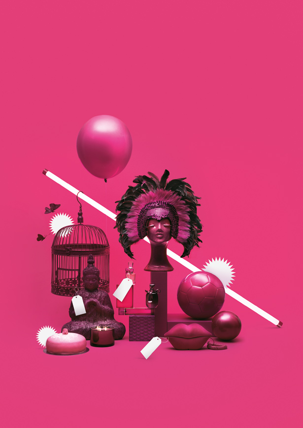
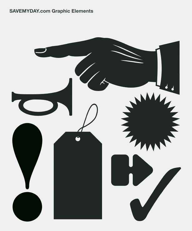
“The was idea to create a mix between 60s retail branding and high-end designer brands. We took all the aesthetics and graphic symbols you have in retail – splashes, exclamation marks, speech bubbles – and put them into a designer landscape,” says creative director Mattias Frodlund, who worked on the project with art director Hanna Moe ahead of its launch in Chile, the Netherlands, Guatemala and Denmark.

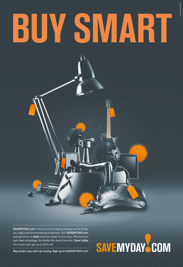
Instead of bombarding potential customers with an array of multicoloured products, inspiration was found in the luxury goods spreads of magazines such as Marie Claire: “The splashes and price tags become so much stronger when there’s a juxtaposition between the two,” Frodlund says. Four different ‘colour universes’ were created, with sophisticated black and white joined by retail-world-staple magenta – “although we added a bit of yellow so it wouldn’t be too fluorescent” – and sharp orange, signalling savings. Berthold Akzidenz-Grotesk, a favourite typeface in the 60s, was chosen for the lettering.
Article continues below 
“It’s a nice poster typeface. It’s lean and sharp and strong and heavy,” explains Frodlund, who is currently working on a campaign for the brand’s Swedish launch.
Sign up to Creative Bloq's daily newsletter, which brings you the latest news and inspiration from the worlds of art, design and technology.

The Creative Bloq team is made up of a group of art and design enthusiasts, and has changed and evolved since Creative Bloq began back in 2012. The current website team consists of eight full-time members of staff: Editor Georgia Coggan, Deputy Editor Rosie Hilder, Ecommerce Editor Beren Neale, Senior News Editor Daniel Piper, Editor, Digital Art and 3D Ian Dean, Tech Reviews Editor Erlingur Einarsson, Ecommerce Writer Beth Nicholls and Staff Writer Natalie Fear, as well as a roster of freelancers from around the world. The ImagineFX magazine team also pitch in, ensuring that content from leading digital art publication ImagineFX is represented on Creative Bloq.
