8 steps to inclusive web design
Discover how to create accessible web design with our expert tips.

Sign up to Creative Bloq's daily newsletter, which brings you the latest news and inspiration from the worlds of art, design and technology.
You are now subscribed
Your newsletter sign-up was successful
Want to add more newsletters?
Accessibility is a human right, and in some countries, the law. In fact, 2018 saw a huge increase in web accessibility lawsuits. Now designers are starting to realise that web accessibility is a must. With that in mind, here are eight top tips for ensuring your web design is optimised for accessibility and as inclusive as possible.
If you do decide to overhaul the accessible elements of your website and realise that your web design needs a total refresh, here are the hottest web design tools and resources you can use to help. Starting a website from scratch? Try a website builder, and be sure to explore all your web hosting options.
01. Define accessibility
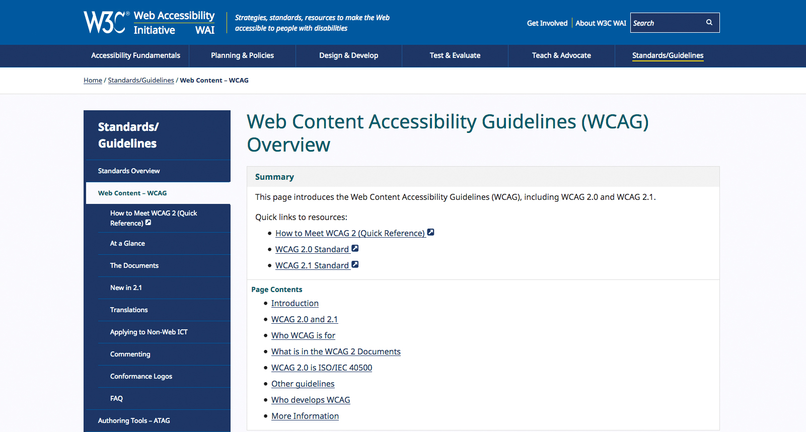
Accessibility and inclusive design are sometimes referenced interchangeably, but failing to recognise the distinction between them can have drastic consequences. Accessibility design is about removing obstacles, so that all users can use the apps and websites we design.
Article continues belowNext, let’s remember that larger font sizes reduce the 'can’t read the text' obstacle, so either we enable certain users to switch over to an alternative 'accessibility mode', or we create an accessible, but separate, version that can be accessed using a link in the navigation. Now, not only does this blur the line between accessible and inaccessible (since visually-impaired users still have to locate this 'accessibility site'), but it’s not at all inclusive, because we’ve alienated these users. They’ve been segregated, made to feel different, and to top it off, we’ve needed to design and develop two versions of our interface, spending additional time and effort.
Instead, we could have simply designed a singular, more inclusive interface, where the font is larger for everybody. After all, even users that aren’t visually-impaired will benefit from being able to read text more easily, and this is why inclusive design is a win for both disabled and non-disabled users. Inclusive design doesn’t abate the experience of those that aren’t disabled. In fact, the vast majority of accessibility rules as defined by the WCAG – Web Content Accessibility Guidelines, double-up as usability tips that if implemented, all users will benefit from.
02. Simplify language
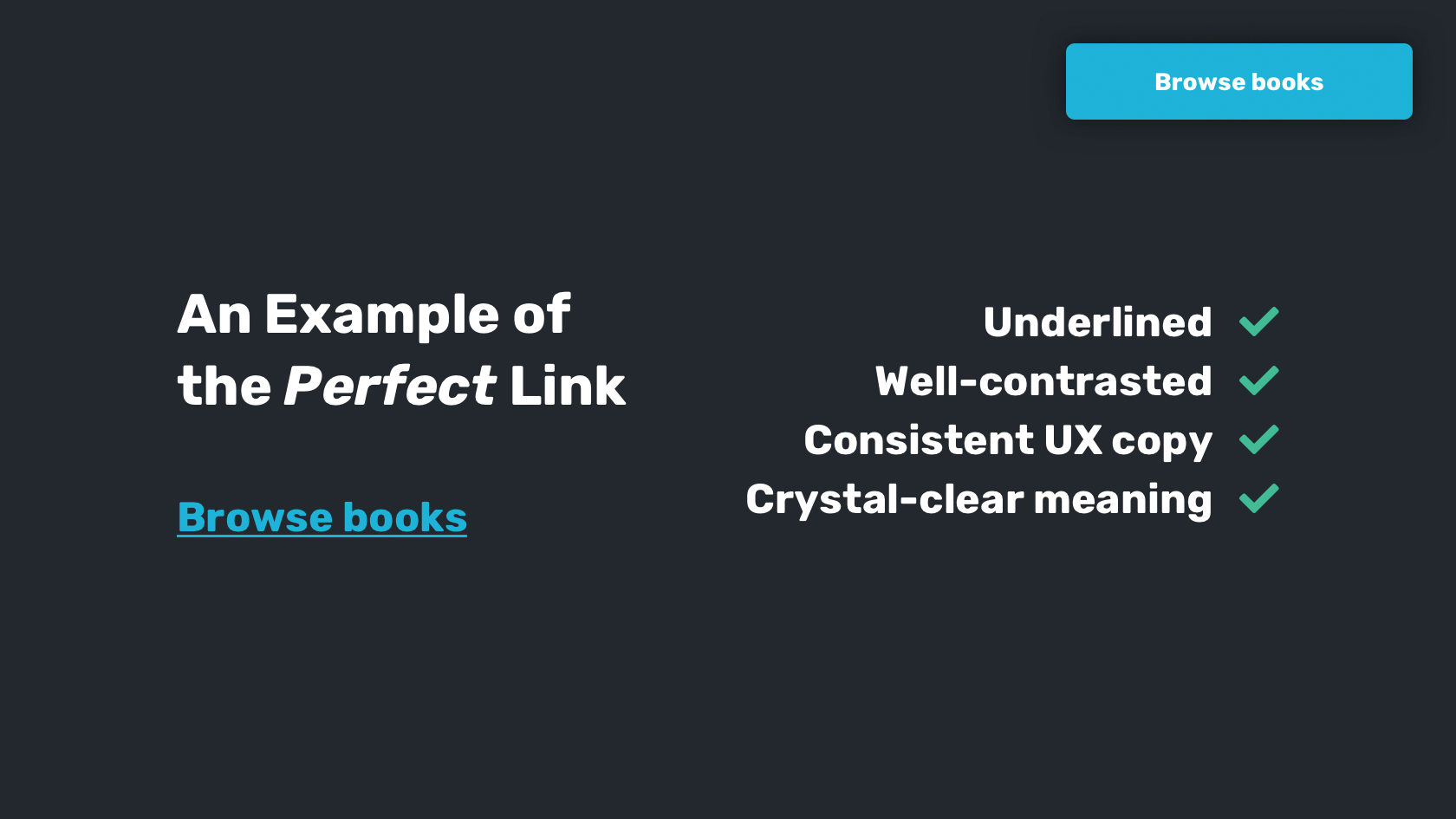
When it comes to the written word, there are a huge variety of considerations to bear in mind if we want to design experiences that cater to everybody. There’s the simplicity of the words themselves (which can affect those with reading difficulties), there’s the typography (which can affect visually-impaired users), and there’s the consistency (which can affect those that are cognitively disabled). And of course, suboptimal design affects those who aren’t disabled just as much as those who are.
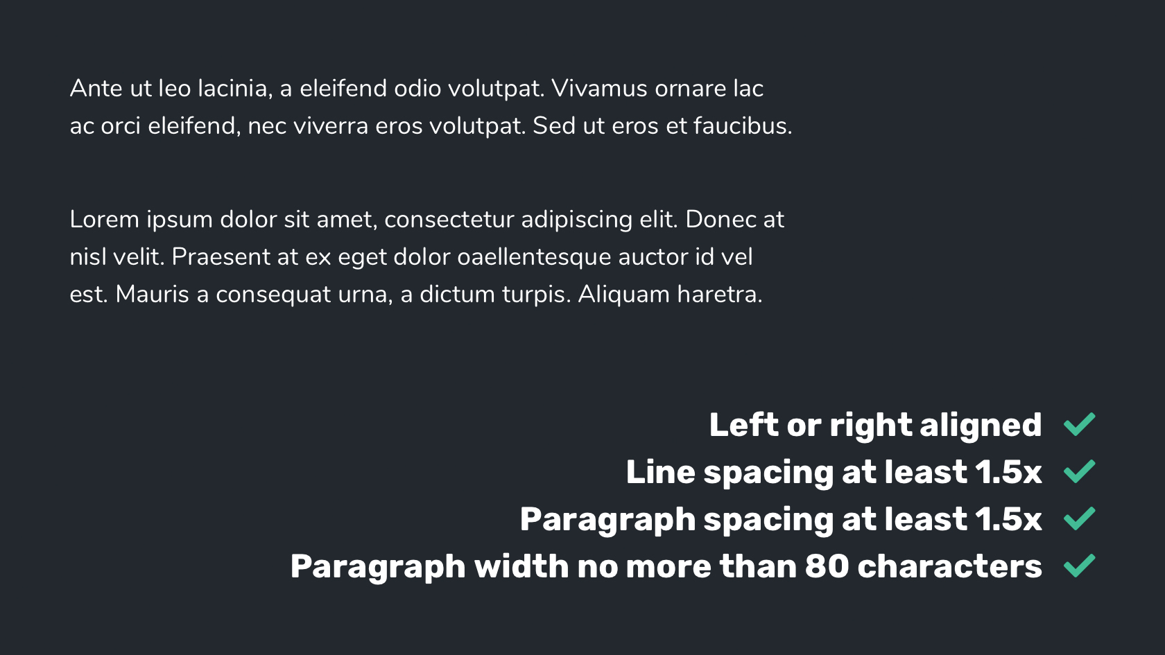
How to improve typography, and therefore readability:
Sign up to Creative Bloq's daily newsletter, which brings you the latest news and inspiration from the worlds of art, design and technology.
- Align text to the left or right only
- Underline links for added visual contrast
- Enforce line spacing at (at least) 1.5x the font size
- Paragraph spacing: at least 1.5x the line spacing
- Paragraph width: no more than 80 characters
How to reduce cognitive load:
- Use simple language
- Define abbreviations upon first use
- Ensure that link text is described efficiently
- Match identical URLs with identical link text
- Logically structure content using clearly-worded headings
03. Optimise colour contrast
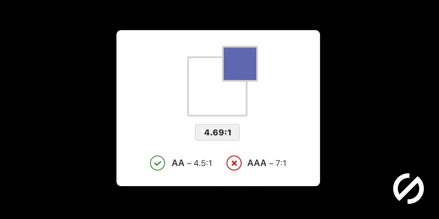
Colour contrast is a measurement of how well the colours of two design elements distinguish from one another. The unit of this measurement is a ratio, and there’s a minimum ratio to aim for. Assuming that various design elements meet the minimum colour contrast ratio as defined by the WCAG, not only are we enabling readability for visually-impaired users, but we’re boosting it for those that aren’t visually-impaired too. This is one of the many ways that we design inclusively with virtually zero effort.
So, what is the minimum requirement, and how do we check for it? Firstly, colour contrast analysers like Stark can be used to measure colour contrast ratio. However, the minimum ratio that we need to aim for depends on the element itself, i.e. whether or not it’s an important UI element, such as an icon or form field, or, if the element is textual, whether the font size is small or large, as larger fonts are more readable even before tinkering with contrast.
These are the colour contrast ratio requirements for text over background as defined by the WCAG:
- 14pt bold or 18pt normal: 4.5:1 (7:1 is better)
- 14pt bold or 18pt normal, and above: 3:1 (4.5:1 is better)
These are the requirements for UI elements:
- Graphical objects (like charts): 3:1
- Focus, hover, and active states: 3:1
- Clickable icons and form elements: 3:1
The Stark app mentioned above can also simulate what our design looks like for users with varying types of colour-blindness – 4.5% of the world is a lot of potential users, after all. If you’re finding it difficult to achieve optimum contrast with links in a body of text, underline them to make the links easier to spot, because some colour-blind users don’t see colour contrast at all!
04. Help users fix mistakes
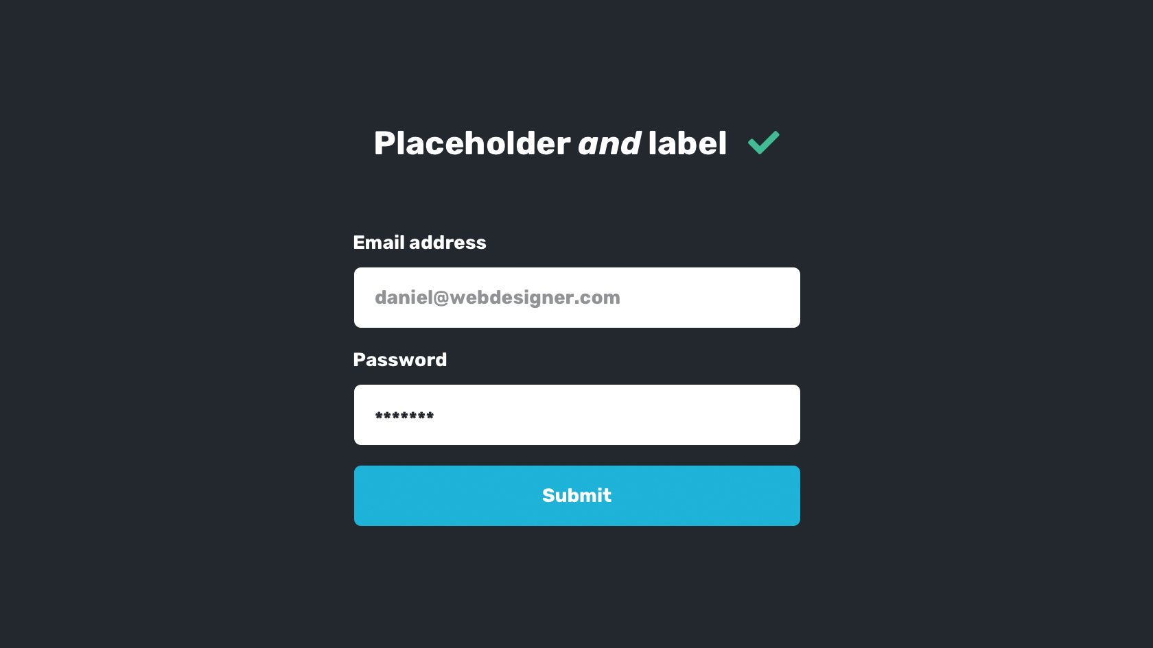
Mistakes often result in a cloud of confusion, especially when the user doesn’t know what exactly they did, or how to fix it. Mistakes are inevitable, especially for the modern-day user rushing to engage with interfaces, heavily armed with their mental model, and this is why helping users (disabled or otherwise) overcome their mistakes is vital to inclusivity.
Naturally, the most common scenario where the user might make a mistake is when filling out a form, and often as a result of a variety of disabilities, i.e. difficulty understanding as a result of a cognitive disability, incorrect data input as a result of a motor disability, and so on. Firstly, if we can fix the user’s error programatically, then crisis averted. An example of this in action could be adding https:// to their URL submission if it’s not already been added, as opposed to forcing the user to fix it themselves.

Consider these other tips for reducing form errors:
- Always use form labels to describe input fields
- …and placeholders to show an example of acceptable input
- Enable autofill and autocomplete to reduce typing requirements
And these tips to help users fix errors:
- Display form errors clearly in realtime
- Let the user verify their input before submission
- Important and often forgotten: don’t make users feel stupid!
05. Take note of 'Skip to Main Content'
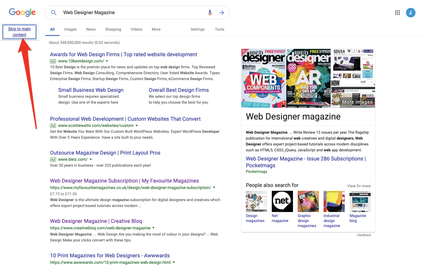
Skip-to-main-content is a relatively obscure accessibility feature aimed at those who navigate UIs with screen readers. You’ve most likely never heard of this feature; that’s how inclusive it is. Screen readers, or simply those who mostly navigate UIs using the keyboard, tab through tap targets using the tab key. If you’re not disabled, you would have likely experienced this regardless when tabbing through form fields on a desktop web browser, since it‘s much easier than clicking.
Skip-to-main-content is an accessibility enhancement to help this subset of users escape repetitiveness by bypassing the main navigation – this works by having the first tab item a link that skips to the main content. It’s obscure to those that don’t use screen readers because this link only displayed once tabbed. Try Googling something, then hitting the tab key!
It’s also important to visually indicate which element is currently focused, since the tab index may shift to an unexpected location (tab indexes and therefore screen readers read from top-to-bottom.) When tabbing through tap targets the :focus state is triggered, and the browser then knows to style the element automatically. In terms of CSS code, this often appears as if it’s a blue box-shadow:, but it’s actually outline:, so make sure that you don’t overwrite this style!
06. Don't create pressure
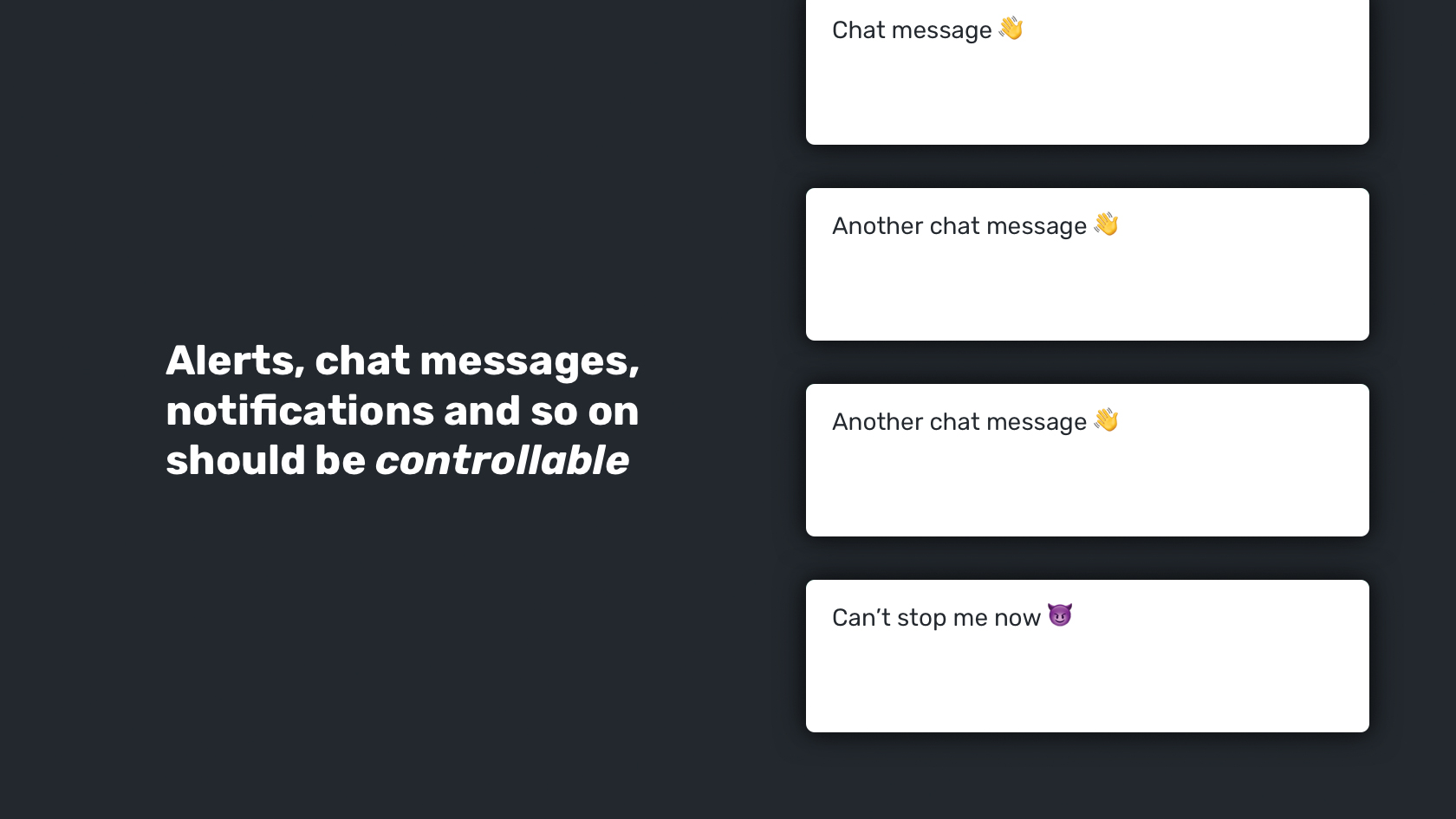
Nobody likes to feel pressured, but for those with motor or cognitive disabilities, pressure can be anxiety-inducing. Interfaces have become vastly more dynamic over the years, as more and more tasks can now be completed using a device. Sadly, far too many dynamic experiences are the result of designers trying to make UIs more imaginative at the cost of usability. A useful snippet of advice would be to simplify the layout and remove unnecessary dynamic elements.
This includes carousels, popups and alerts and distracting animations.
Next, let’s take a look at how we can make these elements, should we need them, accessible to those with disabilities. First of all, we need to add a level of control for autoplaying media that demands attention, as this could add an uncomfortable amount of extra cognitive load for those with cognitive disabilities. The rule is, as defined by the WCAG 2.0, that if media runs for more than three seconds, it should be controllable. Anything else that scrolls, blinks, or otherwise moves automatically without the user having to interact with it (i.e. animations and carousels) should also be controllable if it lasts for more than five seconds.
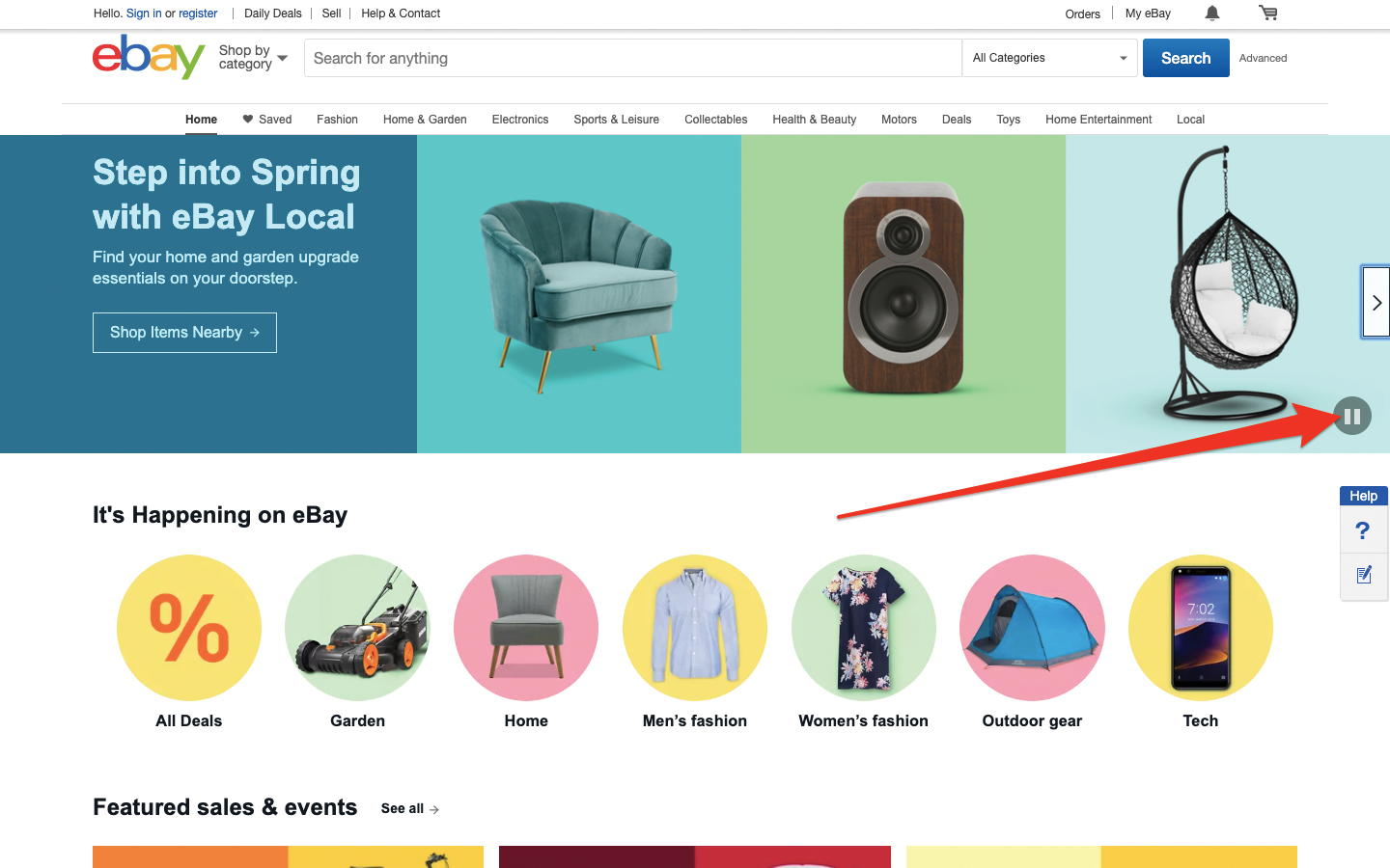
Generally, unexpected movement/media is disliked by users and it’s best to avoid it. Note that a similar rule applies to elements that flash more than three times per second, especially if it’s high-contrast and red, as this can induce seizures!
Concerning chat messages, alerts, reminders, newsfeeds, and the like, users should be able limit their frequency to allow themselves more time to read and understand what’s being communicated, and it’s also advisable to let the user easily dismiss any alerts or visible obstructions with the esc key. Pressure to carry out a task is sometimes unavoidable as some interfaces (like banking interfaces) can timeout for security reasons, and naturally these alerts have to be obvious. In this scenario, disabled users that require more time should be offered the chance to do so, letting the interface know that the user hasn’t abandoned it and mistakenly left their data exposed.
(If you have a lot of media, remember to back it up in the best cloud storage available to you.)
07. Relay with developers
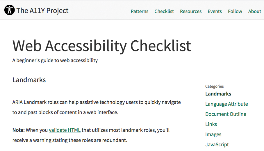
When it comes to making accessibility enhancements, developers should share half of the responsibility, especially when it comes to making user interfaces screen-reader-friendly. Optimising websites for screen readers mostly happens behind the scenes, and doesn’t impact non-disabled users at all, making these websites very inclusive to users of all abilities. For those wondering, a screen reader aids visually-impaired users by audibly reading out what’s on the screen. But what about images? What about icons without text labels? How exactly do screen readers convey design elements with no text description, and how do these assistive technologies quickly switch focus to key landmarks such as search and navigation? Well, this is exactly where the developer comes into it.
Design elements with no text accompanying said element can be described behind the scenes using HTML. Here’s a terrific checklist you’ll want to bookmark.
Let’s go through some of the key aspects:
- Use semantic HTML elements such as <nav> and <header>
- Use ARIA landmark roles to add further context to HTML elements
- Declare the (correct) language (WCAG guidance here)
- Always form elements
- Use “alt text” (Error! Filename not specified.) for text alternatives to images (guidance here)
- Provide no-JS fallbacks and never use inline scripting
08. Choose simple gestures
Choosing simple gestures over complex ones will win over non-disabled users, while making UIs accessible to disabled users. Gestures tend to differ between apps and websites. Firstly, there’s the matter of user expectation; for example, swiping interactions on touchscreen apps is fairly normal, but users typically wouldn’t think to engage in swiping on a website (not even on a mobile website). That aside, is anything beyond simple tapping and clicking tricky for disabled users?
The answer is yes, but they’re also a bit daunting for non-disabled users as well, with swiping possibly being an exception because it can be done using just the thumb. I mean, have you ever tried rotating a Google Map? It’s a really finicky experience, and for those with some motor disabilities it would be a near-impossible task to carry out. Since Google Maps doesn’t offer an alternative way to rotate using clickable buttons, this functionality is neither accessible or inclusive.
So we need to ask ourselves on a case-by-case basis, 'do we really need this complex gesture?' For example, would a static, vertical stack work just as well as a swiping carousel? In both scenarios we’d have content overflowing the viewport either way, so what does a swiping carousel really achieve? Could the swiping be a progressive enhancement for non-disabled users? Simpler is better in this case.
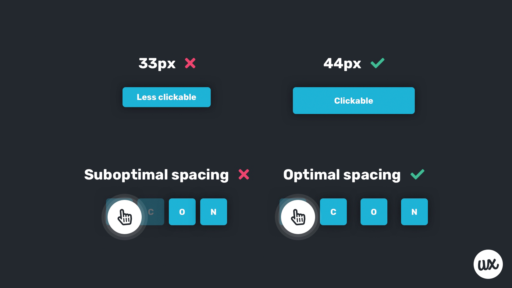
Meanwhile, ensure that tap targets are at least 44px2 (so that they’re easy to tap and click, and also for visual affordance) and reasonably spaced (to reduce the number of error clicks).

Join us on 26 September for Generate CSS, brought to you by Creative Bloq, net and Web Designer. Save £50 with an Early Bird Ticket when you book before 15 August 2019.
This article was originally published in issue 287 of creative web design magazine Web Designer. Buy issue 287 or subscribe to Web Designer.
Read more:
Previously a design blog editor at Toptal and SitePoint, and before that a freelance product/UX designer and web developer for several years, Daniel Schwarz now advocates for better UX design alongside industry leaders such as InVision, Adobe, Net Magazine, and more. In his free time, Daniel loves gaming, café culture and Wikipedia, and also travels perpetually when there isn’t a pandemic.
