15 tips for better lighting keys
Bring your lighting keys to life with advice from an industry pro.
Lighting keys show exactly how a scene will be lit, and express the scene's emotional story, while storyboards tell the narrative story. A good lighting key comes straight from the heart and requires empathy and poetic thinking. You’ll also need a solid understanding of the foundations of light so that you can wield this tool powerfully.
I've worked on animated blockbusters such as Pixar's Coco and Sony's Spider-Man: Into the Spider-Verse, plus many more. Throughout more career, I've discovered these 15 ways help me get my heart on to the screen. I hope they help you, too.
For further tips and tricks on improving your work, see our art techniques tutorials. Or if you want more movie inspiration, see the best 3D movies of the year.
Article continues below01. Build up to big moments
Lighting keys are done in succession. Like music, you have to know where you’re going so that you can control the 'dynamics' along the way. If you know you have a brightly lit burst of colour in your sequence, save it for the high point. Novice artists may want to start with a big moment, but there’s a delicate beauty in the build-up to a climactic moment.
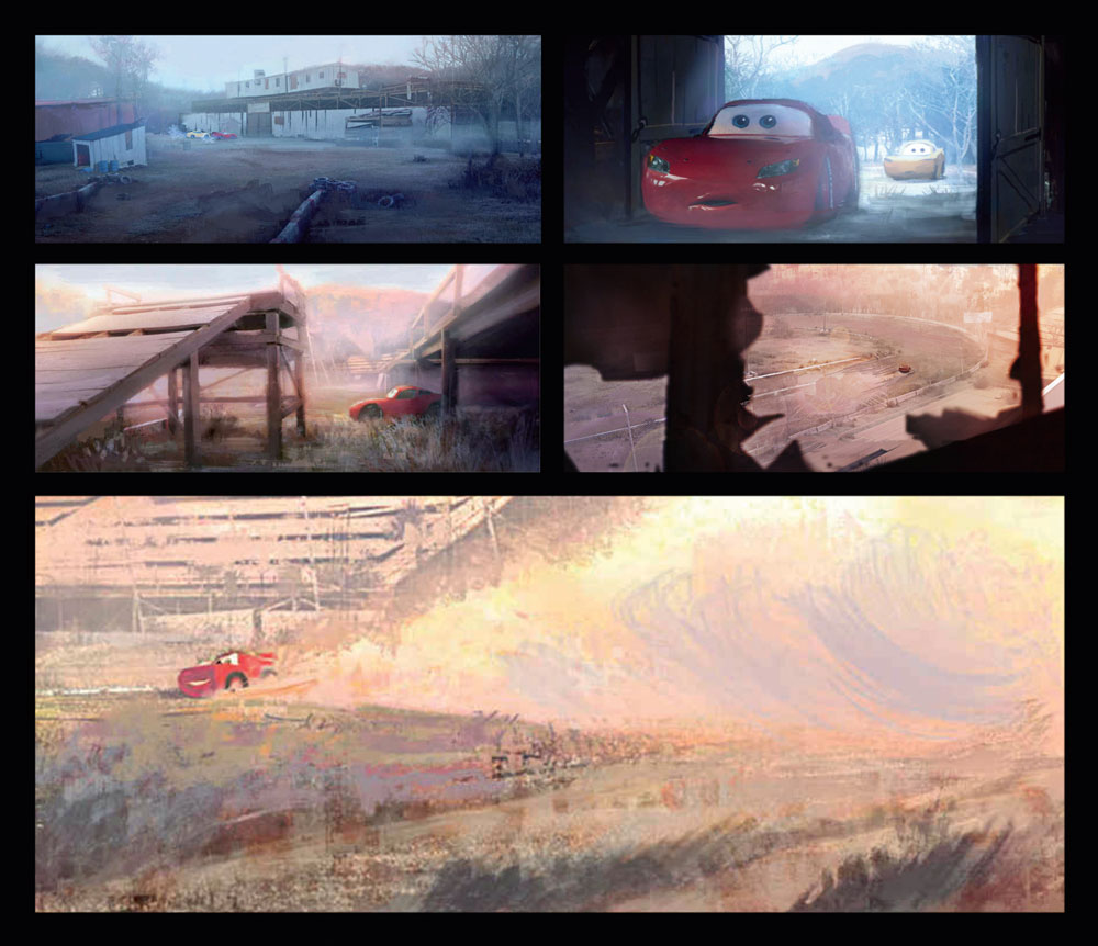
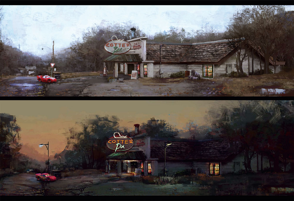
In this scene, Lightning McQueen is following in the footsteps of his former mentor, Doc Hudson, who taught him his iconic move 'turn right to go left'. When I first looked at the storyboards I knew this scene would be an iconic and sentimental moment that needed to be illuminated and brought forward from the rest of the sequence. My challenge was figuring out how to do so.
At the time, artist Bill Cone was teaching me about lighting keys. I studied his work from the first Cars film, and one of his images, in particular, stood out to me. It was an iconic painting of the scene where Doc Hudson is out in the desert kicking up all this dust. Pixar had that image blown up big in the cafeteria. I would stare at it most lunches, enamoured by the way Bill illuminated the atmosphere so beautifully. I took inspiration from that painting and used it as an opportunity to pay homage to Bill, the same way Lightning McQueen was paying homage to Doc. I like to believe it adds a subconscious layer to this key that you can feel.
02. Learn to emphasise with your character
You can’t fake empathy. It’s stepping into the shoes of a stranger and building a bridge from your experiences to theirs. It requires humility, letting go of your personal biases, and the ability to think about someone else instead of yourself. This may sound uncomfortable, but sometimes being uncomfortable is key to creating work that will move people emotionally.
Sign up to Creative Bloq's daily newsletter, which brings you the latest news and inspiration from the worlds of art, design and technology.
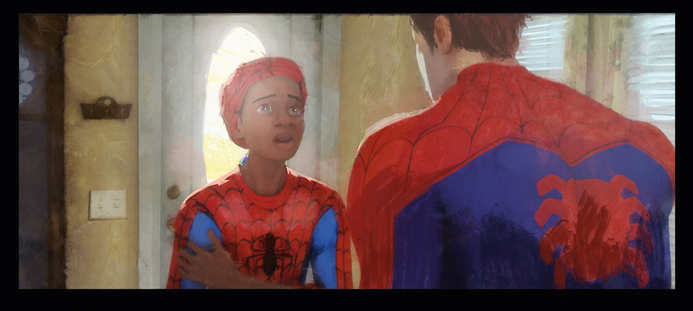
In this example, Miles Morales has learnt something that completely changes his world view. In the moment, he’s feeling several emotions at once. As the artist we have to put ourselves in his place and think of a time we’ve experienced many emotions at once. During those times we tend feel lost and, in search of stability, we cling to whatever we can.
So now let’s get practical. Essentially, to feel lost is to be in a 'haze'. Here, even though Miles is only a short distance from Peter, he’s got some strong atmosphere pushing him back into his haze.
He desperately wants to find stability somewhere, so I made sure to covey that through his gestures: his eyes are watering, his head is coming forward, his eyes are filled with a strong highlight, representing his last glimmer of hope that Peter might be able to help. Miles is grasping onto his arm, which is a clear graphic shape as well. I also made sure to give Peter a lot of form on his shoulders so we could see that he’s also bearing that burden on his shoulders with Miles as he’s listening.
03. Give each painting a title
Something you can do to keep your mind focused on the simplicity of the moment is to give it a simple title. This tip seems so unassuming that you might think it’s insignificant, but it’s useful when you’re painting multiple images in a sequence.
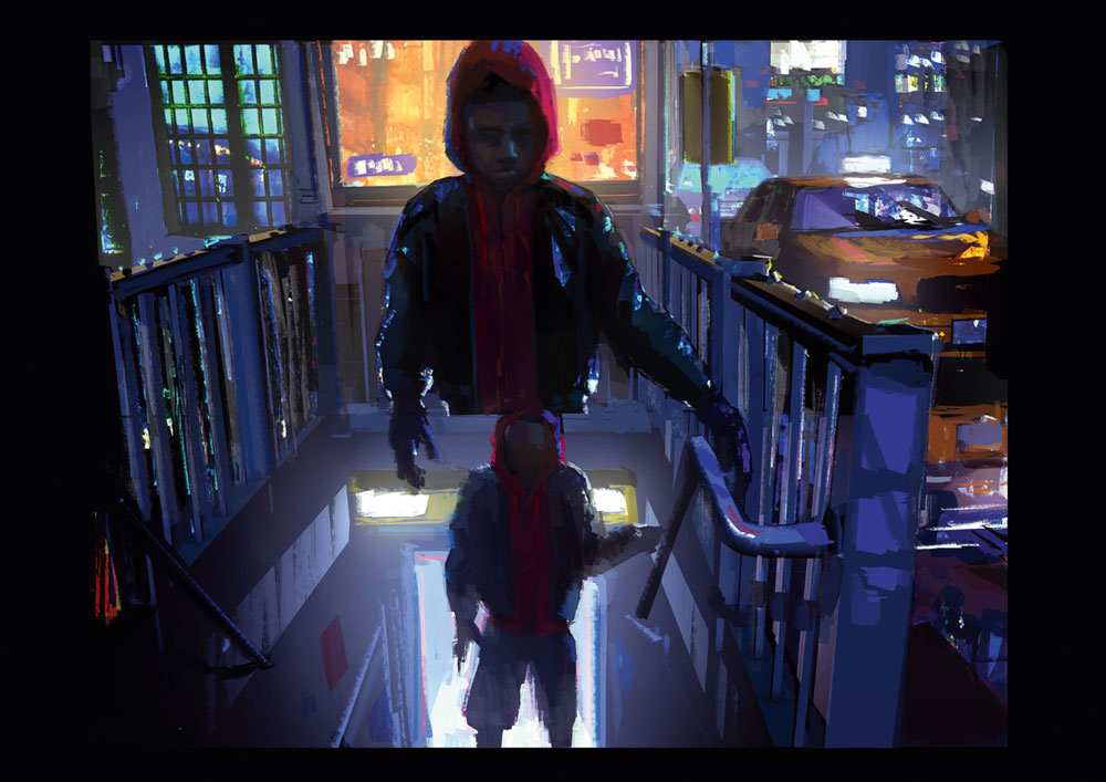
This example consists of several lighting keys that I compiled into one image so that it would flow really well. The title is A New Day. That title informed every lighting decision that I made. Down below we see the early morning traffic being bathed in the first light of the day. I put Miles in shadow in the first key, heading toward the new light. The subway windows were a great opportunity to get light spilling through with God rays, the type of light you would experience in a cathedral with stained glass windows. Often when I think of God, church and rays of light, I think of a new beginning.
The second Miles is now fully in the light. He’s become a silhouette, much like the buildings around him. The last image of Miles is on this iconic crane and he’s nearly invisible as he’s become one with the new day.
04. Paint light, not things
It’s easy to get caught up in the details, but most of the time that’s not necessary for the lighting department. Your responsibility is to create a general direction for how the light looks and feels. When you understand the fundamentals of light you can do this with relatively loose mark making. However, every studio is different, and some will want you to be more specific than this example here, and that’s okay.
If you understand how light works it won’t be a problem for you, it’s simply more time-consuming. However, even in that situation you shouldn’t focus on the thing you’re painting. Instead, focus on where the light is coming from, how it’s travelling there and how it’s received by the object.
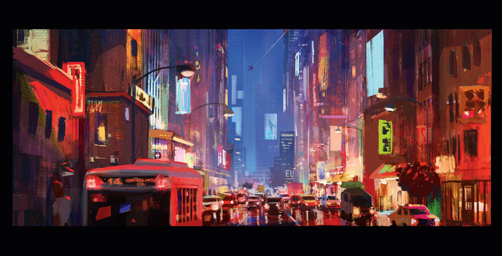
When you focus on painting the light you’ll produce a realistic direction for the key. Here you can see I loosely lathered on colour and light over the buildings, losing much of the details (most don’t even have windows). This tells the technical director that these objects are less important than the cars in the foreground with their reflections on the wet pavement and Miles’ silhouette in the background.
It was a real privilege to work with the team at Sony Pictures Imageworks because they could read this painting and know exactly what to do. That comes with their level of experience and their understanding of how light works. You’ll need to form your own relationship with the people working at your studio and see what works best for everybody to understand each other and work efficiently.
05. Learn from nature
A question that comes up a lot is, 'How can I get better at lighting and colour'. There’s only one answer for this and unfortunately there are no shortcuts. Our limitless source for learning is being outside and studying the nature of light. For example, when I say the word 'sunset', you’ll probably have your own general idea of what that could look like.
I could challenge you and ask for three vastly different sunsets and you could likely do it. The question is, could you do ten? Twenty? A hundred? A thousand? The exciting answer is that it’s definitely possible, and I would claim that there are infinite possibilities to the varieties of how a sunset looks. I would also claim that a sunset can be any colour on the wheel, any value and any saturation. This is why nature is our best teacher because it will never be mundane or boring and it will always surprise you.
When I started working at Disney, my production designer and former teacher there was Bill Perkins. I also asked Bill how to improve my understanding of light and colour. He told me to go to a spot down the street from the studio that had a big white building surrounded by trees and paint it at the same spot every day and paint notes on how each day is different. If it’s not different, it’s not a problem with nature, it’s a problem with my perception.
This is our problem with light. Our eyes will try to convince us that they know what they’re seeing, but we have to override that notion and be humble enough to look as if it’s our first time. When you learn to do this you’ll see colours that you never knew were there.
Learn more about colour with our post on colour theory.
06. Make a simple visual statement
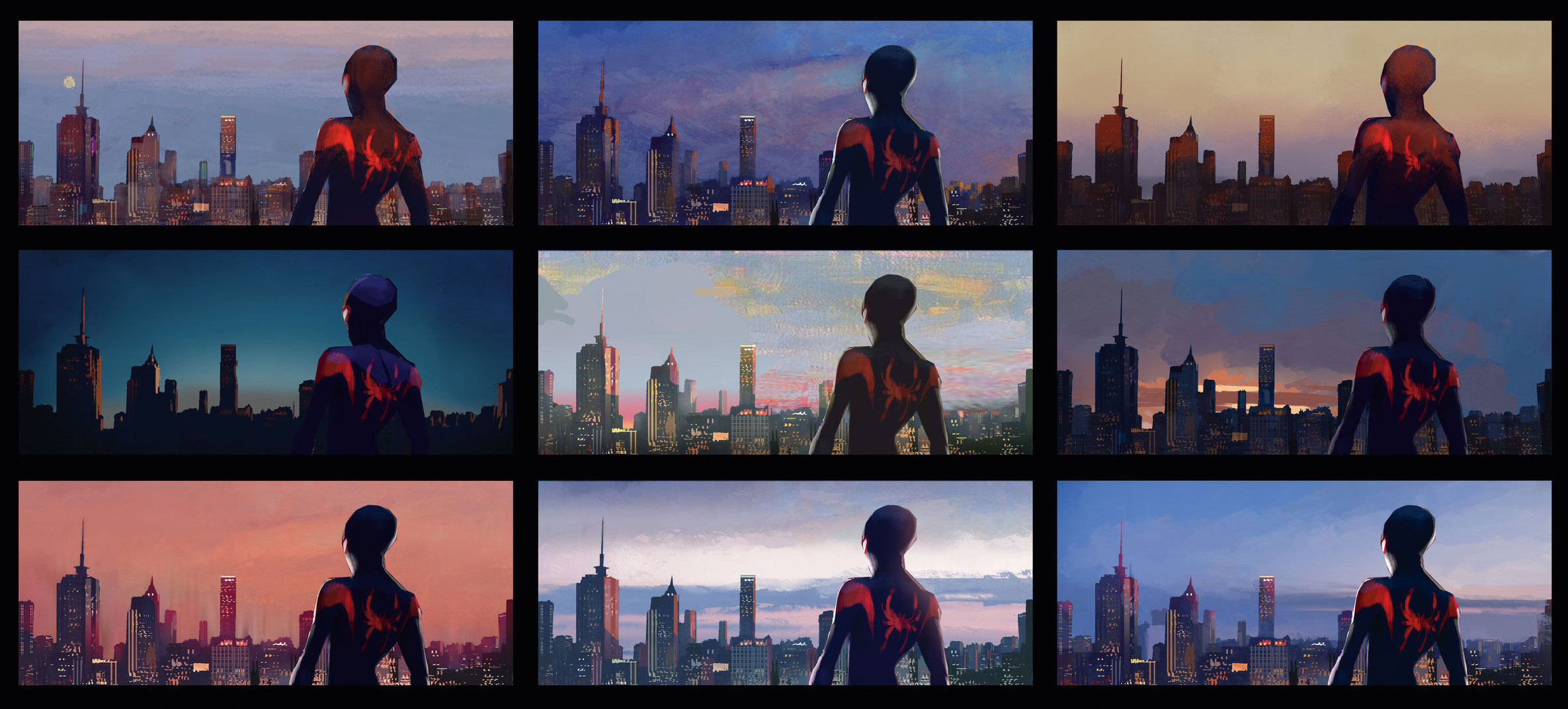
The simpler your image is, the more powerful it will become on screen. This concept can become complex very quickly: take this example from Spider-Man. This is an iconic moment and Miles has not only made peace with himself, he’s restored peace to his neighbourhood.
So for my first attempt I got caught up in the texture of the sky (there aren’t very many skies in Spider-Man so we were writing the visual language as this piece was being developed). I achieved a lot of grit and emotion, but it wasn’t right for the moment. The first one says there’s a lot going on in Miles’ mind when really this is a time for Miles to exhale and be at peace.
In my second attempt, I focused too much on the graphic stylisation of these clouds: they framed Miles nicely, but it felt like they were closing in on him. In the third one the clouds were pushed way back into the background, becoming one clear shape. They’re repetitive so they read as a pattern and overall are soft yet still with a subtle, active shape – in line with the style of the film. The images now feels like a triumphant and calming place for Miles to claim peace.
07. Dig deep, emotionally
If you want your audience to feel where you’re coming from then you have to dig deeper and push yourself to get more emotionally connected to the content. In this example, Miles is about to make his big decision to become Spider-Man. So I combined two keys to match the camera pan. I had all these lights going on and lit his face really intricately, yet I was unsatisfied. I couldn’t figure it out and it was driving me crazy at the time. I had done everything technically right. I understood the moment and it looked pretty cool, but it didn’t have any feeling.
I then came up with this scenario: “Miles is a bit of an outcast; he has one foot in two different cultures, and he doesn’t feel like he fits in any of them. He’s found his calling, but doesn’t know if he can live up to being Spider-Man. He’s in the city that he wants to protect, but yet doesn’t feel a part of it.”
That was my big 'a-ha' moment. I kept the city vibrant and put Miles’ face in the shadows. I used his tough exterior as metaphorical armour to protect himself from getting hurt. This is a sentiment I can relate to and I’m sure other people can, too. So, the solution was to not do more, but do less to get the right emotion across.
08. Differentiate between sight and photography
Light is our only means of seeing and understanding the world around us. We see in our minds not in our eyes, and we’ve learned through school that the path to realism is detail. The pinnacle of this concept is the camera, which picks up every little detail and treats them all as of equal importance. This concept is not a natural one: it’s how a machine translates light, not necessarily how people translate light.
Our vision is much closer to an impressionistic painting because we choose what we should focus on and we generalise and assume the rest. Imagine if I asked you to go to the park, pick out someone sitting on the bench and look at them for five seconds, then close your eyes and describe what you saw. Most of us would describe features about the person we found interesting, but we’d have trouble relating the exact style of the bench, the type of grass or what was in the background, although we would likely have a general sense of the surroundings. This is how you should paint, if you want to share your experiences and heart through your work.
So you may ask, doesn’t film and CG animation use a camera? Yes, but the chief role of the cinematographer or designer is to negotiate with the camera to get the audience to focus on the right details. They may use set dressing, blur, and other varieties of VFX to achieve this. When you understand this principle, it will help you to be clear with your visuals and the audience will be less likely to be distracted.
See our post on the best cameras for creatives if you do want to upgrade your kit.
09. Get the art right first
For me to get my heart across in an image I have to get it feeling right on an artistic level, before I go in and delineate what the specifics are. This is similar to how many painters approach their work: they’ll go in with loose gestural marks and get it feeling right before they tackle the specifics.
I’m sure there’s many reasons for why this tip works for people. My reasoning is it gets me engaged, thinking creatively and excited about what I’m creating. The details can always be decided later. For my personal project, Little, I’ll start with abstract mark making before I figure out what the composition is going to be. I also did this with Spider-Man – often starting in pastel then taking that image and combining it with the storyboard to get something that has heart and also fits the bill for what the directors needed from me.
10. Take feedback
This is a great one for students. If you have a concept or lighting key you’ve been developing there can be an underlying fear of sharing it with people. Not because you didn’t craft it well, but because they might laugh at it or misunderstand it. This is something you need to face head-on: start showing your work without having to explain it.
Family and friends will generally be nice to you: if you give them an explanation before they see the image, they’ll compromise between what you said and what the image actually looks like and agree with you. It’s better that you show the image with no explanation and let them tell you what it is. This will give you valuable insights that you can use to investigate what about your image is giving that impression and how you can fix it. Not everybody within your social circle is going to be able to give you the answer – that’s your job, after all – but everybody’s opinion on looking at images is valid.
11. Choose light that you've seen before
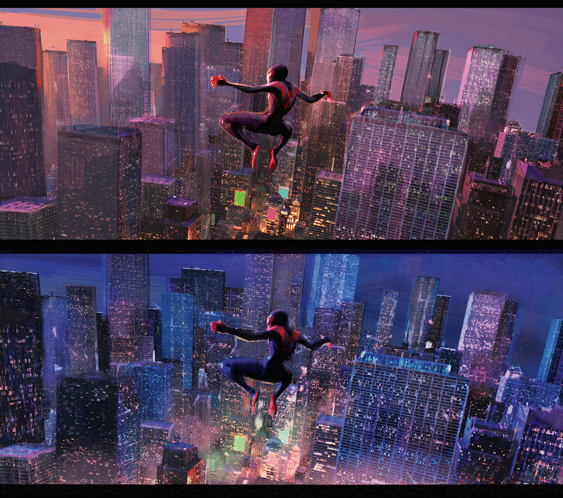
You can see a trend here, right? I often gravitate more towards emotions and feeling when talking about lighting because it’s the responsibility of a lighting key. Here we have one of the last shots in Spider-Man and Miles is airborne looking down at the city. Obviously, I’ve never experienced this before in my own life. I’ve seen similar things for brief moments on a plane or through daring photographers prints, but if I were to create a key solely on those experiences it wouldn’t have much of my emotion put into it.
This piece was titled On Top of the World. That’s an emotion I’ve been lucky enough to feel a few times in my life. Sometimes I’ve felt on top of the world because I’ve just fallen in love, achieved a difficult goal or been hit with inspiration. The feeling is dizzying and exciting and it seems like the world around is sparkling with excitement and opportunity. These are all things I can take and translate them visually, as I’ve done here, to get the feeling across – not just the time of day.
12. Study light fundamentals
Sometimes when we look at work by great painters of light we get the sense that anything is possible, and for the most part that notion is true. However, your mind must be rooted in the fundamentals of how light works and it can be a complex area of study. People will often make up lights and colours that have no origin point and contradict other statements made about light.
Compare this to music: you can play any note you want on the scale, but if you play two notes that just don’t go together it sounds bad. Yet there are some masters of music who play right on the edge and put the wildest combinations together and somehow it all magically works. That’s a mark of someone who has spent time to master their craft and it doesn’t come easily.
Think of your lighting key like a real-life movie set. You have to place lights somewhere and they’re going to affect other things. Here you can use methods to intensify or dull the reaction of light on an object, but it won’t change how it works. In this example I need to amplify Miles launching over a car crash. I could just make him bright and that fixes that problem. However, where is that light coming from? Wouldn’t it cast a shadow? Why is the light only hitting him? Why is everything else desaturated and he’s saturated? Lighting can become a puzzle very quickly!
So in this moment, I found the opportunity to hit him with a strong spot light from the taxi- cab. Now I’m sure if you were going to go in there with a ruler, you could explain that the angle of light on a car wouldn’t tilt in that direction, but that’s where we’re allowed to cheat a little bit. It’s still a real light, it’s logical where it’s placed and how it’s working – I just went in there and adjusted it a bit to suit my needs. Again, you can cheat where lights are placed, but you can’t cheat how lights work.
13. Start with an overcast day
I learned this from a class I took with Robert Kondo and Dice Tsutsumi. Often a computer will render in phases. One of the first phases will show the render of the shot in neutral light. Why neutral light? Because it accurately shows the local colour and general value of every object. Where can we see neutral light in nature? That’s simple – we see it in any overcast day where the light from the sun is diffused through the clouds and spread almost evenly to everything around us. There’s typically no cast shadows or intense light interactions so it simplifies things significantly.
From here you can paint over it with your digital tools, adjustment layers or just translate it traditionally to suit your light condition. It’ll ensure continuity that everything in your shot is being hit with the same light and changing colour, temperature and value appropriately.
In this piece for Cars 3, the overcast day was handed to the shading department because it needed to make sure all the local colours matched what they were painting on to the models. The one painted at near dusk was for the lighting department to know how to alter all those neutral colours to fit the moment.
14. Start with the right song
This happens to me on a daily basis. I can’t find the right palette to match the mood that I’m looking for, I may not have time or luck to capture the perfect moment in nature, haven’t found the right reference or can’t get my head on straight about what’s going on. A good solution is find a song that you think sounds like this moment. Again, this sounds artsy, but we’re artists! Let’s be artsy and get in the right mood to create our masterpieces.
This is an example where I was struggling to find the right palette for Spider-Man. I knew it was dusk, but there’s so many solutions to this time of day, so how do I choose one? Eventually, I found the right song that matched the moment for me and that helped me to gain the nuances of the right palette.
15. Describe the moment
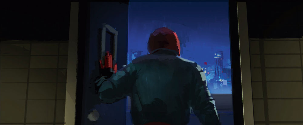
Another tip is to write out terms that describe the moment. This is especially useful for mundane moments. So here’s my seemingly mundane moment example. You have Miles’ back to camera and he’s opened a door to the rooftop. The way it’s framed means we don’t get much space on the picture plane to see what outside looks like.
So I wrote out words and expressions such as 'stepping out into the fray', 'electric blue city', 'the final door', 'determined', 'ready', 'facing your fears' and so on. All of these helped direct me as to what was going on here and how this could actually be a really meaningful key.
Some people may say that some keys are just fillers or they’re all serving your climax. I strongly disagree with this. Every lighting key should have something to say. Whether that voice is quiet, loud, piercing or silent, there’s still value and it should be approached with respect and care.
This article was originally published in ImagineFX, the world's best-selling magazine for digital artists. Subscribe to ImagineFX.
Read more:
Drew is a film designer who’s worked on animated blockbusters such as Pixar’s Coco and Sony’s recent Academy Award winner, Spider- Man: Into the Spider- Verse. He’s currently creating artwork for Laika for its next untitled film project.
