Apple goes flat and minimalist: first look at iOS 7
Official! Take a peek at the radical design of Apple's new operating system - it really is different...
Sign up to Creative Bloq's daily newsletter, which brings you the latest news and inspiration from the worlds of art, design and technology.
You are now subscribed
Your newsletter sign-up was successful
Want to add more newsletters?
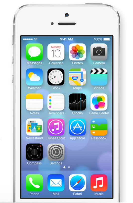
Apple has introduced the new version of its iOS operating system at WWDC, its 2013 worldwide developer’s conference, to a standing ovation.
"iOS 7 is the biggest change to iOS since the introduction of iPhone," CEO Tim Cook told the conference. "It's packed with tons of new features, and a stunning new user interface."
Modern look
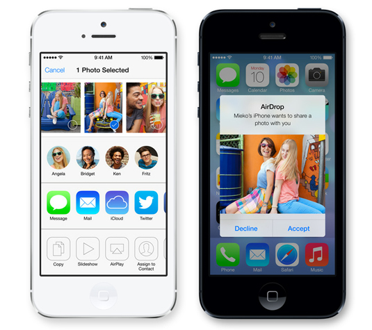
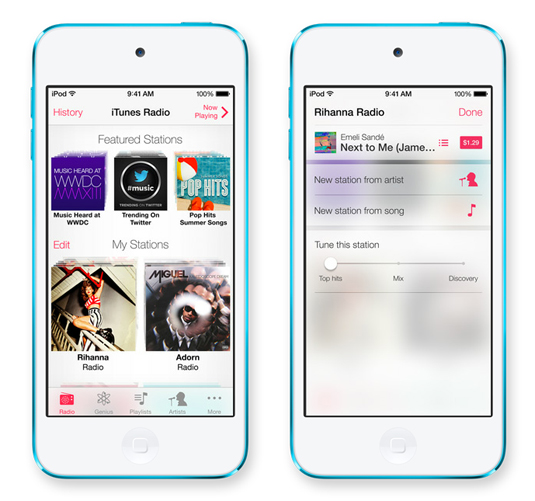
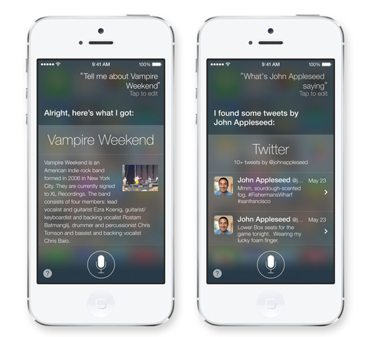
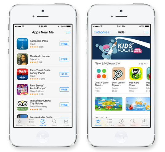
As predicted, the first look at the new interface shows that Apple under Jonathan Ive has gone a long way down the minimalist, flat design route, although the design is not totally free of gradient or flourish. It's essentially an evolution of the look that at first glance looks fresh and modern while still recognisably iOS.
Article continues below 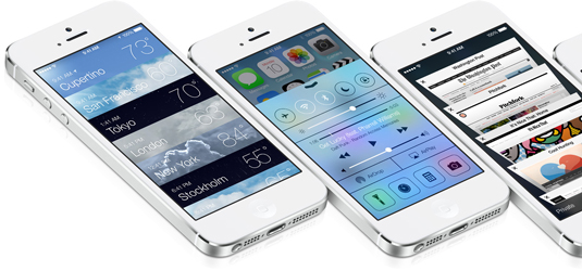
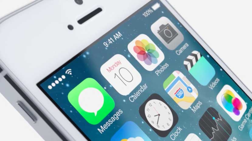
The icons have been redesigned with a new palette of colours and all the elements, including the surrounding chrome, look flatter. Layouts are clean, the signal bars have been replaced with a series of dots, and there's a new slide-to-unlock function.
New font
But iOS 7 isn't just about simplifying the look of the system. The new OS uses the accelerometer to adapt the screen in parallax, creating a 3D feel that looked very impressive in the demo. And while the introduction of Helvetica Neue Ultra Light - a slimmer variation on iOS's standard Helvetica Neue font - made us worry about readability, the good news is that the icons and background in iOS 7 adapt to the available light to improve readability.
iOS 7 will be rolled out "in the fall", we were told. Here are a few more glimpses of the new UI to whet your appetite...
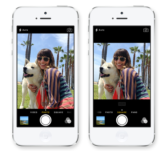
For full details of Apple's announcements at WWDC, check out this article on our sister site Tech Radar, or watch this video roundup:
Sign up to Creative Bloq's daily newsletter, which brings you the latest news and inspiration from the worlds of art, design and technology.
What do you think of the new look for iOS? Share your views in the comments below!

The Creative Bloq team is made up of a group of art and design enthusiasts, and has changed and evolved since Creative Bloq began back in 2012. The current website team consists of eight full-time members of staff: Editor Georgia Coggan, Deputy Editor Rosie Hilder, Ecommerce Editor Beren Neale, Senior News Editor Daniel Piper, Editor, Digital Art and 3D Ian Dean, Tech Reviews Editor Erlingur Einarsson, Ecommerce Writer Beth Nicholls and Staff Writer Natalie Fear, as well as a roster of freelancers from around the world. The ImagineFX magazine team also pitch in, ensuring that content from leading digital art publication ImagineFX is represented on Creative Bloq.
