How we built: Cathedral City
When ‘the nation’s favourite cheese’ wanted to refresh its online presence, they turned to Iris Digital. James Griffiths, Chris Thompson and Claire Wheeldon talk us through the challenge
.net: Why did Cathedral City approach you to redesign their website?CW: Iris has had a longstanding relationship with Dairy Crest: we’d helped to launch and market some of their brands, such as Clover, Milk & More and Utterly Butterly. Based on our track record of high quality and consistency, when the time came the team were keen to get involved.
.net: Why did Cathedral City approach you to redesign their website?
CW: Iris has had a longstanding relationship with Dairy Crest: we’d helped to launch and market some of their brands, such as Clover, Milk & More and Utterly Butterly. Based on our track record of high quality and consistency, when the time came the team were keen to get involved.
.net: What was the brief?
CW: The old site was starting to show its age and wasn’t terribly ‘sticky’. The masterbrand had just been given some new packaging and a new positioning, so we were asked to design and build a new site accordingly. It was clear there was a job to be done in making the existing content easier to digest, prettier and just a bit more interactive.
.net: How did you arrive at the concept?
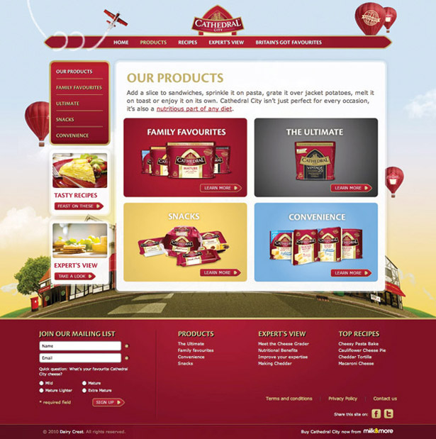
JG: It actually took a bit of to-ing and fro-ing to come up with a concept that felt right for the brand. You’re talking to such a broad audience (cheese connoisseurs, healthy-living parents, students and so on). And ‘The Nation’s Favourite’ is such a big line. In the end we decided to go really simple. Bring the imaginary place, Cathedral City, to life and make it the site’s backbone.

.net: How did you create the cityscape? You took the photos yourself, didn’t you?
JG: Absolutely, it had to feel real. We’d shown the client a scamp of how I wanted the composition of the city to be: the types of shops, the positioning of the buildings, stuff like that. I knew the only way to get that look was to head out with a camera and take those shots myself. So after a day trip round Richmond and Kingston, I had roughly 500 photos to play with. Each building was snapped separately and then comped together afterwards in Photoshop, with a few bells and whistles thrown in. You can hardly see it, but Tim, our copywriter, even came up with names for each of the shops.
.net: How did the collaboration between the creative and tech teams work out?
CW: Best project I’ve worked on. Working and sitting close together really helps me to understand the subtleties of what we’re trying to do; it also allows me to contribute where I think a new technique might lift the experience.
CT: Really good. Griff [James Griffiths] had a very clear vision of what he wanted, so we worked really closely together to make sure the finished result was as near as possible to that vision.
Sign up to Creative Bloq's daily newsletter, which brings you the latest news and inspiration from the worlds of art, design and technology.
JG: Lots of the special effects were added to the site during build. I would ask Chris if something could be done and an hour later there’d be a proof of concept in my inbox.
.net: Why did you decide to forgo Flash in favour of jQuery?
JG: Flash is perfect for some jobs, but it can be a bit of a diversion. Given our wide audience, we’d have had to build an accessible version of the site anyway. So why not just build one version rather than two, and throw in a bit of jQuizzle magic?
CT: We’re all big fans of jQuery and progressive enhancement in general. Nothing in the site screamed Flash (other than the video content) and Griff worked hard to push forward ideas that would work with JavaScript.
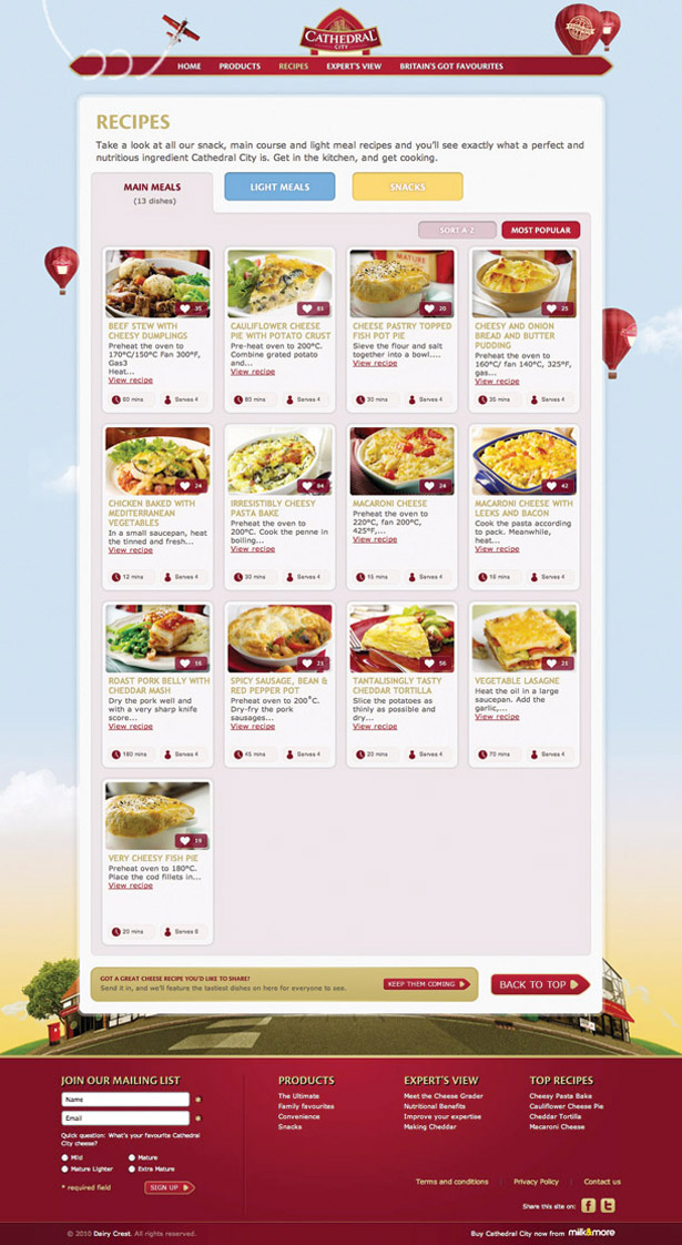
CW: We didn’t have a huge budget on this project either, so it definitely helped that we saved money on Flash resource! Also, there’s a nice little plug-in called Quicksand that we used to add a reshuffling effect when ordering recipes by A-Z or popularity.
.net: What were the biggest obstacles you needed to overcome during the project?
CW: Despite the amount of tech work, surprisingly the colour of the sky was the biggest obstacle!
JG: We must have gone through 10 different versions to get the mood of the site just right. In the end, we opted for a Morning Sunrise to give it a fresh and dynamic feeling.

.net: What did you do in terms of user testing prior to the launch?
CW: Every project we do goes through an IA phase so that copy, design and tech all support a strong user experience. Time was tight, so we ran quick bursts of focus group testing on the big cheese eaters in Iris Towers. And, of course, we did a full QA testing to make sure that all the functionality worked across browsers.
.net: How has the redesign gone down?
CW: The client is really pleased with the design and has already got plans for new site content and campaigns. Since launching the site we’ve had around 85,000 visits, 560,000 page views and an average dwell time of nearly seven minutes.
JG: The recipes section is way more popular than it was on the old site. At the time of writing, I think Irresistibly Cheesy Pasta Bake is the most popular.
CT: Mmmm. Delicious.
The techie bit
Our server-side and front-end teams work with Microsoft.NET, we love the way the IDE suits both teams. There are a few Mac users amongst us too so we’re either in Visual Studio 2008 or TextMate with a Windows VM. We love jQuery, and its use here is a great example of using the right technologies, adding visual richness without the need of Flash. The biggest timesavers were probably continuous integration (with CruiseControl.Net) and our project templates. These help us get started quickly and give project managers access to the latest build, without us stopping to do a deployment.

The Creative Bloq team is made up of a group of art and design enthusiasts, and has changed and evolved since Creative Bloq began back in 2012. The current website team consists of eight full-time members of staff: Editor Georgia Coggan, Deputy Editor Rosie Hilder, Ecommerce Editor Beren Neale, Senior News Editor Daniel Piper, Editor, Digital Art and 3D Ian Dean, Tech Reviews Editor Erlingur Einarsson, Ecommerce Writer Beth Nicholls and Staff Writer Natalie Fear, as well as a roster of freelancers from around the world. The ImagineFX magazine team also pitch in, ensuring that content from leading digital art publication ImagineFX is represented on Creative Bloq.
