GrandArmy delivers patriotic redesign for US Postal Service
There's no mistaking which nation's delivery service this star-spangled branding was created for.
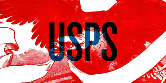
When award-winning multidisciplinary creative agency GrandArmy was commissioned with redesigning the American institution that is the US Postal Service, they went at it with a true sense of patriotism.
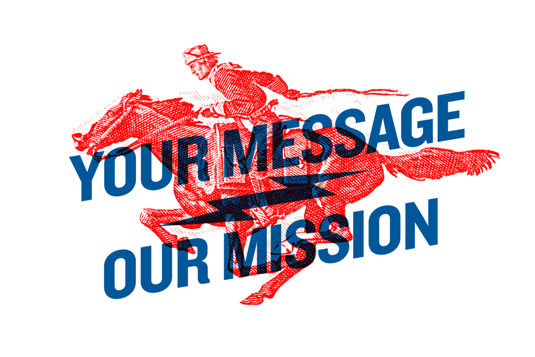
The team comment on its website: "In addition to being a technical marvel, it is also a storied and hallowed institution. From the Pony Express to the first letters sent by air-mail, few things are so uniquely American.
From the Pony Express to the first letters sent by air-mail, few things are so uniquely American
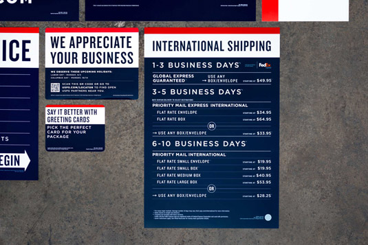
"Plagued by budget woes in the modern era – the USPS sought to modernize its image, and more importantly, streamline the retail experience with clear signage, way-finding and packaging."
Article continues below 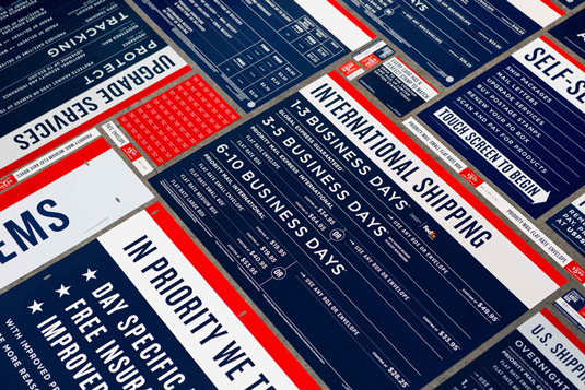
Total knockout
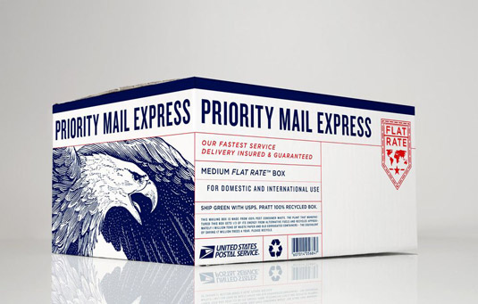
The response from GrandArmy was this strong, patriotic redesign, featuring a bold use of the Knockout font family, delivered in red, white and blue. GrandArmy's Steven Noble also developed an incredible illustration of a bald eagle to feature on the USPS shipping boxes.
However, while the majority of GrandArmy's files were used, the USPS decided to drop the studio's original concepts for its shipping boxes. Although clearly inspired by GrandArmy's designs, USPS instead changed almost every aspect, losing the eagle and opting for a much more minimal approach. Which do you prefer?

Sign up to Creative Bloq's daily newsletter, which brings you the latest news and inspiration from the worlds of art, design and technology.

Kerrie Hughes is a frequent contributor to Creative Bloq, and was once its editor. One of the original CB crew, Kerrie joined the team back in 2013 after moving from her role as staff writer on 3D World. Since then she's written regularly for other creative publications such as ImagineFX, Computer Arts and Digital Camera World. After a stint working for the police, Kerrie is back reviewing creative tech for creative professionals.
