Patterned packaging for cool ice-cream brand
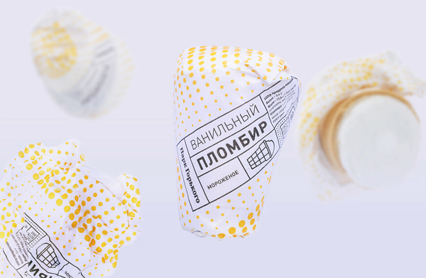
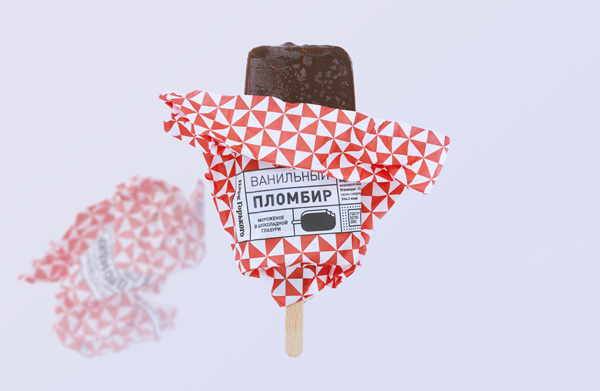
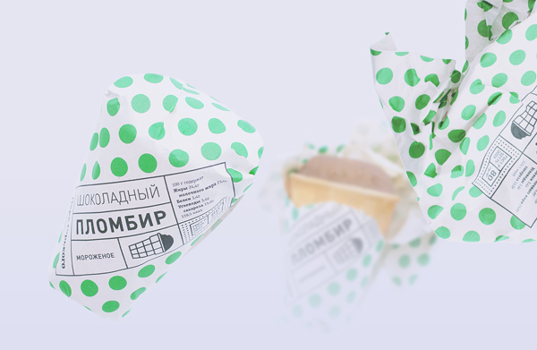
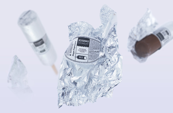
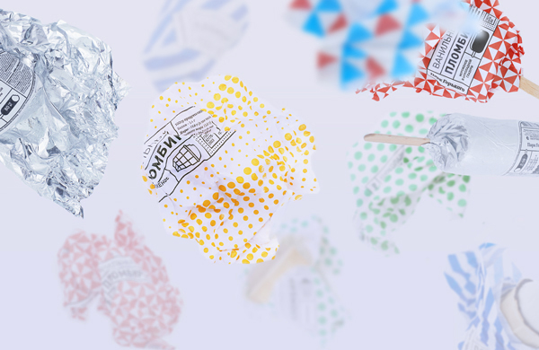
Inspired by Moscow's Gorky Park, this project showcases a cool new look for everyday ice-cream.
Sign up to Creative Bloq's daily newsletter, which brings you the latest news and inspiration from the worlds of art, design and technology.
You are now subscribed
Your newsletter sign-up was successful
Want to add more newsletters?
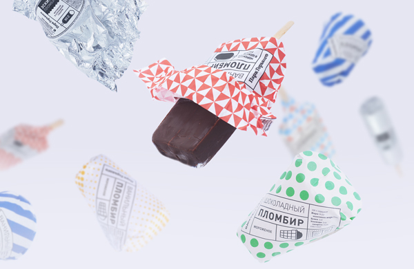
The nights are starting to drawn in here in the UK, so we love feasting our eyes upon bright and beautiful designs during these long winter months. This awesome packaging design brings patterned loveliness to a well-loved brand of ice-cream; art director Misha Gannushkin and graphic designer Anastasia Genkina worked together to bring the patterns to life.
"This icecream has been a treat inseparable from a walk in the Moscow Gorky Park for decades," explains graphic designer Genkina. "It's special taste of creamy vanilla and waffle cone became a memory of childhood for several generations, and it has remained true to the old fashioned recipe.
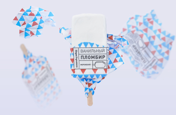
"The aim to connect the historical value with modern recognition through design was achieved by developing patterns, inspired by key symbols of the Park's life. Each pattern corresponds with one of the six flavours." They're certainly a treats for the eyes and tastebuds!
Article continues below 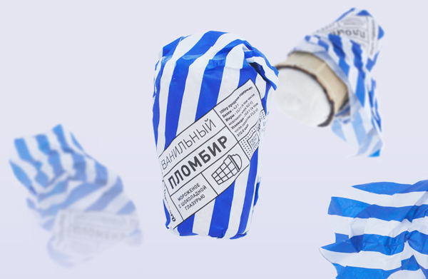
Have you seen any cool packaging lately? Let us know in the comments box below!
Sign up to Creative Bloq's daily newsletter, which brings you the latest news and inspiration from the worlds of art, design and technology.

Sammy Maine was a founding member of the Creative Bloq team way back in the early 2010s, working as a Commissioning Editor. Her interests cover graphic design in music and film, illustration and animation. Since departing, Sammy has written for The Guardian, VICE, The Independent & Metro, and currently co-edits the quarterly music journal Gold Flake Paint.
