Vivid repeat-pattern sushi packaging is a foodie's delight
This fresh take on branding for Sushi store Maki-San makes use of bright colours and brilliant patterns.
Sign up to Creative Bloq's daily newsletter, which brings you the latest news and inspiration from the worlds of art, design and technology.
You are now subscribed
Your newsletter sign-up was successful
Want to add more newsletters?
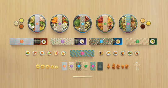
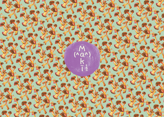
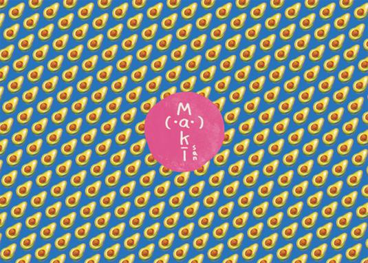
There's some incredible examples of packaging design out there, using unimaginable means to create amazing packaging and branding for a company's product. Here, Kinetic Singapore has produced some perfect packaging for new sushi store Maki-San utilising fun, food-inspired repeat surface patterns.
Creative director Pann Lim ran the project, along with art directors Esther Goh, Astri Nursalim, Gian Jonathan, Jack Tan and Pann Lim, copywriter Eugene Tan and Joseph Davies and programmers Noel Chan and Tori Kuncoro.
"The client wanted to launch Singapore’s first ever fully customizable sushi store," the team explain. "Being offered a wide selection of fresh ingredients, diners could pick and choose precisely what went into their hand-rolls.
Article continues belowThey proposed naming the store 'Maki-San' for one simple reason: the word '-San' roughly translates as 'mister' or 'missus' in Japanese, and by using this suffix, each Maki could be personified.
"This idea also extends to operations: customers can name their own rolls however they choose to. The logo is made up of emoticons commonly used in Japanese pop culture." Popping full of colour and using adorable emoticons and pattern work, we think that the Maki-San project is pretty perfect.
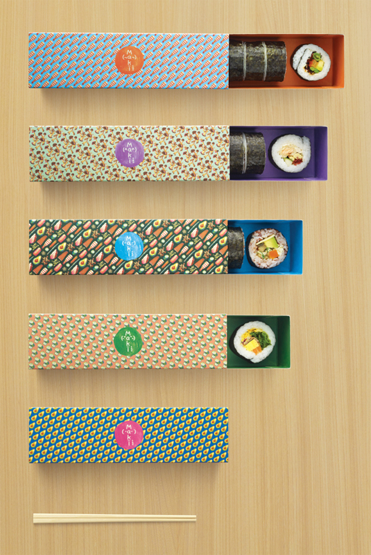
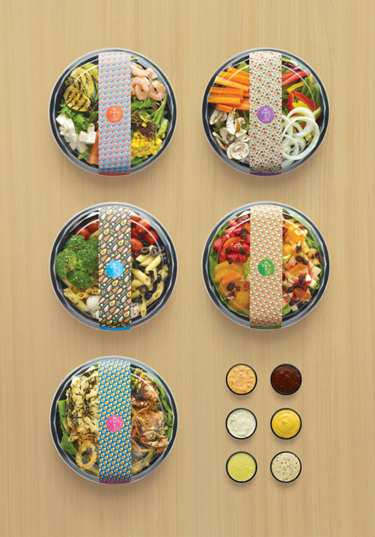
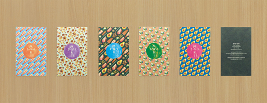
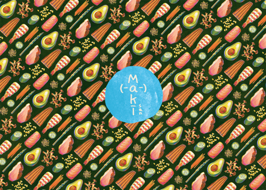
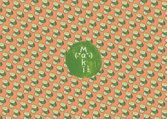
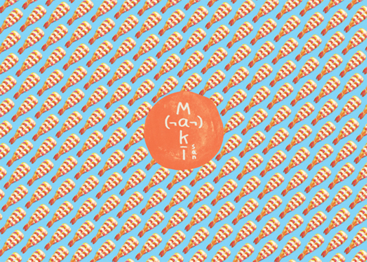
See more of the packaging and branding over on Behance.
What do you make of this packaging? Let us know in the comments box below!
Sign up to Creative Bloq's daily newsletter, which brings you the latest news and inspiration from the worlds of art, design and technology.

Sammy Maine was a founding member of the Creative Bloq team way back in the early 2010s, working as a Commissioning Editor. Her interests cover graphic design in music and film, illustration and animation. Since departing, Sammy has written for The Guardian, VICE, The Independent & Metro, and currently co-edits the quarterly music journal Gold Flake Paint.
