5 common design mishaps... and how to avoid them
Even talented and experienced designers can fall into these traps, says Abby Perkins of Talent Tribune.
Sign up to Creative Bloq's daily newsletter, which brings you the latest news and inspiration from the worlds of art, design and technology.
You are now subscribed
Your newsletter sign-up was successful
Want to add more newsletters?

Want to have a long career as a designer? It doesn't matter how advanced your software skills, or how keen your artistic eye: some things can take even the best designs from great to subpar.
Check out this list of common design mishaps, and learn how to avoid them to keep your designs clean, fresh and functional and your employment long and fruitful.
01. Trying too hard to be trendy
It's always a good idea to stay ahead of the curve, especially in a creative field like design. Know the latest trends in design and aesthetics. Stay on top of what's in and what's out.
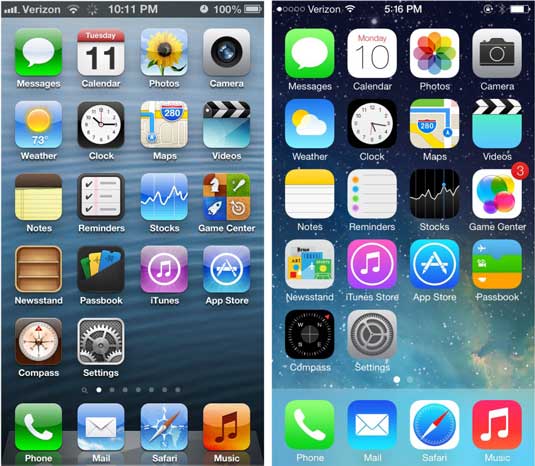
Article continues belowBut trends in design are just like trends in fashion or technology – always changing. Bevel & Emboss. Glossy effects. Drop shadows. They used to be hip. But now? They're a little dated.

While it's fine to experiment with and incorporate trends, designs that are too trendy now will look old-fashioned before too long. Some even found Apple's iOS 7 update too trendy.
The fix: Keep it classic
If it isn't your mantra, it should be: keep it classic. Classic designs may not appeal to the innovator in you, but they'll last longer and hold up better than their trendy counterparts. And it's always okay to supplement the basics with some contemporary accents – just don't go overboard and always receive and respond to design criticism gracefully, as repeat offenses could get you fired.
- Pro tip: if you know the design you're working on is meant to last long-term, don't try and fit in all the latest trends. Save the trendy designs for short-term projects.
02. Designing for the highest common denominator
Here, I'm not talking about your audience's ability to appreciate your design – although that's important, too. I'm talking about the quality of the technology they're using to view your work.
Sign up to Creative Bloq's daily newsletter, which brings you the latest news and inspiration from the worlds of art, design and technology.
If you have the latest in web and internet technology, it may be tempting to design as if your audience does, too. But high-tech elements like parallax scrolling and HD won't have the same effect when viewed using less-advanced technology.

They minimize the effect of your design, frustrate your viewers and ultimately waste your time and effort. Your viewers' frustration could result in a sales downturn, which could lead to your employer cutting you out of the equation.
The fix: Keep your audience in mind
Think of who you're designing for. If it's a tech-savvy audience that likely has access to the fastest Internet and the sharpest devices, you're probably okay experimenting with high-tech, advanced design elements. If you're not sure, it's best to play it safe and create designs that look great in any format.
- Pro tip: if you're working on a freelance project, make sure you know the audience you're trying to reach. Knowing the age and demographic of your audience can help you design an experience that not only works for their technology, but that appeals to their personality.
03. Designs that aren't compatible across different browsers
There are tons of different browsers out there, and every user prefers a different one. Firefox. Chrome. Safari. Opera. Internet Explorer. And those are only the most popular ones.
Since you can never be sure what browser your audience is using, it's important to make sure your designs are compatible across all platforms. If your designs are widely compatible, they'll reach – and impact – a much larger audience. If they're not, their range could be limited and you could leave potential customers on the table.
The fix: Check your compatibility

Check the compatibility of your design across multiple platforms. See screenshots of your designs in different versions of browsers. Use online troubleshooting services to check all the components of your design.
- Pro Tip: As a final fail-safe, make sure your design works great in even the most finicky browser – like an old version of Internet Explorer.
04. Ignoring negative space
We spend a lot of time looking at and talking about the tangible elements of design. Graphics. Fonts. Colours. Images. We focus on what's there. And sometimes, we forget about what isn't.
But negative space is an equally important aspect of design – one that shouldn't be neglected. A lack of space can make designs look chaotic and overdone. And done right, negative space can be a creative way to add dimension to your designs.
The fix: Experiment with negative space

If you're not already exploring negative space in your designs, start now. See what shapes you can make using negative space. Start paying attention to spacing and margins. One of the best-known examples of negative space? The Fed-Ex logo, which uses space to create an arrow between the "e" and the "x."
- Pro tip: Don't try to be too clever with negative space. You could try too hard, miss the mark and lose your audience. When in doubt, always remember that in the end sometimes it's better to be clear – not clever.
05. Designs that are too cluttered
Clutter just might be the worst enemy of great design. It's easy to think that more is better, but graphic design is (or at least should be) understated.
Too many fonts, too many colours, too much text, not enough space – whatever your tendency is, clutter can obscure your message and your identity as a designer. No matter what you're designing, you want a clear, coherent image with a unified theme – not an amalgam of ten different ones.
The fix: Minimize, minimize, minimize
Coco Chanel's first rule of fashion? Always take off one accessory before leaving the house. That guideline can also apply to design. Minimize the unnecessary for maximum impact. Instead of using multiple fonts, try one or two fonts with different sizes and emphasis. Instead of including every colour you can find, choose a few complementary hues and adjust their value and saturation.
- Pro Tip: When you finish a design, take a break from it. Come back later with fresh eyes and see what stands out. Eliminate the elements that are confusing or distracting.
Words: Abby Perkins
Abby Perkins is managing editor at Talent Tribune, a data-driven HR blog powered by Software Providers.

The Creative Bloq team is made up of a group of art and design enthusiasts, and has changed and evolved since Creative Bloq began back in 2012. The current website team consists of eight full-time members of staff: Editor Georgia Coggan, Deputy Editor Rosie Hilder, Ecommerce Editor Beren Neale, Senior News Editor Daniel Piper, Editor, Digital Art and 3D Ian Dean, Tech Reviews Editor Erlingur Einarsson, Ecommerce Writer Beth Nicholls and Staff Writer Natalie Fear, as well as a roster of freelancers from around the world. The ImagineFX magazine team also pitch in, ensuring that content from leading digital art publication ImagineFX is represented on Creative Bloq.
