24 hours with Jonathan Barnbrook
Garrick Webster dives into the mind of the VirusFonts and Barnbrook studio founder, for a day considering politics, psychology and the odd bit of design inspiration too
Sign up to Creative Bloq's daily newsletter, which brings you the latest news and inspiration from the worlds of art, design and technology.
You are now subscribed
Your newsletter sign-up was successful
Want to add more newsletters?

By using his own fonts when he designs something, it can imbue the work with the spirit of the studio, making it more special for the designers, and for the client. But sometimes it works the other way around. A commercial job will present challenges that might be solved by designing new lettering, and this could lead to a font. This counters the common view that self-initiated work is where you generate ideas for your commercial stuff.
Exocet and Mason are two of the most widely-used fonts released by Virus. The latter has been employed by the Finnish heavy metal band HIM, but it’s also popular with Indian restaurants. There’s something about its gothic arches that’s reminiscent of the dome on a mosque, or a Hindu temple. Neither usage is something Barnbrook expected when he designed the typeface, but it makes him happy to see his work used in new ways. “You feel like you’re relevant in some way and adding to the visual language of the world. Sometimes people will surprise you. They’ll use them in a way that you didn’t imagine, but they’ve seen an atmosphere or a voice in there that you haven’t, and that’s a really nice thing to witness,” he says.
At the moment only one typeface is being developed by the studio, and it hasn’t released any new ones for a while. This is largely down to the amount of design work it’s undertaking. The day we visited, Barnbrook was working on a presentation for an upcoming project in the Ukraine. The studio’s influence and popularity overseas is as strong as it is in Britain – particularly in Japan. It has tackled several identity projects there, from the massive Roppongi Hills graphics to the refined and esoteric ones created for Dignity, a modern Tokyo funeral home. The cosmetics firm Shiseido is another client.

While he has little faith in Modernism, Barnbrook does believe that good typography is universal. The spacing between characters has to be right whether they’re Japanese, Cyrillic or Roman. He also believes many overseas clients appreciate the studio’s British perspective.
“People come to us because we’re quite British in our outlook. There’s an element of the subversive that you wouldn’t necessarily get in other countries,” he says. “I do find it bizarre that we’re doing corporate identities because it’s something I hated at college. But there is a certain satisfaction in doing that scale of work, and knowing that you’ve done a good project that people engage with in their environment every day.”
The projects seem to be getting bigger too. Barnbrook – currently in a big woolly sweater and black trousers – even admits that he recently wore a suit to a presentation for the first time. “It was quite restrictive,” he laughs.
Three other designers work there, and he gives them a lot of autonomy, rarely looking over their shoulders. There are no account managers – ideas are presented directly to clients by Barnbrook and his designers. “In big companies you get presenters, which I don’t understand at all because if you’ve done the idea and you communicate well then you should present the work,” he believes. “This is going to sound like a clich, but it’s not what they say, it’s what they don’t say. So if there’s a slight inflection in the voice, they could all say yes but they mean no, and you don’t get that if you get it second-hand from an account manager. A project is about adjustments. A brief changes all the way through so you have to adjust yourself. You get those adjustments through a lot of non-verbal messages in presentations.”
Some clients who come to Barnbrook based on his studio’s reputation are surprised by how small the operation is, given the magnitude of its work. But he’s quick to point out that they’re not sitting there waiting for work, and even when work does come in thanks to reputation, Barnbrook is careful about it. “I think it’s wrong if they’re in a position where they feel like they’re going to commission a great designer who’s going to do a great piece of work. Designing is hard work. It always has been and it always will be. If you get too much respect they don’t say truthfully what they want.”
Article continues below 
Other companies who get in touch are familiar with the studio’s reputation, but not its approach. They might be met with a ‘no’. Ethics have always been important to Barnbrook. He won’t touch anything to do with smoking, and has turned down work from large American fizzy drinks companies. He avoids anyone using sweatshop labour, too. This is difficult because so many things are manufactured in China, where workers are exploited, and because globalisation and the interconnectedness of firms and finance means it’s hard to tell the ‘good’ companies from the ‘bad’.
Barnbrook will often rely on gut instinct, but he also does his homework. “If someone doesn’t feel right, or they overwhelmingly represent something you don’t agree with, then you just don’t work with them. And if there’s something fishy about it you investigate further. But it is very difficult, and you have to go on what you feel. Nothing is isolated in the economy,” he reasons.
“A couple of years ago this Korean leisure company wanted us to do a corporate identity for them. It turned out they were entirely funded by an arms manufacturer who actually produced all of the mines in the Korean War, and then diversified all its cash. So you can’t be so strongly associated with that kind of thing.”
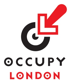
He would rather get involved in projects that might bring about greater social and economic justice. They’re more gratifying, even if they don’t pay the bills. One of the studio’s recent projects was a logo for Occupy London, the anti-capitalist protest movement, who invited Barnbrook to submit a design. A series of potential new logos was put to an online vote, with the designers remaining anonymous. The Barnbrook logo won. The Occupy Times, which documented the demonstration against corporate greed, also used a Virus font.
Sign up to Creative Bloq's daily newsletter, which brings you the latest news and inspiration from the worlds of art, design and technology.

The Creative Bloq team is made up of a group of art and design enthusiasts, and has changed and evolved since Creative Bloq began back in 2012. The current website team consists of eight full-time members of staff: Editor Georgia Coggan, Deputy Editor Rosie Hilder, Ecommerce Editor Beren Neale, Senior News Editor Daniel Piper, Editor, Digital Art and 3D Ian Dean, Tech Reviews Editor Erlingur Einarsson, Ecommerce Writer Beth Nicholls and Staff Writer Natalie Fear, as well as a roster of freelancers from around the world. The ImagineFX magazine team also pitch in, ensuring that content from leading digital art publication ImagineFX is represented on Creative Bloq.
