New talent: Ravensbourne College degree show
Computer Arts editor Nick Carson picks his highlights from Ravensbourne's 2014 Graphic Design graduates.
Sign up to Creative Bloq's daily newsletter, which brings you the latest news and inspiration from the worlds of art, design and technology.
You are now subscribed
Your newsletter sign-up was successful
Want to add more newsletters?
If you're looking for exciting new graduates for your studio or agency, don't miss Computer Arts' New Talent special, issue 230, featuring our handpicked selection of the UK's best graduates – on sale 24 July.
Given that it's simply entitled The Degree Show – and boasts the generic, all-encompassing URL thedegreeshow.com – you could be forgiven for assuming that Ravensbourne College of Design and Communication is the show in town.
Based in a strikingly modernist building facing the Millennium Dome, and decked out for grad show season with pink neon strip lights and fluoro orange lettering suspended from the ceiling, the college certainly makes a zingy first impression.
Article continues below 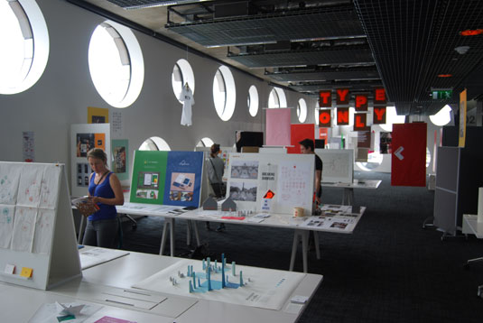
Despite a minor scheduling mishap meaning that team CA rocked up a couple of hours before Ravensbourne's grad show was officially due to open, we were fortunate to get a private tour of the Graphic Design room courtesy of Thomas Walskaar, who developed the event branding as part of his course.
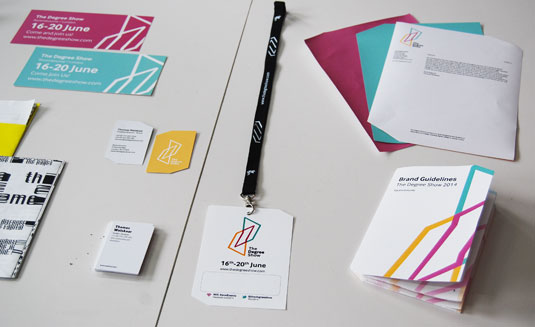
While 2013's branding took on a 'TV show' theme, Walskaar's brief was more course-focused, with a view to encouraging curious visitors to explore the building rather than making a beeline for one area.
It had to sit comfortably with Ravensbourne's own branding across various platforms, and he chose Dalton Maag's InterFace to complement the Akzidenz-Grotesk used by the college.
"I experimented a lot around the use of shapes and patterns from around the building, drawing inspiration from the circular windows and Penrose pattern on the façade," says Walskaar.
Sign up to Creative Bloq's daily newsletter, which brings you the latest news and inspiration from the worlds of art, design and technology.
So without further ado, here are our top five Ravensbourne grads to watch from 2014.
Chris Norris
- Course: BA (Hons) Graphic Design
- Website: www.chris-norris.com
- Project: Discrimi-Nation
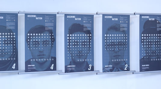
Displayed as a series of eight banner-style posters suspended along the side wall of the exhibition, Chris Norris' Discrimi-Nation project immediately stood out.
Born out of a challenge set by research and statistics company YouGov to interpret any of its vast number of data sets in an engaging, visual way, Discrimi-Nation explores the extent to which different groups of people in British society suffer discrimination.
Armed with a stack of over 1,700 survey responses including 'a lot', 'some', 'a little' and 'no' discrimination – as well as the obligatory 'don't know', of course – Norris set about developing a visual language to express the issues at hand.
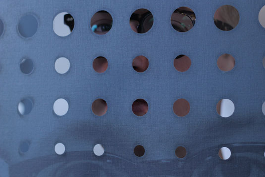
"I came up with a system that shows the more discrimination the public feels a particular group in society faces, the more their face is obscured," he explains.
Photographs of people of different genders, races, sexualities and religions had holes punched through them, corresponding to the strength of the survey response – the more perceived discrimination, the bigger the hole. A beautifully simple idea, confidently executed.
Edward Yau
- Course: BA (Hons) Graphic Design
- Website: www.edwardyau.co.uk
- Project: Xin Restaurant
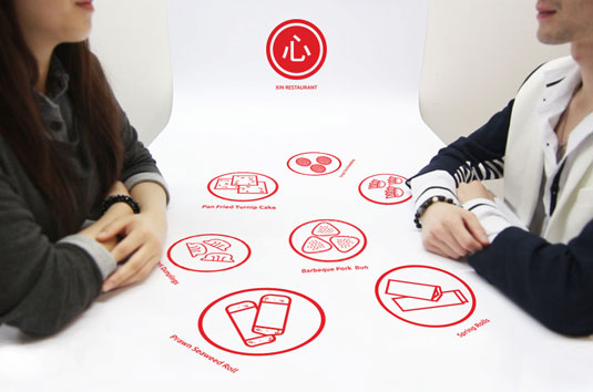
Another stand-out from Ravensbourne was Edward Yau's clean and stylish Xin Restaurant branding work, a collaboration with architecture student Yunhong Xue.
Having worked together before, the duo initially came up with the concept of a recipe app that teaches people how to cook using pictograms. One of Xue's previous projects was the design for a digital-themed restaurant, and this draws the two together.
"Increasing the efficiency of the service was a main factor, and we began to consider using emerging digital technologies to improve this," explains Yau. "We wanted to encourage social interaction between diners, and sharing through the ordering, waiting, and eating process. Chinese Dim Sum was the ideal cuisine for this."
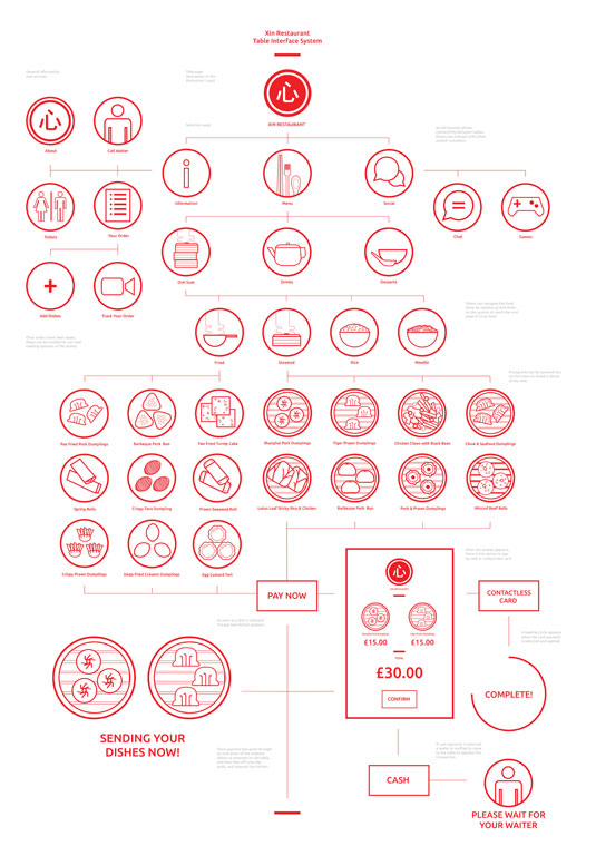
"We wanted to push the idea of connectivity," Yau continues. "The interior is designed with connected walls, tables and floors: every surface is interactive and responds to the user."
Ordering and paying would be as much a part of the experience as eating the food, with everything controlled from the interactive tables – for which inspiration came from films as diverse as Tron Legacy and Wreck-It Ralph.
"We wanted to keep the overall design simple and clear," adds Yau. "The table functions and menu are in the form of pictograms, to make them universally approachable."
Clarke Cribb
- Course: BA (Hons) Graphic Design
- Website: www.clarkecribb.com
- Project: Would You Beleaf It?
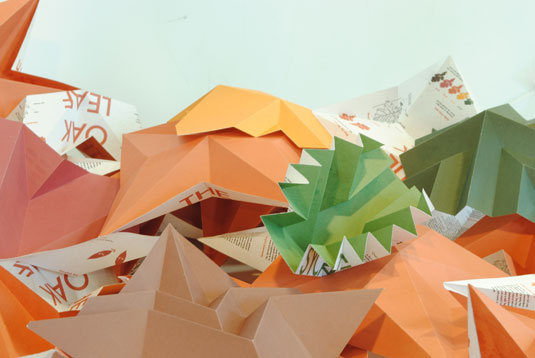
Like Discrimi-Nation, Clarke Cribb's origami-inspired installation Would You Beleaf It? was created in response to a YouGov brief to visualise particular statistics, and certainly made an impact on us.
Survey data gathered from the Woodland Trust informed Cribb that the average member of the public is unable to correctly identify the leaves that come from particular types of tree, and he decided to do something about it.
With a passion for unusual formats, he began researching paper engineering to develop a physical, origami-style replica of eight different leaves that conveyed particular information using diagrams and pictograms.
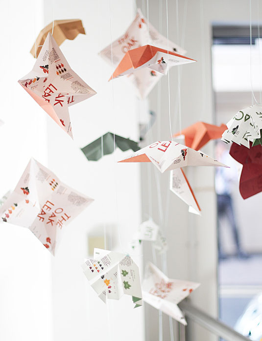
"At first I designed all kinds of charts, which relayed the information correctly, but didn't work with the overall feel of the design – they needed to be more 'leafy'," he grins. "Each leaf represented one per cent, so the more there are, the more recognisable the leaf."
Joshua Allen
- Course: BA (Hons) Graphic Design
- Website: www.joshallen.co.uk
- Project: Brxtn font
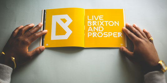
With mixed feelings about the re-gentrification of Brixton caused by its continued redevelopment, Joshua Allen set out to preserve the historic essence of the London district in which he was born and raised.
"Amidst the drastic change in the area and contrasting opinions towards it, my response was to transform and immortalise an iconic piece of its not too distant past into something that could live on forever in its future," he explains.
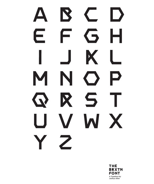
Marked for demolition, Southwyck House estate on Somerlayton Road became a symbol of what Allen calls "pre-affluent Brixton", and the geometric shapes of the buildings there - hexagons in particular – would form the basis for Brxtn, a font imbued with the essence of the district.
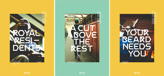
"Every time I completed a character, it gave me the enthusiasm to go on and create another one," he smiles.
"I look forward to taking this project further, by turning the project into a working font. Hopefully I will be able to use it to create an official identity for the area I've grown up in."
Carrie-Ann James
- Course: BA (Hons) Graphic Design
- Website: www.carrieannjames.com
- Project: Comfortable Temperatures
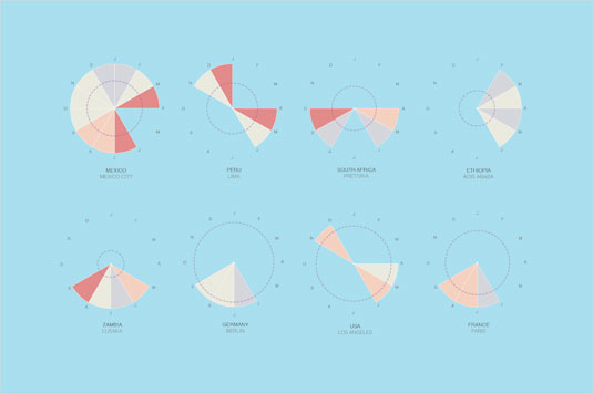
Completing a trio of information design-focused Ravensbourne highlights, Carrie-Ann James' Comfortable Temperatures project brings a more conventional infographic-style approach to the table.
"I found it quite funny how people in England don't like the weather to be too hot or too cold," she recalls. "This sparked my idea of showing temperatures that would be comfortable for everyone to enjoy, and where it would apply."
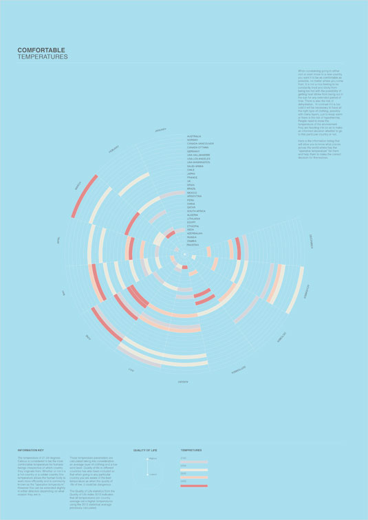
Having discovered the optimal environment to be between 21 and 24 Celsius with mild wind conditions, she then set about finding which countries could boast these "comfortable temperatures" at what time of year – adding some data about their relative quality of life too.
James set out to make the multiple layers of data as easy to digest and understand as possible. "Everything came together at the very end, and the concept worked effectively," she adds.
Get a half-price CA subscription!
We know it isn't always easy being a recent graduate. So to help - and celebrate the 2014 degree show season - we're offering an incredible 50% off an annual subscription to Computer Arts magazine.
For just £39 you'll receive an entire year of industry insight, opinion and inspiration, delivered directly to your door.
Plus: sign up by 10 July and you'll receive our New Talent issue, featuring our guide to 2014's most outstanding design graduates - and a very special cover designed in response to a joint brief with D&AD New Blood.

Nick has worked with world-class agencies including Wolff Olins, Taxi Studio and Vault49 on brand storytelling, tone of voice and verbal strategy for global brands such as Virgin, TikTok, and Bite Back 2030. Nick launched the Brand Impact Awards in 2013 while editor of Computer Arts, and remains chair of judges. He's written for Creative Bloq on design and branding matters since the site's launch.
