If you're looking for exciting new graduates for your studio or agency, don't miss Computer Arts' New Talent special, issue 230, featuring our handpicked selection of the UK's best graduates - on sale 24 July.
For creative directors and design journalists alike, degree show season is a real assault on the senses, incredibly inspiring and exhausting in equal measure.

Alongside It's Nice That's Rob Alderson and Creative Review's Mark Sinclair, I was asked to judge the Best Stand category at this year's exhibition, considering look, feel and style of presentation as well as overall quality of output.
We managed to find a consensus, and our three winning stands (as well as a couple of special mentions) are set out below, along with a selection of stand-out students from these and several other colleges.
Best Stand #1: Edinburgh Napier University

With a balance of tactile, handmade creations, colourful posters and other curiosities, Edinburgh Napier University's eye-catching stand featured a diverse selection of styles and approaches, all with a consistently high standard.
Compared to some of the more conventional exhibition-style layouts, it felt almost like a gallery shop, with plenty of depth and interest to keep browsers engaged.
Two particular graduates stood out from a very strong field:
Emily Elvin

- College: Edinburgh Napier University
- Course: BA (Hons) Graphic Design
- Website: http://emilyelvin.prosite.com
- Project: Wake Up And Sleep
Focused on expressing the unsettling state of sleep in our society, Emily Elvin's Wake Up and Sleep project came about thanks to her own perpetual struggle to get a proper night's kip. After researching some of her peers' sleeping habits, she began to investigate a number of the bad habits at the route of the problem.
"Sleep in the 21st century has been deemed to be more neglected and problematic than ever," she observes. "With vibrant visuals and moving elements, I aimed to bring to life the chaotic surroundings that inhibit the single most important behavioral experience that we have."

Using coloured paper, Elvin began developing exaggerated 3D models to illustrate the problems visually. "The greatest challenge was getting the message across using only paper," she admits. "Using stop-motion animation allowed the paper models to immediately come to life."
Some of the factors she tried to express include light, technology, toxins and highly vivid colour. "Making the animation fast-paced and rich with intensity sends the message of chaos, and the loss of control we've developed when it comes to sleep," she adds.
Jolita Lenktaityte

- College: Edinburgh Napier University
- Course: BA (Hons) Graphic Design
- Website: www.behance.net/Jolita
- Project: You Are What You Tweet
Bringing a splash of neon yellow to the already colourful Edinburgh Napier stand was Jolita Lenktaityte's You Are What You Tweet, a project exploring the ubiquity of online self-promotion.

"I took some of the common online behaviours and applied those in offline situations," she explains. "For example, would you wear your tweets as a T-shirt or a piece of jewellery, or hang it on the wall?"

Her favourite aspect was making the clothing, one item of which was made from transparent PVC. "To reflect the fake online identity that people often create by over-sharing and abusing social media channels like Twitter of Facebook, I chose artificial materials like acrylic or PVC," she adds.
Best Stand #2: Arts University Bournemouth (UAB)

If Edinburgh Napier channeled the spirit of a boutique shop, Arts University Bournemouth's Graphic Design stand felt more like a stylish reference library in a studio.
Individual items of student work were carefully arranged in a clean, uncluttered tabletop layout, with reference numbers beside each that corresponded with a neatly ordered row of matching box files along the back wall.
Interested parties could then browse additional information about each student, one of whom for us was:
Emily Baldwin

- College: Arts University Bournemouth
- Course: BA (Hons) Graphic Design
- Website: http://emily-baldwin.squarespace.com
- Project: The Imperfect Campaign
Amongst a stylishly presented show from AUB, one project stood out for us: Emily Baldwin's beautifully produced book The Imperfect Campaign, which as she explains, "graphically represents imperfections by intentionally subverting objects."
Baldwin's concept evolved from exploring the broad subject of 'imperfection' and what it means. "I didn't wish to focus on body image, as this is a prominent issue in today's society," she reveals. "It developed by looking into the perfection of social media, and subverting the angle from which we perceive it."

Throughout the book, social issues are subtly pointed out through visual cues: "You see a beautiful bike, and shortly afterwards acknowledge that the wheels are square," is her example. "This allows the viewer to search out a deeper meaning within the visuals, and interrogate them."
Meanwhile, over on UAB's Illustration stand a couple of rows further down we also spotted:
Annabel Davis

- College: Arts University Bournemouth
- Course: BA (Hons) Illustration
- Website: www.annabeldavisillustration.co.uk
- Project: Feles De Regnum (The Kingdom of Cats)
To balance the serious subject matter of her previous work, Annabel Davies took a lighter route for her final project, creating a fictional universe where anthropomorphised cats rule instead of humans.
"I'd been looking into art history and found myself enjoying paintings that tell stories of the history of that time. I especially liked how royal families could use art as propaganda to manipulate the views of the public, so I tried to create my own fictional monarchy - with cats to give it an amusing edge."
Davies started with pencil sketches, inking over the main lines and adding more pencil for shading. After scanning in each image she digitally build up the project, adding colour and brush marks to create form, shape and depth.

Choosing the right colour scheme was important: "I like to stick to a fairly limited palette," says Davies, adding that she referenced many books on historical paintings before creating her own scenes and portraits.
"It was the end of my course, so the last time I could set myself a free and fun project without the horrors of reality knocking on my door. I tried to make the most of it," she laughs.
Best Stand #3: London College of Communication (LCC) School of Design

Our third pick for Best Stand was the ever-excellent London College of Communication. The sole representative of the University of the Arts London at New Blood, it was notable for its clean, minimalist layout, which felt unified and confident.
The CA team spent a couple of hours at LCC's sprawling main show a couple of weeks back, so we won't repeat ourselves here: you can read our round-up of our favourites from the Illustration and Graphic and Media Design courses.
You can also read our highlights from two other UAL colleges: Central Saint Martins and Chelsea College of Art.
Special mention: Nottingham Trent University (NTU)

Judging the Best Stand category was a close-run event, and falling just outside our top three was Nottingham Trent University - so we'll give it a special mention.
The stand's pinboard-style layout aligns a diverse selection of projects with a satisfying, grid-based approach that feels like a piece of graphic design in itself.
Two students in particular stood out from NTU:
Tim Green

- College: Nottingham Trent University
- Course: BA (Hons) Graphic Design
- Website: www.behance.net/timgreen
- Project: Angostura Bitters rebrand
Briefed to make a current brand 'the dog's bollocks', Tim Green was attracted to Angostura Bitters after seeing the product on a night out and realising how easily it could be overlooked.
"For a brand that has lasted the test of time and survived since 1824, it is constantly named as a must ingredient to any cocktail," he says. "However their current visuals seem unconfident in its ability, and its position in the market."

Green was inspired by the drink's origin in Trinidad & Tobago, but was keen to avoid cliches like the red, black, gold and green Carribean colour palette. "The inspiration comes from all over the environment, from architecture to the colours of the shoreline," he explains, "as well as the Victorian scientists who studied the wildlife of the area when the drink was flourishing."
Angostura Bitters is known for its oversized label, and Green chose to retain this feature while developing it to encourage consumer interaction: folding it open reveals a second design that's more fitting to the bottle underneath.
Joshua Mulcahy

- College: Nottingham Trent University
- Course: BA (Hons) Graphic Design
- Website: www.behance.net/JoshuaMulcahy
- Project: Think Different
Winner of the Chartered Society of Designers' Student of the Year Award, Joshua Mulcahy attempts to explore political or cultural events through his work, taking inspiration from Russian Constructivism and The Bauhaus.
"This is the reason much of my work can appear very simplistic," he explains. "It's about translating complex information into more basic forms."
For Mulcahy, the highlight of his experience at NTU was his third-year final project: an abstract portrait of the late Steve Jobs entitled Think Different, rendered through a series of red, orange, yellow, black and grey triangles.
Another special mention: Falmouth University (Illustration)

An invariably strong contender at D&AD New Blood each year, Falmouth University is also worthy of special mention. While its presentation may not have been as innovative as some of the other colleges, the calibre of the work on show on the Illustration stand more than made up for it.
Former CA designer Becca Allen paid a visit to her alma mater on our behalf, and you can browse some of her highlights from this year's Graphic Design and Illustration courses.
Five more to watch at D&AD New Blood
Besides our highlights from the Best Stand candidates, here are five more individual students that stood out from the rest of the D&AD New Blood exhibition.
Julie Ritchie

- College: Edinburgh College of Art
- Course: BA (Hons) Illustration
- Website: www.julieritchie.co.uk
- Project: Dullsville
Two pop-art-style framed prints on the Edinburgh College of Art stand caught our eye: extracts from Julie Ritchie's graphic novel Dullsville, which she developed in her final year.
"It's a kind of coming-of-age story, and follows the relationship between two characters who inhabit a boring suburb," she explains. "The prints act as a kind of infographic mind map of their personalities."

Ritchie particularly enjoyed the subject matter: "There's something quite satisfying in seeing a collection of these icons come together to create a narrative, when on their own they stand for quite different things," she adds.
Ollie Williams

- College: Falmouth University
- Course: BA (Hons) Digital Media
- Website: www.silkworthandsire.co.uk
- Projects: Tangible Sequencers and Newsfeed Haiku
Two projects leapt right out from Falmouth's Digital Media stand, largely for their innovative way of bridging the gap between the analogue and digital worlds. And both were by Ollie Williams.
First up, Tangible Sequencers links a series of wooden blocks with three MIDI step sequencers, so by moving them around or flipping them over your can change the audio output in real time to create an ever-shifting soundscape.

Meanwhile, Newsfeed Haiku is a "physical haiku generator" that uses split-flap displays to create a constantly changing poem. "The words used are 540 of the most frequently occurring words in news articles published on national newspaper websites on Saturday 24 May 2014," explains Williams.
"How do we keep track of one specific moment in time in an era of 'always on', constant data streams? This project attempts to create a poetic construction from an ephemeral moment, as seen through news feeds and media streams."
Laura Hudson

- College: University of Huddersfield
- Course: BA (Hons) Graphic Design
- Website: www.laurahudsondesign.com
- Project: Making The Invisible Visible
Stemming from a self-written brief to raise awareness of mental illness, Laura Hudson's Making the Invisible Visible builds on the absorption concept of Oscar Diaz's ink calendar, in which ink absorbs through embossed channels that form the dates within a month.
She used the concept as a striking visual metaphor for mental illness, too-often seen as a taboo subject. "Because it's occurring within the mind, it doesn’t generally have any physical attributes in the same way as many physical illnesses, so people prefer to assume it doesn’t exist or it isn't serious, purely because they can’t see its effect."
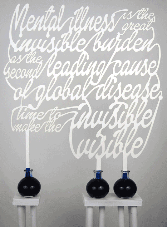
Using hand-drawn calligraphy, laser-cut from paper, she created an intricate typographic message in which all the words are connected, allowing the ink to spread upwards.
The biggest challenge was finding the right paper: "It had to be absorbent enough to carry the ink up, but strong enough to withstand the amount of liquid being absorbed without tearing," she explains. "I settled upon a piece of scientific grade blotting paper, 330gsm with a cellulose content of 95 per cent."
Liv Bell

- College: Loughborough University
- Course: BA (Hons) Visual Communication: Illustration
- Website: www.livbell.com
- Project: Roald Dahl: Adult Edition
As its title suggests, Roald Dahl: Adult Edition was Liv Bell's attempt to reinvent the iconic children's author's books for a different audience, inspired by the similar approach taken by the adult cover designs for the Harry Potter series.
"The idea began when re-listening to Roald Dahl's audio books, which me and my siblings used to do on long car journeys as children," recalls Bell. "They seemed no less exciting, however now I appreciated Dahl's dark cynicism and grotesque humour, which is hidden within his clever storytelling."

She was keen to get across the playful nature inherent in the stories, while refining it for an older audience. "The biggest challenge was my own connection to Quentin Blake’s illustrations. His imagery is tied to Dahl’s books, and makes them instantly recognisable," she points out.
"I would almost be disrespecting him if I was to just 'alter' or slightly change his imagery, so I wanted to get as far away as I could from his imagery, while retaining my own vision and style and not completely loosing the energy of Dahl's storytelling.
Hungry Sandwich Club

- College: Leeds College of Art
- Course: BA (Hons) Graphic Design
- Website: www.hungrysandwich.es
- Project: Super Sandwich Screens
Hungry Sandwich Club first caught our eye at the Leeds College of Art degree show. The young design and illustration studio drew our attention again at D&AD New Blood with co-founders Andy Foster and Martin O’Dea's fun take on motion graphics.
The pair synced an animation over three evenly spaced iPads, which were attached to the wall in a vertical triptych-esque setup. "The scenes and elements are all produced as vectors and separated into individual parts," explains Foster.
"We measured out the space and calculated the gap between screens. Using these measurements as a template, we could animate in a tall rectangle and were able to chop this into the separate iPad videos."

"Keeping the iPads in sync was a nightmare," he admits. "On our opening night we had to resort to having six people press play at the same time. Thankfully we found a clever piece of software to do this job for us."
"We love that we were able to do something bright and playful that catches people’s attention," he adds. "We wanted our character to show though."
You can also read some more in-depth highlights from Leeds College of Art's Graphic Design course, courtesy of our friends at Elmwood.
Best of the rest at D&AD New Blood
Finally, check out these five stands that caught our eye from across the exhibition, also all worthy of further inspection.


Half-price CA subscription offer!
We know it isn't always easy being a recent graduate. So to celebrate 2014 degree show season, get an incredible 50% off an annual subscription to Computer Arts magazine. For just £39 you'll receive an entire year of industry insight, opinion and inspiration, delivered to your door.
Plus: sign up by 10th July and you'll receive our New Talent issue, featuring our guide to 2014's most outstanding design graduates - and a very special cover designed in response to a joint brief with D&AD New Blood.

