This type-based identity is built to evolve
This bold and minimal identity was designed to showcase Cerovski's distinctive print work.
Sign up to Creative Bloq's daily newsletter, which brings you the latest news and inspiration from the worlds of art, design and technology.
You are now subscribed
Your newsletter sign-up was successful
Want to add more newsletters?
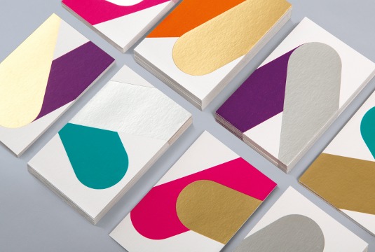
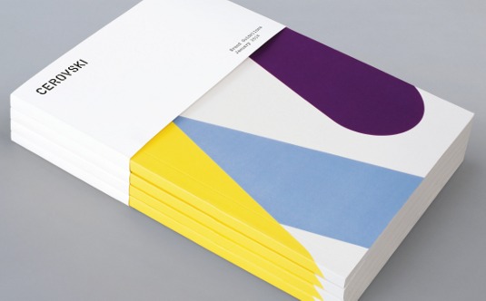
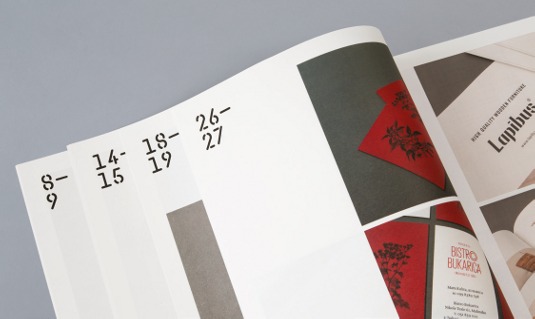
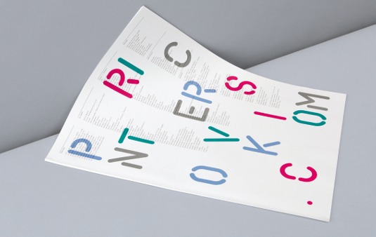
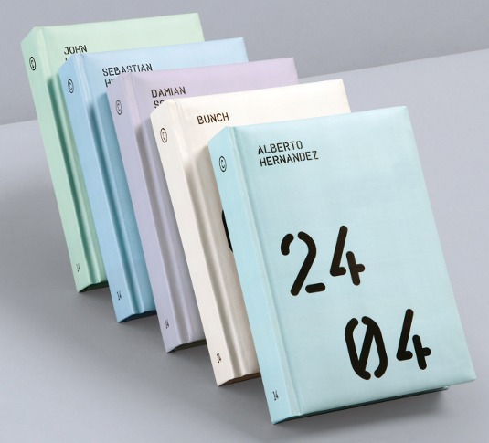
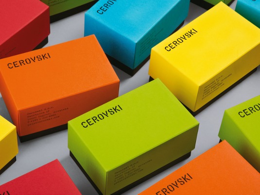
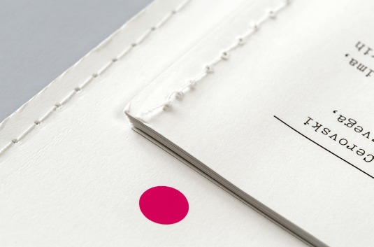
A bespoke, stencil-cut typeface forms the basis of Bunch's new identity for Zagreb-based print production studio Cerovski. Bold forms extend from the custom logotype, pulling the identity together across the studio's website and printed collateral, and providing large areas to showcase the special inks and finishes that Cerovski is known for.
"A cylinder-shaped device is taken from the shape of the letters, and presents an element that will gradually evolve as we continue working on other applications in the future," explains Bunch partner Denis Kovac. "We are looking forward to it."
This article originally appeared in Computer Arts issue 225.
Article continues belowSign up to Creative Bloq's daily newsletter, which brings you the latest news and inspiration from the worlds of art, design and technology.

The Creative Bloq team is made up of a group of art and design enthusiasts, and has changed and evolved since Creative Bloq began back in 2012. The current website team consists of eight full-time members of staff: Editor Georgia Coggan, Deputy Editor Rosie Hilder, Ecommerce Editor Beren Neale, Senior News Editor Daniel Piper, Editor, Digital Art and 3D Ian Dean, Tech Reviews Editor Erlingur Einarsson, Ecommerce Writer Beth Nicholls and Staff Writer Natalie Fear, as well as a roster of freelancers from around the world. The ImagineFX magazine team also pitch in, ensuring that content from leading digital art publication ImagineFX is represented on Creative Bloq.
