Master web typography with OpenType
Jason Pamental explains how to add web typography delight with OpenType features for better kerning, proper ligatures and numerals.
We can all agree that embeddable web fonts are one of the biggest advances for design on the web since its inception, particularly in the age of responsive web design. With so many elements that move and change from one screen size to the next, great typography and distinct typefaces are one of the only constants that work equally well on every device (except devices using the Opera Mini browser).
Just adding web fonts is only part of the story. Words may have meaning, but letters have emotion. OpenType (OT) is a cross-platform font file format developed by Adobe and Microsoft. Its features add greater depth and variety by expanding the character sets of OT-enabled typefaces to include such typographic delights as ligatures, swashes, stylistic alternates and even real kerning. Expand your emotional vocabulary by exploring all these marvellous features; there's no reason to stop with just the typeface.
Watch an exclusive screencast of this tutorial:
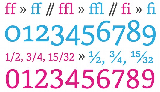
Article continues belowJust what are all these typographic beauties? Well, for starters there are ligatures (including standard, discretionary and contextual varieties). These are combinations of characters that historically tend to blend together when drawn or cut, such as ff, ffl, fi or fj. Technically, this is when the 'hood' of the f is combined with the 'tittle' of the lower case i or j, but you can see how it could become hard to keep a straight face when discussing the topic.
One of my personal favourites is the less common ligature for ct and st as seen in Adobe Caslon Pro, among others. Then there are swashes, like those found in Fairbank (shown in use from Fonts.com): lovely swoops and embellishments that add a truly distinct character when put to good use.
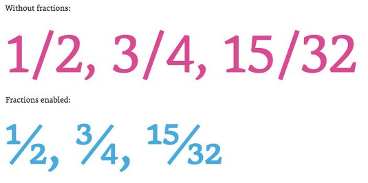
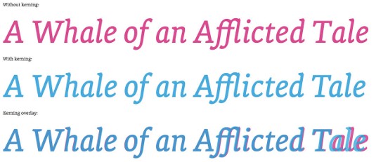
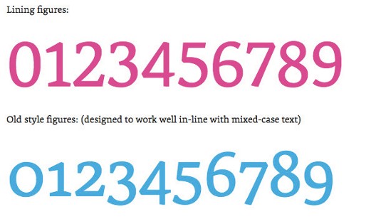
Other common features include stylistic alternates and various options for numerals, including tabular figures (evenly spaced and perfect for financial tables), fractions, oldstyle figures (with both ascenders and descenders to fit well with upper and lower case letters) and of course, kerning tables. (That alone may be worth the price of admission, as I've always felt that browsers tend to do a fairly middling job of spacing type on screen.)
- Download a sample page that includes loads of tips and tricks you can try in your own projects.
A bit of backstory
These characters and features have existed for centuries, but only recently have they become usable on the web. Ligatures were first seen in Sumerian manuscripts and many subsequent forms of writing and calligraphy. With the advent of movable type, ligatures were used to improve letterspacing to allow spacing tighter than otherwise separate blocks of type would allow. Many of these features fell out of favour with the advent of photo- and then computer-based typesetting. It's only in recent years that better font formats have made them available again, and use of them has increased.
Sign up to Creative Bloq's daily newsletter, which brings you the latest news and inspiration from the worlds of art, design and technology.
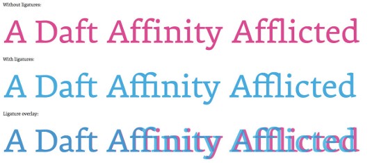
With the arrival of OpenType (or more correctly Open Font Format) on the desktop and its derivative Web Open Font Format (WOFF), for use on the web, there finally exists a pair of font formats that can be used nearly universally. The significance here is these formats support a much wider array of characters and features for finer typographic control than ever before. As in all things web, use of these features is supported at varying levels in all the major browsers, but it's prevalent enough now to be worth serious consideration and use.
The CSS required has been around for a few years, and is part of the CSS3 type module. Unfortunately, it's been slow progress to get wide enough support for the WOFF format, so it follows that browser implementation and support has evolved slowly as well. It's worth noting, though, that every major shipping browser does support OpenType features (with the exception of Opera Mini). You can check on how far back that support extends easily on Can I Use.
Thankfully, even though support and syntax vary, tools like Sass can help make it more practical to give it a try, and if the syntax doesn't work or the feature is unsupported, the user just ends up with normal text. Of course, there's always a catch; enabling OpenType features does increase the file size, but with care and caching it doesn't have to be a performance killer.
So why bother?
Design is about communication and people make judgements about usability based on aesthetics. So it's our duty to pull out all the stops in how we communicate with our typographic choices. Furthermore, you must remember we read by scanning groups of shapes, not individual letters. So the smoother the flow, and the easier it is to grasp groups of letters and understand them as words and phrases, the faster the user will comprehend the message you are trying to get across, and you'll be doing it with style.
The details, please
Once you have a font included in your site that has OpenType features enabled, using them in your CSS is fairly straightforward. The official CSS3 syntax looks like this:
p {
font-feature-settings: "liga" 1, "frac" 1;
}
This code would turn on both standard ligatures and fractions, if those features are available. Due to syntax variations, the actual safer way to include them would look more like this:
p {
-moz-font-feature-settings : "liga=1", "frac=1";
-moz-font-feature-settings : "liga" 1, "frac" 1;
-webkit-font-feature-settings : "liga" 1, "frac" 1;
-ms-font-feature-settings : "liga=1", "frac=1";
-o-font-feature-settings : "liga" 1, "frac" 1;
font-feature-settings : "liga" 1, "frac" 1;
}
Yes, Firefox is in here twice. That's due to a syntax change somewhere around Firefox 14. Here's a more complete list of what features exist and how to reference them:
- "c2sc" : small caps from caps
- "calt" : contextual alternates
- "clig" : contextual ligatures
- "dlig" : discretionary ligatures
- "hist" : historical character alternatives
- "hlig" : historical ligatures
- "kern" : enable use of embedded kerning table
- "liga" : common ligatures
- "nalt" : alternate annotation
- "salt" : stylistic alternatives
- "smcp" : small caps
- "ss01" : alternate stylistic set 1
- "ss02" : alternate stylistic set 2
- "ss03" : alternate stylistic set 3
- "ss04" : alternate stylistic set 4
- "ss05" : alternate stylistic set 5
- "swsh" : swashes
- "zero" : slashed-zero
The following options require a sort of conditional logic (at least in your own mind), as you can really only enable one of these pairs at a time:
- Number case:"lnum" : lining numbers or "onum" : oldstyle numbers
- Number spacing:"pnum" : proportional or "tnum" : tabular (for lining up rows of numbers like financials)
- Fractions:"frac" : normal fractions or "afrc" : alternate fractions
Don't want to remember all that? If you use Sass, I've got a Mixin for you. It provides the list above and does all the code writing for you. For a more exhaustive list, try Adobe.
A reasoned approach
Every element of your design must be there for a reason, but it's important to remember that sometimes, a good reason is simply for greater beauty. And that's OK. The nice thing about OpenType features is they fall back to regular type all on their own, so they're pretty safe to add to your design, and the level of polish they add can be quite noticeable. With greater emphasis on readability, increased pixel density and screen quality, more and more users are reading longer content online. That means the benefits in readability from better typography can quickly translate into increased loyalty, greater perceived usability, and even parades of unicorns and puppies (OK, so maybe that last one is an exaggeration).
Words: Jason Pamental
This article originally appeared in net magazine issue 253.

The Creative Bloq team is made up of a group of art and design enthusiasts, and has changed and evolved since Creative Bloq began back in 2012. The current website team consists of eight full-time members of staff: Editor Georgia Coggan, Deputy Editor Rosie Hilder, Ecommerce Editor Beren Neale, Senior News Editor Daniel Piper, Editor, Digital Art and 3D Ian Dean, Tech Reviews Editor Erlingur Einarsson, Ecommerce Writer Beth Nicholls and Staff Writer Natalie Fear, as well as a roster of freelancers from around the world. The ImagineFX magazine team also pitch in, ensuring that content from leading digital art publication ImagineFX is represented on Creative Bloq.
