9 things we learned about design in 2015
Tom Moran, Gary Glozier and Sion Evans of TH_NK reveal their top takeaways from the past year.
2015 is nearly over, but what have we learned? For the creatives at digital transformation agency TH_NK the answer is quite a bit, actually – and they'd like to share their newfound knowledge with the community.
So in this article, they've gathered together their biggest takeaways of the year from senior experience designer Tom Moran (1-3), design director Gary Glozier (4-6) and lead front end developer Sion Evans (7-9). We'd love to know your thoughts on the issues they raise – please feel free to share them in the comments at the bottom.
01. The Internet of Things has arrived

As a concept, we've been aware of the 'internet-of-things' for a long time; an interconnected world of devices ranging from your car to your toaster. However, 2015 really felt like the arrival of the internet-of-things with a huge range of smart, interconnected devices arriving on the market.
An internet-of-things also saw the emergence of digital algorithms actually starting to interpret the Big Data being produced to give some incredible insights, such as Google Now.
There were also interesting developments in products and apps designed to harmonise and collate a world of disconnected devices; such as NinjaBlock that uses a central gesture-based interface to control your lights, heating or even pause your movie.
02. Adaptive design has become essential
This year saw a huge increase in screen sizes, ratios and resolutions that all require design consideration from the very beginning of the scoping process.
Adaptive design requires the UX designer to approach each screen as a fresh canvas, taking into consideration the various benefits and challenges it provides; from round watch faces like the Samsung Gear 2 to 4k televisions.
Sign up to Creative Bloq's daily newsletter, which brings you the latest news and inspiration from the worlds of art, design and technology.
03. Wearables are here
Amid a flurry of controversy and mixed reviews, the launch of the Apple Watch finally kick-started the wearable market by providing a decent innovation platform of sensors and monitors wrapped in a desirable and fashionable product. The true power of the Apple Watch is in the app community behind it and what they can do with the range of capabilities the watch provides.

One of the interesting qualities of wearables is that they render themselves obsolete with success. Lumo Lift is a wearable device to improve posture by 'teaching' the user to sit correctly. As they learn and improve the need for the wearable decreases until they no longer need it at all.
In the future there may become a split in wearable devices, those that can be designed as apps for the consolidated devices and those that are produced at low cost and are inherently designed to be discarded with time.
04. The web's never looked better

The death of web design was a hot topic and not without good reason. Mobile and responsive design frameworks by their very nature filter out unnecessary user interface components.
The result is a drift towards generic, homogenized design patterns. Off-the-shelf packages have opened up web design and made it accessible. Beautiful, functional websites are no longer the preserve of the few and that's a good thing.
We eagerly await the arrival of The Grid and are keen to see how artificial intelligence shapes digital design. A website that learns, that can continually evolve its interface to improve usability is a compelling prospect.
05. Spotify personalisation is actually good and feels human
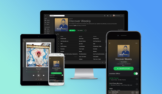
AI helped us discover new and exotic music in 2015. We enjoyed our trial of Apple Music but Beats Radio just wasn't our thing. We soon tuned back into Spotify thanks in no small part to Discover Weekly, a service that generates a personally tailored playlist based upon our listening habits.

Using algorithms that seek out playlists that feature songs you've also added, then recommending other tracks from those playlists, Spotify has enriched our listening in a surprisingly successful way. By centering on a two-hour playlist, complete with personalised cover art, we're given enough variety without too many tune-out moments.
Found them first is an application from Spotify that allows music pioneers to boast about discovering new artists. There's also been talk of an application that matches music to your heartbeat or pulse via a smartphone or watch. In terms of designing new and exciting ways to engage their audience, Spotify has had a busy year.
06. Slack is helping us to collaborate
We share a great deal of creative stimuli in the agency. With teams split across both London and Newcastle we're keen to embrace any technologies that reduce our reliance on email as a communication channel. It's therefore no surprise that Slack has proven to be an unprecedented hit.
#Creative is just one of the thirty-five strong channels that emerged within days of being installed. Our channel has become rich in links to design innovation, opinion pieces and everyday discussion. We have a channel for each client and every part of the agency is sharing and discussing ideas. Our inboxes feel a lot lighter for it too.
07. CSS3 and Material Design have made the web more beautiful

With Microsoft announcing the end of IE8 support by the start of 2016, its new browser Edge to be built around web standards, and other modern browsers expanding capabilities quicker than ever before, it finally became viable to start utilizing the latest CSS3 modules and properties.
Media queries, now a must for responsive design, allowed developers to target breakpoints, orientation and device. CSS animations and transitions, new selectors, Webfonts and layout options all helped to reduce the previous strain on front end JavaScript.
The advancement of CSS also opened the door to new design principles: enter material design. Google announced its new design language back in 2014, and adoption of the UI design philosophy is already widespread, with a host of front end frameworks available, including Google's Polymer Project, Angular Material and Materialize to name a few.

The idea behind Material is that the elements of design have structure, edges, shadows and depth, and use animation to give users meaning and visual clues about what, and how to interact with them.
By creating design elements that users can relate to, as they would in the physical world, ones that abide by the rules of physics, use natural light and shadow, exist in space, and in relation to one another, allows an instinctive user interaction and makes the primary objective of the application instantly understandable.
08. The front end build process is now mainstream
After a couple of years in the realm of the early adopter, 2015 saw everyone jump on the front end build process bandwagon. With the expanding popularity of NodeJS, front end development became as complex and interwoven as classic back end development.
Gone were the mundane tasks that drove developers to despair – file minification and concatenation, image compression, and HTML templating, now all run seamlessly in the background. You can now create build processes to do pretty much anything.
Even Microsoft integrated Grunt, Gulp, Bower and NPM into Visual Studio. Its back end alternatives MSBuild and Nuget, although useful for server side tasks, have little to offer front end in comparison to the huge libraries of plugins and packages from NPM and Bower.
09. JavaScript MV* frameworks have accelerated the development process
For the past few years jQuery has been the most important and impactful library in web development. But 2015 saw manual DOM manipulation declining, and with it jQuery. In its place has risen the likes of AngularJS, Backbone and Ember.
Instead of writing JavaScript to find, bind, extract data and modify elements, MV frameworks tends to use templating and extends HTML attributes to bind events and display data. So the only JavaScript written is to modify the state of modules.

MV* frameworks simply help structure your code. The MV part, Model and View are always likely to be included, and allow separation between data (Model) and UI (View). The star (*) part generally defines how you handle user input and interaction, and then updates the View.
There's a number of different patterns defined (MVC, MVVC, MVP), each with their own benefits, issues, and supporters. The use of MV* pattern has seen the rise of single page apps, with Gmail and Google Docs being a couple of the best examples. They download everything in a single payload, preventing the need for any further full-page rendering.
Words: Tom Moran (1-3), Gary Glozier (4-6) and Sion Evans (7-9)
Tom Moran, Gary Glozier and Sion Evans are, respectively, senior experience designer, design director and lead front end developer at digital transformation agency TH_NK.
Liked this? Read these!

The Creative Bloq team is made up of a group of art and design enthusiasts, and has changed and evolved since Creative Bloq began back in 2012. The current website team consists of eight full-time members of staff: Editor Georgia Coggan, Deputy Editor Rosie Hilder, Ecommerce Editor Beren Neale, Senior News Editor Daniel Piper, Editor, Digital Art and 3D Ian Dean, Tech Reviews Editor Erlingur Einarsson, Ecommerce Writer Beth Nicholls and Staff Writer Natalie Fear, as well as a roster of freelancers from around the world. The ImagineFX magazine team also pitch in, ensuring that content from leading digital art publication ImagineFX is represented on Creative Bloq.
