The best (and worst) logos of 2024
Some of this year's logos were no-gos.
Sign up to Creative Bloq's daily newsletter, which brings you the latest news and inspiration from the worlds of art, design and technology.
You are now subscribed
Your newsletter sign-up was successful
Want to add more newsletters?
As another year comes to a close, we're finally in a position to take a look back at the year in logos. As usual, we've seen a ton of new icons, symbols and wordmarks in 2024, with some refining existing assets, and others offering brand new designs. Some are worthy of our best logos roundup, while others belong in the design hall of shame.
From rebrands to new brands, we've seen more logos than ever over the last twelve months, with some hogging headlines and others offering more subtle refinements. Here's our roundup of the best (and worst) of the year.
The best:
01. Mazda
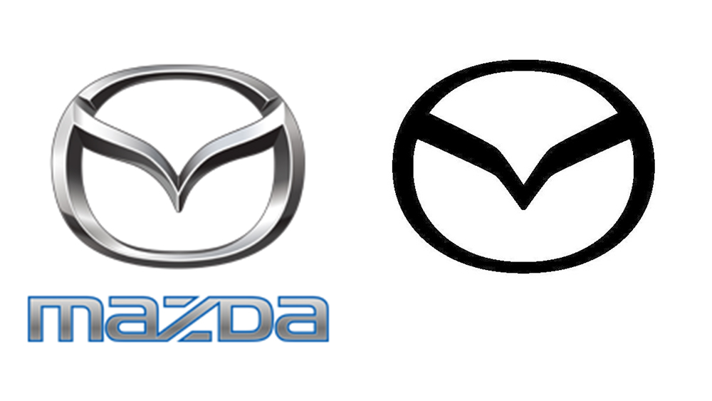
While it hasn't announced it officially, Mazda this year trademarked a new logo. Like most new car logos, it's a flatter take on the existing design – but we think it was a necessary change for the brand.
Article continues belowThe Japanese brand has been trying to move upmarket, but it's been doing so with a logo that's starting to look very dated. The new design follows the trend in recent car logo redesigns, but it's a much better fit. It's recognisable (unlike the Kia logo), and it would serve Mazda's efforts to shift its brand appeal from a young audience to focus on a higher-end market.
02. The 2025 World Games logo
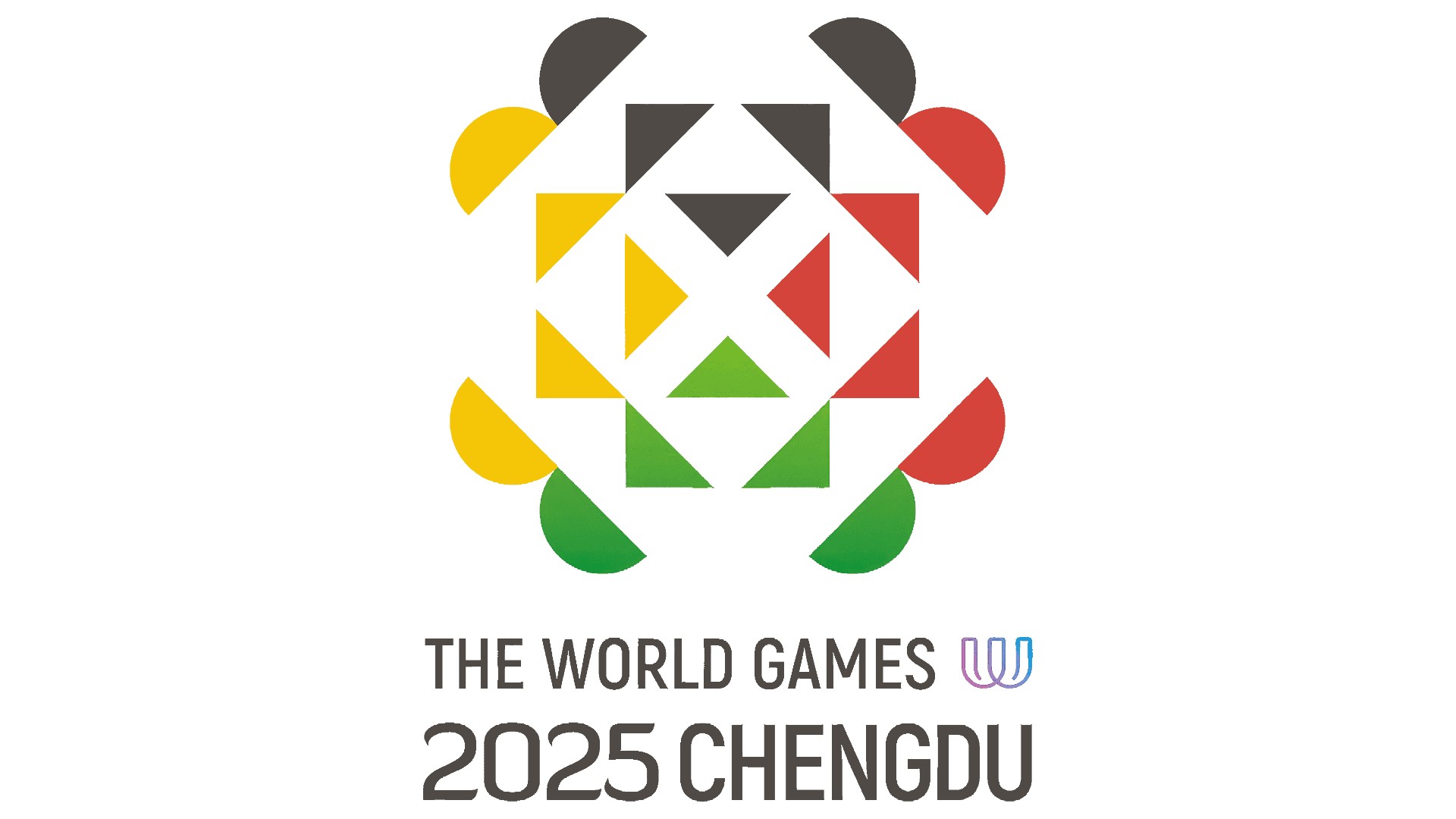
Designed by British designer John Fairley, the Chengdu 2025 World Games logo features geometric shapes symbolising the interconnected fate of humanity and respect for cultural diversity. But there's also an optical illusion in there for the eargle-eyed; the black section looks like the face of a panda (an animal that, incidentally, Chengdu is famous for).
03. The National Football Museum logo
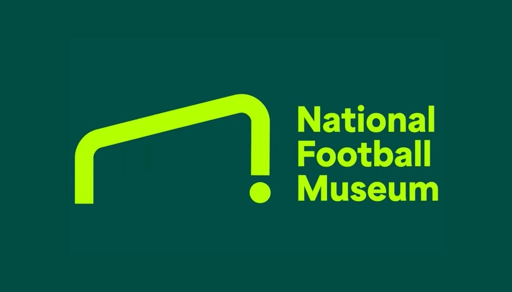
The National Football Museum logo might be one of the most literal logos on the list (it's a goal and a ball), but it's proof that sometimes that simplest ideas are the most effective. This minimal concept by Poke Marketing is a winner in our book.
The worst:
01. Jaguar
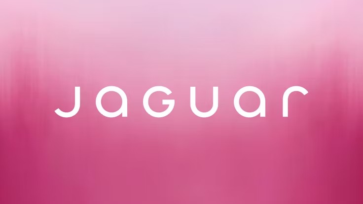
The entire Jaguar rebrand of 2024 has been mocked to oblivion, with the marketing images featuring diverse and colourfully dressed characters bearing most of the brunt. But the logo has proven unpopular too.
Sign up to Creative Bloq's daily newsletter, which brings you the latest news and inspiration from the worlds of art, design and technology.
Jaguar calls the wordmark "a powerful celebration of modernism – geometric form, symmetry and simplicity – demonstrating the unexpected by seamlessly blending upper and lowercase characters in visual harmony." But the design was quickly parodied by several other brands on social media, who jokingly presented versions of their own logos featuring a similar mix of upper and lowercase characters.
02. Visalia
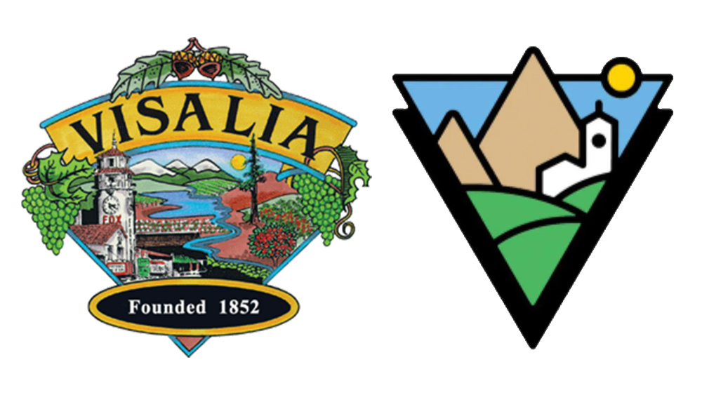
The residents of Visalia, California, didn't react well to the news that the city's elaborately illustrated logo would be replaced with a flat and simplified version. People complained that the design "sterilized" the city's personality and rendered its landmarks unrecognisable. In the end, the town tossed out the redesign and reopened submissions.
03. X TV

While the Twitter/X rebrand was all sorts of chaotic, the X TV logo was one of the most hilariously anticlimactic elements. Elon Musk claimed to have designed it himself, and it shows – it's literally the word TV slapped next to the X. Still, at least it doesn't resemble an IUD like the Tesla logo.

Daniel John is Design Editor at Creative Bloq. He reports on the worlds of design, branding and lifestyle tech, and has covered several industry events including Milan Design Week, OFFF Barcelona and Adobe Max in Los Angeles. He has interviewed leaders and designers at brands including Apple, Microsoft and Adobe. Daniel's debut book of short stories and poems was published in 2018, and his comedy newsletter is a Substack Bestseller.
