Responsive web design
With sites being accessed by an increasing array of devices and browsers, users deserve a quality experience no matter the size of their display. Ethan Marcotte explains how our designs can become more responsive
Sign up to Creative Bloq's daily newsletter, which brings you the latest news and inspiration from the worlds of art, design and technology.
You are now subscribed
Your newsletter sign-up was successful
Want to add more newsletters?
A professor of mine once told me that every artistic movement was a response to the one before it. Bebop threw off the melodic strictures of swing, while film noir countered the glossy sheen of big studio comedies with gritty antiheroes. George Lucas watched a few too many Kurosawa films and a bunch of old Westerns, and Star Wars was the result.
Influence and inheritance: it’s an old song. The still-young field of web design is no exception, and is very much influenced by its predecessor, print.
Unlike print, though, much is out of our control: browser incompatibilities, a reliance on locally installed fonts, an ever-changing browser window: it’s enough to drive a poor designer mad. So in the face of every inconsistency, we impose constraints on our medium to better establish a sense of control. Fixed-width layouts and minimum screen resolution are two such constraints: they better help us isolate the problems we feel we can solve from those we can’t. Divide, quarantine and conquer.
Article continues belowBut the web is becoming more unpredictable, not less. There are more devices, more browsers than ever before. The explosive adoption of excellent small-screen browsers such as Mobile WebKit has further compounded the effect.
Unfortunately, our early attempts at designing beyond the desktop have felt all too similar to our divide-and-quarantine approach from the past. Here’s a quick example: I was working on my laptop when a friend emailed me a link to an article she’d just read on her phone: http://webkit.dailykos.com/stories/2010/4/11/856114/-My-iPad-as-a-tool.html.
Note the webkit subdomain: the site’s owners had quarantined the ‘mobile experience’ on a separate subdomain, fixing the width to 320px. Once that link was shared (via email, or saved to Delicious or Instapaper), readers were locked into that context, regardless of browser. As you might guess, the reading experience was less than optimal (read: “awful”) on a desktop browser.
Fragmented content
You could argue that this example simply suffers from poor execution, that some simple browser sniffing could easily redirect users to the “full” article. But I think it’s symptomatic of our general approach to designing beyond the desktop: in the face of the many uncertainties, we place constraints on our designs, such as a minimum screen resolution, to better isolate the problems we can fix from those we feel we can’t. But fragmenting our content across different “device-optimised” domains is a losing proposition. We simply can’t compete with the pace of technology, updating our sites each time a new, competent browser hits the market.
Sign up to Creative Bloq's daily newsletter, which brings you the latest news and inspiration from the worlds of art, design and technology.
Rather than creating disconnected designs, each tailored to a particular device or browser, we need to treat them as facets of the same experience. Responsive web design means creating an adaptive design that’s aware of the context it’s viewed in and optimises its display accordingly. And we can do so simply by embedding standards-based technologies in our work. By starting with a flexible grid (with flexible media), we can incorporate media queries to create that responsive design.
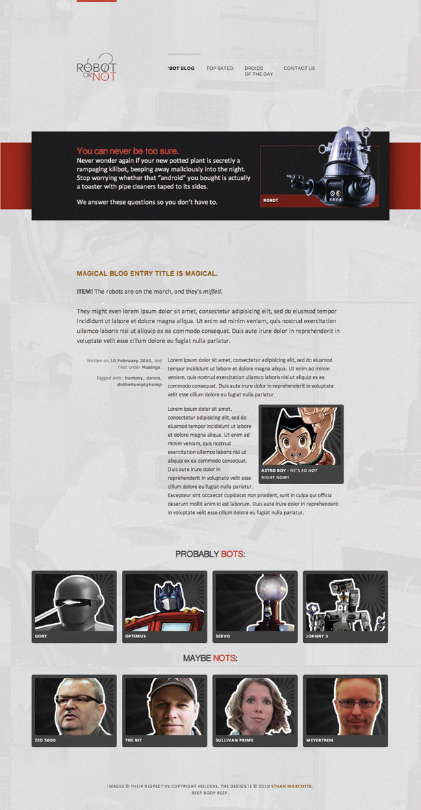
To illustrate this, I’ve built a simple little (fake) site called ‘Robot or Not’ (see above). It’s the definitive answer to who is and isn’t a robot. Your cat? Not a robot. K-9? Totally a robot.
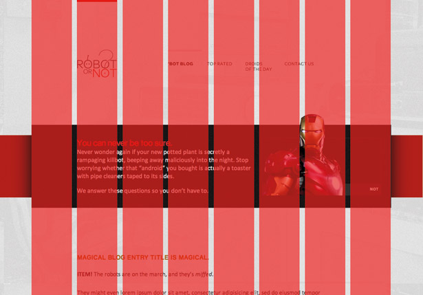
The design is straightforward, draped across an eight-column grid (see below). Our first challenge: how do we take a fixed-width mockup built in a graphics editor, and translate it into a fluid grid that can expand and contract along with the viewport?
First ingredient: the fluid grid
If you’ve ever sized text with ems, you’re well prepared to answer that question. Let’s assume my body element has a font-size of 100% – which, by default, is equivalent to 16px. Further down in the document, I have a headline that’s supposed to be sized at 22px in the comp, but I want to set it in nice, relative ems. To do so, we simply take the target value for the headline’s font-size in pixels, and divide it by the font-size of its container – ie, its context. The result is our desired font-size, expressed in proportional, em-ready terms. In other words: target ÷ context = result.
We can take our pixel values and plug them into this formula. To properly set our headline in relative terms, divide the target value (22px) by the font-size of its context (16px): 22 ÷ 16 = 1.375.
There we are: our headline is 1.375 times the default body size, or 1.375em, which we can copy directly into our headline’s font-size property.
We've just described a font size not as pixels, but as proportions measured against an element’s container. But every element of our grid – and the elements laid upon it – can be expressed proportionally in exactly the same way. In other words, we’re looking not just at the desired size of a particular element, but the relationship of that size to the element’s container. Doing so will allow us to construct a grid whose pixel-based width might change, but whose intrinsic proportions will remain intact as it resizes. All by reusing our trusty type formula: target ÷ context = result.
Looking at the design (see below), we can see that the content area is designed to be 637px wide, with two significant elements inside it: the main content, floated to the right, is 420px wide; the metadata is floated to the left, and sized at 204px. And if we were content with pixels, we’d be done with our job by now:
#blog .main { float: right; width: 420px; } #blog .aside { float: left; width: 204px; }Of course, we can do much better. The pixel values from the comp are simply our target values, which we can express in relative terms. Let’s start with the main content area, whose target value is 420px. The element’s contained, however, within the designed width of 637px – the width of the entire blog module. So all we need to do is divide the two: 420 ÷ 637 = 0.659340659. Move the decimal over two places to the right, and we get 65.9340659%, a width we can drop directly into our CSS (resist the urge to round that number; browsers are actually adept at taking care of that for you):
#blog .main { float: right; width: 65.9340659%; /* 420px / 637px */ } 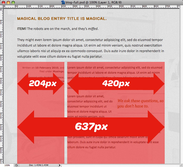
Let’s see if we can do the same with the metadata’s target value of 204px. Using the same context (637px) as before, we get 204 ÷ 637 = .32025117. As before, we can take that 0.32025117, or 32.025117%, and apply it directly to the metadata’s width:
#blog .aside { float: left; width: 32.025117%; /* 204px / 637px */}So we’ve completed the large, macro-level columns. But we’re not quite done; there’s a pullquote embedded in the main content block, floated to the right. According to the comp, it’s the same width as our metadata (204px) as each occupies exactly one column in our grid. But while we were proportionally describing .main and .metadata in relation to the full width of our design (637px), our blockquote is nested inside of .main. Our context has changed.
Rather than dividing by 637px – 204 ÷ 637 = .32025117, we’ll need to divide it by the width of .main, its parent element, and our new context: 204 ÷ 420 = .48571. With that, we’ve finished our little mockup. Our new width is .48571, which beautifully describes the width of our pullquote in relation to its container – all in flexible, proportional terms.
#blog blockquote { float: right; width: 32.025117%; /* 204px / 637px */ }Constructing a fluid grid is that simple: dividing your target pixel value by context results in a rational, flexible width. As the viewport expands and contracts, the pixel widths of individual columns change but the proportions of our grid stay intact.
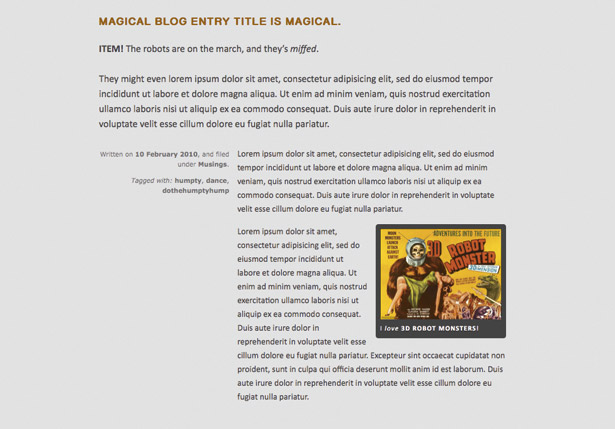
Of course, a number of CSS frameworks have recently stepped up to the challenge of creating flexible grids since I came up with the initial approach. Nicole Sullivan’s OOCSS grids module is phenomenal; designinfluences.com/fluid960gshttp://designinfluences.com/fluid960gs has a ‘fluid port’ that might be of interest to users of that framework. But if you’re working with irregular grids, or you aren’t interested in frameworks, the target ÷ context = result formula is all you need to build your own flexible, grid-based designs.
Second ingredient: flexible images
With our grid in place and resizing beautifully, let’s focus on incorporating some fixed-width elements. After all, it’s painfully simple for text to reflow in a flexible container; what happens when we introduce fixed-width elements? Well, I hear images are going to be just huge on the web, so let’s start there.
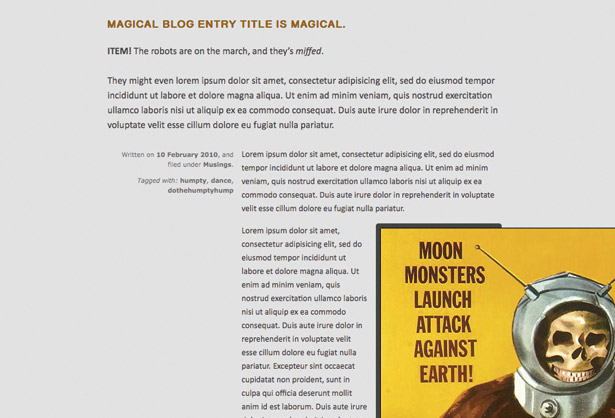
What happens when we drop in an oversized graphic we know to be larger than its container? Awful, unspeakable things. Our image is over a thousand pixels wide, and there aren’t any constraints on its width. It’s simply overflowing its container, and breaking our page pretty thoroughly. But what if we could say that our image should reflow and resize itself proportionally, and should never exceed the width of its container? With a quick dab of CSS, we can get exactly that:
img { max-width: 100%; }First discovered by Clearleft’s Richard Rutter, the max-width: 100% technique ensures an image never exceeds the width of its containing element. If the width of its container changes, the image resizes proportionally in nearly all modern browsers. The max-width: 100% treatment also applies pretty well to other embedded media, such as video:
img, video, object { max-width: 100%; }Of course, IE doesn’t support max-width pre-IE7. If that’s a concern, workarounds are available. Some include JavaScript-based patches to implement max-width-like behaviour; others use proprietary, Microsoft-only CSS expressions to simulate the effect. I advise a simpler approach: just drop this rule into your IE-specific stylesheet:
img { width: 100%; } 
Note this is a drastically different rule: whereas max-width: 100% says that the element should never exceed the width of its container, width: 100% says that the element should always match the width of its container. As a result, I recommend scoping the IE-specific rule to elements that you can predict will be oversized in relation to their containers, like so:
img.full, .entry img, .entry object { width: 100%; }We’ve now completed a design that expands and contracts proportionally with the browser window. But responsively speaking, our job’s not quite done.
Third ingredient: media queries
Flexible or fixed, no design scales well beyond the context for which it was originally designed. When made smaller, the background sprite used for the navigation becomes clipped at smaller resolutions, and our content becomes illegibly narrow. Conversely, when viewed on a widescreen display, the images grow freakishly large.
Enter the media query. Part of the CSS3 spec, a media query enables us to inspect the physical characteristics of the device rendering our design. If the device passes the test outlined in the query, then the CSS contained within is loaded. As our flexible layout resizes, we can apply media queries at different resolution ranges to surgically correct issues as they appear – whether in a widening desktop browser window or on mobile devices.
For example, let’s tackle some of the smaller screen displays. Since issues crop up when my browser window is 660px or lower, I can create a media query that targets that range:
@media screen and (max-width: 660px) { … } 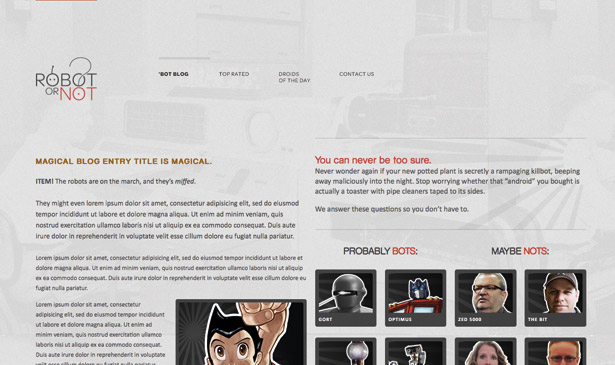
With that in place, I’ll include a few rules to reorient some of the masthead elements, optimising their display in a smaller viewport. For example, I could isolate the logo from the navigation by placing each on its own row, and have each primary navigation item occupy roughly a quarter of the screen.
@media screen and (max-width: 660px) { #logo a { display: block; float: none; margin: 0 auto; } #nav { clear: both; padding-top: 0; } #nav li { margin-right: 1.5053763%; width: 23.87096774%; } }But what if it’s viewed on a smaller resolution, or just reoriented in portrait mode? No problem: I can easily shift the navigation to a stacked, two-column layout, all by adding another media query:
@media screen and (max-width: 340px) { #nav li { width: 49.247311827956989247%; /* 458px / 930px */ } }It’s not just about ‘designing down’, though: we can use media queries to optimise for the higher end of the resolution spectrum as well. By including an @media screen and (min-width: 1100px) block, I can introduce an alternate layout that optimises my content for larger displays. And with these three media queries in place, our site’s finally finished.
Working together
It’s tempting to reduce the concept of responsive web design to one of its component parts, that it’s simply about ‘triggering alternate layouts with media queries’, or perhaps ‘designing for mobile.’ In fact, the three components are inseparable: devices or browsers without support for media queries can still avail themselves of a flexible layout that affords a measure of resolution independence.
Of course, that’s not the end of the challenges before us. How does a highly art directed layout adapt to a changing browser window? How do we rethink complex, interaction-heavy interfaces on a smaller display? Responsive web design offers us a foundation, a framework for tackling these problems – both now, and in the years to come.

The Creative Bloq team is made up of a group of art and design enthusiasts, and has changed and evolved since Creative Bloq began back in 2012. The current website team consists of eight full-time members of staff: Editor Georgia Coggan, Deputy Editor Rosie Hilder, Ecommerce Editor Beren Neale, Senior News Editor Daniel Piper, Editor, Digital Art and 3D Ian Dean, Tech Reviews Editor Erlingur Einarsson, Ecommerce Writer Beth Nicholls and Staff Writer Natalie Fear, as well as a roster of freelancers from around the world. The ImagineFX magazine team also pitch in, ensuring that content from leading digital art publication ImagineFX is represented on Creative Bloq.
