Add a touch of the old masters to your sci-fi art
Nick Harris reveals how to capture the essence of the old masters in your sci-fi work in 3 easy steps.
Sign up to Creative Bloq's daily newsletter, which brings you the latest news and inspiration from the worlds of art, design and technology.
You are now subscribed
Your newsletter sign-up was successful
Want to add more newsletters?
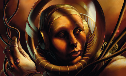
There's a common stereotype associated with Old Masters, which usually comes across in the form of crusty, discoloured oil paintings with religious themes. Early school trips to museums and art galleries are to blame for that. Most of the popular pigments ground for paint at the time were earth- or clay-based colours.
Brighter pigments often came at prohibitive prices and could be extremely toxic. The effect of aging and oxidising of the painting itself and its coats of varnish often disguise the original sparkle that many an image may have held.
I was lucky enough to see the Sistine chapel ceiling in mid-restoration and the difference between the before and after areas was startling. Bottom line: the Old Masters stereotype equates to a brown-biased palette for me, but look into it properly yourself.
Other main factors for identifying this imagery period include the use of chiaroscuro (exaggerated light/dark) and exaggerated posture twist (contraposta). Again, look these terms up for fuller explanations, because there's not really room here.
I'm going along the starting path of one technique that lays down a red mid-ground base colour into which I block in an underpainting with lighter and darker tones. In real oils you would then glaze colours over and build up form and depth. However, in this digital world I find it needs a little adapting…
01. Start with texture
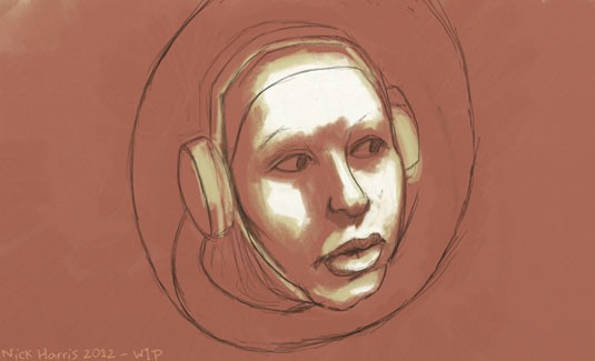
In ArtRage I set a basic canvas texture and bump up the scale and texture a bit. I mark out a rough idea on the red base using the pencil and block in some light areas using warm-white (with just a touch of ochre) and to start defining some form with the Oil Thinner setting turned up to about 65 per cent. The main light source is coming from the right.
02. Establish a warm colour scheme
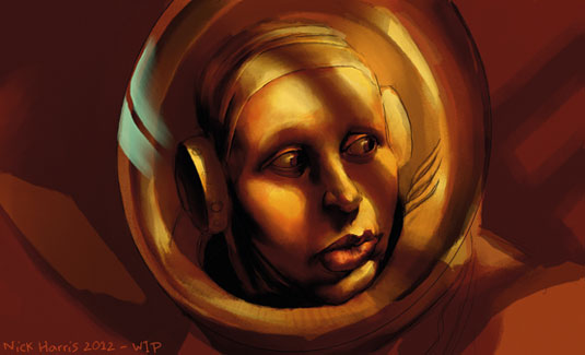
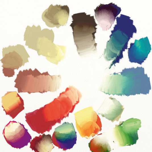
I sample colours from the prepared image of my mixer palette that I've pinned up on screen as a reference image, and establish what are likely to be the darkest areas to the left of her face. I find the best way to get this depth is to glaze my darkest brown/purple mix over the base painting on a layer set to Multiply, with the Oil Thinners still turned up.
Sign up to Creative Bloq's daily newsletter, which brings you the latest news and inspiration from the worlds of art, design and technology.
03. Build up your layers
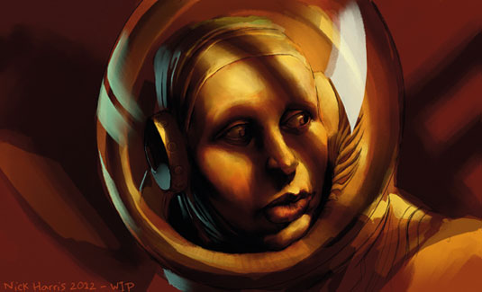
I work at building form using colour that's strongly biased to a warm ochre palette. Shadows are kept exaggeratedly dark (for the chiaroscuro effect). Any glazing layers that I add are collapsed as soon as I finish with them, enabling me to work as much as possible on one layer with the Oil brush. Finally, I add the highlights to the scene.
Artists' Secret: Cut down on your colours
Using a limited colour palette can make life much easier when using colour. I used six base colours and white for this image. I know this is a specific exercise, but you'll find that a limited palette can really help unify an image.
Words: Nick Harris
Gloucestershire-based Nick went digital in 2000 after 18 years working with traditional methods. He works mainly on children's illustrations. This article originally appeared in ImagineFX magazine issue 80.
Like this? Try these...
- How to design an original sci-fi character
- Free Photoshop brushes every creative must have
- Free Photoshop actions to create stunning effects

The Creative Bloq team is made up of a group of art and design enthusiasts, and has changed and evolved since Creative Bloq began back in 2012. The current website team consists of eight full-time members of staff: Editor Georgia Coggan, Deputy Editor Rosie Hilder, Ecommerce Editor Beren Neale, Senior News Editor Daniel Piper, Editor, Digital Art and 3D Ian Dean, Tech Reviews Editor Erlingur Einarsson, Ecommerce Writer Beth Nicholls and Staff Writer Natalie Fear, as well as a roster of freelancers from around the world. The ImagineFX magazine team also pitch in, ensuring that content from leading digital art publication ImagineFX is represented on Creative Bloq.
