How to mix traditional and digital media
Try mixing traditional art skills with your digital painting process for unique-looking imagery, says illustrator Jean-Sébastien Rossbach.
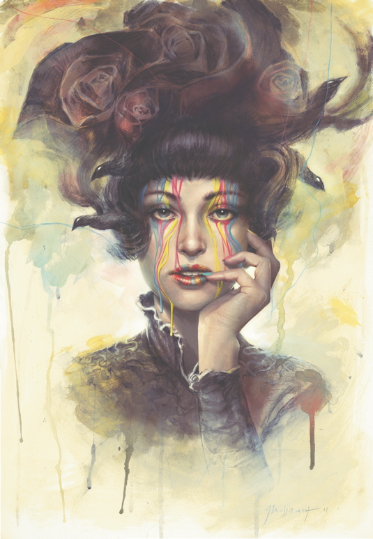
People say that I have a painterly style. The fact is that when I was an aspiring artist back in the late '90s, I used Photoshop to help me achieve the results I had in mind, and I was frustrated not to produce them using real paint and brushes. I would often begin an illustration on paper, try to push it as far as I could, and when I reached my limit I'd scan in the art and finish it digitally.
Years afterwards, I often do things the other way around: create a sketch in Photoshop before switching to my canvas. My technique may have changed, but I haven't lost the habit of playing with tubes of colour, and I still like to use both digital and traditional tools for the complementary services they provide. After all, sharpening your technique in a sketchbook is definitely not the same as doing it on a Wacom.
01. Ready your tools
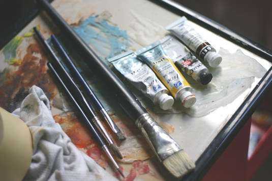
For this workshop you'll need your computer and a tablet; a scanner; vine charcoal, conté crayons or a heavy 7B pencil; a kneadable eraser; a regular eraser; a couple of brushes and a few gouache tubes.
Article continues belowThe paper can be whatever you have to hand: Bristol, Canson or watercolour paper, for example. You can also choose to paint on top of one of the drawings you like in your sketchbook, but you'll need to tape it on to your table to prevent the page from warping.
02. Charcoal or pencil?
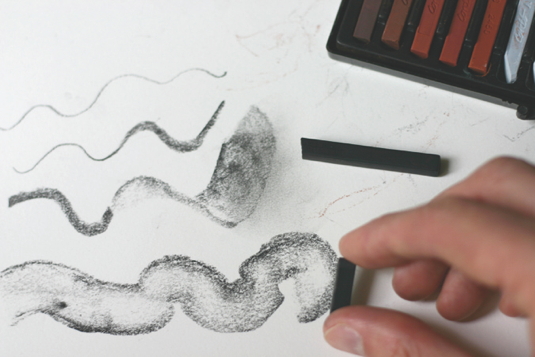
I use charcoal because it's a versatile tool that produces a variety of effects, from thin lines to bold strokes. However, those just starting out can find it tricky to control, with the results often looking messy. So use a regular pencil if you prefer. Try not to use a mechanical one, though: we want to have fun here, not produce a technical drawing plan!
03. Now create your base image
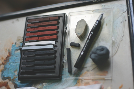
Feel free to draw straight from your imagination or from a reference. You can use tracing paper if you're not comfortable with free hand, or even use a light table if you have one.
There's a common belief that tracing is cheating. This is partly true, but try to consider the painting for what it is: an exercise. You need to focus on the expressiveness of your drawing and the painted textures you want to produce.
Sign up to Creative Bloq's daily newsletter, which brings you the latest news and inspiration from the worlds of art, design and technology.
04. Strong black values
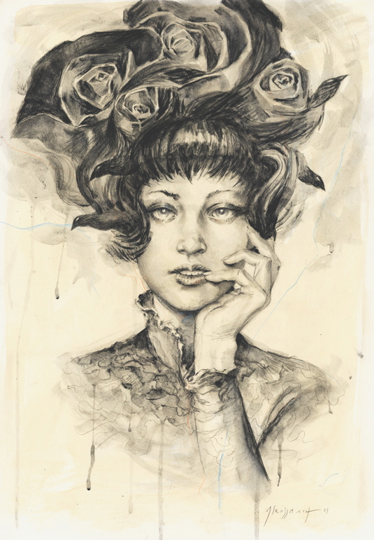
It's important that you use something with a strong black value, such as a 6B or 7B pencil. The goal is to let the drawing appear behind the paint that will be applied later.
If you use a 2H or an HB pencil, there's a good chance the information will be lost. Again, if you feel uncomfortable with diving straight in with a 7B, you can still make a pre-drawing with an 2H to be sure of drawing something accurate.
05. Expressive marks
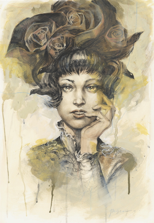
I don't use a mechanical pencil, because in this workshop I'm trying to give as much expressiveness to my first traditional steps, which I'll be counting on to make my painting stand out.
I'm not afraid to make mistakes, either, because I know that I'll be able to paint over them and fix it in Photoshop. I just let the charcoal do its job and have fun with the marks that I put on the paper.
06. Simple paint palette
It's time to start painting, and I begin with gouache. I stick to a muted palette of just a few colours: sepia, yellow, black and white. The idea is to stay quick and loose. Gouache isn't a transparent medium, and you don’t glaze with it. I use it to push certain specific areas, such as the rose on the right, the collar and the arm into the background. This enables me to place the emphasis of the picture on the face of my character.
07. Play with your strokes
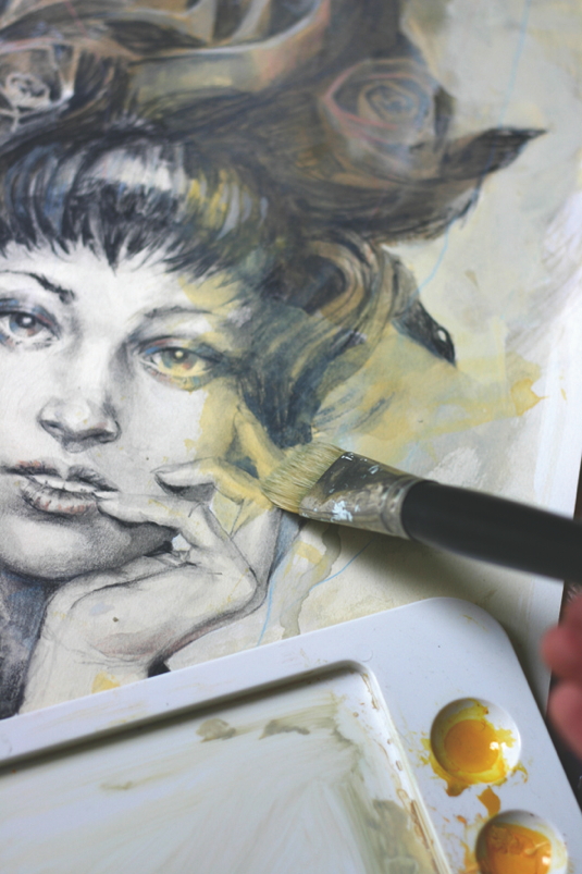
Notice that I don't touch the face too much; I just place a wash of yellow on its right-hand side. This is the focal point of my painting, and that's why it's the place where I try to keep the blackest blacks.
Don't hold back from playing with strokes: here, I make big bold marks and paint drips of paint to create that painterly look. At some point I also doodle with a blue coloured pencil. I'm just having fun!
08. Scan into Photoshop
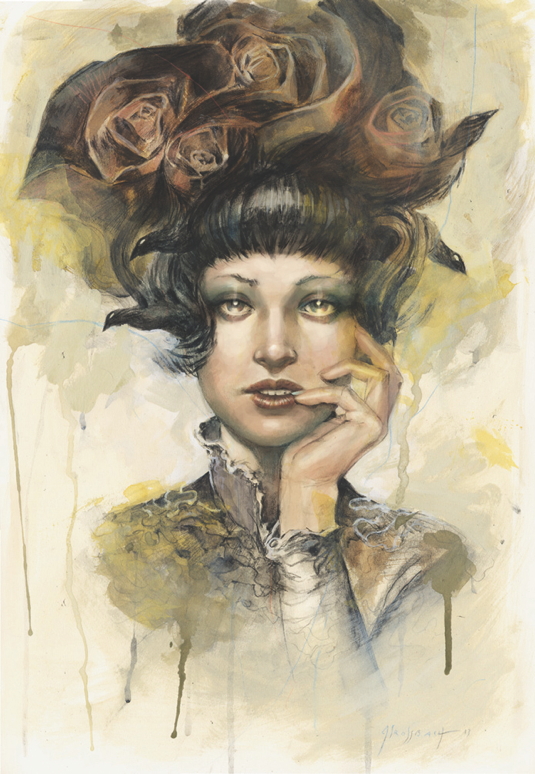
Now that my painting is dry, I can scan it and begin to play with it in Photoshop. Since I've decided to create a mixed media image, I'll only focus on the face and hand, and leave the rest of the image almost as is.
I begin to paint the flesh over my drawing slowly on a Multiply layer with a pinkish brown tint. I'll only use a small number of layers during the entire process.
09. Selective brush usage
I use only a handful of Photoshop brushes. They're regular, round brushes along with a couple of custom ones that I use all the time when I want to create a painterly effect.
I just increase the values slowly, with Opacity rarely more than 20 per cent. I like to create a fairly realistic result, but I don't go mad with the level of detail because I'm keen for the face and hand to blend with the loose background
10. Iron out those errors
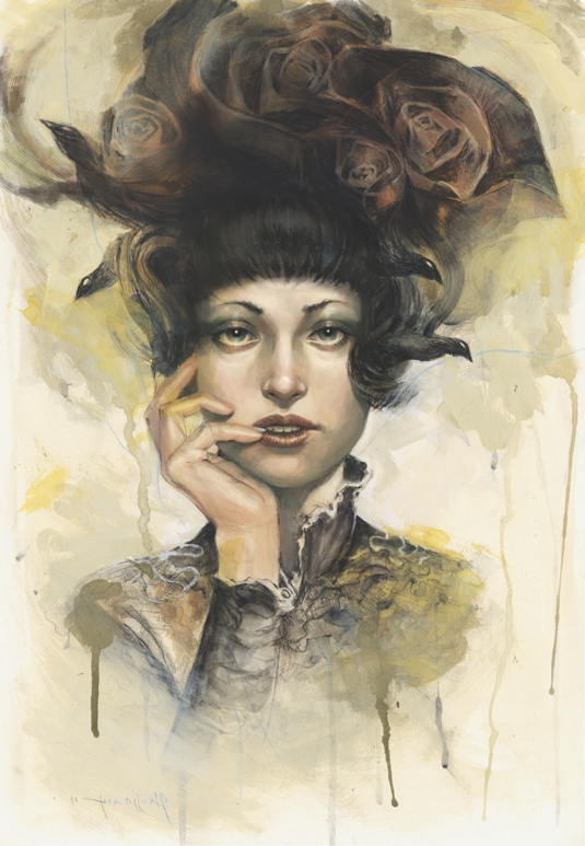
I flip the image, and I quickly can see some flaws here and there: one eye isn't placed particularly well, her mouth looks too narrow and the sparkles in her eyes are too big.
Flipping an image is a good way to highlight incorrect elements that don't jump out at you at first. I can also see that my composition is slightly unbalanced; there's something a little wrong with the headdress compared to the placement of the hand.
11. Maintain balance
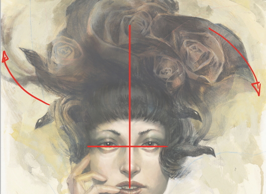
I decide to complete the lines of force by adding a wing to the little bird on the upper left corner. It's important to keep a well-balanced composition. You may not see it at first, but you can certainly feel when something's unbalanced: it makes the viewer feel uncomfortable.
This little wing is just a couple of strokes, nothing too defined, but it complements the petals at the far right. Its general silhouette mirrors it upside down.
12. Light sources
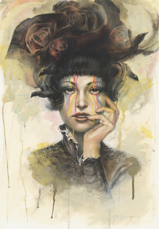
I now go back to refining the skin. I try to always keep in mind where my light sources come from and what shadows they produce on the face. I have the light of the sun from up above, and another light source right behind her.
The colour of the skin isn't just pink: it's warmer and yellowish where the light hits it directly, a little more red around the nose, the eyes and the fingertips, and colder and blue in the shadows underneath the nose, the cheekbones and the neck.
13. Strong colours
When the level of detail on the character's face looks right to me, I begin to add drips of vivid colours falling from her brow. Even though the subject matter of this image is the paint itself, it amuses me to think that the drips of paint are actually digital paint placed on top of a traditional drawing. This is my subtle way of giving a little depth to this image so that it's not just the portrait of a cute girl
14. Realistic drops
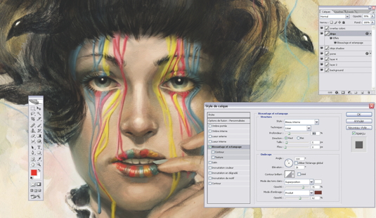
I use the Bevel and Emboss filter to add a quick 3D effect to the drips. By playing with the opacity of my brush I'm able to create some subtle changes to the thick acrylic substance of the paint. The paint slowly runs down and affects the lips and fingernails
15. Paper texture
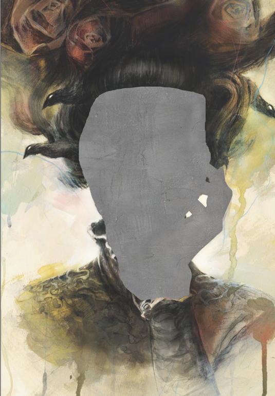
I don't want my image to look like a collage with a very painterly and loose background sitting behind a very digital-looking face and hand. So I place a painted paper texture of my own on an Overlay layer on top of the face and hand.
You can search online for such textures easily enough, but you also can paint them by yourself on real paper and scan it. This will then be your texture and nobody else's.
16. Happy accidents
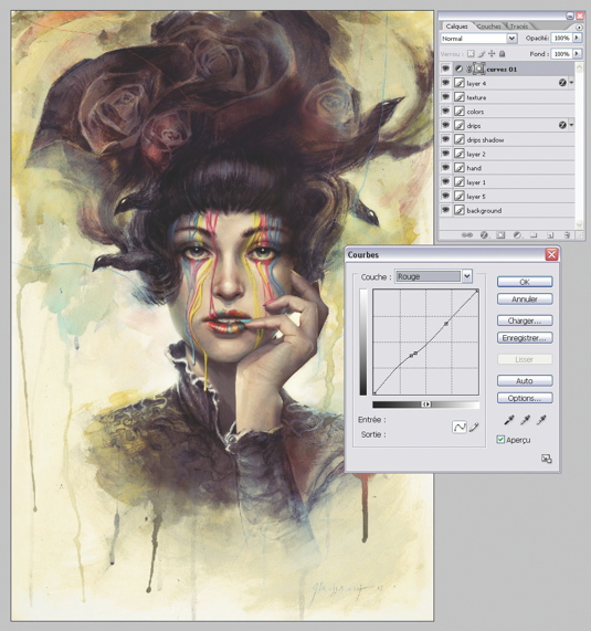
Finally, I add a Curves Adjustment Layer on top of all layers. This method always brings surprises and colour ideas that I wouldn't have found myself. It's just the little reward I'm looking for to say: "Hey! Now I'm done!"
The image ends up with that typically melancholic blue/ greenish tint made popular by a certain smartphone software that everybody loves these days (which I won't name here, but you know the one I mean).
Words: Jean-Sébastien Rossbach
Jean-Sébastien Rossbach is an award- winning illustrator, concept artist, and painter. His clients include Marvel, Ubisoft, Wizard of the Coast, Blizzard and Tor Books. This article originally appeared in ImagineFX magazine issue 102.

The Creative Bloq team is made up of a group of art and design enthusiasts, and has changed and evolved since Creative Bloq began back in 2012. The current website team consists of eight full-time members of staff: Editor Georgia Coggan, Deputy Editor Rosie Hilder, Ecommerce Editor Beren Neale, Senior News Editor Daniel Piper, Editor, Digital Art and 3D Ian Dean, Tech Reviews Editor Erlingur Einarsson, Ecommerce Writer Beth Nicholls and Staff Writer Natalie Fear, as well as a roster of freelancers from around the world. The ImagineFX magazine team also pitch in, ensuring that content from leading digital art publication ImagineFX is represented on Creative Bloq.
