The best monogram fonts feature in some stunning monograms. From General Electric to Yves Saint Laurent and NASA’s iconic worm, there are plenty of great monogram logos around, often with iconic, memorable typefaces.
While some graphic designers draw monograms from scratch, many use off-the-shelf fonts to at least start the process while an identity project is getting off the ground and the creative approach is being finalised with the client. In fact, ready-to-go fonts often end up being used in the final design with just a few tweaks to make them gel (see our favourite monogram logos).
By speaking with designers and looking at lovely monogram logos out in the wild, we've put together a list of unique, interesting and even outrageous monogram fonts that can provide inspiration for your next project. If you're after more font inspiration, don't miss our lists of the best free fonts, the best italic fonts or our favourite handwriting fonts.
The best monogram fonts
01. Fidelio

- Price: From $45.25
- Download Fidelio from MyFonts
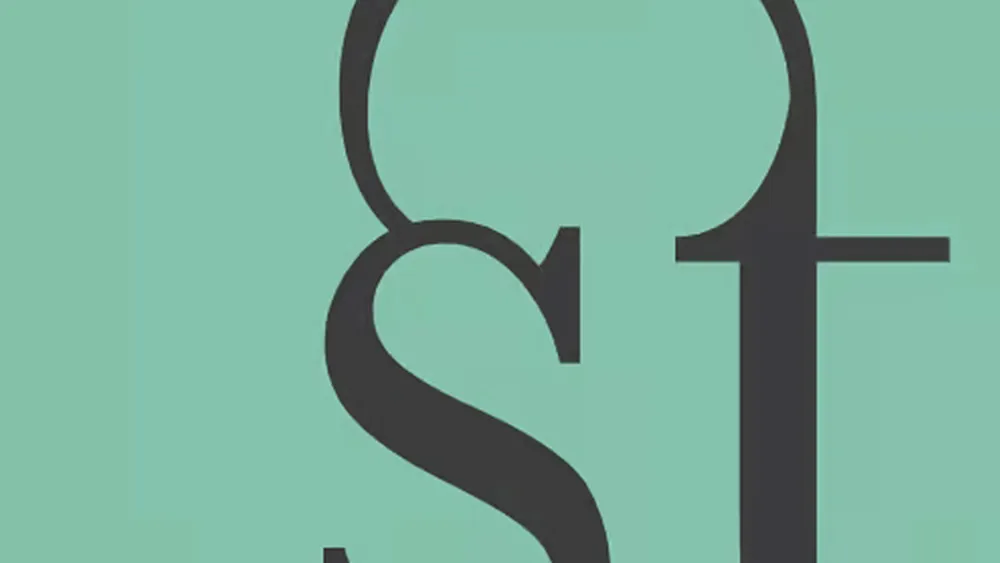
Drawn by the French graphic designer and typographer José Mendoza y Almieda in 1980, Fidelio was named after Beethoven’s only opera. Despite this Germanic influence, it’s a chancery script with a Romanesque look and feel. Its loops and flourishes are attractive, but not overdone, and pulling the initials of a brand name together in various ways will result in some fascinating permutations as the extensions of the letters interact. The beauty brand Armand Dupree uses Fidelio almost unchanged in its monogram logo.
02. Baskerville

- Price: From $39.99
- Download Baskerville from fonts.com
Designed in the 1750s, Baskerville is a classic typeface that you probably already have in your arsenal – it’s part of the Adobe Fonts collection after all. Inspired by Didot and Bodoni, it’s the contrast between the thick and thin strokes that you will play with when using Baskerville as the basis for a monogram logo. Turn up that contrast until the thin strokes have disappeared and with a touch of creative magic you’ll create a monogram that is an abstract form while remaining readable as lettering to the viewer. The V&A and Roger Federer logos are examples where a Baskerville-style font was the start of something special.
03. Caslon Graphique

- Price: From $29.99
- Download Caslon Graphique from MyFonts
Caslon is another classic English typeface that is hard to beat. The original font family was developed by Caslon in the 1720s, and Caslon Graphique takes those basic proportions and pumps up the contrast. As with Baskerville, the interplay between the light and heavy strokes is what makes Caslon Graphique a joy to work with in logo development.
04. Bellissima Script

- Price: From $79
- Download Bellissima Script from Sudtipos
In days of yore, monograms were formed from the initials of important people and sewn into their clothing in lavish calligraphic lettering. Bellissima Script gives you all the delicious swoops and swashes you could ever need when designing a monogram logo with an elegant, sophisticated Baroque feel. Not only does Bellissima Script ooze with class, it’s an award-winning typeface by Alejandro Paul, which helped his foundry Sudtipos make its name in the early 2000s.
05. American Typewriter

- Price: From $35
- Download American Typewrite from FontHaus
Although inspired by typewriter fonts, American Typewriter was never really used in the machines and now enjoys life in the digital realm as a MacOS and iOS system font. As such, it is likely to be right under your nose, ready to be deployed in your monogram logo designs. The lightest versions of this typeface, with its soft curves and delicate slab serifs, are crying out to be connected with cleverly drawn swashes. Well linked, two- and three-letter monograms in this typeface work well as white out of a colour in a roundel.
06. Maelstrom Sans

- Price: From $60
- Download Maelstrom Sans from Klim Type Foundry
Ever since the late '90s, New Zealander Kris Sowersby has been absolutely killing it typographically via his Klim Type Foundry. Maelstrom and Maelstrom Sans are typefaces that radically reverse typographic norms when it comes to contrast. Where a typeface like Didot would have a thin stroke, Maelstrom goes thick… and then some. It’s not the only typeface to do this – also see the Negative variation of Typotheque’s Karloff – but it is perhaps the most extreme. Playing with Maelstrom will result in a monogram logo the likes of which the world has never seen, so why not give it a shot?
07. History

- Price: From €72
- Download History from Typotheque
Experimentation with letters and finding new ways to connect them is at the heart of designing an appealing monogram logo, and History from Peter Bil’ak’s Netherlands foundry Typotheque is a typeface that offers plenty to experiment with. The standard Roman letter forms are there, and you can build on them in layers, adding serifs, swashes, outlines, patterns and more. There’s ample scope with this font to create numerous utterly unique monogram logos, and History has been applied in fascinating ways already in the world of identity design.
08. Bisect

- Price: From £45
- Download Bisect from MuirMcNeil
Like History, Bisect is a type system that uses layers to interesting effect. However, where History celebrates the past, Bisect effuses about the future. These geometric, monospaced fonts build each letter from basic forms, fitting them into squares on a grid. Different fonts within the typeface are designed to work in layers and using them in that way could result in a monogram logo with two slices of future and one slice of retro in its look and feel.
09. Founders Grotesk

- Price: From $60
- Download Founders Grotesk from Klim Type Foundry
A modern geometric typeface may not seem like your go-to when thinking about a monogram logo, but if the client you’re branding is a modern organisation then why not use one and instead of just thinking outside the box, cut the box up completely? The great thing about geometric typefaces where the 'O' forms a perfect circle is that often the letters can be quartered and used to create new typographic structures – and that’s where possibilities come to the fore in terms of monogram logo design. Founders Grotesk is a great example, but you could also try Avant Garde, DIN, Futura and many others.
10. Digestive

- Price: From $129
- Download Digestive from Ohno Yype
According to its designers, Digestive is the offspring of Art Nouveau and Gothic architecture influences. However, looking at type set in this face you’d be forgiven for thinking that it is actually a clever attempt to form letters from the digestive tract of a higher mammal. Never run from a font like this: unusual and even quite ugly typefaces can result in the most interesting and experimental monogram logos and they should never be written off. Digestive is a mind bender – use it and look for others like it.
For more inspiration, see our pick of the best monospaced fonts and the best multilingual fonts. We also have a guide to how to add fonts in Photoshop and a complete guide to font licensing for designers.

