Colour in web design: all you need to know
Sign up to Creative Bloq's daily newsletter, which brings you the latest news and inspiration from the worlds of art, design and technology.
You are now subscribed
Your newsletter sign-up was successful
Want to add more newsletters?
The success of any piece of visual communication depends on colour. Research into the impact of colour in marketing tells us that it takes the average person just 90 seconds to make a subconscious decision about a product, and that 62-90 per cent of those decisions are based on colour alone.
Consequently, sharpening up your knowledge of colour theory and psychology can go a long way to helping increase conversions, and can in many instances improve the usability of your interfaces (to make inherently useable sites, keep things straightforward with a website builder).
Here are some factors you need to bear in mind when making colour decisions in your designs. Feeling inspired? Make a mood board and keep it safe and shareable in cloud storage.
Article continues belowUnderstand what colour means to your audience

When it comes to colour, one thing you’re sure to come across is controversy. There have been multiple attempts to map human feelings and emotions in reference to colour. Broadly, different colours portray the following:
Red
- Positive connotations: Energy, passion, strength, warmth, excitement
- Negative connotations: Anger, aggression, fear, rebellion, evil
- Used to: Create urgency, stimulate appetite, signal stop
Yellow
- Positive connotations: Happiness, optimism, warmth, playfulness, fun
- Negative connotations: Critical, cowardly, impatient, pessimistic, impulsive
- Used to: Brighten spirit, demonstrate playfulness, show warmth
Green
Sign up to Creative Bloq's daily newsletter, which brings you the latest news and inspiration from the worlds of art, design and technology.
- Positive connotations: Growth, vitality, natural, earthly, balanced
- Negative connotations: Greedy, materialistic, envy, devious, indifferent
- Used to: Demonstrate growth, show eco credentials, signal go
Blue
- Positive connotations: Trust, stability, calmness, integrity, loyalty
- Negative connotations: Sadness, coldness, predictability, conservative, rigidity
- Used to: Promote calm, gain trust, show cleanliness
Black
- Positive connotations: Authority, control, strength, sophistication, seductiveness
- Negative connotations: Secretive, negative, dark, depressing, aloof
- Used to: Create mystery, assert confidence, demonstrate sophistication
While these are great reference points, research tells us that our perception of colour is hugely influenced by our personal background, culture, experiences and preferences.
In China, for example, yellow has become synonymous with pornographic publications, so while Mailchimp’s Cavendish Yellow homepage (above) beautifully signifies happiness, optimism and warmth to some, those cheeky monkeys may be interpreted a little unexpectedly in the world’s most populous country.
Once you know who you’re designing for, take into account the impact of your use of colour to ensure you don’t send users the wrong message by assuming that everyone will react in the same way.
The 60-30-10 rule
Traditionally used for interior design, adopting this three-colour formula will give balance and consistency to your interfaces. If you allow your primary colour 60 per cent, your secondary colour 30 per cent and your accent colour 10 per cent, users will be able to move comfortably between the focal points of your interface without being overwhelmed by an excessive palette.
Make colour work for you

Understanding that some sections of your audience will respond differently to your chosen colours than others should serve as a reminder that colour has the ability to work both for and against you. Red and green in the context of a physical traffic light system mean two very different things; stop and go. However, this logic doesn’t always translate to the digital world of interface design.
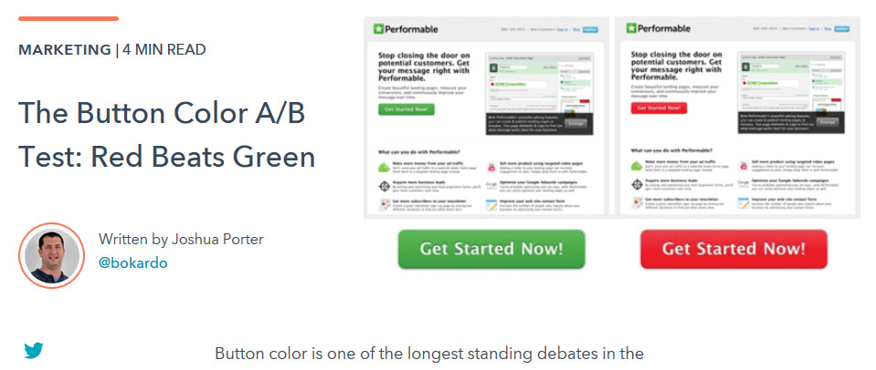
In an experiment titled The Button Color A/B Test: Red Beats Green, Joshua Porter trialed a green button and a red button against one another on a landing page to see which converted more people to sign up to his Performable platform. Given the mentioned connotations for each colour, one might predict that the green would be the better performer, but 21 per cent more people clicked on the red button. We can assume that this was due to the attention-grabbing nature of red, or perhaps because red contrasted more with the pre-existing green highlights in the interface.
However you look at it, we should bear in mind that, although colours signify meaning, it’s always worth testing with users in the context of your page layout. This will ensure that colour is working to your advantage, rather than to the detriment of your conversion rate. And whatever you decide with colour, be sure to check your web hosting service is working for you.
Reinforce your message with colour

To avoid undermining your brand’s message, choose colours for your interface that reinforce its values or proposition. It’s easy to fall into the trap of choosing eye-catching colours and fashionable gradients, but functional choices could be better in the long term.
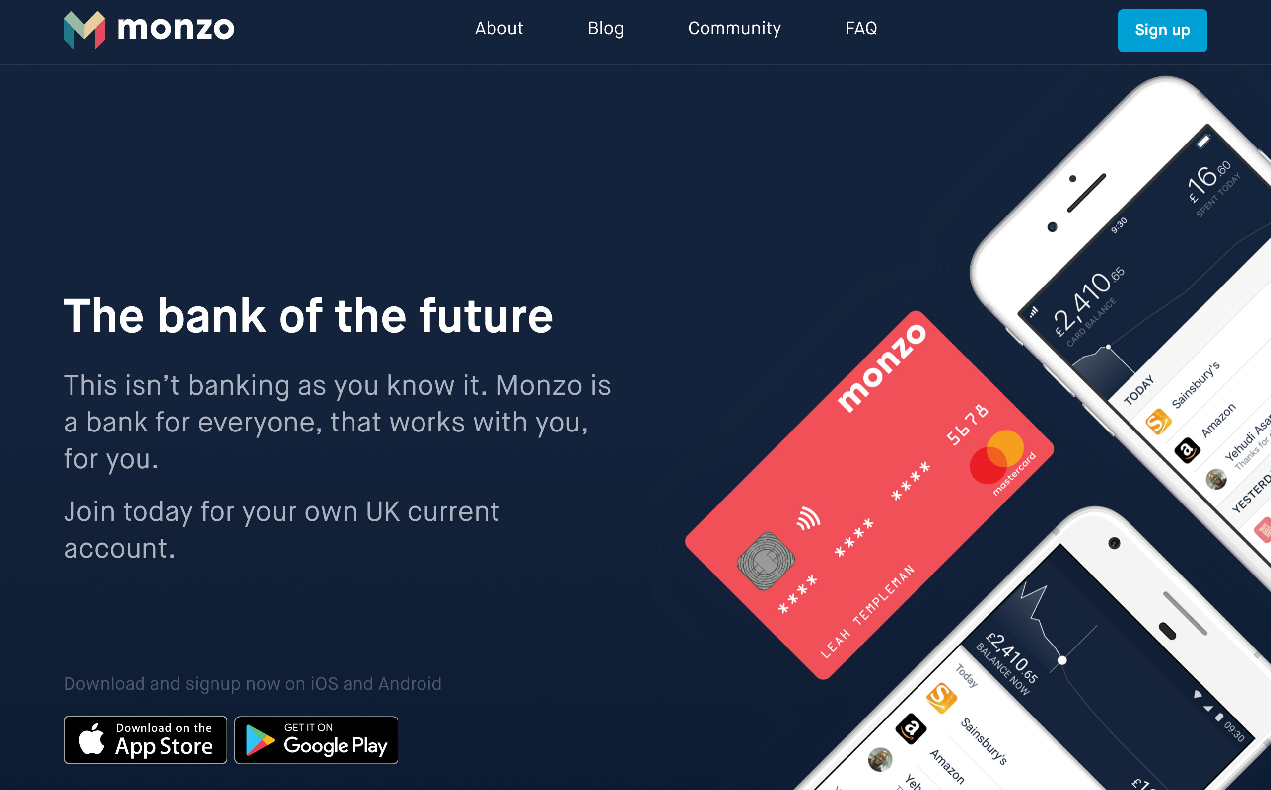
Although Monzo’s physical bank cards are an eye-catching and very practical coral, the colour scheme of the website tells a story of stability and trustworthiness, using a dark blue backdrop combined with light blue highlights that are bright enough to draw your attention but muted enough to maintain an air of integrity.
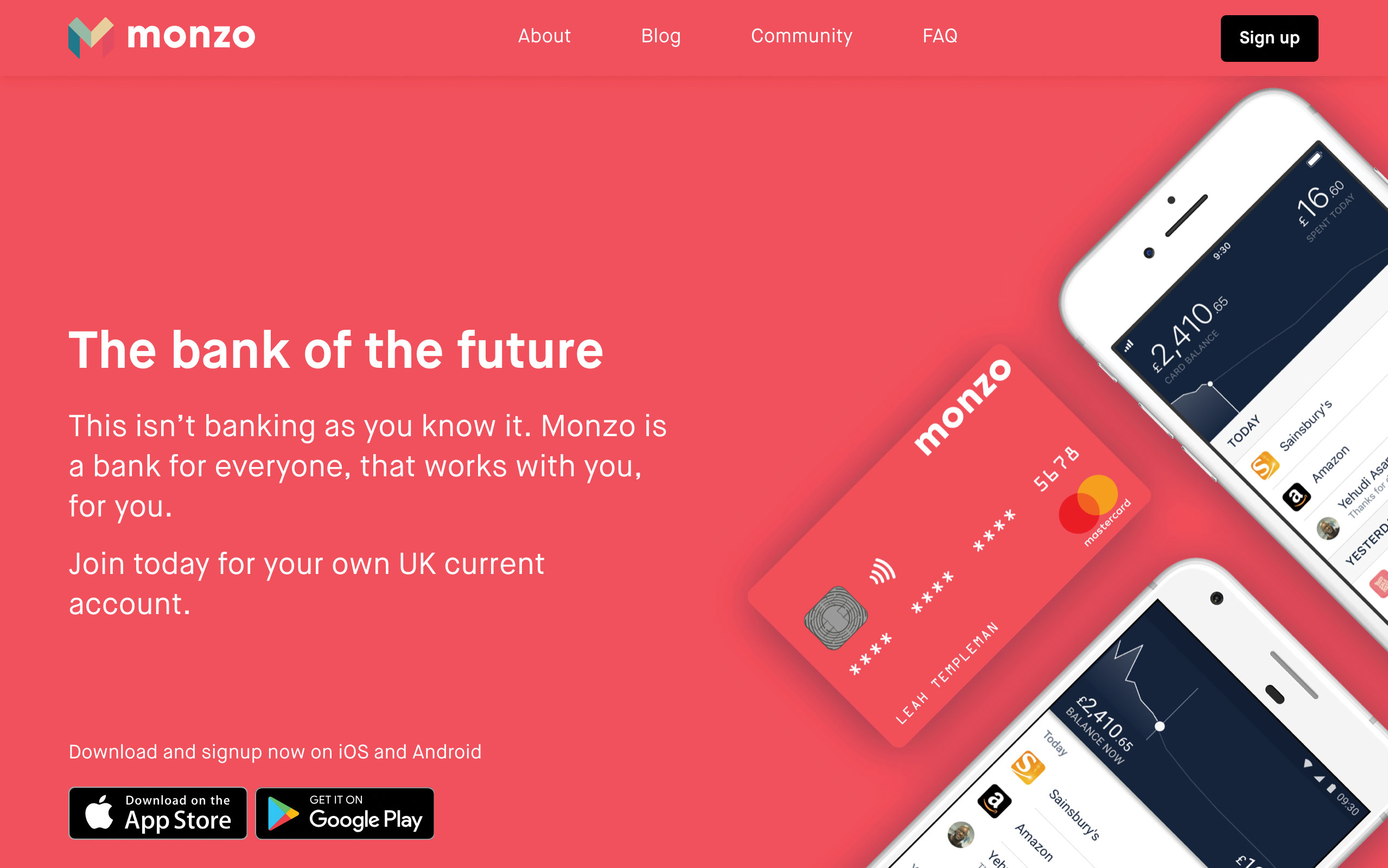
By playing with the CSS values of the homepage, we can make coral the primary background colour, creating a youthful and energetic-looking homepage. It’s undeniably attention-grabbing, but would potential customers be more likely to trust a financial organisation based on these qualities? You’d have to test it with users to be sure, but colour psychology would suggest a big no.

Colour and accessibility
Approximately one in 12 men and one in 200 women are affected by colour blindness. This, paired with the fact that screen readers do not communicate colour to visually impaired users, means we should be mindful that colour alone is not always an appropriate means of conveying meaning within our interfaces.
If, for example, you need to communicate an error on your page, the colour red might not be enough on its own. Good copywriting combined with spacial and typographic hierarchy should be utilised to enable people with colour blindness and those using screen readers to better understand any errors you are trying to display. When designing your next interface, try viewing your file in greyscale to test whether or not your error messages, calls to action and notifications still make sense without reliance on colour.

This article was originally published in issue 284 of Web Designer. Buy issue 284 or subscribe here.
Read more:
Joss Cook is a freelance designer and design manager at Unity. Formerly design manager at Lush Digital, he was awarded Wirehive 100 Creative of the Year 2014 and voted No. 1 in The Drum Design Census 2015. He has written for Web Designer and Net magazines.
