Create a cyberpunk character in Photoshop
Discover the process of painting a cyberpunk character for Android: Netrunner.
Sign up to Creative Bloq's daily newsletter, which brings you the latest news and inspiration from the worlds of art, design and technology.
You are now subscribed
Your newsletter sign-up was successful
Want to add more newsletters?
For this workshop, I’ll take you through the stages for creating artwork for card games – in this case, the character Noise for Android: Netrunner, produced by Fantasy Flight Games.
Illustrating images for card games has some special considerations to keep in mind that make it unique from other types of creative work. Readability is always a concern, because card game images are often printed very small and should be recognisable at a glance.
This isn’t to say that they can’t be detailed, but complexity often comes at a price. Particularly in the Android game world, avoiding over-elaborate imagery can be tricky, because the setting naturally combines futuristic tech, intricate interfaces, and complex characters with the backdrop of a gritty, dystopian world. Striking a balance between creating a compelling scene and what needs to be communicated becomes an art form in itself.
Article continues belowWhile there are many approaches that will enable you to accomplish this, doing so in a way which achieves that balance is the key. Composing an effective card illustration takes practice, and while I’m still in the process of learning myself,
I hope to share some techniques I’ve learned along the way, which will help you to bypass some of the usual pitfalls.
01. Assessing the brief and supporting materials
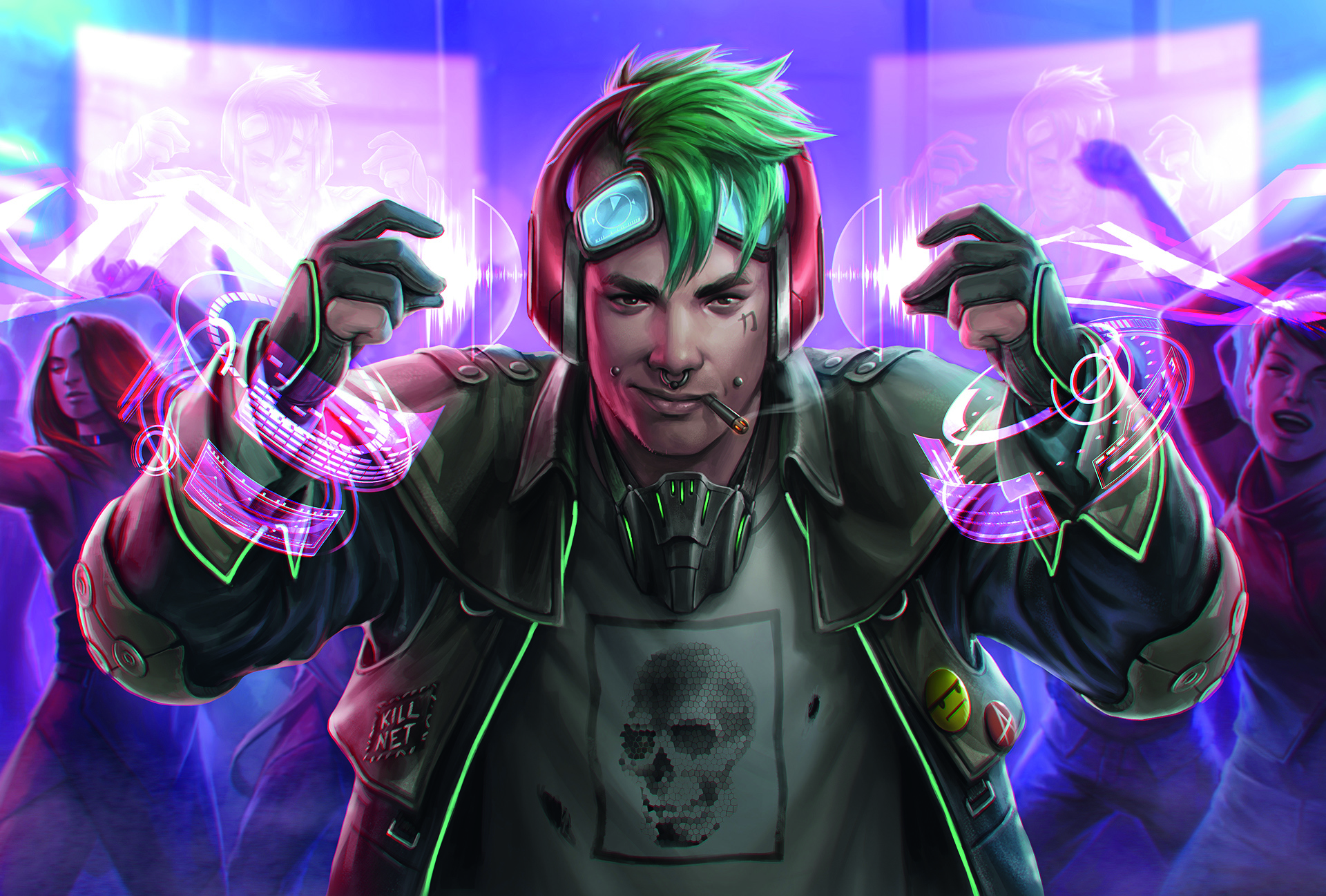
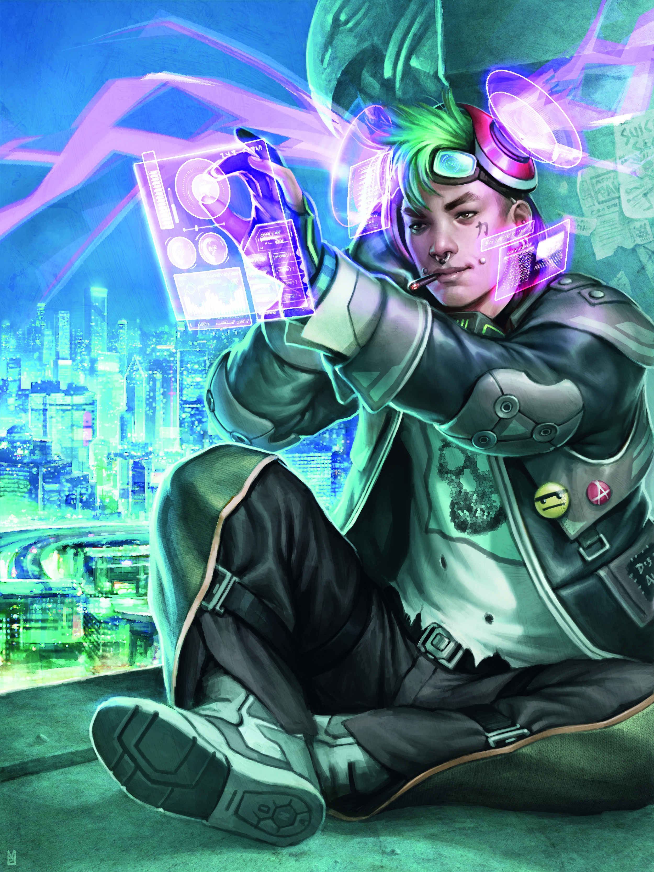
The brief comes from the art director, and contains the title of the image, what kind of card it will be, a description of what’s happening in the scene, and some reference. For this image, the brief involves the character Noise taking control of a nightclub’s systems. I’ve painted Noise before: he’s a smug, self-serving, anti-hero type character, and his personality is going to be front and centre.
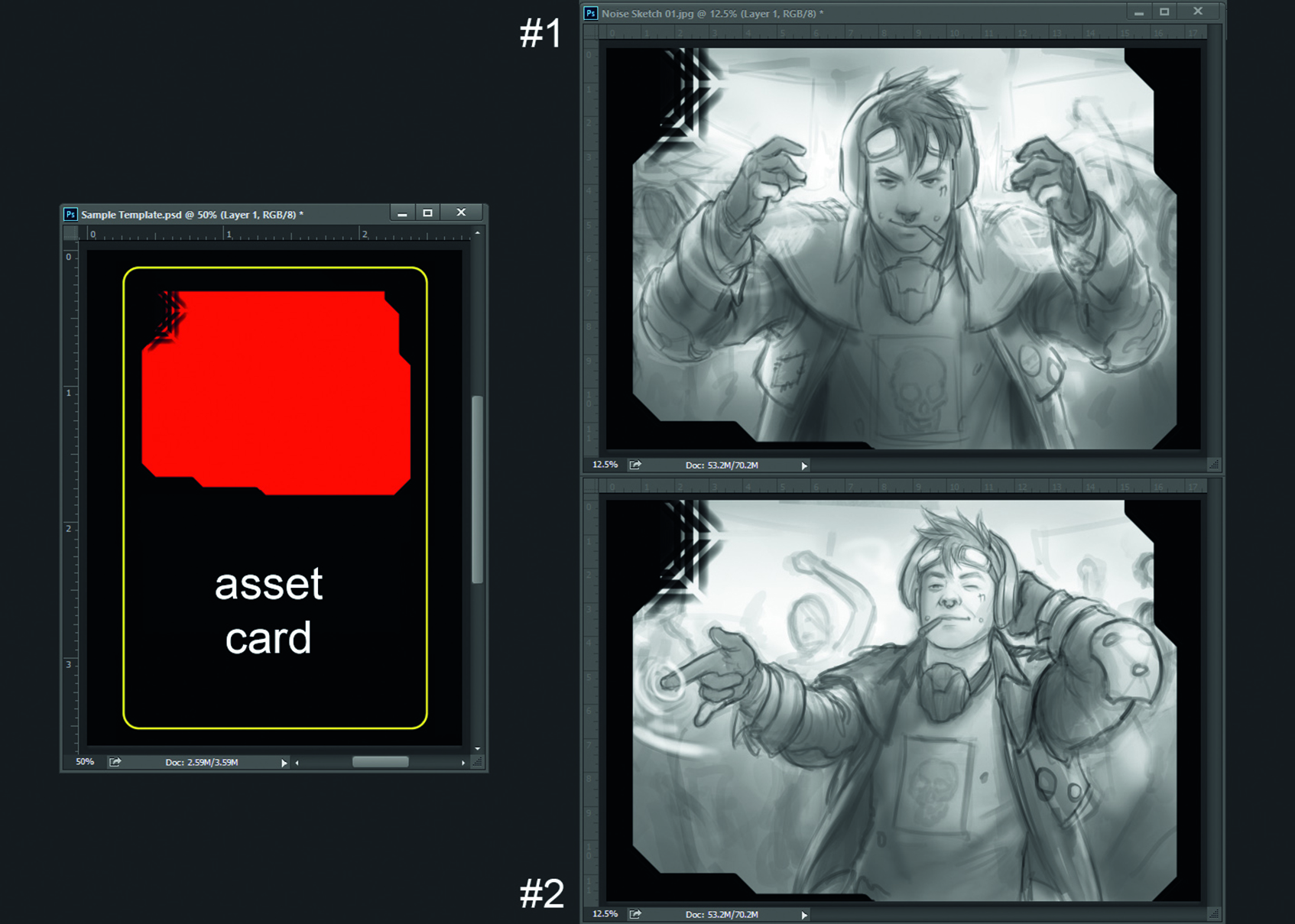
02. Consider the frame template
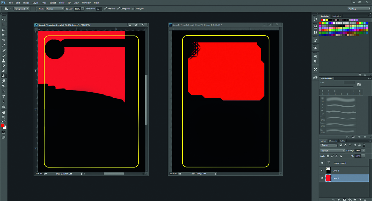
Knowing what type of card it is, I can take a look at the framing element I’ll be working with. From a game design standpoint, the frame assist in separating the cards in play on
the table, helping players to tell at a glance what kind of card it is. For the artist, however, this framing element is important for determining how to set up the composition of your image.
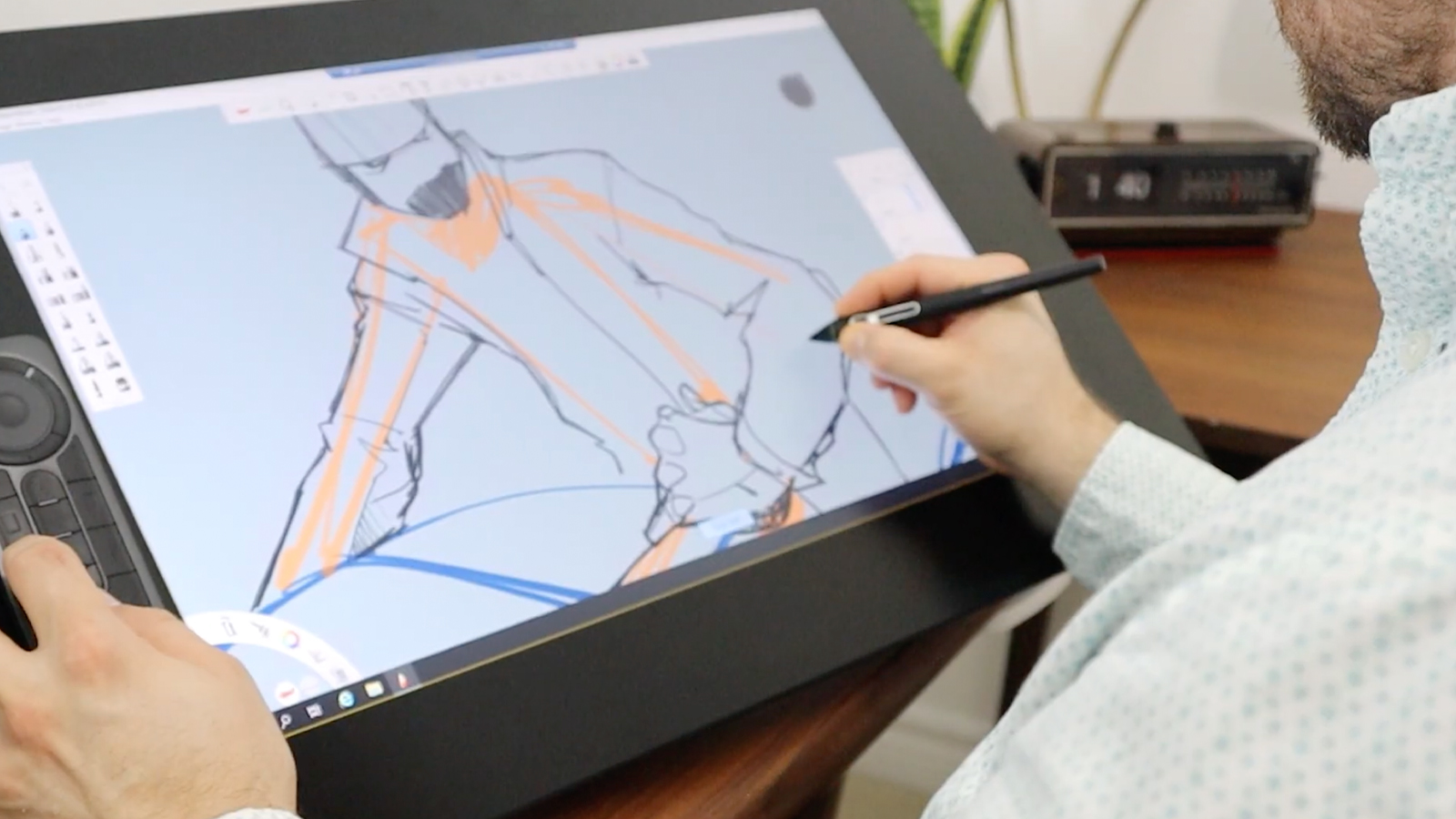
03. Produce sketches
I begin creating sketches that satisfy the brief, as well as work within the borders of the frame. I concentrate on a simple composition that showcases the character’s personality. I know that I won’t have much background to play with, and I need to convey the nightclub environment, so I decide to depict the character as if he’s in the middle of a dance floor.
04. Organising elements in the scene
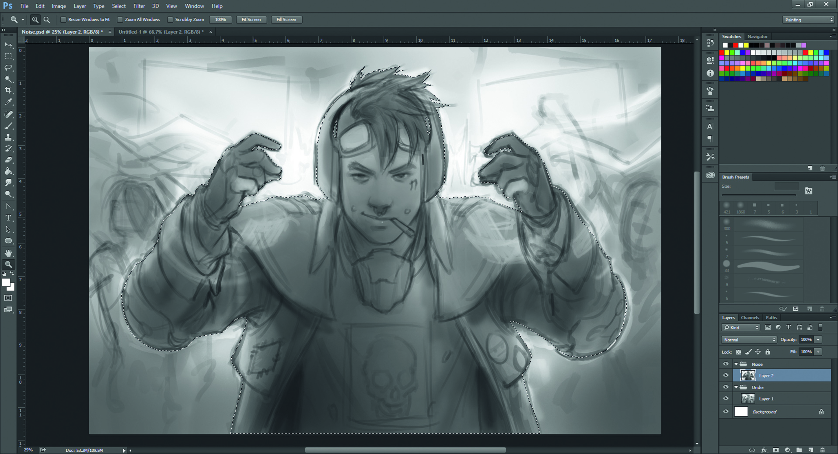
I separate the back-, mid- and foreground elements on to individual layers using the Lasso tool and copy/pasting the selection. This not only streamlines the work for me, but if the art director decides to move or scale any of these elements, then it’s easy to do so without disrupting the others or needing a lot of repaint to fill in gaps. Because of the small amount of mid- and background in this image, I decide to group those two elements together and only separate out the foreground character.
05. Colouring the background
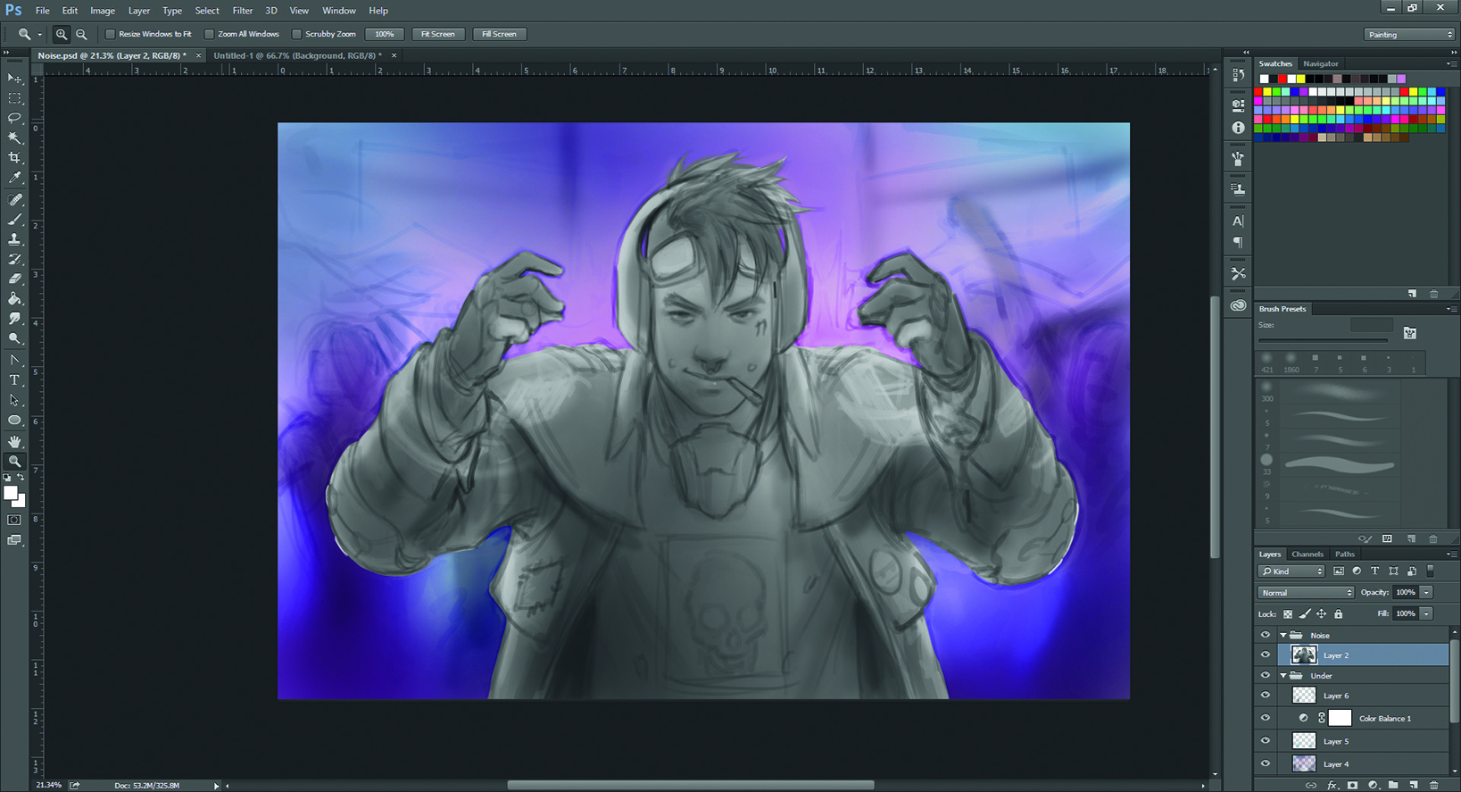
I wash some neon colours on the background on a Color layer. Darken layers help to tone down some of the brighter areas and produce more saturation, while Color Dodge layers amp up the light sources. I want to give the impression of a busy dance floor, as well as supporting the shape of the main character. I also avoid design elements that will give Noise a strange silhouette.
06. Dramatic lighting
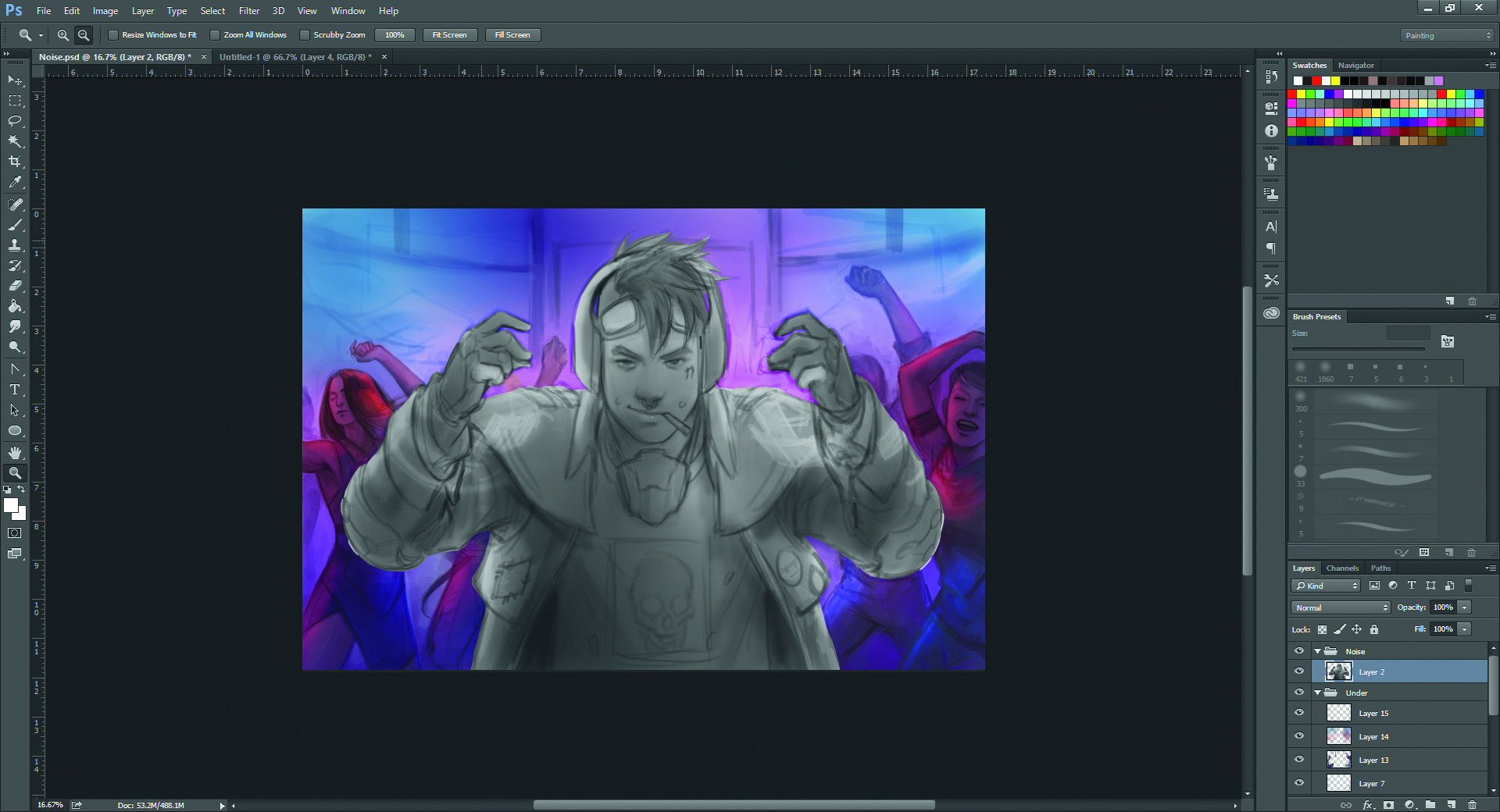
As I work on the background, I realise that I haven’t quite accomplished my goal of establishing an interesting pattern to the background and it’s become slightly muddled. To fix this, I add a hard red lighting to the characters that helps to draw them out, and gives the background a more dramatic lighting setup.
07. Directing the focus
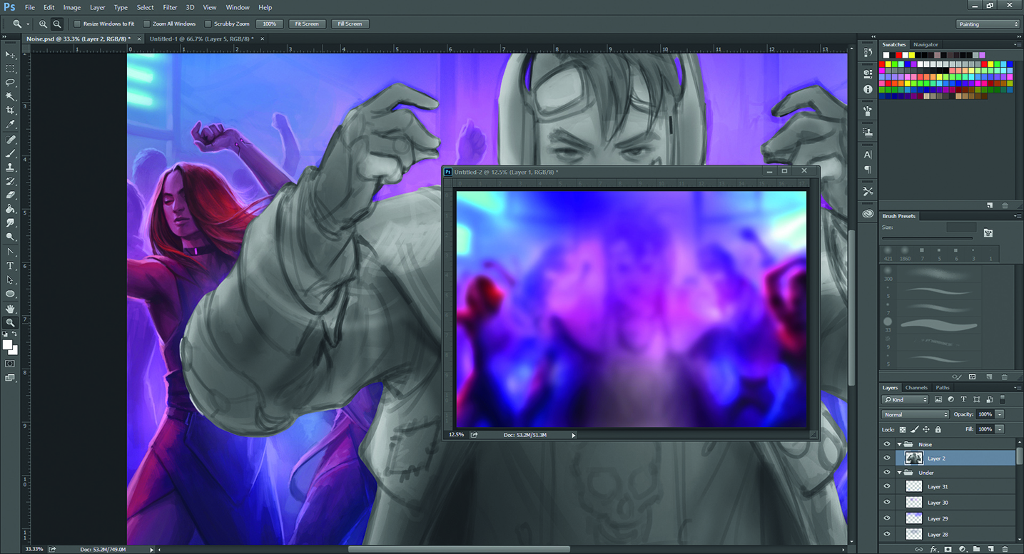
I don’t spend too much energy on polishing the background. Not only won’t it be visible at the final card size, but I also want to avoid visual confusion with levels of detail.
I instead focus more on how the background appears at a small size, thinking of it as a pattern of colour and shapes, similar to how things look when you squint your eyes.
08. Use field blur techniques
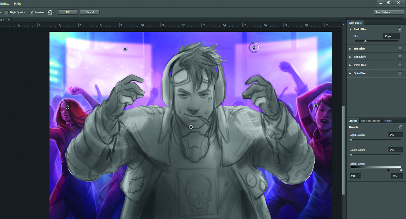
I want to further reduce the importance of the background figures, so I’ll add a subtle blur. First, I duplicate the background and collapse it to a single layer. I don’t want to lose a sense of depth so I use a Field Blur, which enables me to place pins on the layer and control the level of blur for each pin. Now I can blur the background to a greater degree than the midground dancers.
09. The main event
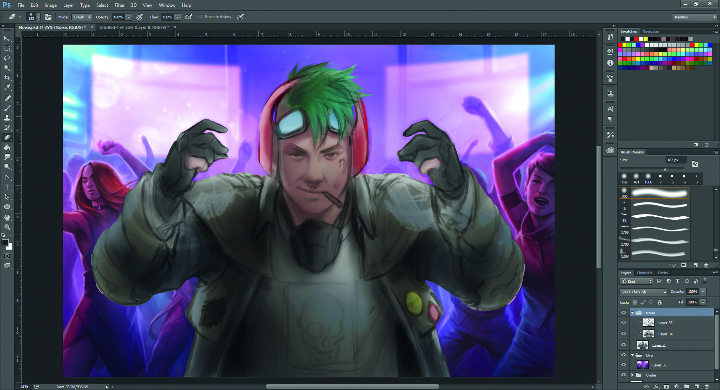
With the background finished, I move on to the main character. I begin by using Color and Darken layers to wash in colours and shadows, giving myself a good base to work from. Again, this is an existing character in the Android world, so his colour palette has already been established.
Establish clipping masks
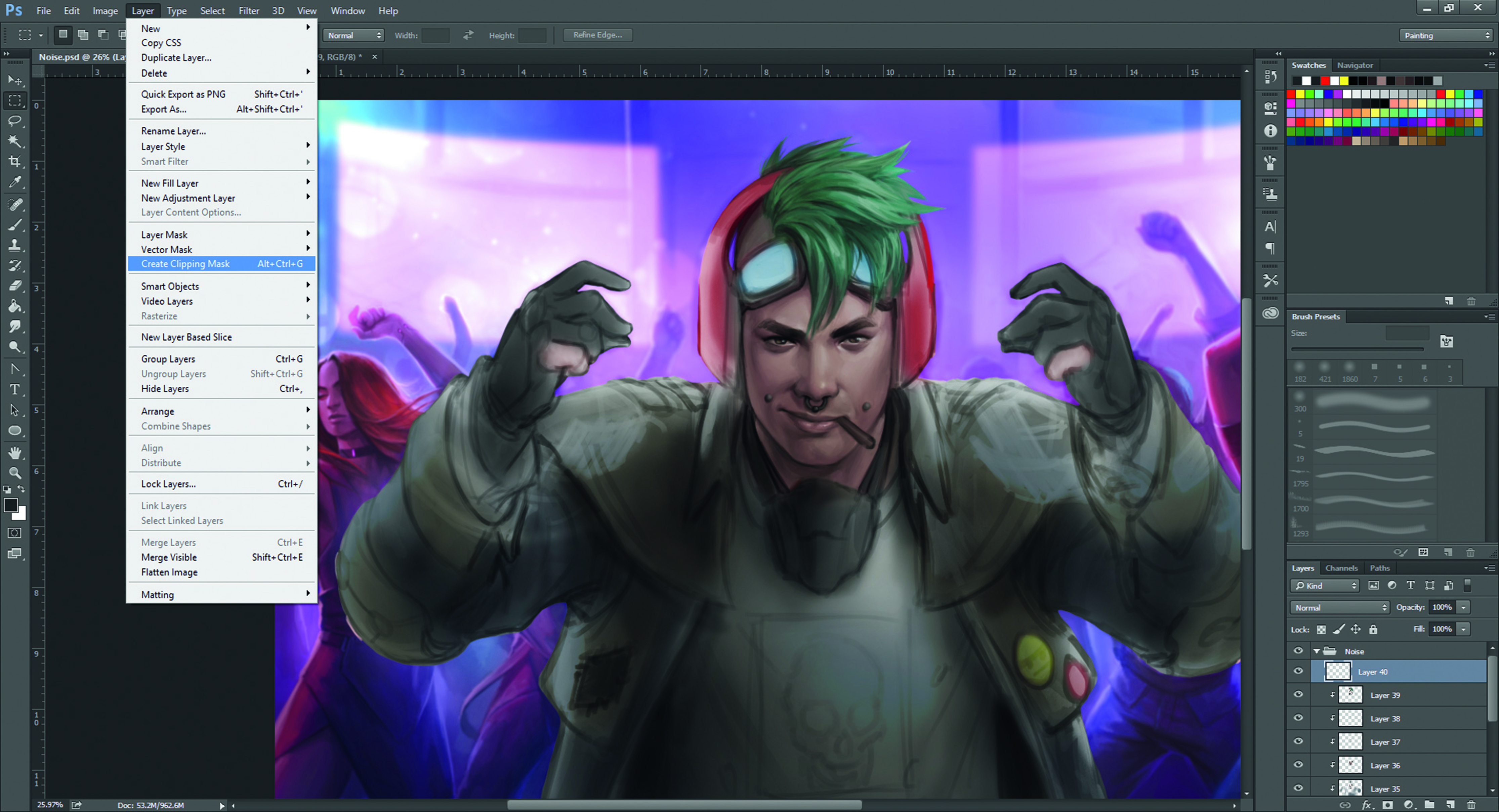
When I work on characters, I don’t paint directly on my sketch layer in case I need to go back to it. Having separated it out at the start, I work on layers that have been attached to it as a clipping mask. I achieve this by creating a new layer above the base layer, right-clicking it and selecting Create Clipping Mask or Layer>Create Clipping Mask.
11. Details, details, details
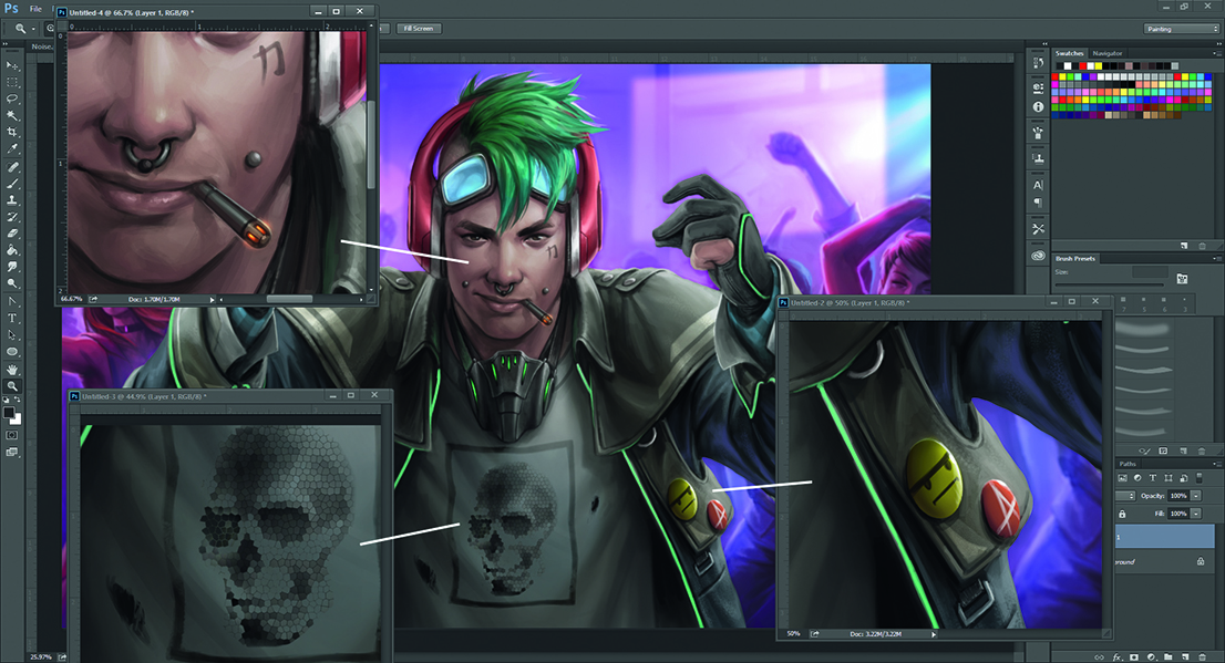
As I render the character, it’s important to pay attention to the little details: his smirk, his buttons and patches, the holes in his T-shirt, his tattoo, and so on. All of these help tell the story of the character beyond what’s happening in the scene, and set him apart as a character who lives beyond just fulfilling the purpose of this one piece of art.

12. Making things cohesive
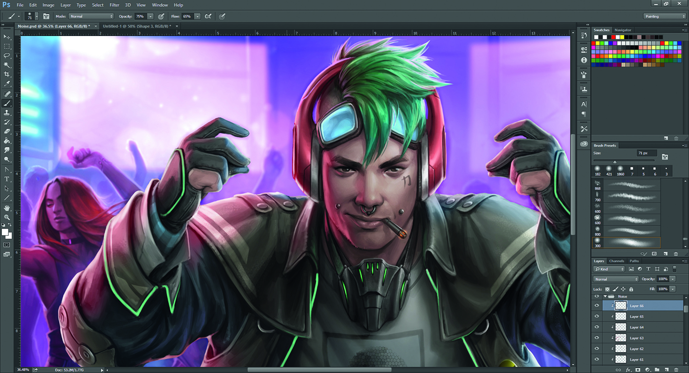
The last stage of painting the character is to make sure I light him appropriately so he looks like he’s a part of the scene, in addition to being the focal point. He’s lit with the same hard red light that’s affecting the other characters, but he retains much of his natural colouring, which helps him stand out. I make sure to blend into the scene any elements that seem out of place on him or are drawing too much attention.
13. Creating the interface
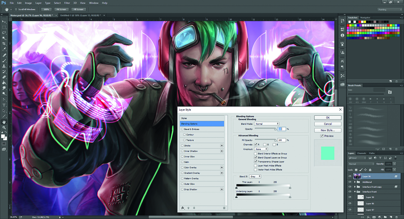
For Noise’s hacking interface, I use Photoshop to assemble a separate sheet featuring various techy designs I could combine to create a series of digital projections. I use Color Dodge layers, which gives it a nice holographic glow. I also give it a magenta colour to tie it in with the overall colour scheme and make it a supporting element, instead of making it a contrasting colour.
14. Apply a colour aberration effect
I click Select All>Copy Merged, pasting a copy of the finished image into a new layer. I double-click this layer and in the dialog under Channels, I untick the Green and Blue channel boxes, then click OK. I then Transform the image, scaling it slightly overall. This offsets the layer, giving the image a slightly glitched video appearance to really sell the cyberpunk theme
Sign up to Creative Bloq's daily newsletter, which brings you the latest news and inspiration from the worlds of art, design and technology.
