If celebrities were Pantone colours
Prince has his own purple Pantone, so what colours should other famous icons lay claim to?
Sign up to Creative Bloq's daily newsletter, which brings you the latest news and inspiration from the worlds of art, design and technology.
You are now subscribed
Your newsletter sign-up was successful
Want to add more newsletters?
Last year, legendary musician Prince was honoured with his own Pantone colour (a bold shade of purple, of course). And that got us thinking: what Pantone colours might other famous musicians, celebrities and icons be awarded when they pop their clogs?
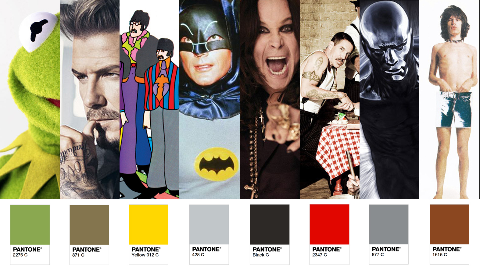
So, we did it. Using some of their famous songs, nicknames, outfits or just whatever sprang to mind, really (this was not a scientific experiment based on colour theory), we've come up with some new celebrity Pantone colours...
01. It ain’t easy being Pantone 2276 C
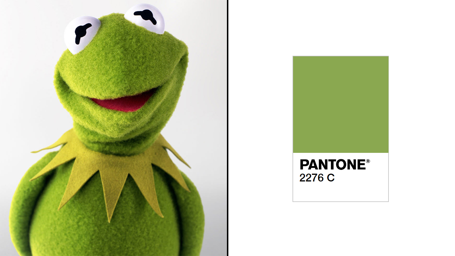
Could there be two better contenders for green than Kermit the Frog or The Incredible Hulk? Kermit won for us: we think that after everyone’s favourite amphibious felt thing retires (can a Muppet retire?) he should get his own Pantone green, as a tribute to, well, just being the coolest frog ever. After all, he's already got his own font. We’ve matched Pantone 2276 C to his skin tone, which we think is a pretty good fit.
Article continues below02. Pantone Black C Sabbath
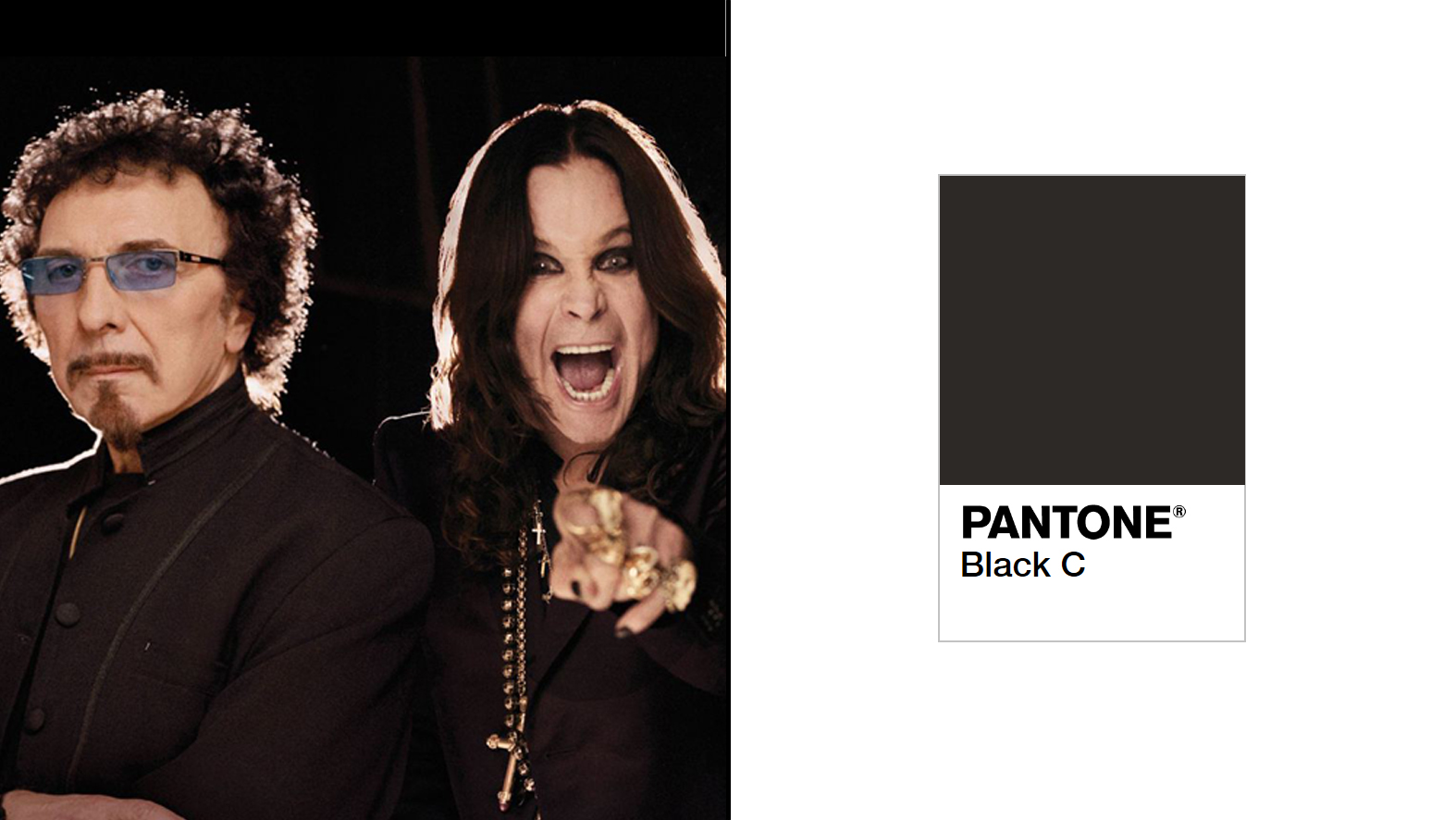
There could only be one Pantone colour to honour perhaps the greatest heavy metal band of all time. The darkest of darks, the blackest of blacks: Pantone Black C. Whether it’s Ozzy or Iommi, we reckon Pantone should get on this quicker than Mr Osbourne devours a small winged mammal.
03. Pantone 871 C Balls
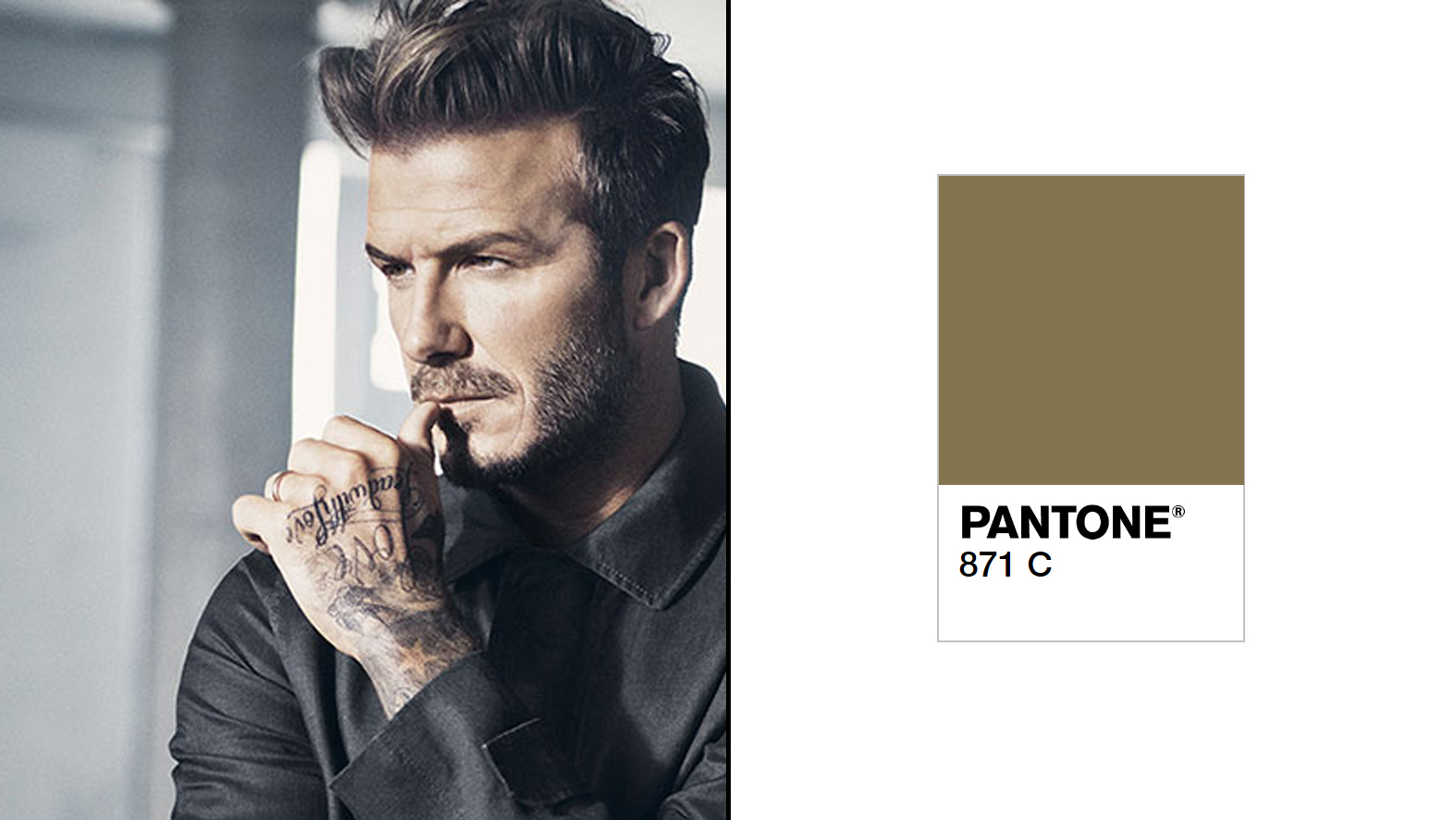
Remember when David Beckham was called Golden Balls? Is he still called Golden Balls? Regardless, he's one of the world’s best-known footballers and style icons, and we can think of no better colour to name after him than the trusty Pantone 871 C metallic.
04. We all live in a Pantone 012 C Submarine
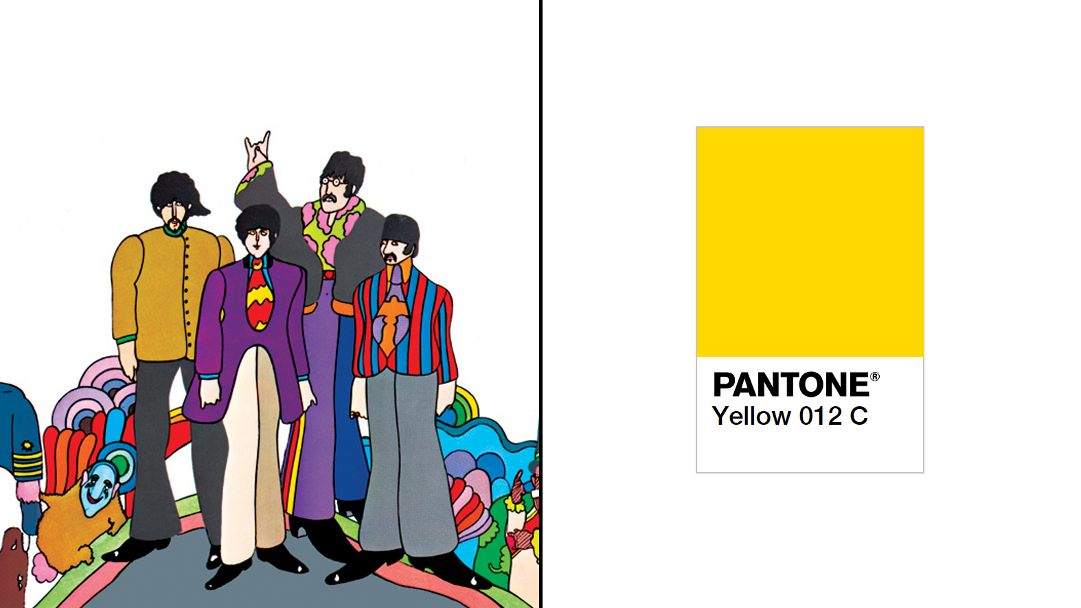
John, Paul, George and Ringo’s psychedelic phase was perhaps best captured by the trippy graphics in The Beatles’ 1968 animated movie Yellow Submarine. So it’s fitting that the fab four get their own Pantone Yellow – 012 C to be precise. Or perhaps we should dedicate the colour to illustrator Heinz Edelmann, the man responsible for the hallucinogenic look of the film (who sadly died in 2009).
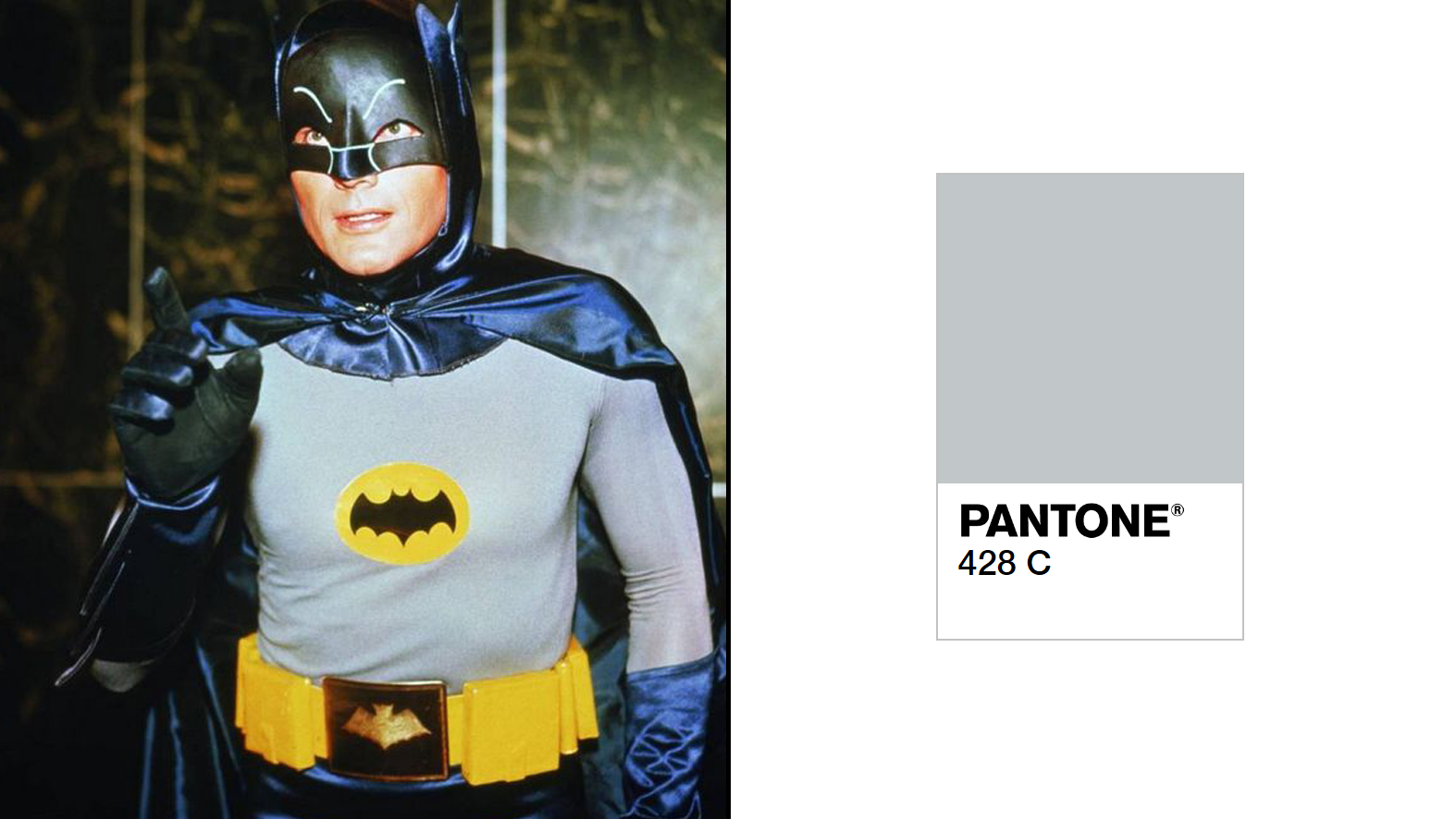
05. The Pantone 428 C Knight
Seeing as Christian Bale has hung up his boots as the caped crusader, we thought about honouring him with Pantone 419 C – one of the darkest Pantone colours you can have without actually being black.
Sign up to Creative Bloq's daily newsletter, which brings you the latest news and inspiration from the worlds of art, design and technology.
Alternatively, we could dedicate Pantone 428 C to the TV Batman played by Adam West, who passed away last year. We’ve colour-matched this Pantone to '60s Batman's classic grey suit.
06. Pantone 2347 C Hot Chili Peppers

Anthony Kiedis, Flea et all deserve a vibrant red in honour of their rocking funk – and we can’t think of anything better than Pantone 2347 C. The American rock band has been sock-wearing for 35 years now – surely to mark this milestone Pantone can sponsor them and rename the band Pantone 2347 C Hot Chili Peppers. C’mon, what else is its marketing team doing?
07. The Pantone 877 C Surfer
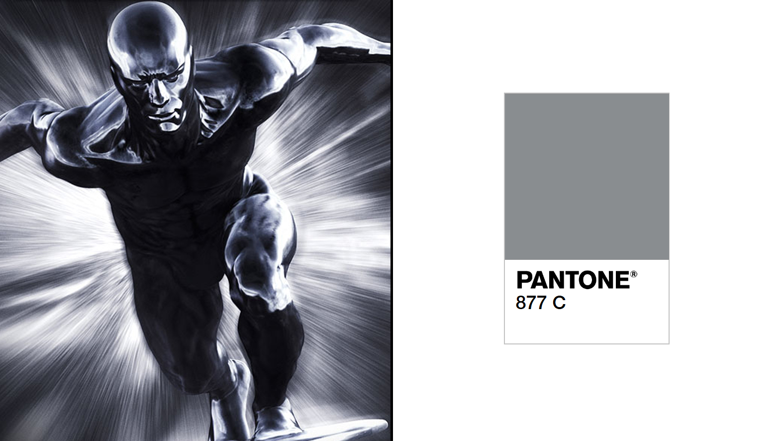
Norrin Radd, or The Silver Surfer as he’s more commonly known, is a comic book character created by Jack Kirby back in 1966. He searches for planets for Galactus to devour. And his skin? Well, we think he was dipped in a vat of 877 C ink. In the rather terrible Rise of the Silver Surfer movie he saves earth, sacrificing himself. So come on Pantone, give Norrin what he deserves.
08. Pantone 1615 C Sugar, why do you taste so good?
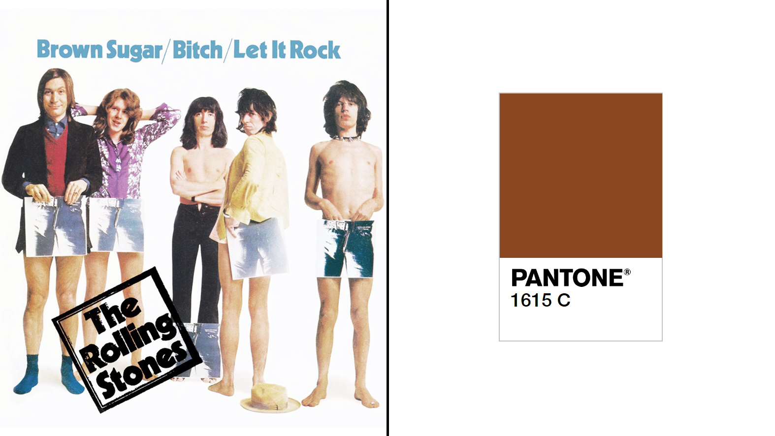
Okay, we’re scraping the barrel a little bit now, and Mick Jagger, Keith Richards, Ronnie Wood and Charlie Watts are probably not best associated with brown (we could have matched the Rolling Stones' famous lips logo to a red, but that’s already been taken by the Chili Peppers). It just so happens that Brown Sugar is our favourite Stones song, so we're awarding the band with Pantone 1615 C.
Thank you, and good night.
Related articles:

Rob is editorial, graphic design and publishing lead at Transport for London. He previously worked at Future Publishing over the course of several years, where he launched digital art magazine, ImagineFX; and edited graphic design magazine Computer Arts, as well as the Computer Arts Projects series, and was also editor of technology magazine, T3.
