Master the finer points of typography
Explore the aesthetic dimension of type to see how it serves and enhances design.

Type is part of our everyday lives. It can be seen everywhere – in books, newspapers and billboard advertising, on signs and online; on shop fronts and packaging; on buses and trains and rashers of bacon, even in awesome tattoos!
Typography is an essential part of the communication process whether it’s used in print, on screen or in any other media. It’s used to attract attention, engage the reader and convey meaning. It can evoke mood – by suggesting power or sympathy, for example – and evoke a specific era by looking old or modern. Despite all of these possibilities, typography is often overlooked or carelessly applied.
The language of type
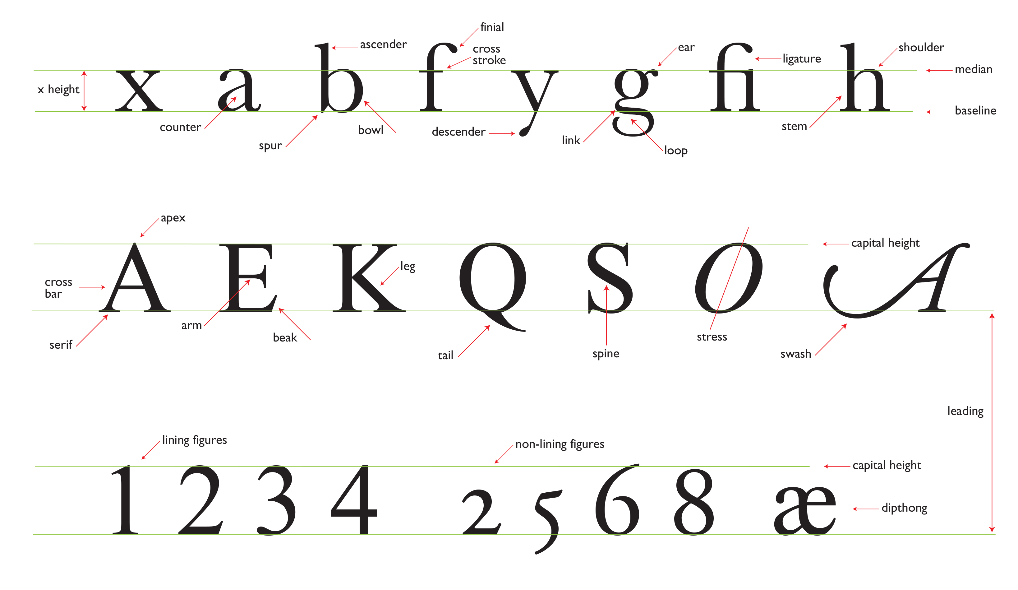
Type has its own unique language and technical terminology, which is mainly used to describe the component parts of letters. The chart opposite shows those you’re most likely to come across during your day-to-day work. They derive from a time before computers arrived on the scene, and some terms, such as ‘beard’, have disappeared completely.
Article continues belowThe term ‘leading’ (pronounced ‘ledding’) is still in use and refers to the distance from one baseline of text to the next. It can be expressed as ‘10 point type, 2 point leaded’, or ‘10/12 point’ (‘10 on 12 point’), for example. The name derives from a thin strip of lead or other metal used for measuring – in this case, 2 points in thickness (2/72 inch) – and this would be inserted either by machine or by hand between each line of metal or wooden type. Use of the word ‘leading’ almost disappeared when the term ‘line feed’ was brought into circulation with the arrival of computer- assisted typesetting.
Software will give default leading based on a percentage of the type size you are using. Don’t let the machine decide your fate!
Jonathan Doney
This also described the mechanical process involved at the time: the computer would usually set type on a continuous roll of paper or film and had to be instructed that to set the next line, it needed to feed the right amount of paper through the cassette. Unless you change it yourself, software will give default leading based on a percentage of the type size you are using. It’s up to you to change this to what you require. Don’t let the machine decide your fate!
Others terms have changed through our everyday use of computers. For example, when describing a website link we are all familiar with saying ‘www. istd.org.uk slash join’. We know that ‘slash’ means a diagonal stroke leaning to the right, but its real name is ‘solidus’. Try saying ‘solidus’ to your friends, and the likelihood is that they won’t know what you’re talking about.
Getting to know the standard terminology of type will help you enormously when comparing fonts, making informed choices about typefaces, and having discussions about design with colleagues and authors.
Sign up to Creative Bloq's daily newsletter, which brings you the latest news and inspiration from the worlds of art, design and technology.
Points or millimetres?
Which should you measure in? It’s really up to you and what you find more comfortable to work with. I always state measurements using the point system because that’s the way I was taught. If you say to me ‘12 point type’, I can visualise it easily. If you say to me ‘4mm type’ then it will take me a while to get a mental picture. It could well work in reverse for you. The determining factor is that whichever you use, be sure to use it accurately. A description of the point system can be found in the glossary at the end of this article.

What are the rules?
This is the most common question I’m asked, other than ‘what’s your favourite typeface’. It would be wrong for me to suggest there are any hard-and-fast rules of typography. I prefer to use the word ‘recommendation’ rather than ‘rule’. Much typography is driven by the demands of legibility and readability overseen by common sense, good practice and experience. Typography is made up of many facets, which are all interrelated. If you change one thing, you should – and in some cases must – consider changing another.
It has been said that you should never mix serif and sans serif typefaces in one design, or mix symmetrical design (centred) and asymmetrical design (ranged) elements together. These two basic rules can be and have been broken many times, producing results that have still been great, but it needs to be done with skill and thought. With care, rules can be broken.
There are, however, three things that are really frowned upon and considered bad practice. They concern short lines that might appear in running text. One is called a widow, and the other an orphan. These are described in detail in the glossary. The third thing concerns line endings. If the last word on a line is the start of a new sentence, this is considered bad practice.
Much depends on judgement. To develop a better sense of what works and what doesn’t, start to build your own encyclopaedia of type in your head. Start by looking closely at a typeface. Get to know the fonts that look great and acquaint yourself with the ones that don’t.
Ask yourself some basic questions about them. Is it serif or sans serif? Does it look old or modern? Are the ascenders and descenders nearly touching, and do the lines look too close together? If you decide they are, what would you do about it?
Remember, good typography rarely gets noticed, but bad typography always does.
Jonathan Doney
Fonts with large x heights and small ascenders/descenders require more leading than those which have a small x height and long ascenders/descenders. Are the lines of text too long?
The average English word is made up of five characters and one space, which equals six characters in total. Recommendations for minimum and maximum line lengths vary slightly depending on their source, but are generally in the range of 36 characters (6 words) per line minimum and 60 characters (12 words) per line maximum. Ask yourself: ‘Does my design fit this guideline?’
Remember, good typography rarely gets noticed, but bad typography always does.
This article was originally published in Computer Arts magazine issue 256. Buy it here.
