8 steps to designing the perfect infographic
What is an infographic and how do you create them? Jessica Draws explains all.
Last month, while happily nibbling on a canapé and sipping a cocktail at the monthly I Am Woman networking event I was chatting away to some businesswomen and the obvious question was asked: "So, what do you do?" I launched into my usual explanation of some of the services I offer including print/web design, illustration and infographic design and I noticed a couple of blank faces among the ladies. "What's an infographic?"
It occurred to me that this is the most common question I get asked – even when I've been approached by a new client wanting an infographic! Quite often they're even unsure of what exactly one is but have heard that it's a great marketing tool for businesses and so are keen to commission their own.
So, in the hopes of demystifying the infographic design process and hopefully sharing some tips on how to create great infographics I introduce my guide to infographic design. Enjoy!
Article continues below 
01. What is an infographic?
Simply, an infographic is information graphics, visually interpreted information or data also known as data visualization. It's a great way to turn a complicated or confusing subject into an easily digestible and aesthetically pleasing experience for the viewer.
It can be a brilliantly effective way of marketing a product, promoting an experience, educating and raising awareness of any subject you can think of. A great design can engage and captivate and inspire people to action.
In this information age when there is so much information to digest and compete with each other, an image, clever use of typography and a well thought out narrative can tell that story much quicker and more effectively.
They can be a super-effective tool in a digital marketing campaign and this is why they are being used so readily by small businesses as well as huge organisations. Even The White House are spitting out their own infographics (some good and some very bad; more on this later).
Sign up to Creative Bloq's daily newsletter, which brings you the latest news and inspiration from the worlds of art, design and technology.
It's not a surprise then that illustrators and designers everywhere are being commissioned more often to create these wonderful tools.
Over the last two years, infographic commissions have risen substantially and I'm slowly racking up a hefty portfolio of designs for a range of clients. In the rest of this article I'll share my tips for getting them right.
02. Know your subject
Some clients will approach you with a well thought out brief, all the content and data researched and edited and ready to go. Some might even have a rough wire frame, colour palettes sorted and supply you with a lovely set of brand guidelines and off you go.
Read everything thoroughly and put some extra time in doing some research of your own into the subject before you start. Even if it's a subject you know vaguely about, it's important to know what you're communicating as it'll impact on tone of voice and the style of the imagery you create.
In other cases you may get approached by a client who is not entirely aware of what an infographic is, know that they should be using them but only have a vague idea of what they need. In this case, the designer turns into researcher, editor, copywriter and project manager. These are the most exciting infographics to work on but are definitely the most challenging.
Guiding your client through the process can be a great experience. Learning so much about a new subject and having so much control over the content and brief is wonderfully satisfying. However, there's much to consider before jumping straight into the design.
Be organised. Find out what the message is, what the overall call to action is if there is one and whom the client needs to communicate the message to. You may find that you'll need to guide your client's decisions on these questions but it's important to get these sorted early on.
Next you can go about reading, researching and collating data and content. That's means finding articles and books relevant to the subject and collating sections of information that will help communicate the message.
03. Have a plan
Once you've collected the information or have been supplied all the information, it's helpful to get to thinking about how to tell a story with the data. An infographic needs a narrative and a flow. Essentially you are creating a visual journey through a particular subject and with every story we need a beginning, middle and an end.
For example, take a look at the infographic below created for Maytech. Titled 'Do you know where your data is?', the aim was to raise awareness among IT professionals and company directors about the importance of monitoring data sharing and updating security policies.
So, the beginning is an introduction to data, how we create it, how much we create, where it comes from and a bit of history. The middle is where all this data is stored and who is storing it and the dangers of not knowing where the data is. The end is the future outlook and the posing of the question, 'do you know where your data is?’

There is a clear flow and narrative. Before beginning the design process and you have all your content and your story mapped, wire frame it! Sort though your content, and edit, edit, edit until you have your story and then arrange into sections. Clearly defined sections.
This is such an important process and always best to get the wireframe signed off before you begin the design. There's nothing worse than spending hours on a design, creating intricate bespoke illustrations only to find your client isn't happy with the content.
If needed, give the client and idea of colour palette and image style you intend to use too, before you start! It's also a good idea to find out if there are any brand guidelines you need to adhere to!
04. Converting text to images
Now you have your wire frame approved its time to start converting that text and data into visuals. It's a case of show don't tell. This can definitely be tricky and occasionally you may need a brief explanation to go along with your images.
However, try and transform as much as you can into imagery. In some instances the subject matter will dictate how much this is possible. For an example, see this infographic created about the psychology of influencing and persuading.

The data provided was so much more about being in certain situations that the imagery definitely needed explanations. Therefore it was a question of balancing the text with the images.
Others, where the data is purely factual, it's much easier to reduce the text to virtually nothing or at least to incorporate the text within the images. Such as 'Gone in Six Seconds' and 'Who is the modern day white van man?'.
05. Don't lose interest!
The longer your work on a project and the longer you're talking about the same subject it's sometimes easy to lose interest and resort to easier methods. This is when it's a good idea to take a break and revisit the job with fresh eyes.
It's easy to use blocks of colour and quicker simpler illustrations (sometimes these are appropriate of course) and shortcuts with blocks of text but it will not result in a great design or a happy client.
One example I've found recently was this infographic from The White House '10 Things You Need To Know About President Obama's Budget'. This infographic, well... this isn't an infographic at all. This is a glorified list and unfortunately completely misses the point of an infographic.

The key is to really think about how you can visualise each slice of data rather than just writing it in a nice typeface and laying it out in a creative way.
- Don't lose steam and get lazy: take a break and revisit.
- Don't be boring: really think about how you can change up the layout and flow and make it more interesting.
- Attempt to invent new ways to define and break up sections but don't get too carried away: you still need your reader to know where they are supposed to be looking, and in what order.
If you're running out of ideas how to visualise something, get another pair of eyes on it before you resort to your average pie charts and graphs. A client would be able to create standard charts themselves, there are plenty of tools out there. That's not what they're hiring you for. This is where you need to think outside the box. Occasionally the subject matter might call for a graph but make sure to dress it up, do something unique with it.
06. Be careful with fonts!
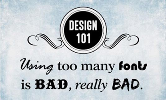
The typefaces we use within any design are so important and can be the difference between a great design and a giant headache for your viewer. Try to limit the fonts your use to two, three at the very maximum. Choose one headline font suitable for your titles and sub headings and one clean, legible typeface for any smaller body text/notes.
If you need a third, it would probably be for things like extra facts dotted around the infographic or perhaps for super important stats you want to draw attention to even further.
Too many typefaces can easily confuse the eye and make it difficult to decide where to look first and disrupt the flow and the narrative. Be selective and use the font family to divide information and content appropriately.
Similarly, be wary of the size of your type. Take a look at The Top 10 Worst Infographics according to Klientboost and browse through some pretty horrific type decisions. Also think about what you're saying with those fonts and how appropriate that font is to the subject.
You may not have complete copywriting control over the project but you know what's going to engage and what isn't. Make sure your title is going to engage straight away. For example, check out this infographic created for Folly Farm. Initially the title was just 20 Animal Facts. Sure, it does what it says on the tin but it's not very catchy or encouraging.
How about promising the reader a bit of a giggle? That would encourage me to click for sure! Make sure the font is appropriate for the audience and the subject as well as appropriate and visible enough to use it all the way through. I find it's always best to get your fonts sorted before you start any illustration.
07. Bright isn't always best
A bright colour palette doesn't always mean that it's automatically going to be eye catching. Colour choices can make the difference between hooking people in instantaneously or making them turn and run terrified they'll go blind from the garishness. It's important to consider this before you start.
Of course it might change as you progress with the design but you'll have a better idea of what works once you've done some research. Think about your subject, your audience and consider things like colour psychology and how you want the user to feel/think when viewing the infographic.

Consider who you're creating this for; who are they? What do they buy? Think about if it's a product you're promoting, do you need to reinforce the brand with brand colours? Make sure you establish if there are any guidelines you need to follow before you start.
Similarly with fonts, don't overdo it with the number of colours. Use one or two main colours and perhaps only two more for accents. Use the accent colours to decipher between different sections or themes.
08. Proof read, test and check your ego...
Proof read! Proof read! Proof read! It's going to be so embarrassing not to mention unprofessional if you send a beautifully designed infographic off to your client with glaring typos.
Proof read! It'll be even more embarrassing if your client doesn't notice either, publishes the infographic and then is faced with a tsunami of comments and complaints. That's the wrong sort of attention. Again, proof read like your life depends on it.
Test your infographic on some colleagues and whoever your can grab. Does it flow, can the easily see the narrative? Is the text too small? Too large? Too much? Too little? Does your illustration of a dog actually look like a dog?
It's important to check everything makes sense to other people. That cute little illustration you've created that you think definitely absolutely looks like a dog chewing a bone, someone else might not see. That little pun you think is so clever might turn out to be offensive or just not make sense at all! It's not going to work as a marketing tool if it's just you that understands it.
Remember, you're not creating this for yourself. If things aren't working, suck it up, check your ego and change it. There's not point publishing something that just won't deliver, even if you think is bloody fantastic. Have fun!
Words: Jessica Draws
Jessica Draws is an experienced designer with a love of beautiful, creative visual work. She has produced infographics, illustrations, graphics and digital artwork for brands including Sainsbury's, Go Compare, IKEA, and London Women’s Clinic.

The Creative Bloq team is made up of a group of art and design enthusiasts, and has changed and evolved since Creative Bloq began back in 2012. The current website team consists of eight full-time members of staff: Editor Georgia Coggan, Deputy Editor Rosie Hilder, Ecommerce Editor Beren Neale, Senior News Editor Daniel Piper, Editor, Digital Art and 3D Ian Dean, Tech Reviews Editor Erlingur Einarsson, Ecommerce Writer Beth Nicholls and Staff Writer Natalie Fear, as well as a roster of freelancers from around the world. The ImagineFX magazine team also pitch in, ensuring that content from leading digital art publication ImagineFX is represented on Creative Bloq.
